Be Unforgettable With Chunking
“One-seven-three-four-six-seven-three-two-one-four-six-Charlie…” And there’s more to that string of numbers and words as Mr. Data from Star Trek utters them to lock out the ship’s computer.
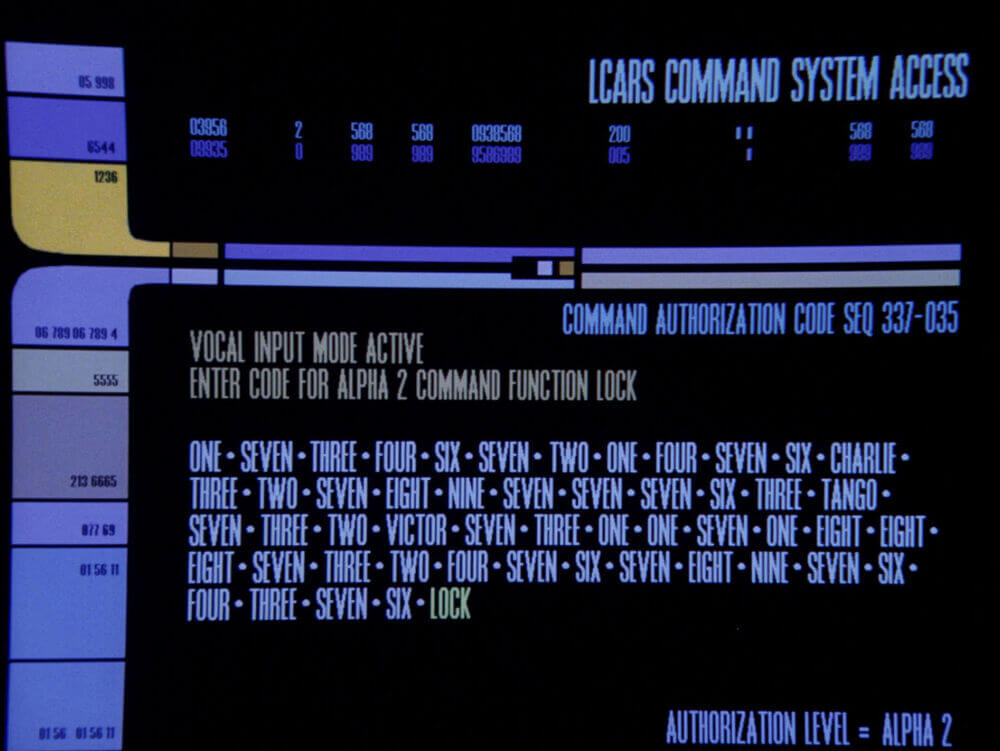
Passwords in the future are really hard to remember. (Photo Credit: CBS)
Only an android could hope to remember that password. Or his average human (or alien) crew members could use the Chunking technique to memorize it.
Chunking info into smaller bits helps us memorize long lists of numbers, words, or facts. And it’s something that can help you boost your site’s conversion rates.
What Exactly is Content Chunking?
Content chunking breaks up long strings of information into smaller, bite-sized units. These chunks are easier to burn into your working memory than a longer, uninterrupted string of information.
This is because our short-term memory is a bit crap. Ever heard the phrase “in one ear and out the other”? Well, that’s what happens with our short-term memory when we’re bombarded with a ton of information all at once. We can only remember up to seven items at a time.
In 1956, George Miller figured out that we can hack our short-term memory by breaking all that info into manageable, digestible chunks. So it takes what is in our RAM and imprints it onto our ROM for safe keeping.
There are four major parts of chunking memory processing:
- Chunk. The digestible form of information to be memorized.
- Memory Code. This is the memory hack we use to imprint the information.
- Recode. This is where we burn it into our memory.
- Decode. Finally, this is where we can recall the information because we did the other things.
But when it comes to your users you’ll want to break down information on your site so it’s easier to digest, and far more memorable. That’s where Content Chunking comes in.
Breaking up all the content into your site makes it searchable, scannable, and readable.
Why Do We Chunk Content?
Chunking content makes scanning easier for your users, improving their ability to remember it. Our goal should be to create meaningful and visually distinctive content that sticks.
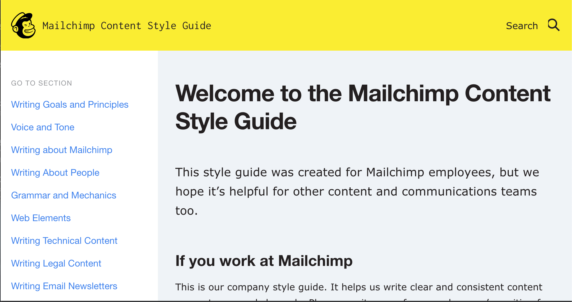
Mailchimp uses Content Chunking to train their team on how to write powerful content.
We want to ensure that critical information is caught, stored and, later, recalled, especially in distracting environments. Complex interfaces are to blame for a Navy ship striking another ship. So in certain situations, chunking content could avert disaster!
How to Use Chunking For Conversion Rate Optimization
We want to make decision-making easier for our users and potential customers. Chunking can aid us in that goal while at the same time boosting our conversion rates. Let’s take a look at some examples.
Break Up Content Into Sections
This works especially well for video content and online learning. Make each video into chapters or topics. This allows users to easily navigate.
ZURB does this with their responsive design courses so that users can learn at their pace. They chunk content into intro, advance, and master classes.
Use Graphics, Headers, and Bullets
Let’s take a look at one of the courses in a little better detail.
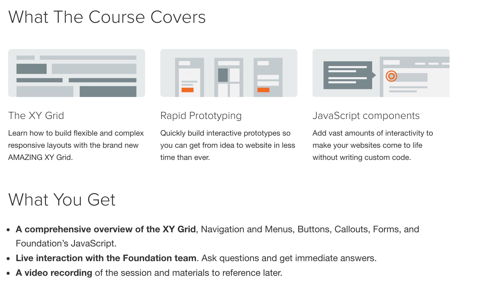
Page of the Intro to Foundation Course.
Here you can see the information is grouped under different headers. Graphics are used to illustrate points. And bullets easily allow a potential customer to see what they’re getting with this course.
This also makes the content scannable and digestible at a glance.
Break Up Long Lists of Information
Chunking up long laundry lists of information goes a long way to getting someone to hit that “buy” button. Pricing pages are the perfect place to do this.
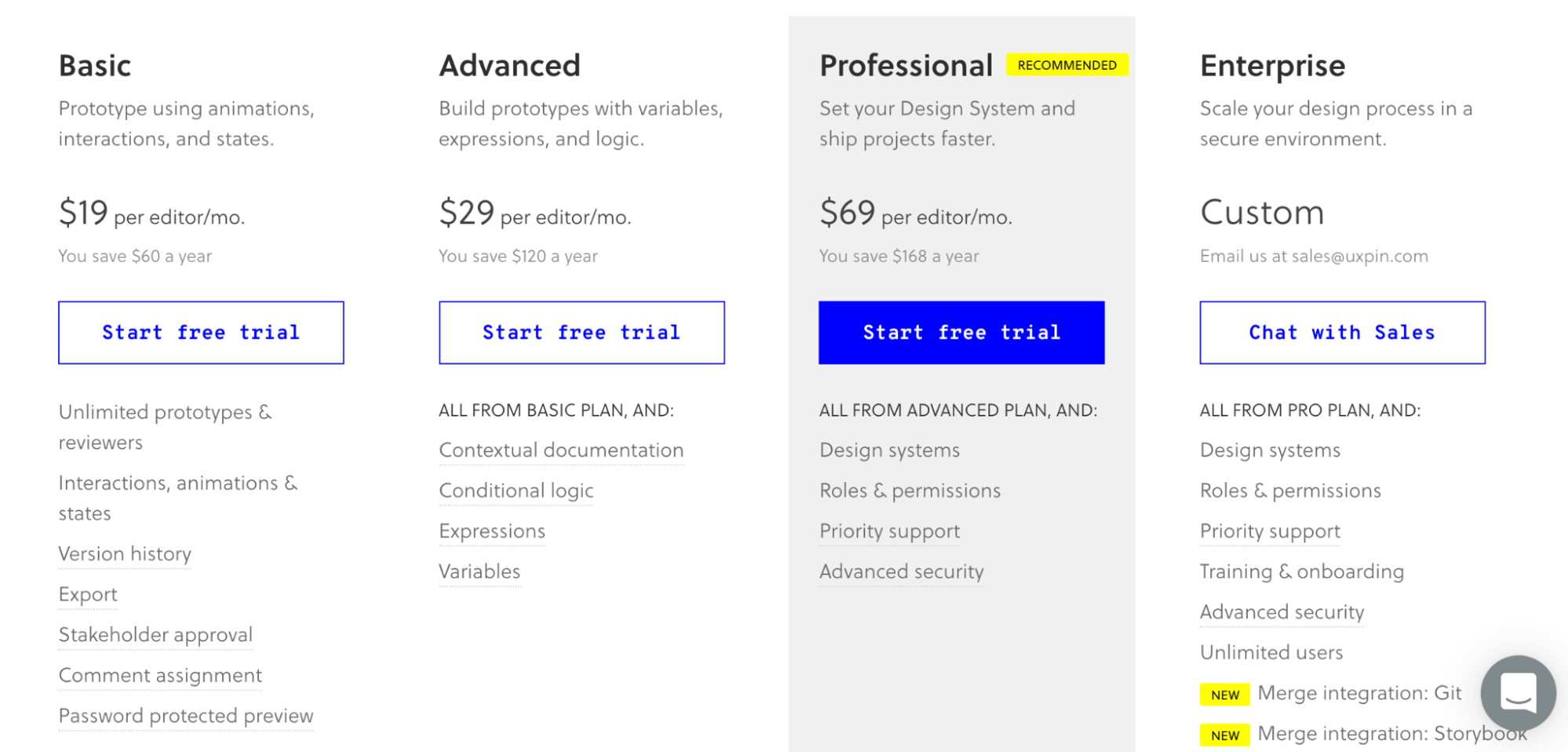
The pricing page of UXPin.
Here we see a combination of bold typefaces, boxes, and coloring to highlight critical information that a user might need to remember and recall.
Test Whether Users Can Remember Your Content Chunks
Can your users remember the content you have on your site? Well, Helio has a conversion user test that will allow you to test just that then see how it affects your conversion rates.

