How Readability Can Bring in More Money
Communication is tough. Just ask Jean-Luc Picard. When faced with an alien that communicated in odd phrases, like “Shaka, when the walls fell,” he was dumbfounded. How could he have any chance of bonding with the alien before the creature-of-the-week off’d them both?
Turns out they communicated in metaphor, based on their myths and legends. But his most difficult mission: reading and translating legal gobbledygook on a futuristic computer terminal.

Readability sucks in the 24th Century. (Photo Credit: CBS)
Shaka when the walls of text fell! Reading a screen like that gives us a headache.
But it doesn’t have to be like that for your audience. You can totes make your site readable, which will only boost your conversion rates.
What the Heck is Readability?
Readability breaks down walls of text. Chopping it down through structure, sentences, word choice and grade-level reading comprehension. Until you have the meaning and intention of what you want to say to your audience without alienating them.
It’s much more than typos and grammatical errors. It’s about communicating in the easiest way for both you and the reader.
Understanding Your Readers Needs
Put yourself in how your audience will encounter your site. You want to talk to them, not at them. It’s about sparking a conversation.
Visitors tend to scan your site, rarely reading each and every word. They look for a few things:
- Headlines.
- Subheads.
- The first sentences of each paragraph.
- Highlighted keywords.
- Any links.
It’s very similar to scanning the Sunday paper. Now that we mention it, readability increased newspaper circulation back in the day. If it’s good for old media, it’s good for you.
One thing that’s important to highlight are transition words. Readers use these to get the big ideas, and separate them from one another. Well, besides doing so with subheads.
A Moment on Accessibility
Readability can also help your accessibility. Since those who are visually impaired use screen readers to scan the text, having things readable makes it easier for those tools.
- Visual hierarchy is important. Headlines and subheads allow you to chunk information in an order that makes sense for reading. Yale has a great resource on headline best practices.
- Chuck those $10 words. Be thrifty in your word choice. You aren’t trying to impress your college composition professor. You want to strive for a high school grade level or lower.
- Consistency in text. Don’t mix comic sans with Times New Roman. Or else your designer might justifiably kill you. You want your font choices to remain consistent throughout your site, including how they’re formatted, left-aligned is usually the best.
- Stick to one big idea at a time. You don’t want to firehouse the reader with a lot of ideas all at once. Shorter sentences and paragraphs, the better.
And it all comes down to dollar dollar bills, y’all. If your site isn’t readable or accessible, then you’re leaving money on the table.
Simplify Your Content and Get Better Conversion Rates
Take a sledgehammer to your content. Be absolutely ruthless in smashing those huge chunks. Use a chisel to chip away at the details. Do this until you’re left with a beautiful digital sculpture. And no we don’t mean an NFT.
Some general best practices:
- Have well-written content, which improves your UX.
- Short, direct sentences over long-winded ones.
- Once again, ditch those $10 dollar words.
- Blast away any buzzwords, geekspeak, jargon, and acronyms.
- Headers, sub-heads, bullet points, and bolding are great to create a structure for reading ease.
- Be conversational if you want to strike one with your audience.
- Be a merciless editor, making every word count.
Let’s take a look at some specific examples and takeaways from some big name companies.
Consider Your Audience
One of the things you want to consider: who is your audience?
Your audience will determine your word choices and how you use them. Sure, we want to eliminate jargon, but if you’re a healthcare organization, you’ll likely use medical terms… a lot.
Microsoft’s Style Guide has a specific section dedicated to writing content for developers.
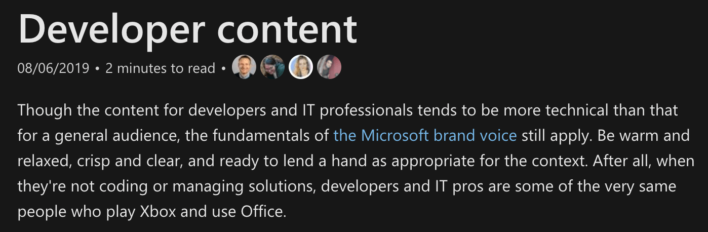
Start of Microsoft’s Developer Content Guide.
Microsoft advises skipping the basics for the developer audience, who’ll be more than familiar with core concepts. It also provides a glossary of specific developer lingo with directions on how and when to use them.
And, of course, Microsoft has a section devoted to localization. Because you’ll want to ensure your content matches the needs of those in specific countries, especially to avoid any communication faux pas.
Voice and Tone
It just isn’t word choice that matters. Voice and tone are just as important.
But let us take a quote from the excellent Mailchimp Style Guide to explain for us:
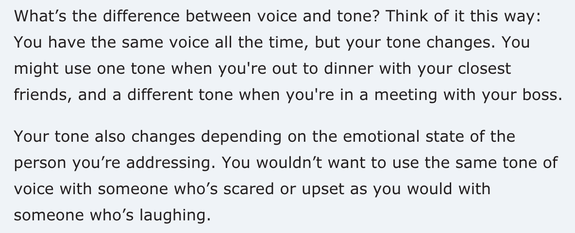
Excerpt from the Mailchimp Styleguide on Voice and Tone.
Your voice, or the one your company uses, conveys so much about who you are. Are you fun and playful? Or are you serious and dour? A gaming website won’t have the same voice or tone, as say a mortuary.
Structuring Your Content
The presentation of your content goes a long way to making it readable. Structure gives it form and function. And it can change depending on where it appears.
For example, a pricing page will look very different from an average blog post. Both have specific structures that won’t work with one another. In some cases, you can templatize content, just switching out the appropriate details.
A few questions to consider when structuring content:
- What information are you presenting?
- Where will it appear the most — web or mobile?
- Is your structure the best manner to convey it?
Layout and presentation can impact your conversion rates. 76% of consumers base their decisions on a company on the ease of finding information.
Sources for Testing Your Content’s Readability
Now that you have an overview, it’s time to put your content to the readability test.
We’ve assembled a few tools from across the universe for you to use.
- Automatic Readability Checker. Enter your text and it’ll be scrubbed to check if it’s easy to read based on 7 popular reading formulas.
- Yoast SEO Readability Checker. Yoast provides a readability checker integration for WordPress, which scans your content when uploaded. It searches for transition words, sentence length, headings, etc.
- Hemingway Editor. This app is great to determine the grade level reading comprehension of content.
Testing Your Content With Your Audience
Once your content is refined, you can put it out in the wild with an actual audience before you ever hit publish.
Helio lets your survey folks to get their thoughts. For example, you can use the following to get insight into how an audience feels about your content:
- Card Sort. This test is great to see how your audience would structure content. And that could be useful in figuring out what’s the best structure.
- Preference Test. Show two different pieces of content with the same information and see which one resonates with your audience.
- Free Response. Give your audience free range to speak their mind on your content.
And there’s a template you can use to get you going. Check your audience’s comprehension of your site with this plug-and-play test.