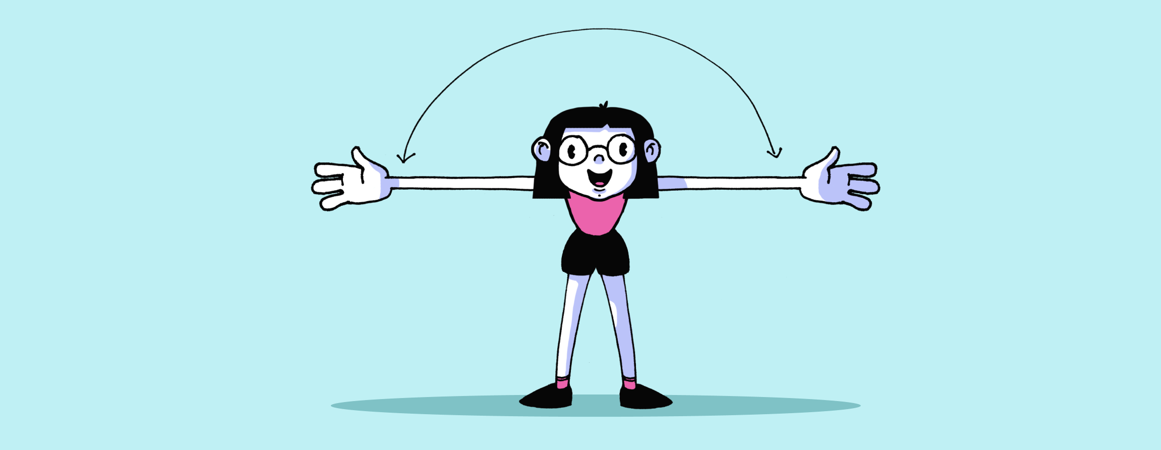
Rule Of Space
Objects in motion need a little lead room — space into which they appear to move.
The rule of space says that you should have more space in front of the subject than behind, thus giving the subject space to move into within the picture.
Rule Of Odds
People are more attracted to uneven numbers in a composition and we can use that to make our interfaces subtly more interesting.
When incorporating a collection of subjects in your design, the law of odds asserts that an odd number, rather than an even number, will make a more intriguing and visually beautiful composition.
Responsive Web Design
Keep your page looking spick-and-span on any and all web-enabled devices.
Responsive web design, also known as responsive design, is an online approach to design that assures usability and user satisfaction by rendering web pages properly, across a number of devices and window or screen sizes ranging from small to large.
Run Fast
Run fast, bite hard, and fear nothing
Try some stuff and break things. And if you’re going to fail, run fast. The celebration of failure is one of the things that built the tech industry and Silicon Valley.
Rule Of Thirds
People’s eyes are attracted to the areas one- and two-thirds of the way from the edges of the canvas in a photo or illustration.
The Rule of Thirds is a way to look at the layout of a design by placing a simple grid overlay, divided equally into thirds, both horizontally and vertically, on the space to be used for the design.