Rule Of Space
Objects in motion need a little lead room — space into which they appear to move.
![]() Morgan McGowan
. 5 min read
Morgan McGowan
. 5 min read
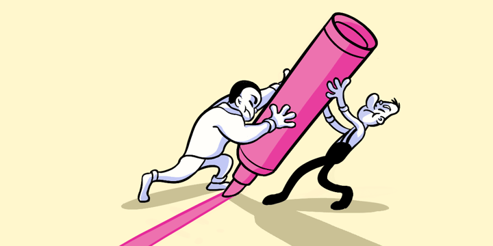
The nuts and bolts: The rule of space says that you should have more space in front of the subject than behind, thus giving the subject space to move into within the picture.

When users see a button with an arrow, sometimes they feel a little anticipation about what it’ll do. They expect it will do something, sure — but only after they tap it.
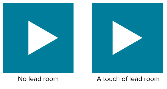
But some buttons look pre-tapped. Like the arrow’s already moving out of the frame. That’s because directive shapes like triangles and arrows should not be perfectly centered.
The Rule of Space says that when conveying motion, you should leave space into which the object appears to move. Compositions facing to the right, say, a play button, need a little extra room on the right side for the arrow to “move.” Without that space, the arrow looks off-balance, even if it’s correctly centered.
This idea isn’t limited to buttons. Photos and page layout also benefit from giving elements a little room to play.

Above: Not only does the person in the photo have lead room, but we naturally follow her gaze to her hand — and it’s a short step from there to the site’s logo.

Above: The people in the photos above are positioned in the right because they face left, giving them a little breathing room. Well, OK, the guy facing the wall is only facing slightly left. But still.
This subtle rule requires a good deal of finesse and a healthy dose of instinct. You can’t just measure x pixels from one side vs. the other. But giving the object in question a little room to move into also gives users a sense of balance. Maybe even anticipation for what happens when they tap that button.
Make sure you have that Rule of Space in your site with the easy to use Helio Test Template.