
Rule Of Thirds
People’s eyes are attracted to the areas one- and two-thirds of the way from the edges of the canvas in a photo or illustration.
![]() The Helio Team
. 5 min read
The Helio Team
. 5 min read
The nuts and bolts: The Rule of Thirds is a way to look at the layout of a design by placing a simple grid overlay, divided equally into thirds, both horizontally and vertically, on the space to be used for the design.
Not every composition needs perfect balance. In fact, many are more interesting with elements away from the center axes altogether. But where should the important elements go?
The Rule of Thirds says that compositions have more visual interest when elements are one- and two-thirds from the edges of their canvas. Two-column layouts, for example, do better when slightly indented away from the edges of a browser window.
Ideally we would divide a composition — page layout, photo, illustration, etc — into nine equal blocks (three wide, three tall, like a tic-tac-toe board). The most “interesting” points occur where the lines intersect.
In responsive web design, hitting the exact marks isn’t easy. But if you get the idea, that the one- and two-thirds regions attract the eye, then you’ll get full advantage of the meaning behind the rule.
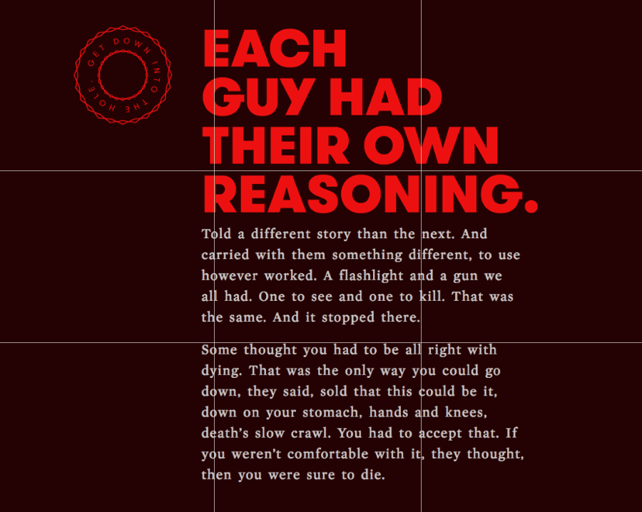
Above: This layout follows the rule — well, guideline — of thirds in spirit. Its left-aligned text falls along a vertical one-third line, added here for clarity. Likewise, its headline and second paragraph come close to the horizontal lines.
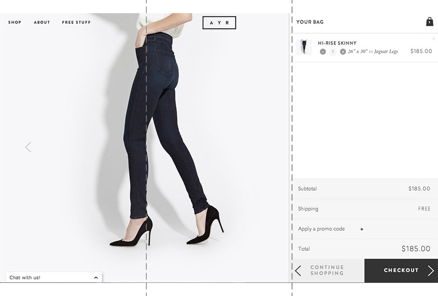
Above: You don’t always have to follow horizontal and vertical thirds. This example hits the right marks (the dashed lines that we added for clarity) with its vertical guides only — and still works fine. (Source: http://patterntap.com/pattern/bag-ayr)
So it’s the spirit of the rule that matters. That’s great because in responsive web design, the canvas — and thirds of a canvas — can change depending on a browser’s width. Elements within the design, especially its graphics and photos, do well to obey the guideline. That should interest designers as much as their audience
Check out the Rule of Thirds on your site with this test template: