
Negative Space
Empty space that creates site rhythm.
![]() . 5 min read
. 5 min read
The nuts and bolts: Negative space is the empty, blank areas in designs or “holes” where the page shows through between the main design elements. It can be seen as white between design elements and has been referred to by many different names such as “negative” or just “white space’.
Negative Space: the not-so-final frontier. These are the… No, We aren’t talking about some crazy inverted version of the stars and universes above, type of space. We are talking about the negative space found within design.
Negative space is everywhere and it is nowhere. Quite omnipotent. This negative space can be simplified and described as the unused real estate found on websites. Because negative space may be seen as spots of empty void, some people may not give it much attention and think it’s not that important to focus on. This feeling is quite the contrary. Negative space is just as important and powerful as the space of the site that is being taken up by content and elements — positive space.
Negate for the Greater Good
Negative space real estate doesn’t necessarily mean that we are talking about stark white spaces for backgrounds. Negative space can be textured and it can really be any color possible. After all, it is simply the unused area found on pages.
Negative space is a huge part of design. A lot of studies and articles have explored the ideas of negative space and what it means to messages and communicating to users. Negative space has much more meaning and impact than just solely being the unused space found on a page, on site or in an ad.
It’s almost strange to say, but utilizing effective negative space takes time to properly cultivate into your skillset. It’s an art to manipulate the empty spaces found around your site in a meaningful and communicative way. Efficient and proper application of negative space helps create balance, even pages, and groups similar elements together. All in all, negative space is a major factor in creating good designs.
Right and Wrong for Your Negatives
The reason we keep harping on the proper use of negative space is that there is such a thing as poor negative space management.
Poor negative space usage can be spotted right away. There is often no consistency found in the negative spaces, and because of the vast amount of variation of spaces in the negative space your eyes can never rest easy upon the page.
There’s a trend where many feel the more empty space on your page, the better. It may be an aesthetic trend as of late, but if you don’t properly utilize a vast amount of empty space, it can still come off as being a poor choice and poor design.
Efficient in being Negative
Let’s take a look at the Facebook landing page and how they’ve managed their negative space to convey messages and meanings.
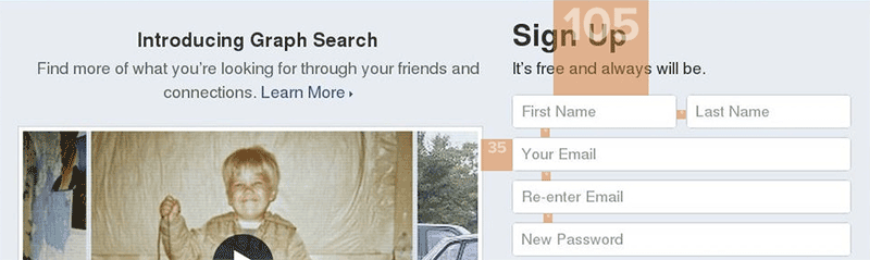
Facebook.com landing page.
Efficient use of spacing of the negative space helps create rhythm of the page. As you can see above, the orange spacers show that each element has proper spacing between one another. This helps in differentiating what belongs together and what is separate from one another.
Spacing is important as well for grouping similar pieces of the page together. Again, with the orange spacers, you can see the “Sign Up” field elements are all evenly spaced with the same amount of spacing. This type of spacing helps your eyes decipher these elements as a group that belongs together.
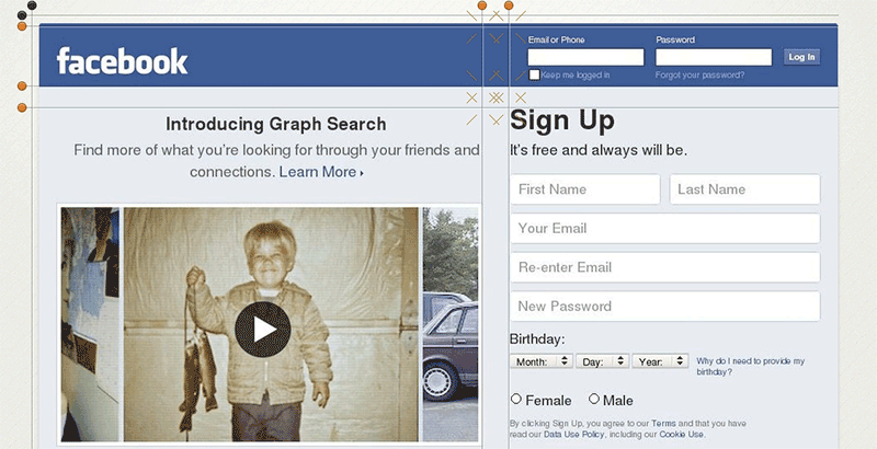
Facebook.com landing page example
Following suit of the spacing, intersection points use spacing to help draw the eye to certain areas of your page. In the image above, you can see how the spacing causes the eye to focus on the area near the sign-in and sign-up areas (as marked by the X’s). Facebook creates a call-to-action using the negative space to draw the user to sign in and sign up. Use Tools Negatively
If you aren’t too sure about how you’ve managed the negative space on your page there are a few tricks you can try out to see how users will view your page through the flow created by your negative space.
- Squint your eyes. Blurring out the content helps your eyes focus on the shapes and flow of your overall design. The negative space should help in creating a sense of harmony and rhythm.
- Block out all of the elements and content of a page. Once done, take note of how the negative space leads your eyes around the page.
- If your page employs a lot of color, try making a grayscale version of your page or turning up the contrast. The increased contrast in these settings will make the spaces and negative space more prominent — helping you to see any minor inconsistencies you may have overlooked.
The more tools you have to refine your negative space, the better.
Using Your Negative for a Positive
When building a site, it’s often the content function and meaning that are in the forefront of what we’re designing, how we’re designing and what we’re designing. Though this is true, it’s time to add negative space to this list.
If you fail to pay attention to the negative space and the effect it has upon the user, your design is certain to be chaotic and far too randomly spaced, leading to an overwhelmed and lost user.
Proper negative space management can be the difference between “Hey! Check this out!” and “LOL wut? I’m so confused. Forget it.”
Make it a habit to check how the negative space leads your eyes around your page. Utilize the tools to check your negative space and you’ll be able to manipulate negative space to convey meaning and bring rhythm to your site.
Negative space can be a very powerful tool when harnessed and wielded properly.


