Skeuminimalism
'Less' and 'more' can coexist in responsive web design.
 The Helio Team
. 5 min read
The Helio Team
. 5 min read
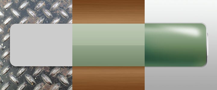
The nuts and bolts: Skeuomorphism is the idea that developers and designers use lifelike elements in their designs. The goal is to make sure people have a similar online experience as they would if it were offline, with everything from colors to textures mimicking those of an actual object or person’s appearance.
Thinking back, it’s hard to remember how much trouble computers once caused people.
People needed help learning to integrate computers into their work, and later at home. Interface designers used visual analogies — icons in particular — to help people relate to abstract computer functions. They took from the physical world and created their counterparts in the digital world.
Skeuomorphs, the embellishments used to make one thing look like another, helped make sterile computer documents more approachable. Friendly. As graphics software matured, high-resolution images — so difficult to create — became a mark of sophistication.
Realism Doesn’t Fit Today’s Challenges
This trend continued into web design, and for a while natural-looking interfaces served their purpose. But many of today’s websites have a new goal: To work well on a variety of devices and screen sizes. We have to wonder, what place do realistic images have in web design today?
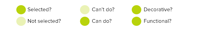
When users get the same thing out of a circle button as a glossy, chrome-edged button, skeuomorphic design may feel like overkill at best, wasted effort at worst.
Then there’s overhead. Detailed imagery takes time to research, generate and in some cases, render. Stock photos aren’t always cheap. And even free texture JPGs have to account for limited bandwidth, a problem we thought was passing with the rise of broadband.
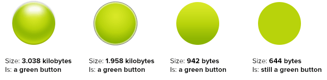
The samples above vary in detail and file size, but not in meaning.
Planning websites to work well on mobile devices means thinking about ways to speed sites up. Photo-realistic works against that — not only do graphic-rich websites take longer to download, but some responsive techniques require several sets of the same graphics for different sizes.
“Flat” style interfaces:
- Load faster because they require fewer graphics
- Let designers focus attention on the overall design rather than the details
- Scale well to differently sized layouts
Today’s browsers can display colors, shapes, good typography, even gradients and shadows. JavaScript enabled browsers to change those on the fly. Designers can rely on the browser to generate much of flat UIs with CSS — “background: #009” takes little effort to transmit.
But most of all, people are acclimated to the web. Users don’t need the analogies they did 20 years ago. They’ve figured out files and folders. They intuitively get hyperlinks. Textures and gloss don’t tell them anything they don’t already know.
Does that mean we can abandon skeuomorphic design altogether? Not quite.
It’s Possible to Go Too Flat
We can say skeuomorphism suffers from excessive detail — but an excessive use of “flat” isn’t much better. Flat colors alone don’t solve design problems.
Discarding unnecessary details and discarding necessary hints is the difference between a flat look and a look that falls flat. What’s tappable and what’s just a panel? Does faded mean disabled or turned off? Every design takes users a moment to learn. But too-flat designs can take longer for people to decipher. There are no set rules, but a few points should raise red flags.
- Relying on color alone. A system of shades and hues can suggest UI, but by themselves aren’t informative.
- Mixing symbols that conflict. The more information expressed, the greater a chance for misunderstanding.
- Looking like everyone else. The more people adopt flat-color, sans-serif looks, how will anyone stand out?
- Requiring a key. User interfaces should guide people through information and functions. If the interface itself needs a guide, something’s amiss.
Use Each When Appropriate
If both removing and keeping detail is bad, what’s best practice? Simple — stop thinking in absolutes. There’s room degrees of detail — when necessary. Smart designers know when to use both. We call it skeuo-minimal.
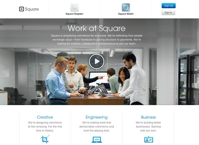
Use one large photo to get attention. Photos make terrific hero elements — the stuff you want to make a first impression. Of all graphics, photos may draw the most attention. Obviously, using photos sparingly saves bandwidth. But even better, the fewer photos you use, the more each will stand out.
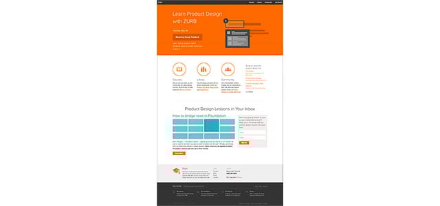
Use background color to organize sections. Noiseless, no-frills, plain colors are ideal backgrounds behind text. At the same time, obvious differences indicate a change without cluttering space with extra text or dividing images. No need to say “you’ve entered a different section” when it’s clearly different. Above, long ZURB pages break into “mini-pages” visible even when reduced.
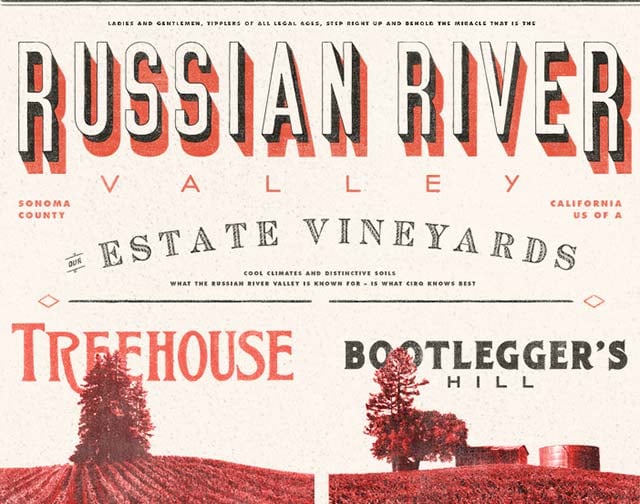
Use textures to set tone. Textures are appropriate if they create a mood, recall a time or are based on tangible experiences. They invite people to a specific time and place, as the landing page of the Cirq website does.
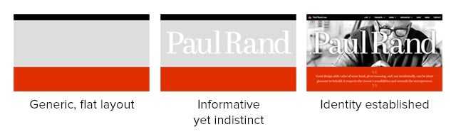
To create a distinct look. Non-flat imagery can make otherwise flat designs stand apart. Flat colors aren’t enough for the unofficial Paul Rand website. Text informs people what the site’s about, but the photo makes the site memorable.
Use Your Best Judgement
Just because many are shifting away from the famous Corinthian leather doesn’t mean we’re done with relating the physical world to abstract information. Back in the day, designers used icons to help people find their way around personal computers. Good user interface design, whether skeuomorphic, flat or something in-between, helps people make sense of information.