Call to Action
Getting users to follow through with primary objectives.
![]() . 5 min read
. 5 min read
The nuts and bots:Any design that prompts an immediate response or encourages an immediate sale is referred to as a call to action in marketing. A call to action (CTA) is a set of words or phrases that can be used in sales scripts, advertising messages, or web pages to compel the audience to take a specific action.
Your site is hemorrhaging active users. You’re trying to corral your users into a specific action. You’ve done everything you think is necessary. You’ve smattered buttons and forms across your site. All in the hopes to lure users into your ultimate goal. Yet there’s no improvement. Things remain flat. And flat ain’t sexy.
Money is wasting away. You’re running out of time. You’ve got to retool before it’s too late.
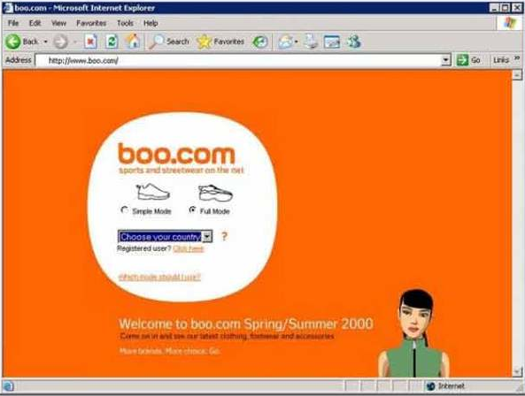
In fact, one site in the late nineties, Boo.com (RIP), found itself in this very dilemma. Their landing page was riddled with superfluous design, unwarranted content, and a poor use of forms. The ultimate goal of this page was simply to enter the site. Because they did not think to retool the page, the business ended up burning through $188 million dollars in eight months. The site died four months later.
If you believe just a few buttons and a few forms are going to help improve site activity — it’s time to rethink your strategy.
Drive Users to Action
You need to drive users to a well-developed and succinct action. In order to accomplish this feat, you have to keep in mind these three concepts: visual design, content, and form elements.
- Visual design is where you build context for your call to action. The user can visualize what needs to be done. This can be achieved through contrast in colors, proximity associations or size variations to beckon the user’s attention. These designs should motivate a user to want to follow through with your actions.
- Content is what guides your user through the action. The words help the user identify what they need to be doing and begin the action. This is achieved through short concise narratives for your user. The shorter and clearer the instructions, the better it is. The content needs to trigger the user to follow through with the action.
- Form Elements are the finishing touch of the process. These elements are the driving force of the desired action, often a button. You want the form elements to promote an action, through no-nonsense means. Make sure the elements are very succinct and clear to their functions. The form element gives your motivated user the ability to trigger the action.
Develop context, guide users’ decisions, and craft elements that finalize your CTA and you’re site will have a competitive advantage. With these advantages and concepts, you harness the tools to drive the most apathetic and casual browser to become a contributing and active user.
Getting desired results requires more than just haphazardly placing buttons about your site.
You have to be aware of the design surrounding your buttons and their placement in the content in order to bring the most effective call to action to life.
Function Follows Form Elements
We usually let the function of a product dictate how things are built. For our form elements — usually buttons — it’s the exact opposite. We have to place buttons based on how the site or page is built.
The layout of a page will dictate how a user looks at the page. An example would be a user viewing a page in a zigzag pattern, a diagonal pattern or straight down. Based on these eye-tracking patterns, we must place a button appropriately to finish the call to action.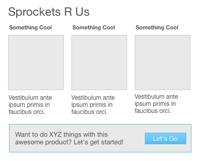
This is an example of a layout in which a user will view the page in a diagonal motion, based on the content and the variations found throughout. Because of this layout, it is imperative that the users’ final focal point is your CTA. By placing the button at the end of your user’s view pattern you make it a point for the user to continue forward with said call to action.
Buttons, You’re Doing it Wrong
Following the same example, as before, there are wrong ways in which to produce buttons, even if they are in line with your call to action.
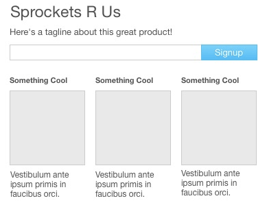
The call to action still wants users to sign up and use the site’s services. The placement follows the user’s eye movement. So why is this button out of sync, compared to the previous?
The client has no context nor reason to follow through with the call to action.
The client needs content and context. They need a reason to follow through with your product. Hierarchy of content lends a helping hand in creating the most effective buttons to aid to the success of your product and your business.
To lend credence to effective hierarchy and buttons, the previous example increased signup activity by 350% over this variation.
Primary Trumps Secondary
With a CTA, there is always a route you want your user to move towards — your primary directive. The other option, usually a cancel or button of similar nature, is the secondary choice in which you’d rather the user not choose to go with.
With these buttons, most — not all — of the time you would want to align the primary on the right and the secondary to the left. You want to leave the user with the best impression last. Reading left-to-right, you will leave the user with the primary choice last and leaving an impression to end with the CTA on the primary choice.
As with hierarchy, the bigger and bolder content garners the most attention and direction. Buttons work the same way. Your primary button gains the same attention with variation. Variation of your button can be achieved through colors and size. We even showcased some super awesome buttons in a blog entry years back, which emphasized some… well… super awesome variations.
Bridge the Gap
Context and buttons are your dynamic duo to create the ultimate call to action. The buttons are your users’ bridge between being a passive user and an active user. To get them over that bridge, the placement and design of your call to action is crucial.
With all the delicate details surrounding the buttons and making them more beneficial to your product and overall goal with the call to action, there is one thing to really remember with your button. Make sure the action is as succinct as possible. Making the action clear and concise for the user is invaluable.
You can give a user all the right context clues, the right guidance towards proper action, and beautiful form elements — should the direct action not be clear and the user is left to their own devices, they may not follow through with your primary CTA.
A Proper Call to Action
Everyone has a CTA. You just need the right information and tools to make yours truly work and speak to your audience in a way that’s advantageous to your business and the users as well.
There are a few tips to keep in mind when it comes to calls to action:
- Leave a CTA on every page. You never know what page users will be entering your site on. The links the user followed to land on your page may not be a path you have thought a user would enter your site. It is in this case that it’s important to have your CTA visible on any page of your site.
- Have a CTA above the fold. The fold is the visible part of a page that is loaded before a user scrolls down. Most of the time, a user scans the information and content of the fold to decide whether they will proceed with the rest of the page. By having a direct CTA placed here, a user can see it right away, rather than scavenging for a reason.
- Know the purpose of your site. By knowing precisely your ultimate business goal, you can cater the call to action accordingly. Giving the users the necessary information and clear distinct action will help benefit their understanding of your site. If the user understands your goals and CTA , you will have accomplished your business’ goals.
Remember actions give pages meaning, purpose. You create the right environment for that through the use of visual design, content, and form elements. A crisp, clear call to action can be the difference between being the next big thing or the next Boo.com.
Does Your CTA Pass Muster
Prevent yourself from following Boo.com’s destiny with Helio. Put your CTA to the test with an actual audience in the wild. Check to see if you’re getting conversions with your current CTA or one you’re thinking of using.