Hierarchy
Build a more meaningful design based on your content.
![]() Morgan McGowan
. 5 min read
Morgan McGowan
. 5 min read
The nuts and bolts: Hierarchy is a visual design theory that designers use to manipulate features to convey their importance on each screen. Things like size allow users to more likely notice larger components, and vibrant colors tend to draw more attention than muted colors.

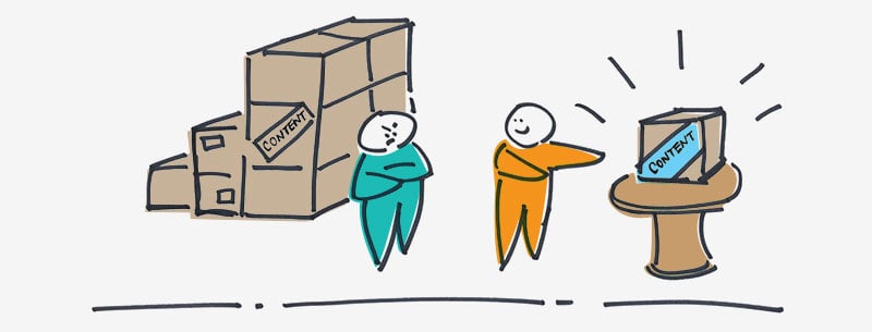
Next time you visit a new site, make it a point to close your eyes before the page loads wait a few seconds then open your eyes and take note of the first thing you see. Spoiler alert: it’s content. The phrase “Content is King,” coined in a ’96 article by Bill Gates, still holds true today.
You need to work with the content you plan on using for your product when designing. Some people often opt to use dummy text when designing. However, dummy text, or lorem ipsum, does not help in giving context nor does it have the message which you, or a possible client, want to convey.
The content you plan to use plays a crucially pertinent role in the design you create.
It’s Not How Much You Have, It’s How You Use It
We agree, content is indeed king. However, just because you add more and more content to your product, doesn’t mean that it’s going to be good. You have to discriminate between what is wanted and what is needed. This helps in formulating a stronger message and better flow for users eyes.
Sometimes, people feel that lots of short keyword-optimized articles make for more page views. Which it does, but the retention of those visitors is non-existent. More page views are wanted, but what is needed is a returning and loyal customer base. If articles are pumped out with little-to-no thought process and just focus on key-terms, there is nothing for the users to grasp or learn from. That’s where the content that is needed comes into play.
Keywords are important to generating more traffic to your site. But these keywords need to be paired with useful and favorable information to help bolster your inbound traffic, as well as returning traffic. The more time you invest in researching what your users are looking for, you can cater your content to satiate those users needs. As long as you keep a foothold on what your users are looking for, you can also provide new and insightful content that they may not even know is out there. With a little elbow-grease you can carve out a devoted and caring collective user base.
It takes much more than just selective content to make for a better, well-manicured page. We need to take into account a ranking system that will help in creating the best presentation for users to easily understand what’s important, even if the users just skim the content — the messages should be easily transferred as long as you execute proper content hierarchy.
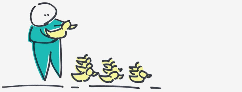
Your Ducks in a Row
When deciding how to approach your designs, you first have to decide what the main message of your product is going to be.
The best way to determine what your main message should reflect, is with a quick glance at the focus of your mission statement. The focus of your content should reflect the message which your business wants their focus to be. For example, at ZURB our goal is to “Help People Design for People,” and we plan on accomplishing this through our mission statement of “ … [teaching] people how to create better products and services … ” Most of the content you will find throughout the ZURB site reflects these ideals of education and helping others learn — just like the ZURBword you’re reading at this very moment!
Once you have the main message, the rest of the content on your page should be in support of your main goal. Everything in your design should have a sense of interconnectedness, if not, the message will be jumbled and lost amongst the users. There needs to be a clear beginning and end.
Sometimes when you work with clients, they may hand you a page of content and then ask you to do design around their ink-ridden page of content. In these situations, you must do as you would with your own content. Find the main messages they want conveyed and find the best supporting statements. Basically breaking down their content heavy sheet of content into digestible, easily understood chunks of the main directive.
Determining how to break up your content is similar to deciding how to approach the main topic of your content. Once again, revisit your mission statement. Scan through the content and see what pieces can be used to help exemplify the main idea of the page, which has been decided upon. Again, make sure these pieces of content are what is needed and not what is wanted.
Once the main message and supporting statements have been decided upon, you need to think about how the messages will be easily deciphered for the users, even those skimming. This is where the designing aspect is vastly imperative.
The Biggest Winner
Weight and size really help in accentuating which messages you want communicate over one another. It almost seems silly to say, but the largest element of your content will draw attention to itself, first and foremost. But sometimes this works negatively against some products, when the largest element isn’t leading into the main concept of the product.
You need to keep in mind that with our hierarchy of content, you want the primary driving force behind your message to be in the largest size possible, without overwhelming the overall design of your product. From this point, you want the rest of the supporting content to downsize in a nesting fashion.
… They Lived Happily Ever After
Every story has an ending. The same goes for your product. You brought to life a message and defined it for your users through your content and the design of your content, however, there has yet to be a conclusion. What do you want the user to do with your product? What is it that you want the user to take with them after they’ve checked out your product?
Your content needs a conclusion. Whether it is a call-to-action from the user, or a way that the user can connect to yours or a client’s business. You need a closing for the users to feel satiated.
How Does Wikipedia do Wikipedia?
A quick look at this capture of a wikipedia page on wikipedia (so meta) you get a sense of what the page is trying to convey to the user, aside from the obvious “the definition”. The importance of content is embedded in how the content itself is presented.
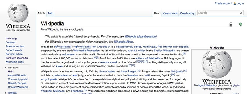
Typography
Just based on the weight and size of the fonts, you can see the title of the page is most important to the user. It explains what the rest of the content going to be covering. After the title, smaller text is nested underneath. The smaller text is supporting the title and giving meaning to the rest of the page.
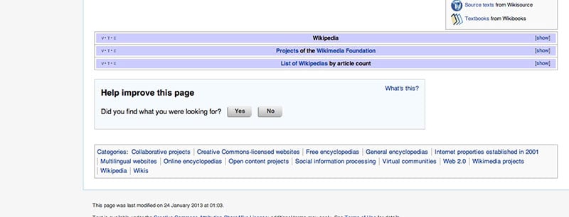
Conclusion
You can see in wikipedia’s footer, that there are a few call-to-actions found. This is created so the user does not have to travel all the way back to the top of the page in order to accomplish tasks that are to be completed after digesting the content of the page. This helps in creating a smooth flow of the page and ease of use to the user.
Stratification That Helps, Not Hinders
The concept of designing a hierarchy of content for your product is equivalent to that of an essay. You have your thesis (main message), your supporting points (the supporting messages) and then you have your conclusion (call-to-action). An essay that is not built with this basic outline fails to have great impact and such is true for your content.
Without proper hierarchy, there is no clear flow or primary message being presented to the user. This type of chaos will inundate the user with unbalanced messages and concepts. Rendering their comprehension of your site null. Proper execution of hierarchy take a little time and a little research, but in the long run, it will pay off. With well presented content, comes greater user interactions and feedback.
The hierarchy standard helps us build meaningful designs and stronger overall messages that will be imparted upon users.
Now put your hierarchy to the test with our Helio test template. You can check to see if your target audience or potential customers comprehends your UI. Check it out: