Interpreting Your Video Test Results
- Helio Data Report Tools
- Filling out your Data Comparison Framework
- Interpreting the DCF data
Helio Data Report Tools
We have easy ways of gathering and comparing your survey results so you can draw conclusions about your video ads.
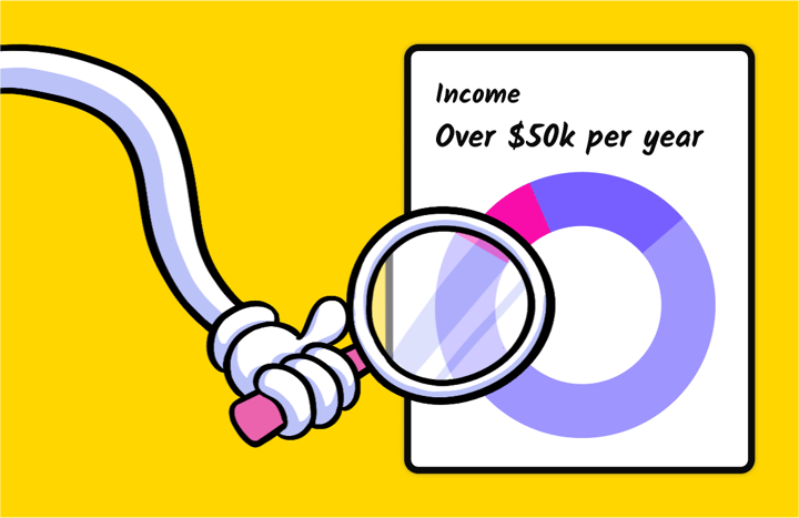
On each test, you can use Helio’s Data Report tools to analyze the results and draw signals from the data. Tap into features such as demographic filters, common word filters, observations, and more.
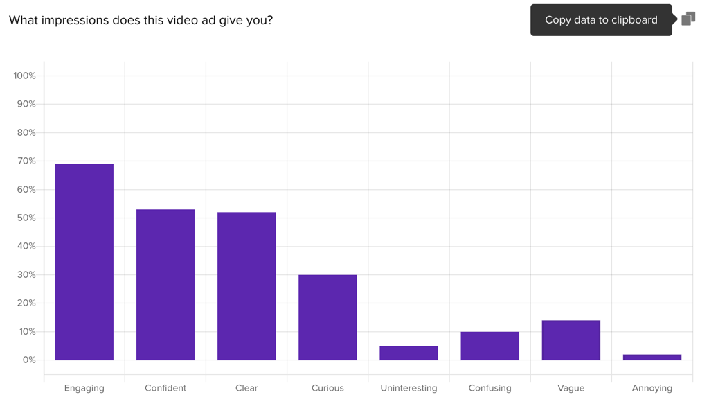
When you have multiple surveys to compare data across, use your Data Comparison Framework to collect the results and find your signals. The copy icon in the top right corner of each data graph allows you to quickly grab the data and enter it into your DCF.
Filling out your Data Comparison Framework
The copy action will grab both the answer options and the data percentages, so that you can paste them into the data comparison framework like so:
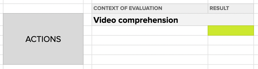
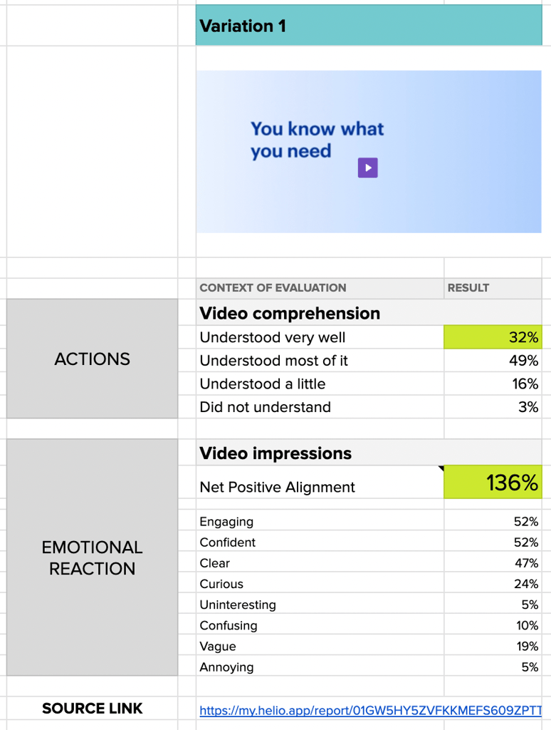
We’ll typically move through each survey one-at-a-time and enter the data, the test link, and any helpful visual context into each column.
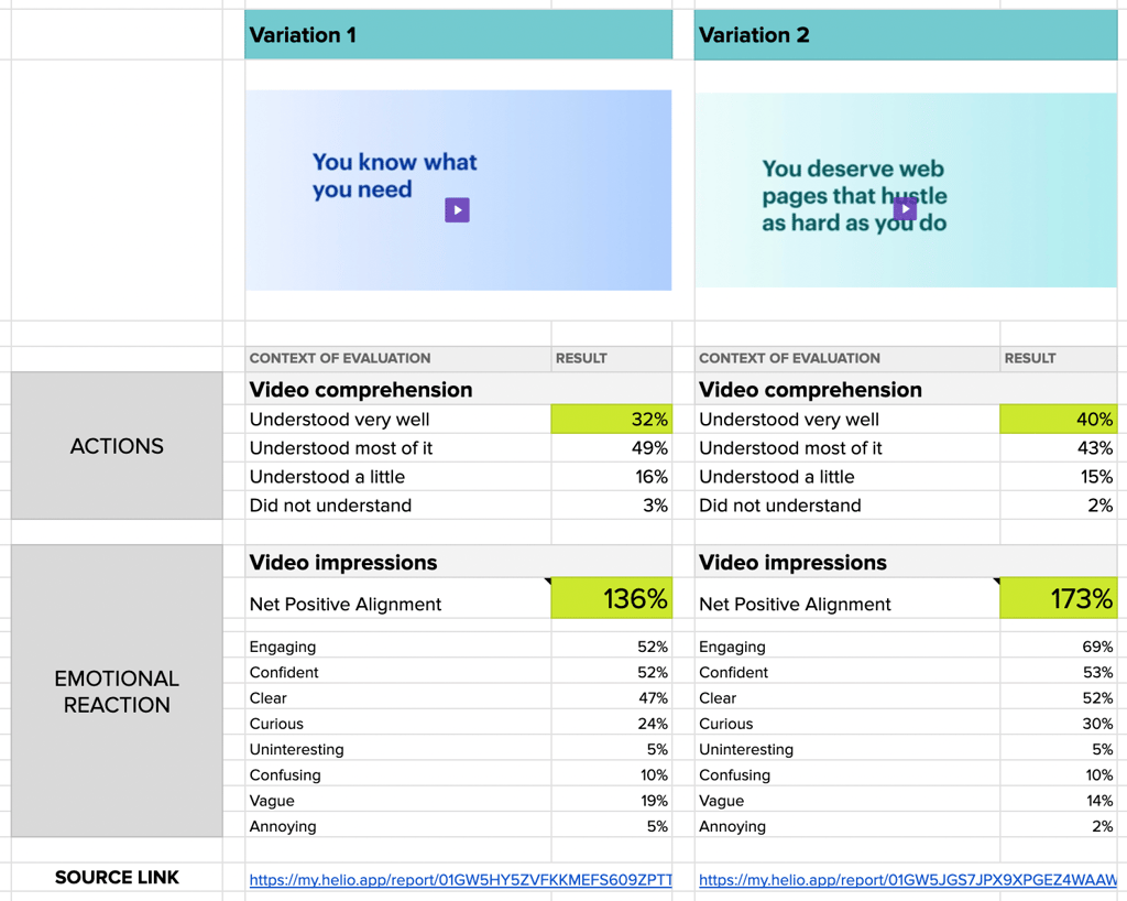
Once each survey has been transferred into the DCF, your filled out framework will look something like this:
Interpreting the DCF Data
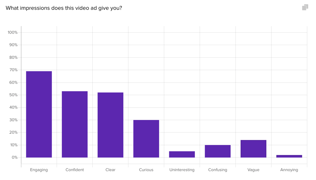
Now, what does this data mean? Firstly, we’re looking for clear signals that one video variation has tested better than the other.
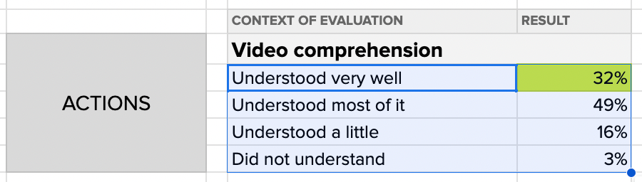
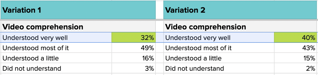
For single-select answers such as multiple choice questions, the Likert Scale question we used for video comprehension, or numerical scales, we’re looking for a difference of 7-8% to signal a strong preference.
For our video variations, we see a comprehension difference of 8% in the top-most answer, signaling that there is a higher level of comprehension for Variation B over Variation A.
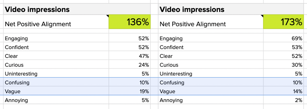
For our brand impression question, we take the sum of the positive answers and subtract the sum of the negative percentages to create a single data point called Net Positive Alignment. Since this is a multi-select question with more answer options, a difference of 10% in Net Positive Alignment, or individual impressions, is significant.
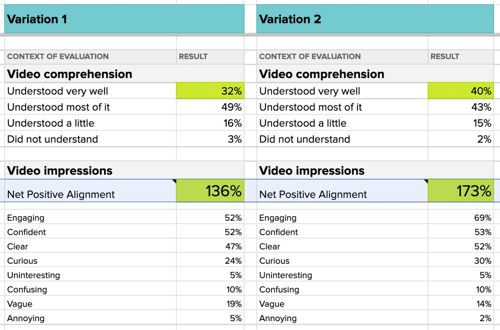
A near 40% increase in positive impressions for Variation B clearly indicates that participants have a more positive emotional reaction to that video.
We also don’t like to see more than 10% in any of the negative responses, so we know impressions of being Vague and Confusing permeate across both videos.
Looking into the qualitative data on each survey can reveal more about why the videos elicited these strong negative impressions. For instance, clicking on the data bar for Vague in the data chart will show all of the written responses from participants who chose that answer:
I thought the video was somewhat vague because it is just stating that they know what the viewer already knows they need and the video implies that the brand drives conversions, but it doesn’t really state clearly what they do or how they provide solutions to the viewer or clients
Small-business Advertiser, Helio Participant
This data not only shows us which video variation we should lean into, but also what tweaks we may want to make for future iterations. These were our 3 main takeaways from the testing:
- Variation 2 produced a significant increase in comprehension and positive impressions over Variation 1
- Variation 2 language felt significantly more engaging than Variation 1
- Both videos produced confusion and can be more clear about how the services help clients.
We typically load these signals into a presentation deck along with the videos to clearly outline the process and findings from our testing. Check out the next section on Selling the Results to Your Team for more information on that process!