Responsive Web Design
Keep your page looking spick-and-span on any and all web-enabled devices.
The nuts and bolts: Responsive web design, also known as responsive design, is an online approach to design that assures usability and user satisfaction by rendering web pages properly, across a number of devices and window or screen sizes ranging from small to large.
You’ve come to the conclusion: you want to re-brand, re-invent and otherwise re-discover a new identity for yourself and your web page. You just finished meticulously crafting a brand new site, getting all the media and text to sit nice and pristine on your great Thunderbolt display. You call your friend to give it a looksy — Uh oh! They viewed it on their Nexus10 tablet (give it a few months and see how dated this page feels for this reference) and boy … it looks vastly different.
Have no fear, my worried and downtrodden friend, all that hard work isn’t all for naught.
Responsive web design, a term coined by Ethan Marcotte, helps get you down the straight and narrow of getting your page and all its associated elements looking fabulous for any and all devices that the whole wide world might use to view your page.
We no longer control what device each person uses to view our pages. To design responsively, we have to learn to relinquish control of our page’s overall look and feel. For the most part, we can decide on the overall feel and look that should be presented by working with the page’s proportions and ratios. However, the evidence is overwhelming on the side of us having to design for a multi-device world.
Mobile users accessing the web outnumber those who use a desktop to surf the web.. It’s happening even as you read this. That makes it even more pertinent to design responsive web pages, taking a mobile-first approach. We will even look at how our own Foundation tool can be used to enhance your foray into responsive design.
Forget Responsive, I’ll Just Create a Native App
Whoa there! Don’t jump to conclusions on your Jump to Conclusions Mat just yet. While there is a definite battle between which is better — native apps or responsive web — we believe the future lies with responsive design. We’re not totally discrediting the use and implementation of apps. There are unquestionably some very great and valuable apps out there. However, the responsive web approach has much more potential and staying power.
Native apps do, however, have one great setback. You have to create wholly different apps to accommodate a variety of operating mobile systems. In other words, apps are not portable in the sense that you cannot develop one app for an android phone and then recompile that same app to work on an iPhone.
In fact, to simply have an app work on an iPhone is completely different than getting the same app to work on an iPad. And that’s just going from one operating system to the same operating system, just on a bigger screen, which requires a lot of work, time and input.
Apps are fine, but they fail to utilize what binds us all — similar to that of Obi-Wan’s definition of The Force (That midi-chlorian theory is just hogwash, as are Episodes I-III). What is the most omnipresent concept in the realm of product? The Web. The web is everywhere and is accessible on any and all devices. By optimizing a page to be utilized on the web by multiple devices in one fell swoop, well, that’s responsive web design.
Cool, Responsive Web Design. So What?
With responsive design, you are developing for multiple devices at once versus developing page optimization one device at a time. If you think you have the aptitude and determination to develop for every device, you’re sorely mistaken (as much as we’d like to believe we could too, it’s just impossible). You may be wondering, “how is it possible to create one page for all these devices?”
It’s all about proportions and ratios! If you want to build a page once and have it appear correctly, that is with minimal amounts of scrolling, minimizing, maximizing, enhancing, de-hancing (that’s a thing right?). To accomplish this, we prefer using our responsive framework, Foundation.
How we specify what fits within these four corners is through the focus of three elements. Which are: a flexible, powerful and fluid grid system, flexible images, and media queries. Let’s begin breaking down what each of these elements mean in the grand scheme of responsive web design, shall we?
Grid
You might be living off-the-grid IRL. However, if you are living off of the Grid (capital “G” as we like to put it) in the web design realm, you are stunting your professional growth immensely.
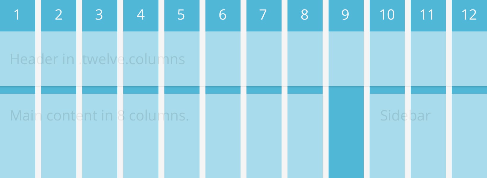
The Grid is the foundation for which your page rests upon. The grid is separated into columns (in Foundation we have it set at 12 columns, all which can be nested and added upon).
What makes the grid so special is that it is fluid, meaning it is based on a percentage, rather than fixed, static pixels. Each column determines the width of where your content will be placed, and inversely the content will determine the height. In order to create ease of flow within the grid and in users’ eyes, between each column and row there are blank spaces, known as gutters, to prevent clustering of content. Your page, once resting upon the grid, will be as flexible as your old Stretch Armstrong toy and fit the screen of just about any device, whether it be your phone, tablet, laptop, monitor, or viewscreen.
Images
Being able to do a handstand scorpion is not only the epitome of flexibility — it’s also quite impressive. You know what else is impressive? Flexible images. The splendor of these images is that they don’t rely on fixed pixel sizes. They throw the notion of static pixels and fixed sizing by the wayside. It works by setting a maximum setting that the image may be seen at (their max-width: 100%).
From there, the image will adjust itself accordingly. By being flexible, the images can rest in the grid and shrink or grow all depending on the user’s preferred method of viewing the page.
Media Queries
It’s approaching New Year’s Eve and you’ve decided to throw a soiree of your very own. You decide you are going to invite all your old college pals over. Sure they are a rowdy bunch, but you don’t mind getting a little crazy yourself. , you let information of your party slip-out around your place of work, and you have invited some fine upstanding gents and ladies over, but you are trying to uphold the clean reputation you’ve built for yourself around the office.
Now what do you do? You have to adapt to your situation. You decide you are going to develop one room in your pad for your raucous college chums and another room refined to the brim with your best stemware, china and Trader Joe’s finest hors d’oeuvres at the ready. You are adapting your home based on your different users (sure, this metaphor sounds a bit like an absurd sitcom plot-line, but it’s helping us get a point across).
That, in a roundabout way, is how media queries work. Media queries are specified attributes that adjust page elements according to your preferred settings. If you don’t want something to appear bigger or smaller than you would like, you can set an attribute to page elements so they can be omitted or added to a page based on your minimum or maximum attribute settings.
To further simplify media queries, there are rules that let you apply specific styles — such as hiding or showing page elements — based on different device device characteristics (i.e. screen size and orientation). This is one of the most important and most often misunderstood pieces in the responsive design process.
Boom! One, two, three. These three, seemingly, simple elements are all we needed to focus on to take a web page from being only optimized for one resolution, to being accessible and beautiful across multiple platforms. One quick concept to touch on before we get any farther — is the concept of mobile-first, the brainchild of our advisor Luke Wroblewski, responsive web development.
Mobile-First
Luke’s main concepts behind the mobile-first are threefold: the mobile market is exploding, the mobile interface causes you to focus and mobile extends your capabilities. Mobile-first concept addresses the interface issue in that some phones or browsers — ahem I.E.7 ahem — may not support media queries, or even some data and actions. So, with the media-first concept we build for these low-tech devices and pair down features.
With limited features, it helps with browsing on these phones or browsers. In turn, this may even help with deciding on keeping some unnecessary page features off the more fully-functional, higher-tech devices. This concept helps in keeping clutter off of final products.
Now, if we have developed with the mobile-first mindset, it will be much easier to progressively enhance pages for larger and larger viewing sources and higher-tech sources, very much a future-friendly progression. It is because of the positive feedback people have given to the mobile-first approach, we plan on implementing mobile-first technology into our next incarnation of Foundation, Foundation 4.
The Perfect Foundation with Foundation
If you have yet to piece this together, we believe that our front-end framework Foundation is the best tool at your disposal to create smooth-operating responsive web design. Though it’s a great responsive prototyping tool, we have built many of our pages straight from our Foundation framework — and it is one savvy tool to have at your disposal.
Because Foundation works well with the prototyping aspect, as well, you can test on all your handheld and desktop devices before publishing.
To summarize what former ZURBianMatt Kelly once said, “Prototyping is like flossing. We know we should do it, but more often than not, we just don’t.” But since we’ve made it so easy for you to do so, why not?
With the foundation laid for understanding these three elements along with the mobile-first approach, what’s the best tool that focuses on them to execute a wonderful and flexible web page?
Battle It Out, If You’re So Inclined
If you don’t believe the hype that we have been putting behind responsive web design, we would like you to go ahead and try — try building a native app. Then develop something for the web. Then let your experiences guide your feelings. We are nearly 110% positive you will begin to realize how amazing responsive design can be for you and your pages.
See if you’re designs are responsive enough with this test template:


