Psychological Noise
Good design can reduce psychological noise by balancing business goals with user needs.
The nuts and bolts: Physiological noise is a distraction that occurs as a result of a physiological process and interferes with communication. Any element that interferes with the interpretation of information from the design to the receiver is referred to as noise.
You know that feeling when you enter a website (let’s say it’s a news source), and you’re suddenly bombarded with way too much content?
First there’s a pop up, and once you click out of that, there’s a distracting animation at the top of the page reinforcing the website’s brand identity. To your right, there’s an advertisement the size of a news story, strategically positioned and designed so that you’ll accidentally click on it. As you scroll down the page, there’s a small text field where you can enter your current city in order to get local weather updates, but it’s not the weather you want — it’s news. After all, that’s why you’re here, right?
There’s a term for this mess. It’s called psychological noise, and in the context of interaction web design, it’s when all the clutter and competing agendas on a single website interfere with a user’s ability to navigate the page.
How Do We Address Psychological Noise?
In the age of e-commerce, it is impossible to completely discount business needs when designing a website. And yet, we believe that a balance can and should be achieved between business needs/goals and user needs. Function drives form, not the other way around, and it is important to question every element on your page to ensure optimal usability and functionality. A single action can be the difference between millions of dollars and unhappy customers.
Delving deeper, we find that the actual source of psychological noise is more philosophical. It’s easy to say business goals should not interfere with user needs, but this is only possible to actually implement when you know what your business goals are. And it is not uncommon for companies to lack this type of clarity in their intent.
It’s not enough to know what service you provide or what your product does. You’ve got to know why you do what you do. Why do you produce this product? Why do you offer this service? Why does your company even exist?
These are lofty questions, certainly, but they are worth asking. Such questions prompt self-reflection, and they are the only real way to directly address psychological noise.
Only once your business intent is clear can you utilize good design to drive action. A strong sense of company identity translates, design-wise, into a website that is free of psychological noise, where every element is deliberate and has a transparent purpose. No nefarious advertising schemes here. Or distracting weather updates, for that matter.
So, these overarching guiding principles are a good place to get you started on re-evaluating your own website and systematically decimating any psychological noise. We also drew from our own experiences to present some easy examples that will get you started on your quest.
Opportunity Sketching
At Helio’s parent company ZURB, we like to frame the opportunity sketch as an illustrated question. These sketches help us view a problem from different angles and, armed with colorful sharpies and awesome sketch sheets, we can conceptualize innovative solutions to user problems. Specifically, opportunity sketching can help us generate alternate ideas for conversion that do not sabotage the user experience with psychological noise.
A while back, we used opportunity sketching in just this way. The folks over at TinyPic, which is a free photo and video uploader, found that their traffic had flattened, and so they came to us looking for more user engagement. It was our job to figure out how to marry business needs with user needs in a way that optimizes both. And we began by sketching out three different scenarios and seeing how they played out.
Optimizing Business Goals Only
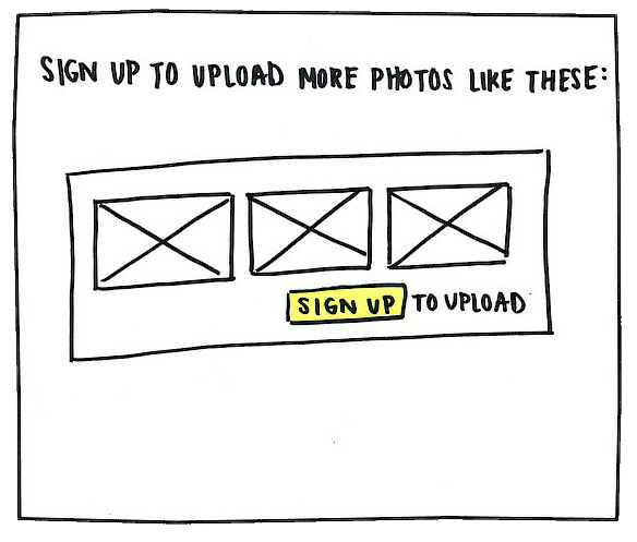
As a business, TinyPic’s goal is to increase ad dollars by getting more user sign ups, and this is easiest done by requiring users to sign up to upload photos. The sketch here includes the three most recent images that the user uploaded (brought up from the browser’s cookies), which serve to remind users of their existing commitment to TinyPic in order to convince them to sign up.
Optimizing User Needs Only
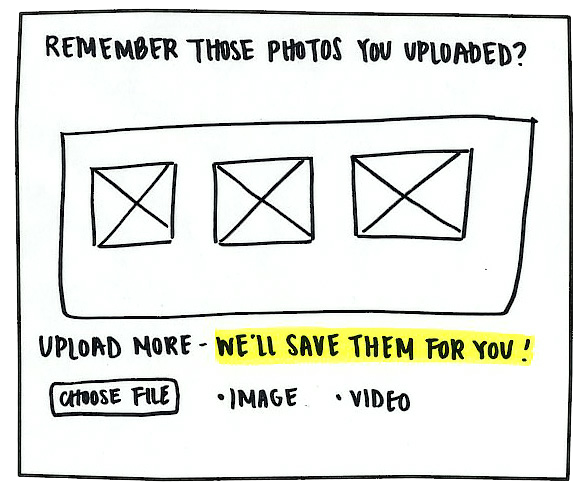
However, in order to provide the best user experience, it’s important for TinyPic to continue to let users upload media without the hassle of creating accounts and logging in. Here in this sketch, the user is presented with the three most recent images they have uploaded in order to encourage them to upload more.
Optimizing Both Business Goals And User Needs
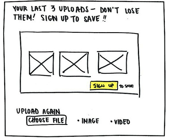
That third sketch was money. The goal was to find an innovative way to merge business goals and user needs without compromising either. In this case, the images were accompanied with a caption that reminded them to sign up and save their uploads, thus disrupting users with their own content. The directive (“Don’t lose them; sign up to save!”) is also a call to action, while still giving the users the opportunity to upload media without an account. And it worked! Sign up registration jumped up 30% in the first month, all while still optimizing the user experience. Bingo.
Customer Service and Feedback
The goal for customer service here is that every customer interaction should blossom into a fruitful conversation. And while that might sound idealistic, customer feedback has sparked and helped shape some of our best ideas. Trends in feedback are especially important to note. Are you receiving the same questions over and over again? Simplify the process. Are certain features consistently unused? Scrap them. By empirically testing what works and what doesn’t, you streamline your product, minimizing psychological noise and ensuring the best possible customer experience. In fact, the importance of customer feedback is what led us to create our product suite, so that others have the tools they need to get through every step of the design process.
User-Centered Design
The goal of user-centered design is not so much to define the user experience, as it is to understand it and help shape it. User-centered design is pretty much the opposite of psychological noise. It’s putting your users first and designing your product or website with their needs in mind (functionality and legibility, packaged in an aesthetically pleasing design). Our mission statement — to help companies design for people — demonstrates our commitment to user-centered design, its something we strive to exemplify in all that we do.
You Can Do It All By Yourself
As consumers, we’ve learned to tune out a lot of the psychological noise we encounter every day. Don’t let your work, be it a product or service or website, fall into that category. Know your company’s goals and have a clear mission statement. And understand what opportunities there are among your customers with this Helio Test Template:
After that, it’s all about designing for your users, prioritizing users’ needs, and listening to what your customers are saying about you. Go get ’em, tiger.
