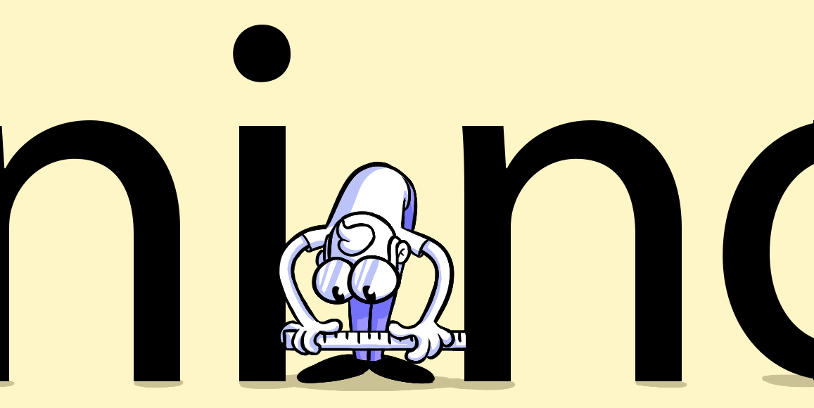
Kerning
Kerning is the space between individual characters in a line of text.
![]() eric
. 5 min read
eric
. 5 min read
The nuts and bolts: Kerning is the practice of changing the spacing between characters in a proportional typeface to produce an aesthetically acceptable outcome in typography. Kerning alters the spacing between individual letterforms, whereas tracking adjusts spacing across a range of characters evenly.
The space between letters is a subtle art that lends itself to professional style.
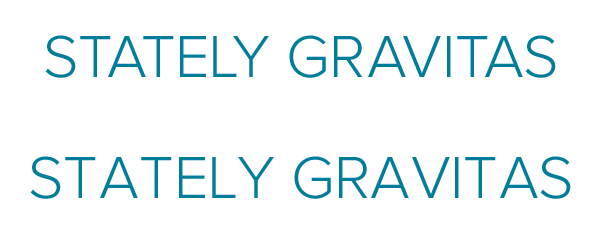
Above: The top example is well-kerned. The bottom, not so much. Kerning compensates for characters with angles — notably A and V in GRAVITAS and TAT in STATELY — as well as those with gaps like those under the bar in T.
Good kerning considers the gaps left by bars and angles. Letters, after all, are not perfect squares with rectilinear sides (except for monospaced families). The trick is to visually average out the space between letters — it’s not always even, so we have to take our best estimate.
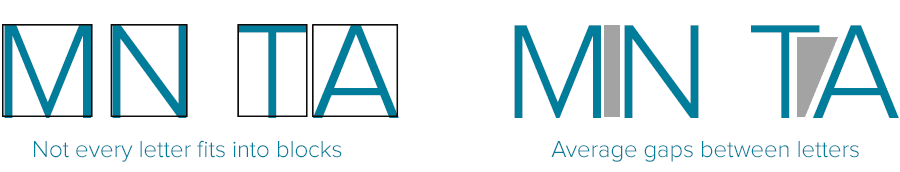
Above: M and N have nice, vertical, defining lines. A and T, however, do not. For even kerning they must be moved closer together. The bottom of the A steps underneath the top of the T.
It goes back to horizontal rhythm. Unsightly gaps between letters give words a staccato beat. Even if readers aren’t consciously aware of it, there’s something off about text that has spaces where there shouldn’t be. Reading needs to flow along effortlessly, without hiccups to subtly distract readers. Want to look like a professional? Then mind your P’s and Q’s — and A’s, T’s, L’s, O’s, V’s, W’s …
Check your kerning in your website designs with Helio. Our easy to use test template allows you to get your design out in front of an audience.