Color
Properties of light are the last step between our products and our users.
![]() . 5 min read
. 5 min read
The nuts and bolts: Colors can attract users and help you communicate your message more effectively. Colors are likely to be mentioned prominently in any UI Design guidelines and establish a brand’s or product’s basic mood, tone, concept, and connotation.

Color is the different properties of light. Each color has different properties that make it unique, while still relating to other colors.
- Hue is the frequency of the spectrum that our eyes perceive as red, green, blue, etc.
- Saturation is the strength of the hue (bright, faded, dull, nearly gray).
- Brightness is the absolute value of the color (black, white or in between).
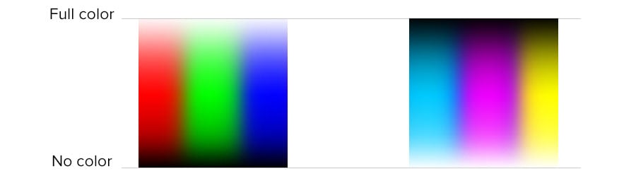
Primary colors — hues, really — provide the base for all other colors. There are different sets of primaries, depending on the medium.
Additive primary colors are red, green and blue. They’re called “additive” because they add brightness to a dark background. Think about computer displays: They go from off (black) and get brighter as we turn up the color. We use additive colors in our design because our work is online.
Subtractive primary colors are cyan, magenta and yellow. These subtract brightness from a relatively light background, such as using a Sharpie on white paper, or mixing oil paints to make colorful marks that are inherently darker than their canvas.
Lots has been written on color theory, and we offer this advice:
- Use fewer hues. You’ll find that colors coordinate better if you use different shades of the same parts of the spectrum.
- Try it in black and white. You’ll discover readability issues if you remove color from a design.
- Use color consistently. If your header is dark blue, don’t suddenly change it to bright orange on arbitrary pages. By the same token, keep your calls to action recognizable as such by using the same color throughout.
Why is this important? Understanding how color works is critical to a successful design. Beyond the code, past the design process and after delivery to a user’s browser, our products appear on a variety of screens. Back-lit screens. Screens that deliver our work to users’ eyes as qualities of light.
Test Your Color or Lack of It
The use of color or the absence of it is critical to a balanced site. You can put this to a test with your actual audience in this plug-and-play template.