Interpreting Test Results
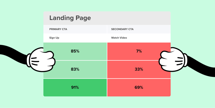
Now that your data points have been loaded into the Interaction Matrix, it’s time to get colorful. Each type of CTA has different success percentages based on whether its a primary, secondary, or tertiary action.
The Success Key will give you the exact percentages that map to different levels of success for each action. Primary actions should be the most noticeable and usable actions on the page, so we expect the percentage of successful participants to be at least above 80%. A percentage in the 90’s means that your action is performing above average, and shouldn’t be tweaked!
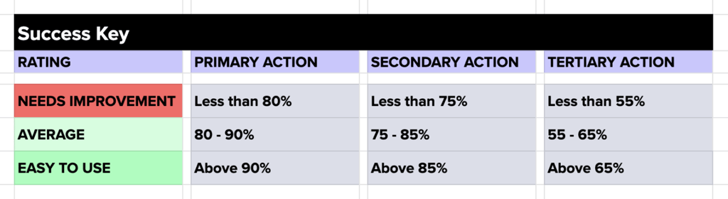
By contrast, tertiary actions are typically more hidden on the page, so we don’t expect more than 55-65% of participants to successfully find those actions on their first click.
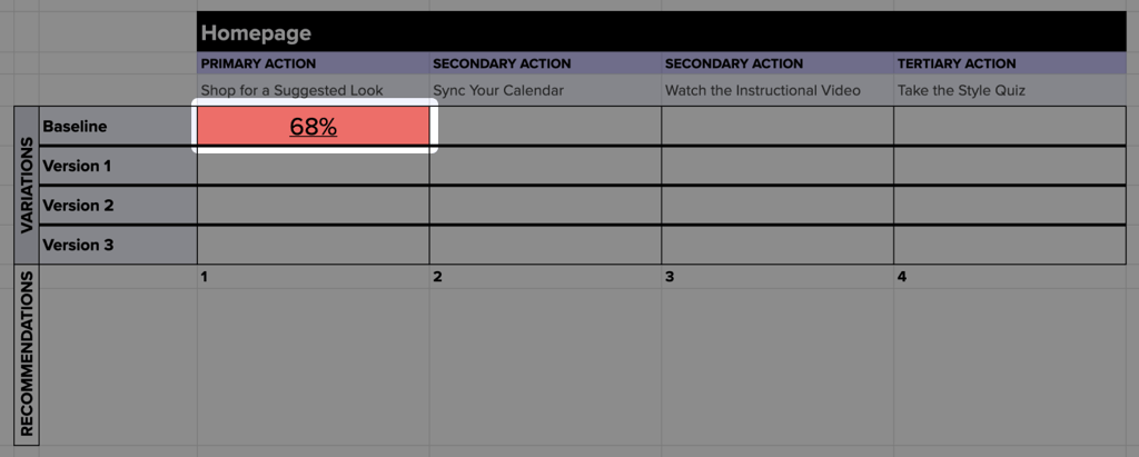
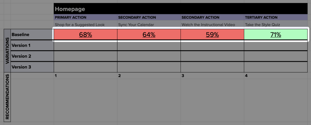
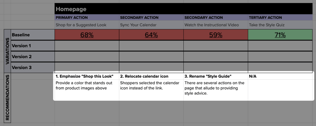
Once all the data points for your first round have been entered, you’ll see a color coded map of exactly where you need to improve in your designs. As you might imagine, red is bad! And in our first round of testing on our eCommerce site Getup, we found that many of our high priority actions on the page were clearly underperforming.
Each round of data points will lead us to a following round of making recommendations for the design. Ideally, we all have designers on standby who can help make suggestions on where the design can improve.
That typically isn’t the case, so one of the most important aspects of the IM process is willingness to try new things. Even if you don’t have much technical expertise, knowledge of your business is enough to drum up ideas of how to improve your users’ experiences.
The goal is to come up with these recommendations quickly, as if they are expendable. This allows you to be in a rapid test & learn mindset where you can quickly turn around design updates and gather more data in a matter of hours. We received 100 responses from our eCommerce audience in just 3 hours! This rapid testing allows us to make decisions driven by data and improve aspects of our site on a near daily basis.
After making revisions based on your first round of data, the testing itself is the easiest part of keeping this process going. Since we’re doing a second round of testing on the same page, and ideally the same actions, setting up the test is easy as copy & paste. Helio’s test copy action allows you to duplicate your first survey, and from there you can simply swap out the images of the designs and your second test is ready to go! Helio’s also gives the option to make a custom template of your test, which will live on the Templates page in your account for future use if you go that route.
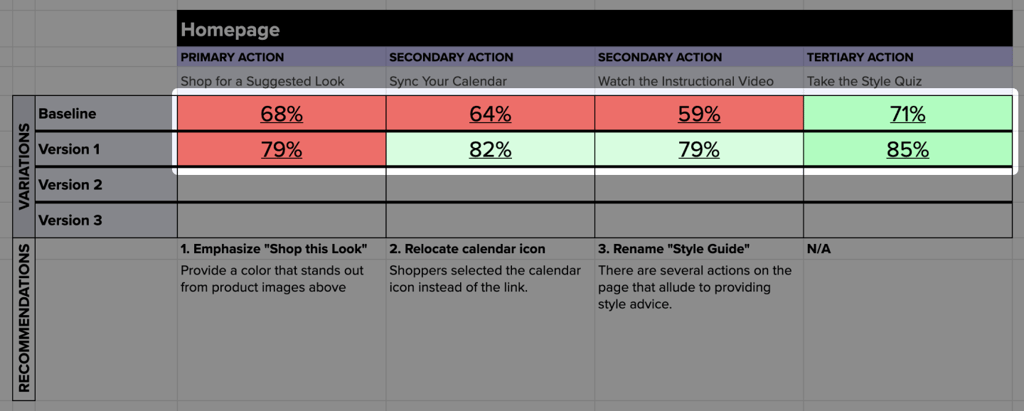
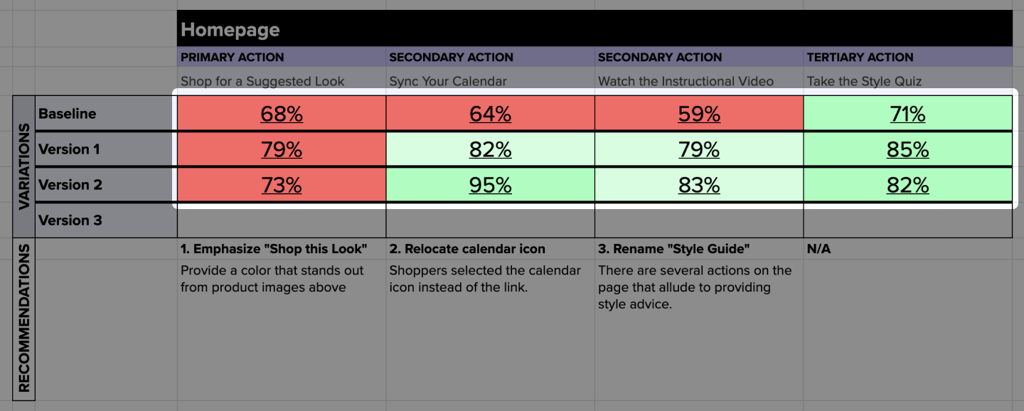
Now that you’re in the habit of rapidly making recommendations and testing your ideas, the rest of your Interaction Matrix should fill out quickly. Once you have several lines loaded with data, you’ll hopefully start to see trends of improvement across your design variations. It’s most common for your IM to start out with more red in the first rounds, and then benefit from your recommendations in subsequent tests.
If you’d like to see more complete examples of the Interaction Matrix besides just our eCommerce company Getup, check out our B2B and B2C examples in the next section!