User Interface
Good interactions guide users through actions.
The nuts and bolts: The user interface (UI) is the point of interaction and communication between humans and computers. Display screens, keyboards, mice, and the appearance of a desktop are all examples of this. It can also refer to the way a user interacts with a program or a website.
The best interactions have less to do with technology and more to do with relationships. It can be said websites and web apps exist to serve users, but those services are more capable than ever, and expectations have risen to match. If increased complexity is the problem, then better design is the solution, especially if we want to prevent users from threading water in a sea of uncertain actions.
Users can defy the most carefully planned designs, tapping buttons in the “wrong” order or finding uses for a system that designers never anticipated. Other times design delivers what users didn’t expect, causing frustration (quickly followed by calls to customer support).
Luckily, we can prevent confusion with good design decisions that removes uncertainty. The best way to foster great relationships between websites/apps and people is to treat user interface as a partnership. Users choose from the options that designers offer.
Like anything, UI has degrees of success or failure. Signs of a bad UI include:
- Doing the unexpected
- Overwhelming or underwhelming users
- Breaking users’ trust
While a good UI:
- Leads users through a process
- Gives users appropriate options
- Explains more than it says
There are many ways to do that. If nothing else, asking other people if your designs meet those six criteria will improve your work. But we’re going to look at three techniques often used to make a good UI: Focus, Layers and Personality.
Focus
The most common symptom of a weak UI is a lack of purpose. Adding purpose isn’t as superficial as spalling an <h1> element on the page, but making everything fit a goal. Strong UIs include only what the user needs to accomplish a task at a certain time, then carefully lead into the next task, but — here’s the clincher — start by letting the user choose the goal. Take this process, for example:
- The user clicks a login link.
- The user enters their name and password.
- The user clicks submit.
- If their credentials are valid, the site lets them in. If not, it gives them a warning.
It’s important to recognize the unspoken “conversation” here. In most UIs, people begin by choosing a goal like “I want to log in.” They don’t say that aloud, of course, but indicate their wish by clicking a login link. In turn, the UI replies by showing username/password fields and a submit button — the process needed to carry out that goal.
It’s unlikely you’ll see a search field in a login screen because search won’t help the user do that. Likewise, a search form shouldn’t interrupt the user’s quest for results with a password field. Good UI anticipates what a user needs to accomplish the task at hand, and does not overwhelm with more than they need.
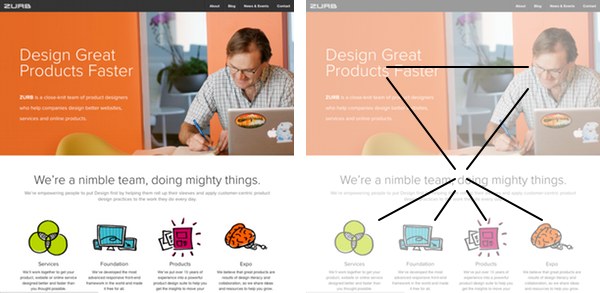
Focused UIs aren’t limited to forms. Any page can benefit from focus. Homepages, for example:
Not only does this design limit what users see, it leads them through information to options.
- To learn about a site, a user goes to its home page.
- The design has a hero image, a prominent tagline and several descriptions of the company’s services.
- User sees the photo, reads the tagline and peruses the three teasers.
- Arriving at the end, the user chooses one of the teasers.
Boom. Done. A focused UI presents only what people need in such a way that they follow a path.
Layers
Users react differently to a website depending on how developed their relationship is with an app or site. That’s why good UIs have more than surface veneer — although aesthetics are important, especially in the beginning.
1. Heroes
Interfaces can fail right out of the gate by not providing what the user thought it would. The solution? Use decisive hero elements to set expectations from the start.
Large headlines. Wizards. Single-word subheads. All the large, high-contrast, spotlight-stealing attention grabbers we call hero elements serve new users. Hero elements are champions of purpose.
Any element — photo, a piece of text, an icon — can be a hero element. Making it so is a matter of presentation.
- Contrast: Hero elements stand out from their neighbors. Complimentary colors, stark white and black, and extra padding all help a hero look heroic.
- Size: Heroes live large. A good rule of thumb: Make one thing twice as large as the next-largest.
- Placement: Hero elements are best placed at the top center of a screen because that’s the area users see first.
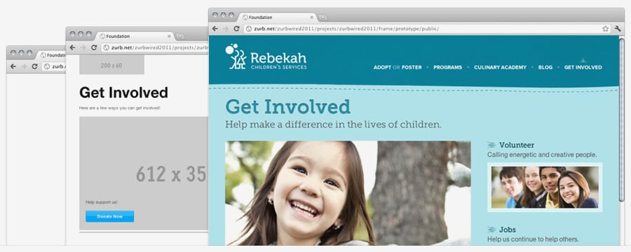
Above: Hero elements stand out even in wireframes and sketches.
But hero elements don’t dominate for the heck of it.
In spite of being obvious, heroes declare a purpose. When users first start to use an app, they explore. They push buttons to see what happens. They visit pages to find out what’s where. In short, they ask “will this help me do what I want?”
Heroes must give an accurate impression of each view’s purpose at a glance. That’s why if ever there was a time to avoid confusion, it’s in the beginning. Designers use heroes to help users decide if a given screen is worth their while. The example above is pretty clear. If users don’t want to donate, volunteer or otherwise act — “get involved” — they know at once this isn’t the page for them. Heroes are not sales pitches. They’re sign posts. Heroes declare a purpose and let users move along.
2. Delight
After users get used to the big picture, they start to see past the obvious. They reach the second layer when they start to notice details — the little shortcuts, low-contrast icons standing to the side, the extra features that help them find what they want.
A good interface will give users useful things to discover beyond the obvious application. A great interface will continue to provide little “aha!” moments long after users become accustomed to the app’s workflow. Deliberately playing down details is a great way to avoid both underwhelming and overwhelming users. They need clues, just not all the time.
But there are details, and there’s clutter. To keep extra details from becoming frivolous, most details should be more refined versions of the broad strokes. For example:
- Action: Delete a record.
Delight: Delete more than one record at a time. - Action: Import a file.
Delight: Drag one or more JPGs from your desktop into the field. - Action: Learn about our products.
Delight: Swipe thumbnails for additional views. - Action: Navigate to different parts of the site.
Delight: Faded links show where you’ve already been.
See the pattern? Moments of delight occur when users discover better ways to accomplish what the actions promise.
3. Subtext
The final layer explains what elements are, what they mean, and what they can do — without spelling anything out. In fact, subtext stumbles when users notice it at all, and it dies when it breaks their trust.
This is where the traditional graphic design tools, like color, typography and layout, come into play. Systems of color do more than pick pleasing palettes. They use color to distinguish meaning or brands.
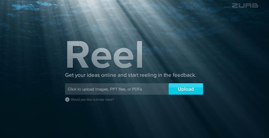
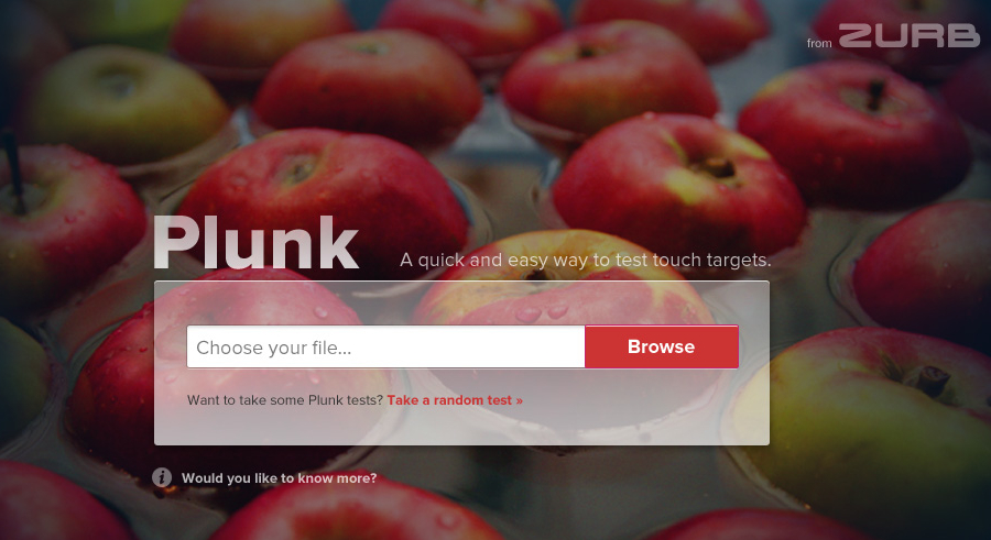
Above: Plunk and Reel are part of the same family, and so use similar fonts and layouts. But color marks them as siblings, not clones.
Designers and users today have many understood conventions: A plus for “create” and a magnifying glass for “search,” for example. Users recognize these subtle suggestions whether they’re newcomers or old hands so using them to represent anything else will cause confusion.
Still, we’re not limited to the usual icons. We’re free to create symbols as we see fit. Beyond common conventions, a successful UI should be learnable. Subtext are the visual cues users pick up without realizing it.
Personality
An interface’s visual style and working process comprise its “voice.” There’s no shortage of variety here. We often think of clean, stark lines as being professional, but “black tie” can also be more ludicrous than serious.
Feedback and engagement with the user becomes a back-and-forth conversation. Important that the UI reflects the company’s “voice.” After all, the app or site becomes the company’s representative.
Does the UI ask for feedback? How much feedback does it give? Are there Easter eggs, or does it get right to business? Most of all, how much freedom does it grant?
Luckily, people are involved.
No, really. Think of it this way: Users aren’t dumb, they’re curious. Without a clear path, they’ll invent their own. That doesn’t mean the design failed, but a successful UI will minimize uncertainty. Like any relationship, the user interface is not a one-sided conversation. It’s the means by which users choose from options that designers offer. Make yours good.
