Source Order
How pages are written doesn't have to reflect the way they're displayed.
 The Helio Team
. 5 min read
The Helio Team
. 5 min read
The nuts and bolts: The underlying mark-up that users rely on to navigate and access content is the source order of a web page.
Grids are restrictive. That’s a complaint we’ve heard from people used to writing code from scratch. The order HTML is written determines how it “flows” on a page.
To keep content higher in mobile layouts, that means putting important content on the left. That limits designers’ options, and it’s not always best for search engines.
Changing source code to benefit visuals also contradicts the best practice concept of separating content from presentation — that information must be formatted to serve appearance rather than meaning.
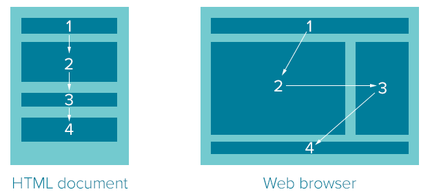
Above: Without source ordering, content that’s arranged in the correct order in HTML must flow top to bottom, left to right, in desktop layouts.
In a perfect world, designers could arrange the elements of any HTML document; however they want without changing what it means. We’re not in that perfect world yet. It’s 2013, and we haven’t seen so much as one rocket pack, much less lunar cities, robot butlers, world peace and meals in pill form.
But we can control, to an extent, the order in which elements appear in a Foundation row. Our responsive framework lets you rearrange elements visually without editing HTML.
Especially with mobile-first design, we’re finding out how important source order is. Simply put, smartphones require more vertical layout. That means what’s most important needs to come first — regardless of whether it appears on the left or right of a widescreen layout. In Foundation, for example:
<div class=”row”>
<div class=”large-9 push-3 columns”>
[Main Content]
</div>
<div class=”large-3 pull-9 columns”>
[Sidebar]
</div>
</div>
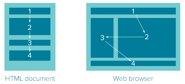
Above: Columns 2 and 3 change places in the browser, but not HTML.
We use this technique in the official Foundation documentation to keep navigation to the left, which we found visually friendly in desktop browsers. But because the navigation comes after the content in HTML — here’s the kicker — the navigation also comes after content in smartphones. There’s no need for users on the go to scroll through many links every time they visit another page.
A word of caution: It’s possible to overlap elements by accident. Like any grid structure, you need to make sure push/pull adds up properly. Luckily it’s easy to spot and correct.
Web Layout is Evolving
Source order isn’t a cheap trick. Designers have been looking for ways to separate layout from document structure since we stopped using tables. The end goal is to create more flexible documents for a variety of devices.
Flexbox: Short for Flexible Box Layout, flexbox lets designers arrange block elements along two axes. They can be reversed; shuffled left, right, up, down or center; and nested. The technique is fairly well defined, but has not been adopted by every major browser.
Adobe Regions: Ever a stalwart of publishing and design, Adobe has proposed InDesign-style blocks through which content can flow. Think of regions as a block element with more than one part, like columns in a magazine. Change the size of one block, and text automatically reflows into the next.
Columns: Another approach divides one block into equal parts. The advantage? Graceful degradation. Columns keep content in one block, which older browsers understand. That’s good news because at the time of this writing, support for columns is limited.
Grid: Aiming to make layout with float and clear as obsolete as tables, CSS Grids promise an almost spreadsheet-like approach to web layout. But, as with other techniques, CSS Grids are not well supported yet. But it has potential.
We can talk about grids, responsiveness, content and presentation, but it’s really about longevity. Content that doesn’t bend to a particular appearance can be presented in ways we can’t imagine. And if we’ve learned anything from the rise of smartphones, it’s that the ways we view web-based information will continue to evolve. Source order is a step towards helping people view in different situations. Or, someday, how their robot butlers read to them.