Shader
Shaders Add Depth and Volume to Your Sketches
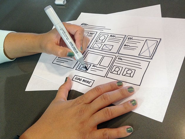
The nuts and bolts: Shaders are professional-quality markers that are highly regarded for their smooth application. Shaders can be layered and blended, they’re streak-free, and they’re permanent, which makes them a wonderful tool for designing.
Shaders are special markers that write medium gray, not solid black, for a surprisingly professional look.
We sketch almost every day here at Helio to express ideas both to each other and to clients. Sometimes these sketches need a little more than black ink on white paper. That’s when we turn to gray — our favorite way to convey a sense of depth.
Before that, however, we create almost all of our sketches with Sharpies to keep us from worrying about details. Quick sketches are like brainstorms on paper, and many don’t last long enough to deserve fine points.
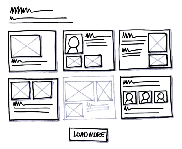
We take sketches that do survive a first pass more seriously. Shading techniques communicate secondary information while adding some depth and volume to select elements — usually forms, images and calls to action.
Copic Shaders are Our Tool of Choice
Our shaders of choice are Copic Sketch C4 Cool Gray No.4, Chiseled. They’re refillable, come with a variety of nib shapes, dry quickly, and look great on paper. They are super versatile, durable and reliable.
The Copic Sketch shader has dual-tips — one on either side — that allows you to create different line weights and also different types of shade. The tips are replaceable, so when they get old you can just get new ones. Also, when you run out of ink you can order a various ink refill that is good for at least 7 refills (specifically with the Copic Sketch).
A Hint of Depth Goes a Long Way
Not everything on a sketch deserves shading, and we use this technique sparingly. We choose to add volume and depth to different types of elements:
- Input forms — Add shade on the inside of the element to add depth and indented
- Buttons — Shade the outside of the right and bottom lines of a button to make it pop out on the page and add volume
- Modals and pop-up windows — Shade the background of a sketch to demonstrate this is secondary content or to make a modal stand out from other elements
- Boxes / images — Shade boxes or images to make them stand out from other elements on the page
- Text — You may want to use the shader to write text for elements that are not active or are secondary
People new to sketching are often surprised how professional their hand-drawn sketches look with straight lines and a dab of gray. Sketches take on a more serious air, as if an elusive quality makes “mere doodles” professional art. Sometimes the simplest solution isn’t black and white.
