Rule Of Odds
People are more attracted to uneven numbers in a composition and we can use that to make our interfaces subtly more interesting.
![]() Morgan McGowan
. 5 min read
Morgan McGowan
. 5 min read
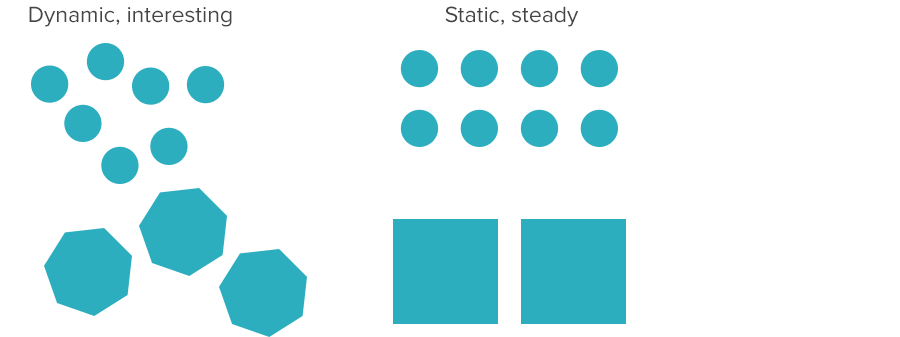
The nuts and bolts: When incorporating a collection of subjects in your design, the law of odds asserts that an odd number, rather than an even number, will make a more intriguing and visually beautiful composition.
People are naturally drawn to unusual or uneven composition. To that end, we use an odd number of elements — hence “rule of odds” — to create visual interest on a website page or app view. That’s not to say that we always use odd numbers. Even numbers imply stability, which can be useful if the design calls for confidence or reassurance.
But that’s academic. Here’s a real example:

Above: A three-wide grid of teasers, one main hero image, three cutout people — even the navigation has seven links. All help draw interest to this page’s composition.
To be fair, the rule of odds doesn’t guarantee interest by itself. It’s just one tool in the arsenal. The rule can work with spacing to emphasize disorder — the more random, the more energetic the composition will feel.
People’s eyes gravitate towards many things in a design: Areas of high contrast, bright colors (instead of dark), and large elements over small. But their eyes also gravitate to the center of a composition. An even number of items in a static layout has nothing in the center, which is another reason to think odd.
See where you can vary your design with the Rule of Odds with this Helio Test Template: