Pixel
When it comes to designing responsively, the pixel is dead.
 Morgan McGowan
. 5 min read
Morgan McGowan
. 5 min read
The nuts and bolts: A pixel is the smallest addressable element in a raster image or the smallest addressable element in an all points addressable display device. It’s the tiniest, most controllable part of a picture on the screen.
Pixels are the smallest addressable elements in a digital image. They’re generally rendered as teeny tiny squares, and thousands of pixels come together to create the images that we see on our laptops, tablets and smartphones.
Hmm, that sounds pretty nifty, right? Well, not exactly. Truth is, the pixel’s dead.
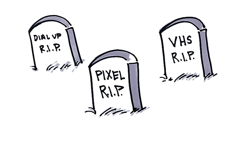
A Eulogy for the Pixel
Back when dinosaurs roamed the lands and Pluto was still a planet, web designers developed sites that were best viewed with a screen resolution of 1024×768 pixels. At the time, this was a fairly sensible thing to do, since 1024×768 was about the standard size of any monitor, and pixels were a useful measurement tool for designers. Though the size of the pixel was never standardized, text was generally 12px or 13px and a typical thumbnail was about 200px, and so on. For a while, this system worked, as long as everyone was working on the same size monitors.
But times change. And with the times, monitor sizes change as well.
First they got bigger and then aspect ratios were modified (hello, widescreen!). Later, smartphones and tablets emerged to radically transform the way people connect with one another and view content. In terms of pixels, this became very confusing, very quickly. As the diversity of devices increased and technological innovation made it difficult to standardize pixel size, these pesky little squares soon became more of a hassle than a help.
The Death of the Pixel
Turns out, pixels aren’t very useful at all. Take an image that’s 300px for instance. It’ll look very different to two users who are using two different devices to view that very image. The display size of a pixel is not consistent, and display resolutions vary wildly across the board.
As the market became saturated with a vast array of devices with different screen sizes, resolutions and densities, it quickly became evident that the pixel could not keep up with the times.
The 1024×768 template for design became obsolete, and the 960 grid was unable to evolve to address the aesthetic needs of designers who were creating websites that needed to be as mobile-friendly as they were desktop-friendly.
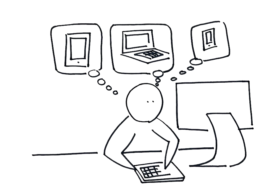
So, rather than catering to all these variations and building multiple websites for each device, we decided to simply kill off the pixel altogether and instead design responsively. The goal was to design in such a way that the content looks optimized on every device. As a result, it’s not devices that we’re designing for — it’s for four corners, no matter the size.
Responsive Design
And, in a nutshell, that’s what Foundation does. A powerful design framework that helps you design for any device, Foundation uses percentages instead of pixels and employs a versatile grid that empowers designers to create websites that work well across all devices
This is where we believe the future of design is. Developers don’t know what sort of device their users are accessing content from, and in an increasingly competitive world, it’s important to optimize across all devices to ensure you’re firing on all cylinders.
But how? How do you actually implement responsive design, and how do you overcome the almost instinctual need for total pixel control? Here are six easy pointers to get you started:
- Use images sparingly. Images will need to be large enough in dimensions to fill the allotted space on a desktop browser, but small enough in file size to load quickly on a smartphone. Use CSS3 to your advantage here with generated gradients, CSS box and text shadows and font-face for typography.
- Structure your page in the order someone will use it. Where possible, ensure that if the layout of your page changes, the flow of someone using it isn’t harmed. For example, if your sidebar were to be placed after the rest of the page content, are you moving a critical action to the bottom of the screen?
- Plan to turn things off. Smaller devices require a more focused experience, so don’t be afraid to turn things off for small screens, or to selectively show/hide elements that make sense in certain situations. This can also serve as an opportunity for self-critiquing: if you’re turning something off for mobile, do you really even need it on a larger screen?
- Know your audience. Certain conventions make sense on the desktop, and on mobile, but they aren’t always the same. Make sure you understand user expectations for common elements like modals or toolbars — and how that applies to various devices.
- Think about your interactions. Are you putting something critical in a hover state? You don’t know if your user will be on a device that can hover. Planning to have a fixed login element? Be careful, since not everything supports fixed positioning. Carefully consider what you want users to do, and think about how they’ll do it on different devices.
- Review with builders. If you’re going to build out the design, review it with other front-end designers or engineers. If you’re not going to build it, do design reviews with the people who are. They’ll help you find the holes in your design and then help find solutions.
The Truth Shall Set You Free
Those handy tips should be more than enough to empower you to design freely and for the future. The times are a-changin. Pluto’s not a planet anymore, the dinosaurs are extinct and pixels are about just as relevant. In fact, they’ve been dead for a while now, and frankly, you can do better.
Get started today with testing your designs by validating your audience in Helio: