Font, Type Family, Typeface
Three terms that describe typography.
Like hue, saturation and lightness, these terms are closely related, but have their own meanings. Fonts are containers, typefaces are designs, and type families are variations.
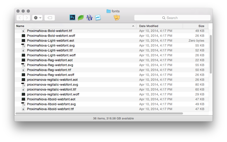
A font is a container of type. On computers it’s a file, such as fontname.ttf, fontname.wof or fontname.eot.

A library of font files, specifically, the Proxima Nova family.
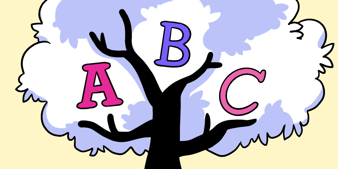
A typeface is the design of a set of characters — letters, numbers and punctuation. Yes, type is designed (to varying degrees of success, but that’s a matter of taste). Designs give type a certain voice. Readers will interpret the same words in different typefaces differently.

Three different typefaces.
A type family is a set of typefaces that relate to each other. Bold, light and italic versions of a typeface, for example, are part of the same family. When we choose a typeface, we also consider its family — and how those variations fit (or don’t fit) into our design.

Samples from the Proxima Nova family.
There are many ways to classify type families, but most fall into five broad groups:
- Geometric: Emphasizing perfect circles, horizontal and vertical lines
- Humanist: Less-strict geometrics with more detail and character
- Modern: Crisp, vertical and formal with a sense of style
- Slab-serif: Wide, sturdy faces with even stroke thicknesses
- Old Style: Centuries-old, traditional looking serifs
Typefaces in the ZURB Process
Choosing typefaces and families comes relatively late in our product design process. We start with by getting the general tone — humanist vs. modern, for example — in our mood boards. When we solicit advice and ideas from our fellow designers, we try at least three different families to figure out which best expresses the message we want end users to get. The idea is to find the right family for the job, the best faces for each element, all contained in as few fonts as necessary.
Test out your typefaces with these easy to use template:

