Critiquing
A design method for evaluating a set of existing ideas to identify changes or improvements.
The nuts and bolts: A design critique is a process of examining a design and providing feedback on whether or not it achieves its goals. A design critique usually takes the form of a group discussion aimed at improving a design. It isn’t just a matter of evaluating a design.
You and your team have brainstormed over and over again, refining and shaping your raw ideas. You’ve gone back and slaved to create sketches or maybe even a prototype. Now you need feedback before you can move forward. That’s where design critiquing comes in.
Grab a small group of people — say no more than 5 people — to discuss your sketches or prototype. You can even make it as few as 2 people if you just want some quick and dirty feedback. You’ll also want a facilitator who can steer the critique to a predefined goal. When you get together and start digging deep into a design, you’ll find that the feedback will center upon:
- Branding elements
- Concept development
- Visual layout
- Engineering feasibility
But you can’t just hop right into a design critique. To make it solid, you want someone who can lead the discussion, keeping things on track. That person should define the goals and questions to be asked, and be able to move the ideas forward once the critique is finished.
Running a solid design critique is tough. You’ve got to have an overall knowledge of design and a soft touch to lead clients and customers through the process. At ZURB, our Design Leads take the conn during the critique. Their goal is to craft a quality critique that will produce solid results that kick the creative process into warp on a project.
We’ve used critiques to help evolve our ideas for various landing pages. At one point, four of us went over one iteration of a page, which was super close to the final design. But the white background didn’t feel quite right so Bryan suggested changing the background color to gray. So our designers opened up the inspector element of the page and hacked away, making an instantaneous change. In a matter of seconds, a decision was made — yes, we preferred the gray background. That quick, impromptu critique took the design to the next level.
See, critiques can be painless.
Critique Ain’t Nothing But Feedback Misspelled
Yeah, we know it’s tough to have your work critiqued. After all, you’ve poured your blood, sweat, and tears into transforming your ideas and those of your team (or clients) into a tangible sketch or prototype. It’s become your baby. And, like a proud mama, it’s easy to have a knee-jerk reaction to criticism.
However, critiquing isn’t an excuse for others to heap on insult after insult. Critiquing should help the designer, the critic, and everyone else on the team learn something that makes them better designers. Critiques provide an opportunity to step back and take a long hard look at the design process, so you can see the gaps and figure out ways of filing them. By doing so, everyone on the team can understand the steps it takes to create great designs.
Critiques should strive to achieve a goal that moves a project forward, not stall it with individual egos. Some typical goals of a critique might include:
- Get valuable feedback from other designers that might have other approaches to a design concept.
- Get buy-in from your stakeholders, clients, and design leads so that the overall design process can run smoothly.
- Figure out the intent of a design decision and potentially compare these ideas against competitors.
- Improve the lines of communication and shape the ongoing dialogue with teammates.
Once you’ve established your goals, you’ll want to pick your design review team. Cue “Mission: Impossible” theme.
I Have No Mouth, and I Must Critique
You can’t have every Tom, Dick, and Harry be part of your design review. Again, critique sessions should have no more than 5 people. Keep it small. Keep it intimate. Also, consider the dynamics each person on the review will bring to the table:
- A fellow designer can lend an eye towards the visual feel of a design.
- Other support disciplines — engineering, marketing, sales, etc. — can ensure that the overall objectives of a design are meeting the goals of the project.
- A stakeholder, client, or design lead might have a vested interest in the financial result of a particular product or concept.
After you’ve assembled your design review team and they’ve accepted their mission, you’ve got to find a place to meet. No, not the ladies room. Although, we’ve heard there’s a meeting there, real soon.
Location, Location, Location
It’s all about real estate, baby! You’ve got to meet in a comfortable place where you can stand around a huge whiteboard and hash out your ideas. Some places you can go for your next critique:
- Large meeting room. — A super-duper room with plenty of space for up to 8 people (or slightly more) to stand comfortably around one of the three massive whiteboards.
- Breakout rooms. These are great for keeping things very focused and on topic. That’s because they allow for a smaller, intimate group of about 3 people to talk around a couple of whiteboards.
- Open floor space next to whiteboards. These allow for quick, impromptu critiques on a whiteboard, which can happen a lot on a project. The best part is that this keeps things flexible and loose. We used something like this a lot during our ZURBwired 24-hour design marathon.
Another way we make space for quick critiques is by having large monitors next to our laptops. We can just easily look over someone’s shoulder and give them speedy feedback on a design or concept. However, it’s easy to grab a few people for this type of critique, but you’ll find that it’s very limiting when it comes to providing specific feedback.
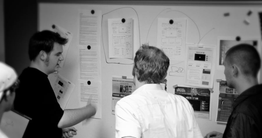
Physical space changes the dynamics of feedback. That’s why, if you hadn’t noticed already, we love standing around whiteboards. They’re fantastic for being able to jot down a note or post printouts. We prefer whiteboards with magnets so we don’t litter the board with pieces of tape.
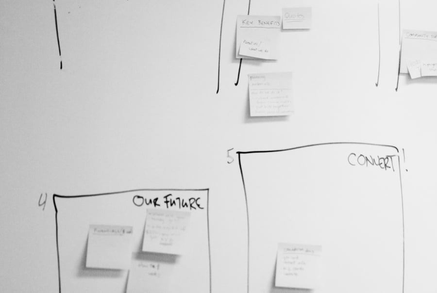
Besides scribbling down notes with a marker, whiteboards are good for sticking Post-it notes with lots of comments from people. Post-it notes make it easy for people to place their ideas on the board without causing a ruckus.
Demon With A Digital Hand
Don’t have the space, don’t panic. Grab a computer. We can accomplish similar results and then some by going digital. Around the ZURB offices, we’re big fans of Helio for collecting reactions from end-users, but to put our feedback in digital order we use a combination of our internal annotation feedback tool called Notable, Slack for short exchanges, and Notion for long-form referencable feedback. You can also digitally alter a design to get down to the nitty-gritty of a design. Here are some techniques in your next critique:
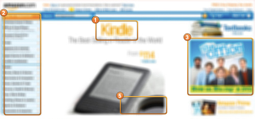
Grayscale — Here we bleed the color out of the design, looking at what’s left. Do the areas of focus still hold up, or does the contrast between elements? We also have to make sure your original hierarchical decisions still hold up when we take out the color.
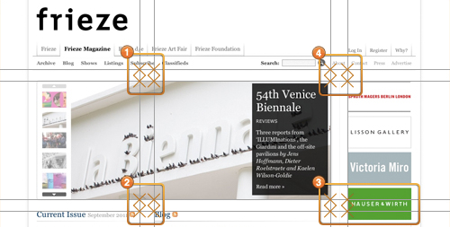
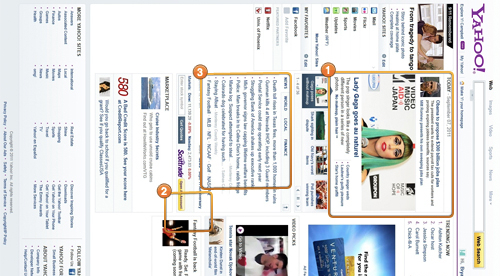
Intersections— Here we look at where the major lines of the page force the eye to focus. We draw the grid lines to show these focal points. A good design will ensure people can read the maximum amount of information in the minimum amount of time, typically seconds.
Contrast — Every design has intentional areas of focus, but are these areas too overpowering? Bumping up the contrast of a design can help show what areas are really jumping off the page when someone initially views the page.
Blur — What does a design look like at a glance, without details? We have to make sure there’s a solid hierarchy and weight, and that if someone glances for a few seconds they get something valuable.
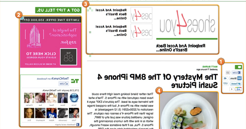
Mirror — Here, we get a sense of how a page feels without readable copy. Areas you might not expect can jump out at you, and misalignments become more obvious.
Rotate— In an age of different devices and screens, it’s valuable to see how a page holds up on its side, or upside down. Could someone get a sense of a site if they saw it on an iPad?
50% Zoom — Here we take a look at a site as a smaller thumbnail; does the layout hold up? The best websites still get the story across at a small size. Elements should look balanced and people should still be able to get the gist of what they’re seeing. After all, we want them to click through.
By altering a design, we get under the hood, seeing what actually makes it tick. This can spark ideas on how to make it even better.
The Critique on the Edge of Forever
A quality critique in Helio can be the kick in the ass that can push a team to further catapult a concept to the next level, coming up with an even-better iteration than before. Hell, you might even decide that you can move a concept or idea to the next phase of the process, either coding it up or going straight to QA with HTML. Or you might just come back for another round of critiquing.
But to make it easier on you, we have a Prototype Testing template. Simply, customize it for your needs.
Bonus points if you can identify the science-fiction/fantasy writer whose work inspired the titles sprinkled throughout the article
