
Designing an impactful homepage is essential for capturing user interest and driving conversions.
A successful homepage must communicate your brand’s purpose clearly and concisely. Prominently displaying your company’s name, logo, and a clear value proposition will ensure visitors understand who you are and what you offer within seconds. This initial clarity helps build trust and sets the stage for deeper engagement.
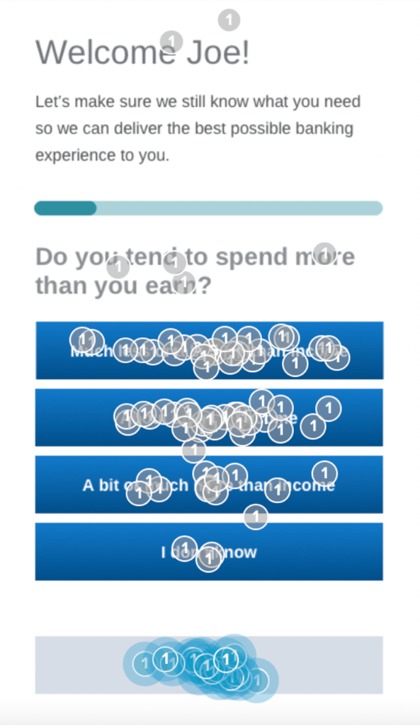
“Your homepgae must communicate in one short glance where users are, what your company does, and what users can do at your site. If your site misses the mark here, it’s nearly impossible to recover.”

Simple, clean designs with clear navigation and well-placed calls-to-action (CTAs) enhance usability, making it easier for visitors to find what they’re looking for and take desired actions.
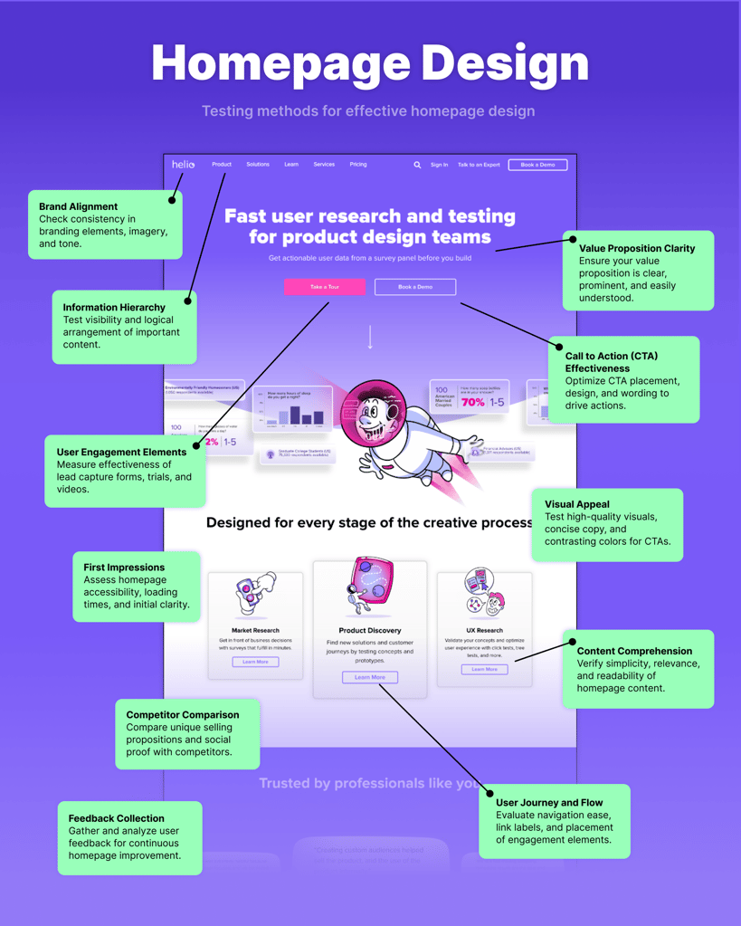
In this blog post, we’ll explore how you can test eleven various homepage design elements using Helio to create a visually appealing, user-friendly, and effective homepage.
Testing your Homepage Design
Designing a homepage that captures attention and drives engagement is crucial for any website. But how can you ensure that your homepage design hits the mark? Helio is a powerful user research and testing tool that helps you fine-tune every aspect of your homepage.
User-centric design is paramount in creating a homepage that resonates with your audience. Research your users’ needs and behaviors and use this data to guide your design decisions. Incorporate high-quality visuals and compelling copy that align with your brand’s identity, avoiding generic images to maintain authenticity.
1. Visual Appeal
First impressions matter. The visual appeal of your homepage design can make or break a user’s decision to stay or leave.
- Use high-quality visuals and concise, audience-focused copy to capture attention and communicate effectively. Avoid generic stock images to maintain uniqueness.
- Avoid overly complex designs, excessive motion, and animations. Simple and standard designs enhance usability by aligning with user expectations.
- Implement contrasting colors to make key elements like CTAs stand out. This draws users’ attention to important actions and can significantly increase conversion rates.
Use the Helio to gather feedback on your color schemes, typography, and overall aesthetic. Visual hierarchy and website aesthetics play critical roles in capturing user interest. Test different visual elements to see which combinations resonate best with your audience.
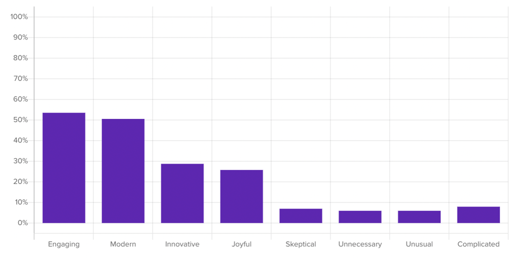
For example, we ran testing on a mock banking platform’s homepage to understand user reactions to the visual content on the page. We used a brand impression question to determine whether the visuals on the page fall in line with the feelings that a banking company would want to elicit from their audience:
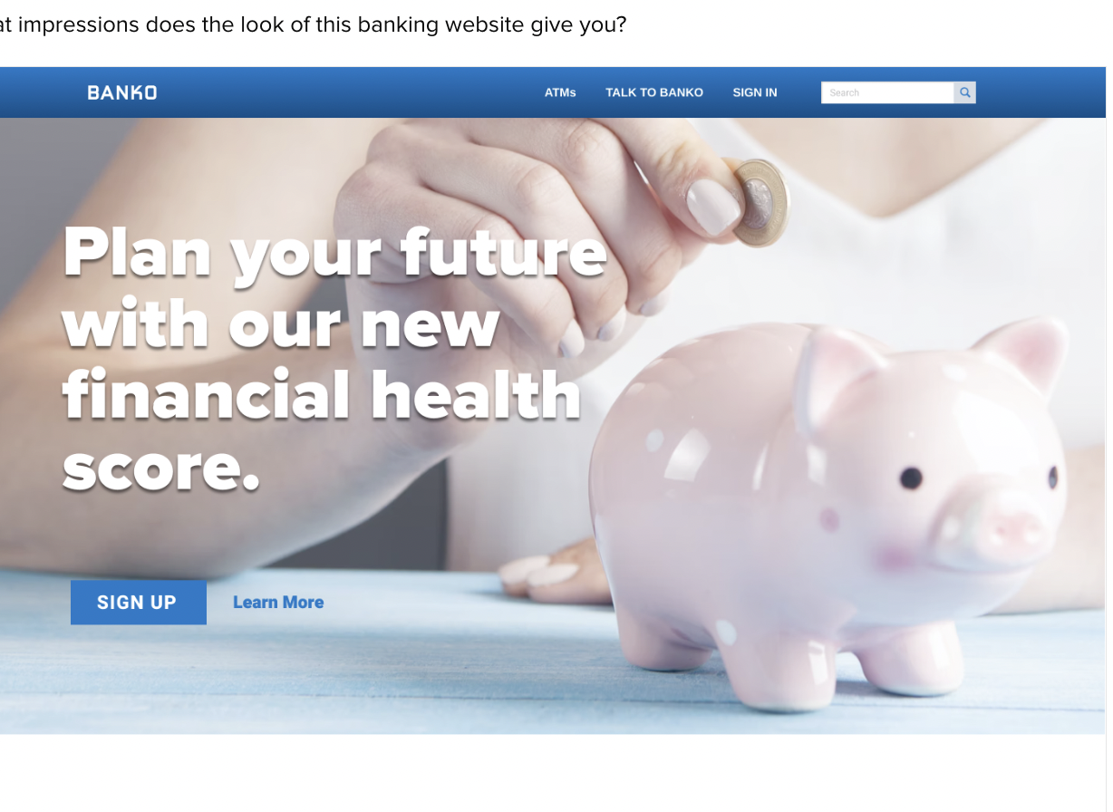
We ran this survey with 100 banking consumers in the United States, and the results provided a breakdown of the most prominent positive and negative impressions that the participants felt about the page:
“The piggy bank is a fun picture that encourages everyone, regardless of financial standing, that savings is possible.”
- Online Banking Consumer (US)
Check out our example for testing creative and ad concepts, and use our Helio template to easily set up your own creative test!
2. Value Proposition Clarity
A clear value proposition is essential for communicating what your website offers.
- Clearly communicate your purpose. Prominently display your company name, logo, and a clear tagline. This helps visitors quickly understand who you are and what you offer.
- Your unique value proposition should clearly state who you are, what you do, and the benefits to users. It must be prominently featured and easy to understand at a glance.
- Ensure your homepage headline and subheading succinctly convey your brand’s identity and benefits. This helps visitors quickly understand what you offer and why it matters.
With Helio, you can test how well your value proposition is understood by your visitors. Use surveys and A/B testing to determine your message is clear and compelling. Ensuring your value proposition stands out can significantly impact your homepage design effectiveness.
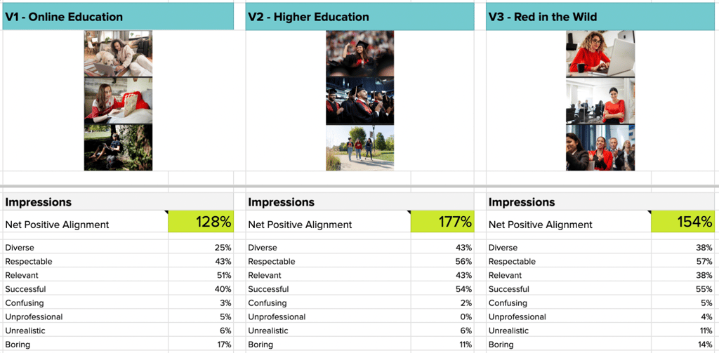
For example, we tested three versions of a banking platform’s landing page hero content with an audience of banking consumers in the US. Versions 1, 2, and 3 of the hero content were sent to a separate group of 100 participants to gather their reactions:
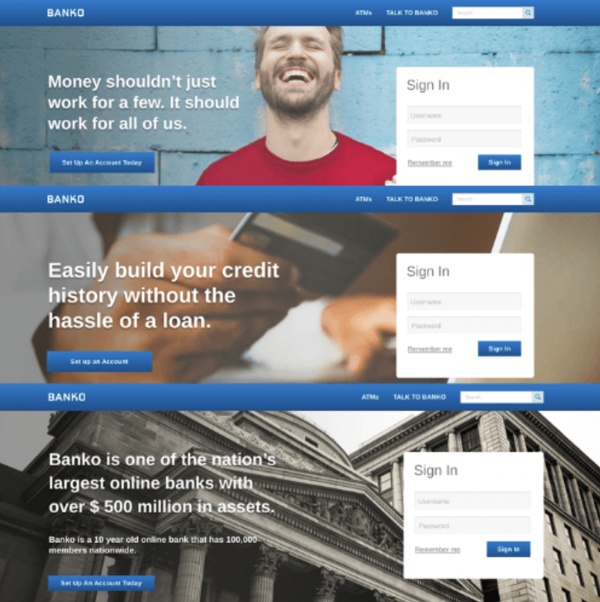
We asked each participant to rate their comprehension of the page, and then indicate what positive (or negative) impressions the page made them feel.
The data from these responses were then copied into the below comparison framework for easy analysis across the three landing page variations:
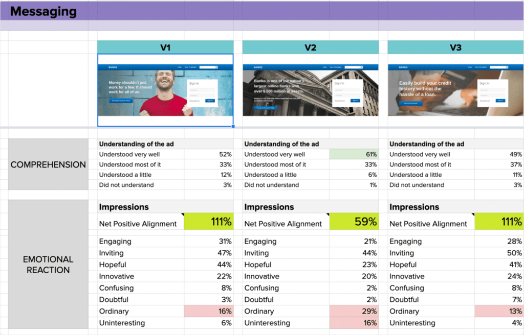
Check out our blog article about testing your value proposition to learn more about the signals we surfaced through this data!
3. User Journey and Flow
Understanding the user journey is key to creating a seamless experience.
- Design your homepage around user motivations and behaviors. Conduct thorough research to understand your audience, using quantitative and qualitative data to guide decisions.
- Use clear, descriptive link labels and emphasize high-priority tasks with a visual hierarchy. Ensure primary navigation is easily noticeable.
- Strategically place lead capture forms, free trials, and video demos on your homepage to encourage user engagement and conversions. Ensure these elements are prominent and easy to interact with.
Helio allows you to map out and test the user flow from the homepage to other parts of your website. Identify pain points or confusing navigation elements and refine them to improve the user experience. A smooth user journey keeps visitors engaged and encourages them to explore further.
In our work with beauty brand & skincare provider SkinSavvy, we needed to understand where to focus our design and development efforts across their website, mobile app, and social media platforms. With many visitors coming through each of those channels, the team needed validation as to which platform would be their testing grounds for developing patterns that would trickle down into the others.
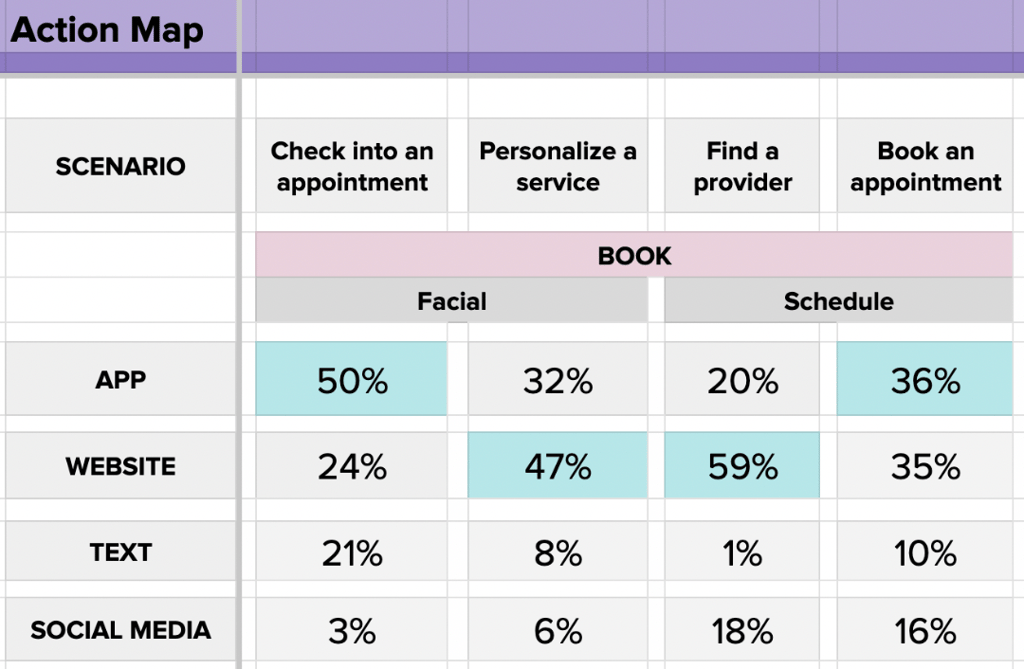
We employed our Action Map testing to learn which channels SkinSavvy’s consumers preferred to use in key situations across the web experience, such as finding a skincare provider or browsing beauty products.
Each box in the image above represents the percentage of participants who would choose that channel to complete their goal; the most prominent choice is highlighted in blue for each scenario.
Check out our blog article on journey mapping to see how you can introduce user feedback and test data into your team’s process!
4. Content Comprehension
Your homepage content needs to be clear and concise.
- Embrace the “Keep it simple” principle by focusing on the most important information and structuring it effectively. This helps keep the design clean and ensures that users quickly grasp the main message without being overwhelmed.
- Update your homepage regularly to stay relevant and improve SEO. Keep the content aligned with user needs and expectations, enhancing usability and search visibility.
- Highlight specific examples of your offerings to guide users and encourage exploration. Prioritize important content above the fold.
Helio provides tools to test how well users comprehend your content. By gathering feedback on readability and relevance, you can adjust your copy to meet user expectations better. Effective content strategy ensures that your message is delivered accurately and effectively.
Message Testing
On Banko’s redesigned landing page, the team wanted to experiment with 3 different types of messaging for their hero content. Banko’s overall goal for its updated messaging was to optimize comprehension of its offerings and produce the most positive impressions from its visitors. With that in mind, those were the two aspects they tested across their messaging variations.
Banko presented each of its messaging variations to 100 Online Banking Consumers in the US. They asked participants to indicate how well they understood the page’s messaging and what positive or negative impressions were most prevalent. Once the responses had been collected on each variation, the Banko team loaded the data into a comparison framework for easy analysis across the different options.
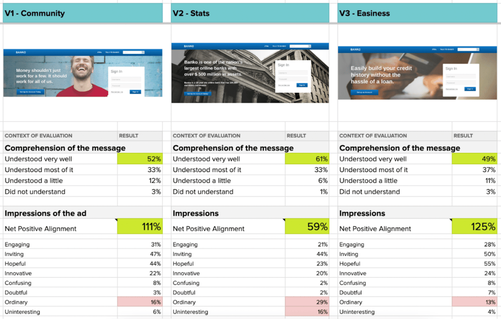
The Banko team found an immediate improvement in user clarity when it comes to their V2 messaging variation utilizing company stats. V2’s comprehension levels of 61% outpaced both V1 (52%) and V3 (49%) by a significant amount.
“I feel like the message is vague – Yes, I understand that it is requesting people to sign up for an account. However, the message itself is simple- Not sure it would make me want to sign up for an account.”
- Online Banking Consumer (US)
Check out the full results from this comprehension testing in our blog on master product messaging!
5. Call to Action (CTA) Effectiveness
CTAs are critical for driving user action. Whether signing up for a newsletter or purchasing, your CTAs must be compelling.
- Strategically place calls-to-action (CTAs) to guide visitors towards desired actions. Use compelling verbs and contrasting designs to make CTAs stand out.
- Use clear, descriptive link labels and emphasize high-priority tasks with a visual hierarchy. Ensure primary navigation is easily noticeable.
- Ensure your homepage supports quick, satisfactory decisions rather than perfect ones—design for users who scan and choose the first viable option they see.
Helio allows you to test different CTA placements, designs, and wording to find the most effective combinations. A well-optimized CTA can significantly increase your conversion rates.
For example, we tested HelloFresh’s membership offer landing page using a combination of usability, emotional reaction, and comprehension questions.
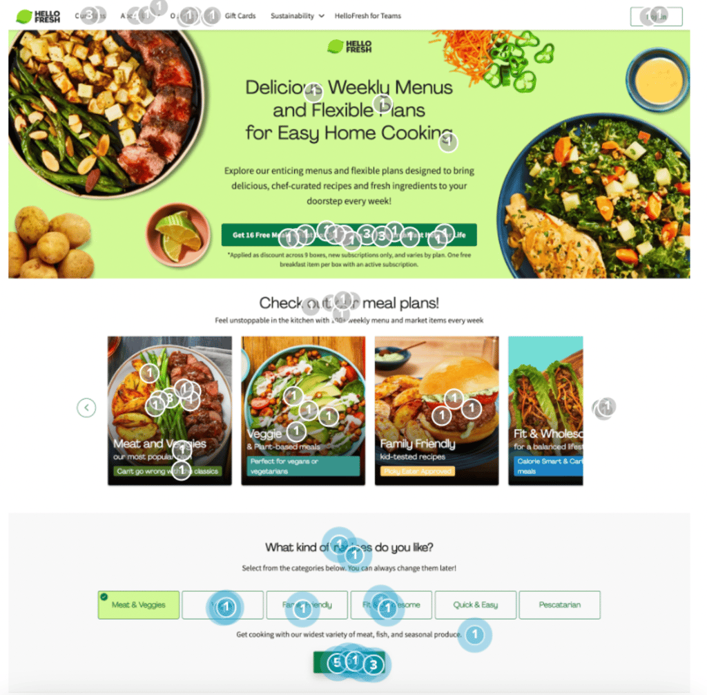
A click test showed how users would interact with the landing page on their first interaction. The largest share of visitors (27%) engaged with the meal plan carousel on first look. Though HelloFresh’s “free meal” offer gets a fair amount of attention (23%), the interactive elements like the meal plan carousel and recipe selector (24%) steal the limelight from their primary CTA.
“It seems like it’s not very clear, or worded deliberately to be misleading”
- Home Cook (US)
Check out the full breakdown of our landing page conversion testing in our blog about turning clicks into customers!
6. First Impressions
First impressions are formed in a matter of seconds.
- Make the homepage easily accessible. Every page should include links to the homepage, ensuring users can easily return for orientation. Use simple URLs and make the homepage visually distinct.
- Optimize homepage loading times and avoid elements that delay content visibility. Provide immediate access to key information without unnecessary animations or pop-ups.
- Your homepage should clearly communicate who you are, what you do, and how you can benefit your audience. First impressions matter, so make sure this information is immediately visible and easy to understand.
Use Helio to test the immediate impact of your homepage design. Gather feedback on what users notice first and how they feel about your site. This insight helps you make adjustments to ensure a positive first impression that encourages users to stay and explore.
To show how you can measure first impressions after initial product use, we put conversational UI to the test by asking users in an audience of home cookers to interact with an AI platform to come up with a new recipe. We measured comprehension, interactions, and emotional reactions to both ChatGPT and Google’s Bard AI to determine which platform makes a better first impression with consumers.
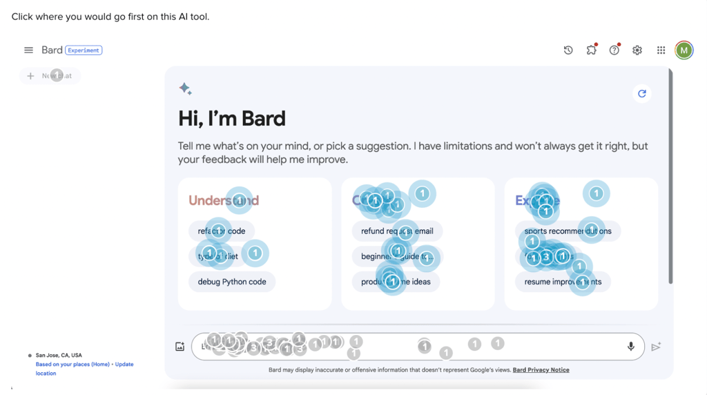
For instance, in our first click testing, we found that 39% of users start on Bard’s platform by interacting with a command suggestion, compared to only 12% on ChatGPT. Bard AI’s more expansive list of category suggestions provides an engaging feature for more users to interact with. This acts as a guide for users, supporting this core principle of conversational user interfaces.
Learn more about how to measure first impressions from our blog on testing conversational UI!
Resources
Homepage Design Resources
-
Why your homepage sucks (and what you can do about it)
, by
James Harrison
-
How to Structure a Successful Homepage
, by
Ryan Gittings
-
18 CTA Design Tips To Boost Your Website’s Conversion Rate
, by
Arnab Roy Chowdhury
-
The Importance of User Journey Map in UX Design Process
, by
Pandu Budikusuma
-
he Complete Guide to Creating a Perfect Value Proposition
, by
Eric Jan Huizer
-
Designing for the Blink of an Eye: Leveraging System 1 Processing for Unforgettable First Impressions
, by
Romain Warion
-
The Importance of Visual Appeal in Web Design
, by
Usabilla Team
7. Brand Alignment
Your homepage should reflect your brand’s identity.
- Reflect your brand’s style through consistent use of logos, color palettes, typography, and tone. This builds a recognizable and cohesive identity.
- Use consistent branding elements like colors, typography, and imagery to create an emotional connection. This consistency builds familiarity, trust, and excitement.
- Use visuals that align with your brand to create a more authentic experience. Avoid generic images; use visuals that align with your brand and message to create a more authentic and appealing experience.
Helio helps ensure your design aligns with your brand values and messaging. Test various design elements to see how well they represent your brand. Consistent branding builds trust and recognition among your audience.
For example, we helped the Indiana University team more closely align their site imagery to the lifestyles and preferences of their remote student base. The goal was to establish a baseline for brand impressions towards the current imagery, and then determine a variation that outperformed the baseline in terms of positive emotional reactions and relevance.
“No one is in classes or doing anything exciting, they are just sitting at home doing homework”
- Undergrad College Student (US)
The IU team moved forward with validation that their Higher Education theme would produce the most positive impressions from visitors to their site. Check out the full case study we published about our work on Indiana University’s brand visuals!
8. Competitor Comparison
Understanding how your homepage stacks up against competitors can provide valuable insights.
- Highlight your unique selling proposition (USP) to differentiate from competitors. Use headlines, visuals, and social proof to differentiate from competitors.
- Display customer testimonials, star reviews, or mentions of well-known brands that use your product to build trust and credibility with new visitors. This social proof can help persuade potential customers of your reliability and quality.
- Mention well-known brands that use your product to establish authority. This social proof can help persuade potential customers of your reliability and quality.
Helio allows you to conduct competitor analysis by comparing user feedback on different homepages. This allows you to identify areas for improvement and differentiate your site from the competition.
To illustrate how Helio can be used to test landing pages, we analyzed five prominent CRM providers—HubSpot, Zoho, Zendesk, Salesforce, and Monday.com.
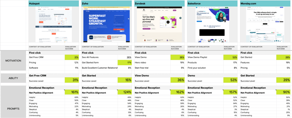
We ran five independent tests focused on user motivation, ability, and clarity of prompts. Distinct patterns emerged that shed light on the strengths and weaknesses of each platform. Below is an image of the framework used to evaluate the results from each test.
Check out our blog on running this comparison test and analyzing the results across each competitor!
9. Information Hierarchy
The way information is organized on your homepage affects user experience.
- Prioritize important content above the fold for immediate visibility. Highlight specific examples of your offerings to guide users and encourage exploration.
- Structure content to enhance usability and align with user expectations. Simple, clean designs with clear navigation and well-placed calls-to-action (CTAs) enhance usability, making it easier for visitors to find what they’re looking for and take desired actions.
- Use a clean layout to help users quickly grasp the main message. Avoid overly complex designs, excessive motion, and animations. Simple and standard designs enhance usability by aligning with user expectations.
Use Helio to test the effectiveness of your information hierarchy. Ensure that the most important information is easily accessible and logically arranged. A clear information hierarchy effortlessly guides users through your content.
For example Q4 Inc., a leading provider of investor relations solutions, faced challenges in website navigation that potentially affected user engagement and content discovery. The main issue was determining the most effective navigational structure to facilitate easier access to critical investor relations content, thereby improving user satisfaction and engagement metrics.
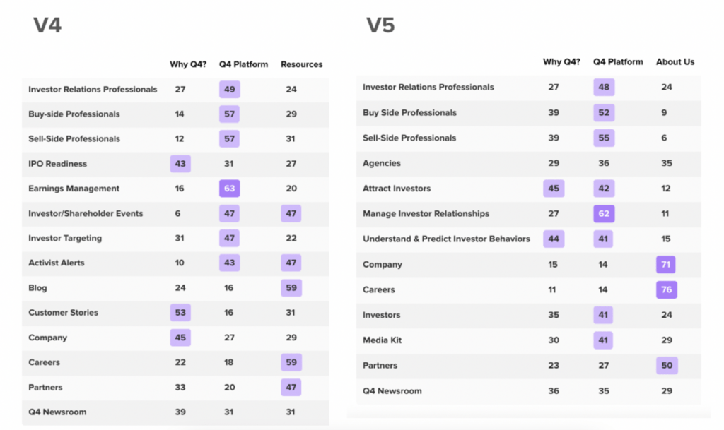
We used a card sorting technique combined with Helio’s remote user testing capabilities to assess navigation expectations across five different versions of the site’s pages and categories.
Check out the full case study on our work with Q4 and updating their navigation structure!
10. User Engagement Elements
Engaging users is key to reducing bounce rates.
- Engage users with dynamic content like lead capture forms, free trials, and video demos. Ensure elements are prominent and easy to interact with to boost conversions.
- Strategically place lead capture forms, free trials, and video demos on your homepage to encourage user engagement and conversions. Ensure these elements are prominent and easy to interact with.
- Update your homepage regularly to reflect current trends, events, and promotions. Use A/B testing to optimize elements and keep the site relevant to visitors.
Using Helio, test various engagement elements such as videos, animations, and interactive features. Determine which elements keep users on your site longer and encourage interaction. High user engagement leads to better retention and conversions.
For example, a feature idea for banking app Banko invites users to answer survey questions in order to determine and help with their financial health. Before spending the money to put this full onboarding flow into production, Banko was able to test the flow with 200 Banking Consumers in the US to determine their follow-through and engagement.
We asked participants to engage with the financial health survey as they normally would, and then focused on the clicks from those at the bottom of the page who would skip the question. Those ‘skippers’ were then taken to a separate question path to explain why they didn’t want to answer the question before being placed back into the onboarding flow.
Check out the full study in our blog on assessing user motivation and engagement!
11. Feedback Collection
Regularly collecting user feedback is essential for continuous improvement.
- Conduct usability tests and gather user feedback to refine your homepage. Use tools like Hotjar to identify issues and improve user experience.
- Conduct usability tests and gather user feedback to refine your homepage continuously. Use tools like Hotjar to identify issues and improve user experience through iterative design.
- Iterate based on testing to continuously enhance your homepage design. Use tools like Hotjar to identify issues and improve user experience through iterative design.
Helio makes it easy to gather and analyze feedback from your users. Use this feedback to make informed decisions about design changes and enhancements. Continuous feedback ensures that your homepage remains relevant and effective.
For example, skincare company SkinSavvy used Helio to tap into and build a list of over 1,000 current customers who had volunteered to provide their feedback on new product ideas and concepts. The SkinSavvy team started small with usage and attitudes surveys to begin gathering feedback as they grew their list:
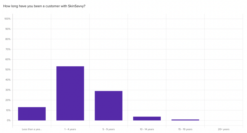
Before long, they had moved into more complex survey types about business patterns, and began surfacing great qualitative responses from their customers:
“90% of my business is no SkinSavvy treatments. I honestly think this year the push on my marketing has been huge for this service so all clients want that option instead of my other facials. I also have had some micro influencers I’ve collaborated with.”
- SkinSavvy Customer
Check out how you can build a customer advocacy program like SkinSavvy in our blog about mastering product feedback loops!
FAQ for Homepage Design
A successful homepage design must communicate your brand’s purpose clearly and concisely, displaying your company’s name, logo, and a clear value proposition. This initial clarity helps build trust and sets the stage for deeper engagement. Additionally, the design should be simple, clean, and intuitive, with clear navigation and well-placed calls-to-action (CTAs) that guide visitors toward desired actions.
First impressions matter, so using high-quality visuals and a concise, audience-focused copy is crucial to capturing attention and communicating effectively. Avoid overly complex designs and excessive motion. Instead, use contrasting colors to make key elements like CTAs stand out, enhancing usability by aligning with user expectations. Regularly test different visual elements to see which combinations resonate best with your audience.
A clear value proposition is essential for communicating what your website offers. It should clearly state who you are, what you do, and the benefits to users, featured prominently and easily understood at a glance. Ensuring your value proposition stands out can significantly impact your homepage’s effectiveness by helping visitors quickly understand what you offer and why it matters.
Understanding the user journey is key to creating a seamless experience. Design your homepage around user motivations and behaviors, using thorough research to understand your audience. Implement clear, descriptive link labels, and emphasize high-priority tasks with a visual hierarchy. Place lead capture forms, free trials, and video demos strategically to encourage user engagement and conversions.
Embrace the “Keep it simple” principle by focusing on the most important information and structuring it effectively. Prioritize important content above the fold and update your homepage regularly to stay relevant and improve SEO. Use a clean layout to help users quickly grasp the main message, avoiding overly complex designs, excessive motion, and animations.
Strategically place calls-to-action (CTAs) to guide visitors towards desired actions, using compelling verbs and contrasting designs to make them stand out. Ensure CTAs are prominent, clear, and easy to interact with. Regularly test different CTA placements, designs, and wording to find the most effective combinations for increasing conversion rates.
Your homepage should reflect your brand’s style by consistently using logos, color palettes, typography, and tone. Use visuals that align with your brand to create a more authentic experience. Regularly test various design elements to see how well they represent your brand. Consistent branding builds trust and recognition among your audience.