In the realm of design, impact trumps aesthetics. It’s not just about how good your design looks; it’s about how well it works. And this must be communicated in your design reviews with stakeholders. Dan Winer, a thought leader in design, emphasizes that the true value of design lies in its impact on users, an insight that holds for anyone in the creative field.
Design impact refers to your design’s tangible effects on user behavior and business outcomes. It’s the difference between a user staying on your homepage and leaving it, between making a purchase or abandoning their cart. Your design has an impact on user’s actions. Let’s dive into how you can transform your design review conversations into measurable design impact.
Designers, don’t forget: You were hired to build a business. Design is the how; building a business is the why.

Dan Winer, Head of Design, Smile
Understanding the Role of Feedback in Design Impact
Dan Winer has an excellent list for designers, or for that matter, anyone producing creative, to sell the value of their work. In every highlighted example, bringing user data into your conversations significantly increases the value of your work. This is especially true if you collect feedback before the team invests in development.
6 No-No’s of Design Impact
Grounding your statements in customer feedback or data ensures that you’re not just making claims about the design, but providing evidence for its effectiveness. This approach shows that design choices are strategic business decisions with measurable outcomes. Below are examples of how to frame each statement with performance metrics in your design review with stakeholders.
Don’t talk about the “quality” of your design.
👉Talk about its impact.
Instead of simply stating the design is of high quality, you could say, “Our design is informed by extensive user testing, which shows a 30% reduction in the average time to complete tasks. This enhances user satisfaction and leads to a higher retention rate.” Showing the business impact of your design quality is important during the design review process.
Don’t present a “cleaner design”.
👉Elaborate on how it reduces cognitive load and boosts efficiency.
During your design review with stakeholders, you could say “Our streamlined interface, based on data analytics, reduces user cognitive load. This leads to a 25% increase in task efficiency, as validated by customer feedback, optimizing workflow and improving overall productivity.”
Don’t stop at “improving the user experience”.
👉Explain why it creates long-term profit.
During the design review process, go beyond talking about improved user experience to explaining its financial benefits. For instance: “By enhancing the user experience, we’ve seen a 15% increase in customer lifetime value, indicating that a smooth user interface directly correlates with repeat business and long-term profitability.”
Don’t sell accessibility as “the right thing to do”.
👉Talk about the potential of the untapped market.
Address the broader implications of accessibility by stating, “Our accessibility features open our products to an additional 15% of the population who experience disabilities, representing an increase in market share and a potential rise in annual revenue by up to 20%.”
Don’t offer “intuitive navigation” in your design review
👉Show how it accelerates the path to purchase.
Link intuitive navigation directly to sales by saying, “Our user-centric navigation design simplifies the purchase process, resulting in a 50% quicker path to purchase and a 20% uptick in conversion rates, as shown by our latest sales funnel analytics.”
Don’t only focus on “inclusive imagery”.
👉Describe how it enhances brand perception and broadens your demographic.
Discuss the tangible benefits of inclusive imagery by stating, “Inclusive imagery has resonated with our diverse customer base, leading to a 40% improvement in brand perception scores and opening up our demographic to a wider audience, as reflected in social media engagement metrics.”
Measuring Design Impact with Helio
How would you come up with usability data before you launch? Screenshot the existing solution and test your new variation against it in Helio. Capture the success rate and response time for every screen’s primary, secondary, and tertiary tasks. This test takes only a few minutes to set up and can be expanded to include additional pages. With Helio’s ready-made audiences, this effort takes about half a day to collect data, compile a comprehensive audit, and produce a report.
To understand the impact of your design, you need data. Before investing in full-scale development, gather feedback. Here’s how:
- Usability Testing: Perform user testing with tools like Helio to compare design variations against current solutions. Measure your homepage’s success rates and response times for primary, secondary, and tertiary tasks.
- Collect Data: Aim for a significant sample size—100 participants is a good benchmark—to ensure your data is statistically significant.
- Analyze and Report: Collect your findings into a comprehensive report. This should take no longer than half a day, thanks to ready-made audiences and streamlined tools available today.
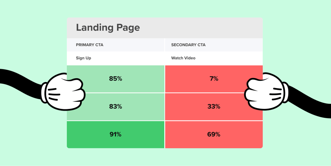
Interaction Matrix for eCommerce Company Getup
When planning updates and iterations to a webpage, collect interaction data to determine the most crucial improvements. First, take what you have, and determine where the gaps are.
The image below shows a practical example of testing for various homepage actions on an eCommerce site. The Interaction Matrix framework shows that Getup’s homepage baseline was first tested, revealing usability issues with many primary and secondary actions, such as Shopping for a Suggested Look.
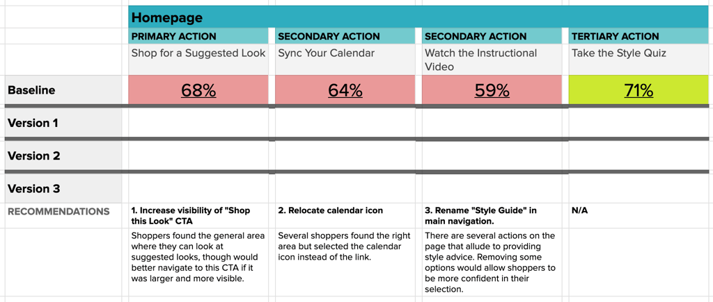
Primary actions are the most important CTAs on the page and are expected to produce at least 80% success from users. Secondary actions, which hold importance but aren’t the main purpose of a page, should reach at least 70% success. Tertiary actions, which may be as small as contact links in the footer, are expected to be found by 55% of users on the first click.
Once you have your baseline tested, use the data to make design decisions to drive your new variations forward.
Here’s what the Getup data tells us:
- Primary Action: ‘Shop for a Suggested Look’ needs improved visibility, especially as the most desired action on the page from a business perspective.
- Secondary Action: ‘Sync Your Calendar’ could benefit from more clearer placement of the CTA itself, and style advice can be more clearly provided from the homepage.
- Tertiary Action: ‘Take the Style Quiz’ consistently performed well, with the least variation among the versions.
Translating Data into Design Decisions
To translate these insights into actionable design strategies, Getup planned the following:
- Highlight Key Features: If ‘Shop this Look’ drives engagement, make it stand out. Use bold colors or position it prominently.
- Simplify Navigation: If syncing calendars is essential, streamline the process. Use icons over text links for intuitive navigation.
- Guide the User Journey: Rename sections like ‘Style Guide’ to more directly reflect the action you want users to take, like ‘Get Your Personalized Style Advice’.
With these plans in mind, the Getup team continued to test new variations of their homepage actions, seeing immediate success in secondary actions like syncing calendars and watching instructional videos.
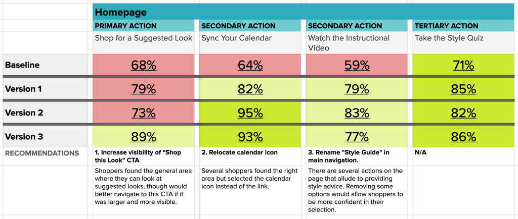
The primary action of Shopping a Suggested Look was the last nut to crack, which finally leapt into the expected success range with Version 3 of the homepage.
Getup’s Interaction Matrix shows constant iteration and improvement over time, validating their team’s decisions with user data.
Final Thoughts on Creating Design Impact
In design, demonstrating impact with data is far more persuasive than subjective quality claims. Use user testing and data analysis to showcase how your designs improve user experience and contribute to business objectives. By doing so, you can create more impactful designs that not only look good but also deliver measurable results.
Remember, your design is often the first point of contact between your user and your brand. Make it count by focusing on design that impacts behavior and drives engagement.