Visual design improvements create a lift in page performance. We came across Kelley Gordon’s post on UX visual design principles.
It inspired us to dive into UX visual design principles, where we are stripping away the complex jargon and focusing on how you can craft interfaces that are beautiful and intuitively functional. It’s easy to get caught up in focusing solely on aesthetics, neglecting usability, or prioritizing functionality at the expense of visual appeal.
Often times as designers, we can get bogged down into either making something “look pretty” (and disregarding the function) or making the function better (and disregarding the visual design). Why not have it both ways? I like to use these principles when making something usable but still beautiful.

Kelley Gordon, Nielsen Norman Group
Have you ever marveled at a website or app that just ‘feels right’?
That’s no accident. It results from meticulous design choices informed by principles shaped by years of study and practice. But how can you leverage these principles to create digital experiences that resonate with users, whether you’re a seasoned designer or just starting?
First, clear the air
You don’t need to sacrifice visual appeal for functionality or vice versa. It’s a delicate dance of give and take, a blend of art and science. And the good news? Applying UX visual design principles doesn’t have to be overwhelming. In fact, by understanding a few core concepts, you can see immediate improvements in your design’s performance and user engagement.
So, what are these principles? Think of them as the building blocks of user experience design: Scale, Visual Hierarchy, Balance, Contrast, and the Gestalt Principles. Each plays a pivotal role in guiding the user’s eye, making content digestible, and ensuring the interface is accessible and engaging. And here’s the kicker – using tools like Helio, you can test these principles and see real data backing your design decisions.
As we unfold the layers of UX visual design, you’ll learn how to apply these principles strategically and creatively. Get ready to transform your design approach and watch as your pages not only look better but perform better too. Let’s turn that ‘feels right’ into a ‘can’t live without,’ one principle at a time.
Understanding UX Visual Design Principles
In UX design, visual principles serve as navigational beacons guiding users through a sea of information with clarity and intent. It’s where form meets function harmoniously, ensuring users enjoy the view and reach their destination effortlessly. These principles aren’t just about making things look pretty and creating a seamless user journey.
Here’s What you Need
Visual design in UX is a symphony of elements working together—scale, hierarchy, balance, contrast, and the Gestalt principles all play their parts. Let’s unwrap these concepts and see how they can transform your digital canvas into a masterpiece of user engagement.
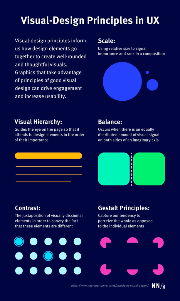
Scale: Think of scale as the volume knob on your design. It’s about adjusting the size of elements to signal their importance. Want to grab attention? Turn it up. Need to be subtle? Dial it down. It’s about finding the right visual decibels for your message to resonate clearly.
Visual Hierarchy: This is your design’s GPS. It guides users along the desired path, ensuring they stop at the key landmarks. By manipulating size, color, and placement, you create a map that leads users exactly where you want them to go, without them ever feeling lost.
Balance: Balance is the zen of design. It’s the equal distribution of visual weight. Whether symmetrical or asymmetrical, it brings stability to your design, creating a sense of calm and order that invites users to stay awhile.
Contrast: Contrast is the spice of your design dish. It highlights differences, brings out the flavors of your layout, and ensures that content doesn’t just blend into a bland puree. It’s about making the important bits pop and keeping the eye interested.
Gestalt Principles: These principles are the psychology behind the scenes. They remind us that users will see the whole before they notice the individual parts. It’s about crafting a cohesive visual story where every piece contributes to the overarching narrative.
Understanding and applying these principles isn’t just a matter of aesthetics; it’s about creating interfaces that users can navigate intuitively. These principles are your toolkit for drawing users in and delivering a user experience that feels as good as it looks. In the following sections, we’ll dive deep into each principle, equipping you with the know-how to apply these tools effectively in your UX visual design principles, projects.
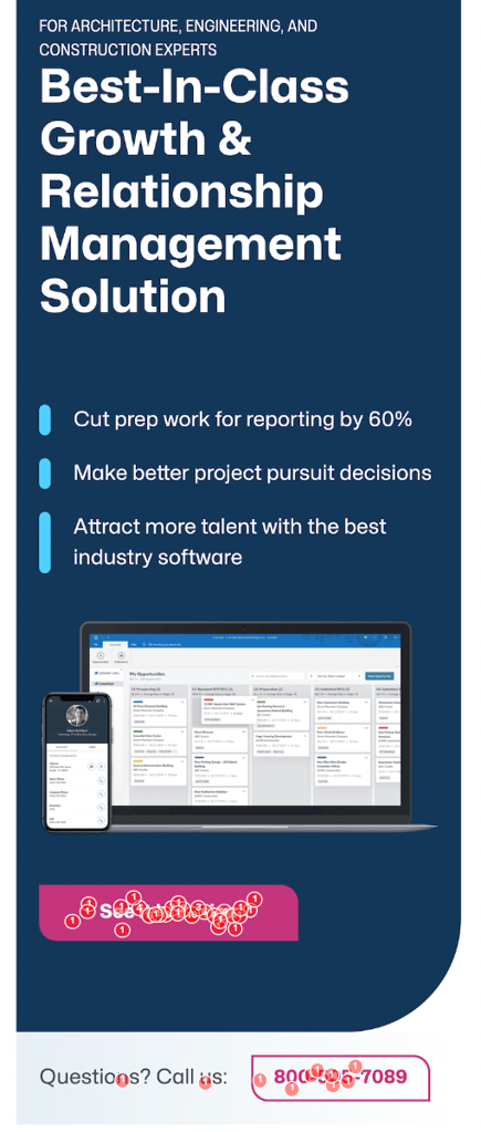
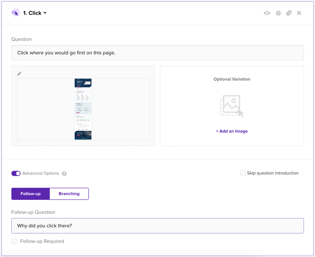
To show how each of these visual design principles can be put to the test, we ran a survey on Unanet’s homepage to understand how successfully the different elements on the page capture visitor’s attention and tell the story.
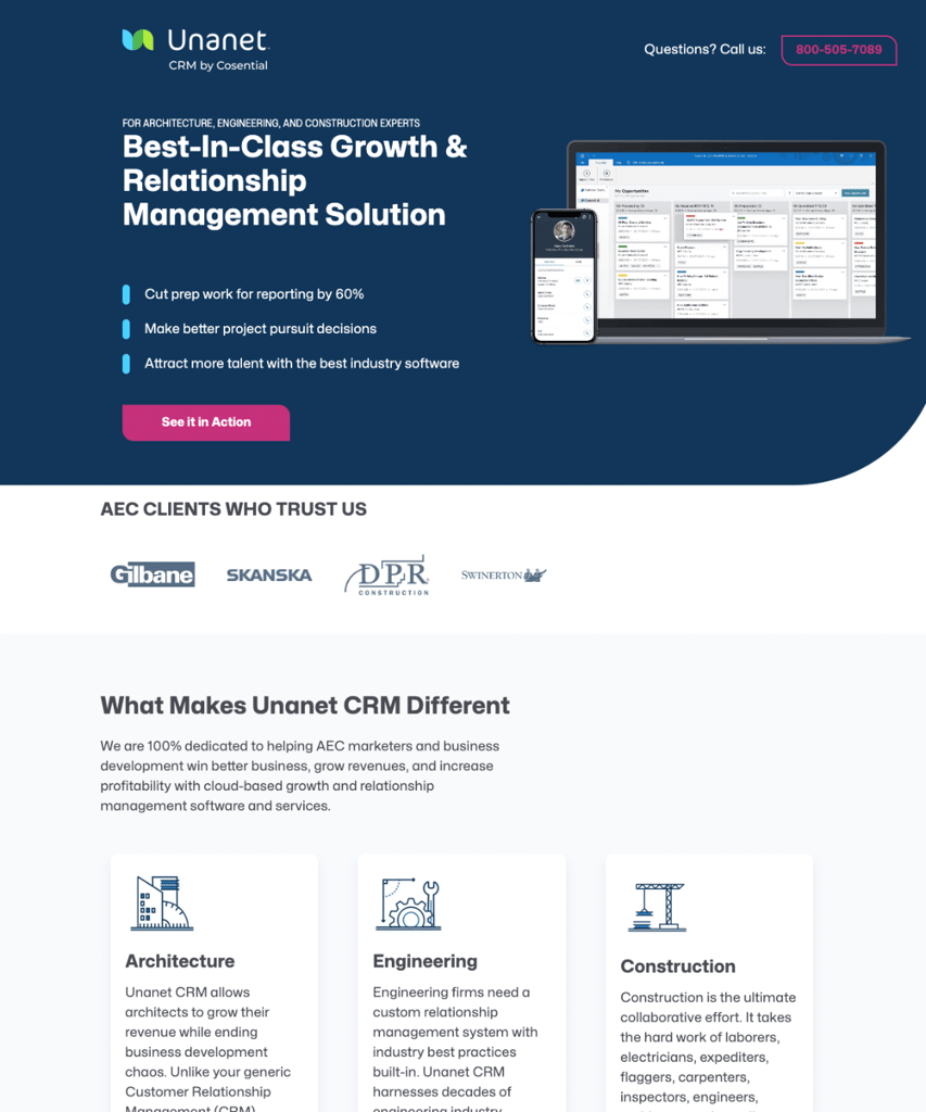
Unanet is a CRM platform for professionals in the Architecture, Engineering, and Construction industries (AEC). To gather feedback on their homepage, we tapped into our Helio audiences of participants in each of these 3 industries to gather 100 quantitative and qualitative responses on the page’s visual design.
Visual Hierarchy: Directing the Show with Purpose
Visual hierarchy is like the stage director of your UX show—it tells each element where to stand and when to bow. It’s not just about throwing content on the page and hoping it sticks. Nope, it’s about arranging it all so that users can take one glance and instantly understand what’s going on. It’s your visual storytelling at its finest.
Think about visual hierarchy as the spotlight on your page. What do you want to shine the brightest? That’s where you point your spotlight. Maybe it’s your headline, your killer product shot, or that can’t-miss call-to-action button. You control the focus and flow by playing with different sizes, colors, and textures. You’re the director here, and your users are the audience following your cues.
Here’s The Deal
You want to guide your users naturally, from one element to the next, without them feeling like they’re being herded. It’s like catching up with a friend, and the conversation flows. That’s the kind of smooth journey you want for your users.
First-click tests? They’re like your dress rehearsal. They show you if your visual cues are on point or missing the mark. You want your users to hit the right buttons (literally) without wandering around lost.On Unanet’s homepage, first click tests revealed where participants gravitate when they first land on the CRM site. The red dots on the homepage below show how many participants clicked on different parts of the homepage:

Our first click testing on Unanet’s site revealed that their Request a Demo button in the hero dominates the visual hierarchy, with over 66% of participants clicking there first. However, surprisingly, the contact us CTA in the top right of the site received almost 10% of clicks on first glance, showing that this element holds more power in the visual design than Unanet might want it to as a secondary outreach option.
So, grab your director’s chair and start positioning your visual elements like a pro. Create a clear path, make the important bits stand out, and watch as your users follow the show you’ve directed, hitting all the right notes along the way.
Scale: The Spotlight of UX Design
Alright, let’s chat about scale. Imagine you’re at a rock concert. Who grabs your attention—the lead singer in the front or the drummer in the back? Like at a concert, scale in UX design helps us figure out who the lead singer is on the page. It’s all about using size to show what’s important and what’s backup vocals.
When you play with the scale of different elements, you tell the user, “Hey, look here first!” or “This bit is not as critical, but still cool to check out.” It’s like having visual road signs that guide users to where they need to go without stopping and asking for directions.
Got a call-to-action button? Make it bigger if you want it to stand out. Want to highlight your headline? Scale it up so it sings louder than your subtext. But remember, it’s not just about making things big. It’s about using size wisely to create a visual pecking order that makes sense and feels natural.And let’s not forget about mobile devices, where screen real estate is like a tiny stage. Here, scale is your best friend to ensure that your content doesn’t just fit, but also shines, regardless of screen size.
Take a Look
To ensure that Unanet’s homepage works across different scale needs, the same test questions were asked of their AEC professionals audience while interacting with the mobile site:
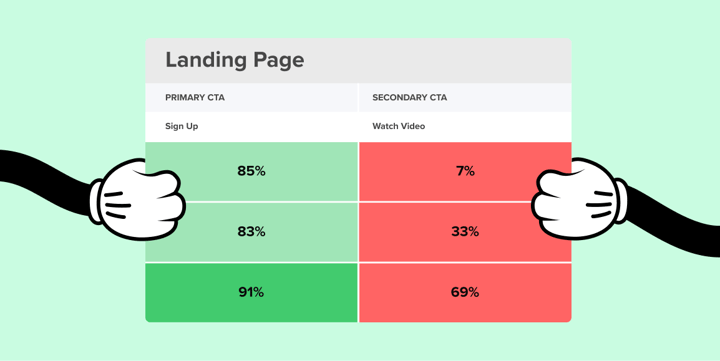
The length of Unanet’s mobile homepage does some interesting things to their primary CTAs, such as moving the first CTA down far below the fold. This resulted in a 4% decrease in participants finding and taking advantage of these ‘See it in action’ CTAs, despite the fact that they occupy the same space in the design as the desktop version. Unanet may need to make some layout adjustments to their mobile designs in order to mirror the engagement success on their desktop site.
“The call to action buttons should be clear and present when you are searching for them.”
– Architecture Professional (US)
So, think about scale next time you design like a music producer. Adjust it until everything hits the right note, and watch as your users rock out to the rhythm of your well-scaled design.
Balance: Finding Your UX Design Zen
Let’s talk about balance, the zen master of UX design. Imagine your design is a seesaw. You want to create a level playing field where visuals are pleasingly distributed, creating a sense of harmony and order. It’s all about making sure your design doesn’t tip over with too much weight on one side or the other.
Balance in design isn’t about making everything symmetrical, though that can be visually satisfying. It’s about arranging elements to give off a vibe of equilibrium through mirrored symmetry or an asymmetrical layout that still feels just right. It’s like a well-organized desk—there’s a place for everything, and everything’s in its place, giving you a sense of calm.
Think Of It This Way
Users feel grounded when elements on a page are balanced. They can kick back and relax into the experience because nothing is jarring or feels out of place. They won’t know why they love browsing your site; they’ll just know they do.
You can test the balance in your designs by throwing different layouts to your users and seeing how they react. Do they find one layout more appealing? Does a certain arrangement make it easier for them to navigate? That’s your balance at work.
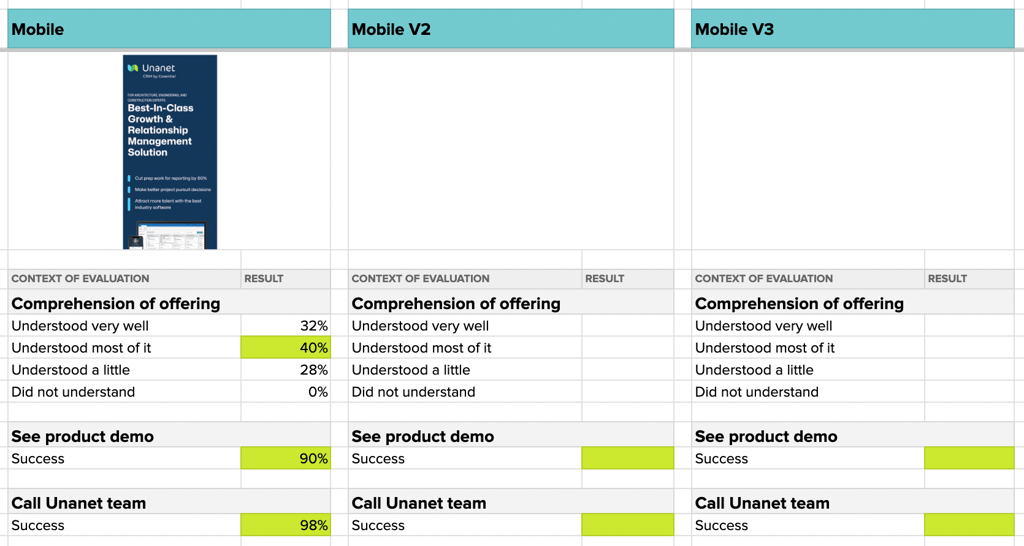
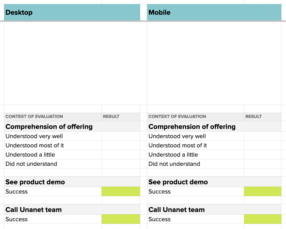
Multivariate testing through Helio allows you to quickly set up and test multiple versions of a design using the same questions with your audience. For instance, Unanet’s desktop and mobile homepage tests were able to be quickly transferred to a spreadsheet view for easy analysis across variations:
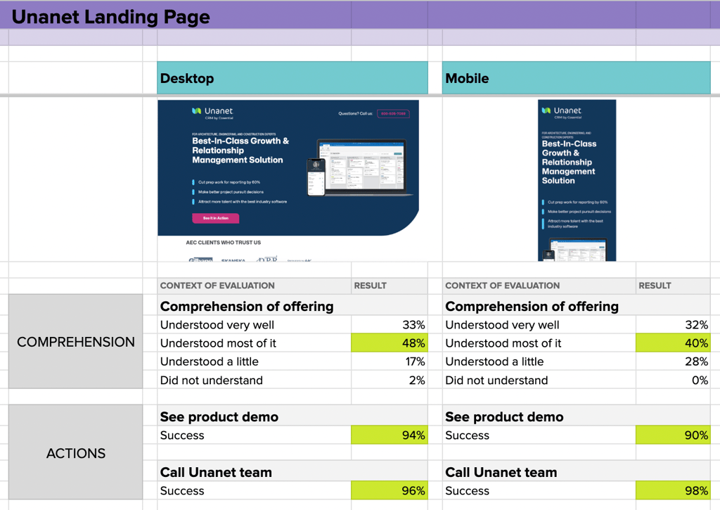
As the data above shows, the comprehension of Unanet’s CRM offering takes a hit when transferring the information to a mobile layout. An 8% decrease in comprehension and 11% increase in participants who understand only a little of the offer is a clear signal that there are issues with the information presentation in the mobile view. Our recommendation would be for Unanet to go back to the drawing board to quickly set up a few different versions of their mobile homepage, and then pass the new versions through the same test questions to validate (or invalidate) the new directions.
So, find your design zen. Play around with the weights and positions of elements until everything feels right. When you hit that sweet spot of balance, you’ll know. Thanks to your perfectly balanced design, your users will stick around longer and walk away feeling like they’ve just had a five-star user experience.
Contrast: The Seasoning of Your UX Design Feast
Let’s spice things up with contrast, the secret seasoning that turns a bland design into a feast for the eyes. Contrast isn’t just about black versus white; it’s the tool that highlights the differences in your design, making certain elements stand out and others blend into the background like a smooth baseline in a jazz band.
Think of contrast as the culinary art of your design process. Just as a chef uses different spices to create layers of flavor, you use contrast to add depth to your user experience. It’s what makes your call-to-action buttons pop, your headlines grab attention, and your text easy on the eyes. Without it, you risk serving up a dish that’s visually unappetizing and hard to digest.
Don’t just throw in a dash of contrast for the heck of it. Use it with intention. Want your users to read something first? Crank up the contrast. Need to draw their eyes to a signup form? Boom, add a contrasting color. It’s like a visual exclamation point, telling users where to look and what to remember.
And Here’s a Pro Tip
Contrast isn’t just about colors. You can play with textures, shapes, sizes, and even whitespace. Yep, sometimes the absence of stuff is the best way to create contrast. It gives your design room to breathe and your user’s space to focus.
To test how your attempts at contrast affect visitor’s impressions of the design, Helio can be used for brand impression testing, which provides a quantitative way to measure user’s emotional reactions to your site.
After a few interactions with your site, such as the earlier click tests we discussed on the Unanet homepage, participants have enough experience with the page to indicate their emotional reaction. The key is to specifically measure the positive and negative reactions that you are intent on as a business.
For instance, as a CRM platform Unanet wants to present themselves as helpful and powerful solution, while avoiding impressions that there homepage content is complicated or confusing, so we put those impressions into a Helio multiple choice question:
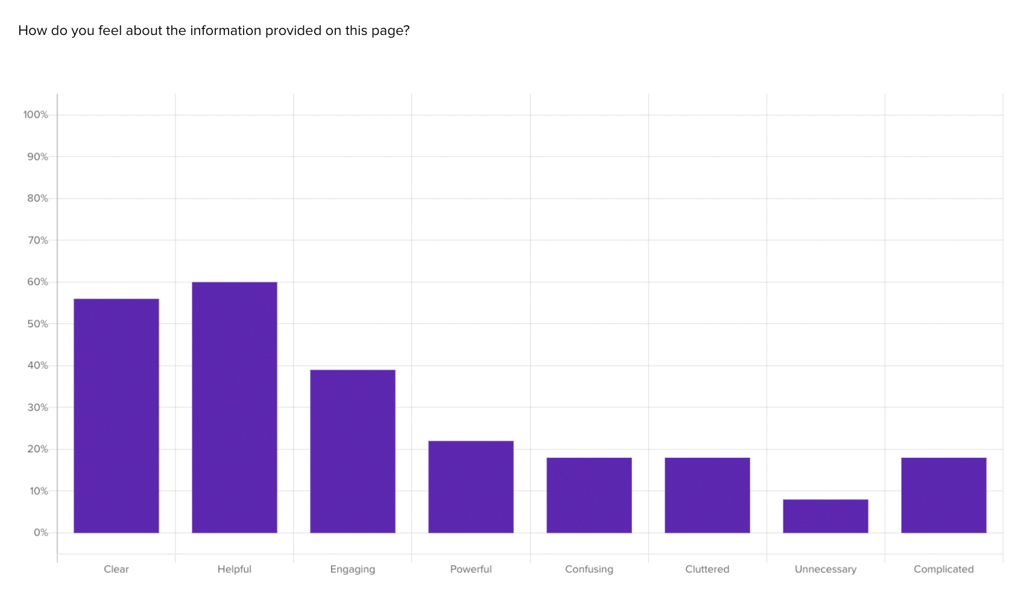
Participants are allowed to choose from up to all impressions, to understand whether their positive impressions might be tainted with certain negative reactions.
Out of 4 negative and 4 positive impressions, participants were asked to indicate how they felt about the content on the Unanet homepage. Once these results are collected, the sum of the positive impressions minus the sum of the negative produces a net positive alignment, a single data point to sum up the emotional reaction to an experience:
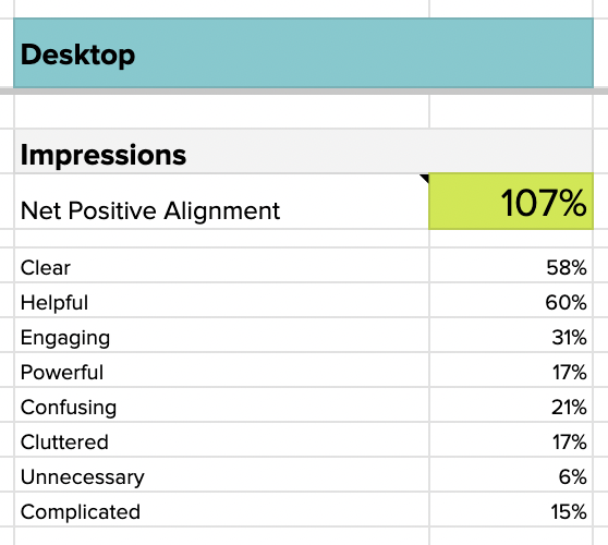
Keeping negative emotions below 10% is important for maintaining positive impressions with an audience, so spikes of over 10% in confusing, cluttered, and complicated are a clear signal that the homepage needs some improvement in those areas. The homepage is also significantly lacking in producing the impression of being a powerful platform, so the recommendation to the Unanet team would be to work on a new version of the homepage that emphasizes this aspect.
“It’s a nice layout with a good design however wordy and could be broken down in a more concise manner.”
– Construction Professional (US)
So, go ahead and season your designs to perfection. Test out different levels of contrast and see how they affect usability. Do they make your site more navigable? Do they boost readability? If the answer’s yes, you’ve got the right mix. Remember, the goal is to create a user experience as pleasing to the eye as it is to the journey. With the right amount of contrast, users will be returning for seconds.
Gestalt Principles: The Mind Magic in UX Design
Ready to add a little mind magic to your designs? Enter the Gestalt principles, the wizards behind the curtain in the world of UX design. These principles are all about how users tend to see the whole picture before we notice the nitty-gritty details. It’s like when you first meet someone – you get a vibe from them before you start picking up on their quirks.
Gestalt principles are your toolkit for ensuring users get the ‘vibe’ of your design immediately. They help you organize content so that it’s not just a random collection of elements but a coherent unit that makes sense at a glance. You know, like how a band sounds great because all the instruments play together in harmony, not just each doing its own thing.
But it’s not just about throwing elements together and hoping for the best. You’ve got to be a bit of a psychologist. Use these principles to create patterns and structures that guide users’ perceptions. Want to make a section stand out as important? Group things together so users see it as a single unit. Got a bunch of features? Arrange them so users can easily see how they relate to each other.
It’s not hocus-pocus; it’s about understanding how the human brain works and using that knowledge to make your design intuitive. So, play around with proximity, similarity, and continuity to create a user experience like a revelation.
And Here’s a Pro Tip:
Test it out with real users. See if they get the gist of your design without having to squint and ponder. If they do, you’ve nailed the Gestalt principles. If not, tweak it until they feel the magic.
With Helio, you can get both quantitative and qualitative feedback to measure how well participants understand the information presented by your designs. Initial reactions, like this likert scale question asking about comprehension of Unanet’s homepage, are great for gauging how intuitive your designs are:
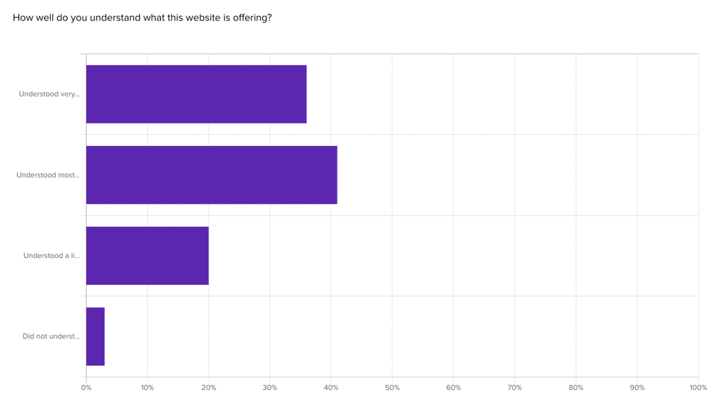
We can’t just take participant’s word for it though, so gathering their written explanation of what they see on the page is important to tell the full story:
What is this website offering?
“AEC marketed options for job growth and obtaining new jobs, organization and management solutions.”
– Architecture Professional (US)
Along with each likert scale choice in Helio, participants were asked to prove their level of comprehension by explaining the offer themselves. Many participants, like the Architecture professional above, used the terms AEC and CRM in their responses, showing a firm understanding of the platform’s target audience and purpose.
Remember, in UX design, the real trick is ensuring the user never has to think too hard. With the Gestalt principles in your design spellbook, you’re on your way to creating some real UX wizardry.
Practical Application and Testing of UX Visual Design Principles
It’s time to roll up our sleeves and get our hands dirty with the real work: applying those UX visual design principles we’ve discussed. This isn’t about lofty theories or abstract concepts; this is where the rubber meets the road, and you get to see your designs come to life.
First Up
Scale. You will want to create and test different screens, playing with element sizes to see which ones hammer home the importance to your users. It’s like tuning an instrument until you hit that perfect pitch.
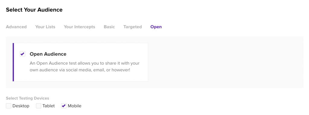
Use tools like Helio to get real data on how users interact with different scales. Target your audience based on the type of device their using so that you can collect reactions to your designs in the proper visual context:
You’ll see where they click and how fast, and that’s pure gold for making informed sizing decisions.
Contrast is all about usability tests. Mix up your designs with different contrasts and see which makes the content jump off the page. It’s like finding the perfect lighting for a photograph—everything looks sharper, clearer, and plain when you get it right.
Next Up
Let’s talk about visual hierarchy. This is where first-click tests become your best friend. They’ll show you if your design is a well-oiled machine that guides users where they need to go. It’s one thing to think you’ve designed a clear path; it’s another to watch users find their way effortlessly.
Helio’s click tests also provide the opportunity for follow-up qualitative responses, so that you always gather an understanding of why participants interacted with the designs as they did.
Balance is your next challenge. Get ready to run concept variation tests to see how different layouts affect your users’ perceptions. You’re looking for that sweet spot where the design just feels right. When users interact with it, you’ll know you’ve found the balance you’re after.
Helio’s advocate experts can help your team set up multivariate experiments that test the balance of different design decisions across multiple versions of your site.
Lastly
We’ve got the Gestalt principles. Here, you test whether users see the whole picture as intended. It’s like a magic eye picture; when it clicks, everything aligns, and the design makes sense.
Now, don’t stop there. Gather insights using concept testing, clickmaps, path analysis, and user surveys. Helio can help you here, equipping you with the data you need to fine-tune your designs based on what real users think and do. Go one step further than your static designs into testing interactive prototypes for even deeper signals about how users navigate through a flow.
Remember, these principles aren’t just for show. They’re the tools that will help you create designs that are not just visually appealing but also functionally superior. So, use them, test them, and watch as your designs resonate with users on a whole new level.
Wrapping It Up with a Designer’s Bow
We’ve unpacked the nitty-gritty of scale, hierarchy, balance, contrast, and the Gestalt principles, not just as concepts but as practical tools you can wield to craft experiences that captivate and engage.
Remember, scale is your headlining act, ensuring the most crucial elements grab the spotlight. Visual hierarchy is the guide that takes users by the hand and leads them through your design without a second thought. Balance is your zen master, ensuring everything feels just right, calm, and collected. Contrast? That’s your spice, adding that essential zing that makes your design sing. The Gestalt principles are the magic that makes your design a coherent story, not just a collection of parts.
Now, don’t just read about these principles—put them into play. Test, tweak, and refine. Use tools like Helio to get real user feedback and keep iterating until your design looks good and feels intuitive and effortless to navigate.
As you apply these principles in your projects, keep the conversation going. Share your hits and misses, talk about what worked and what didn’t, and always keep your user in the center of it all. Because at the end of the day, UX design is about creating experiences that resonate on a human level.
UX Visual Design Principles FAQ’s
UX visual design principles are the rules and guidelines designers follow to enhance user experience through visual elements. They ensure the interface is intuitive, accessible, and engaging, including concepts like scale, visual hierarchy, balance, contrast, and the Gestalt Principles.
To apply scale effectively, adjust the size of elements to reflect their importance within the interface. Make key elements like call-to-action buttons larger to draw attention, and use a smaller scale for less critical information, ensuring a clear visual order that guides users naturally.
Visual hierarchy organizes content on a page by importance, guiding the user’s eye through the design. It uses size, color, and placement to create a flow that leads users through the interface without confusion, akin to a well-directed show.
Balance provides stability and harmony in design, creating an environment that feels right and inviting. Achieve balance by evenly distributing visual weight across the layout, using symmetry or asymmetry to create a sense of order and calm.
Use contrast to differentiate and highlight key elements in your design. Employ contrasting colors, textures, shapes, and sizes to draw attention to important features and improve readability, akin to adding spices to a meal to enhance its flavors.
The Gestalt Principles describe how users perceive and process visual information as a whole before noticing individual elements. They are significant in UX design for creating cohesive interfaces where elements are grouped and structured in a way that makes intuitive sense to users.
Test your UX visual design’s effectiveness using tools like Helio for real user feedback, conducting usability tests, first-click tests, and concept variation tests. This data helps refine the design based on user interaction and preferences.