
Any digital marketing plan expects the creation of a compelling landing page. A well-designed landing page can significantly increase conversions, engage your audience, and drive sales. But how do you ensure your landing page hits the mark? Enter the concept of a landing page swipe file—a dynamic repository that helps you conduct thorough research and gather inspiration for your landing page content.
What is a Landing Page Swipe File?
A landing page swipe file is a collection of materials providing insights and inspiration for creating your landing page. It can include screenshots of successful landing pages, headline examples, copywriting techniques, calls-to-action that convert, design elements, and user feedback on various landing page elements. It is an essential tool for marketers, copywriters, and designers aiming to create high-converting landing pages.
A landing page swipe file may include various components, such as:
- Headline Examples: Captivating and successful headlines that have driven high conversion rates.
- Subheadline Samples: Compelling subheadlines complement the main headline and provide additional context.
- Call-to-Action (CTA) Phrases: Effective CTA buttons or links have led to a high click-through rate.
- Lead Magnet Ideas: Different types of lead magnets like ebooks, whitepapers, or webinars that have successfully captured leads.
- Testimonials and Reviews: Examples of how customer testimonials and reviews are integrated into landing pages.
- Visual Elements: High-quality images, videos, infographics, or other visual aids that engage users.
- Page Layouts: Various structural layouts showcase effective organization and flow of content.
- Color Schemes and Typography: Design elements that have been used effectively to draw attention and make the page aesthetically pleasing.
- User Forms: Examples of form designs that have resulted in high completion rates.
- Social Proof Indicators: Ways to display awards, endorsements, or social shares that build credibility.
- SEO Elements: Meta descriptions, title tags, and header tags from high-ranking landing pages.
- Unique Selling Propositions (USPs): Clear and concise statements that communicate the value proposition effectively.
- Content Samples: Snippets of content that effectively communicate benefits and address pain points.
- Navigation Examples: Simplified navigation menus that guide the user without distractions.
- Interactive Elements: Features like quizzes, calculators, or sliders that have improved user engagement.
These components are used to inspire and inform the creation of new landing pages or the optimization of existing ones, to improve user engagement and conversion rates.
Average Marketers look for new hacks. Great Marketers study the foundations of human psychology.

Pierre Herubel, Writer of Marketing Guides & Frameworks, Test, Iterate, Scale

Conducting Research with a Landing Page Swipe File
Before figuring out how to conduct research for your swipe file, it’s worth looking at Pierre Herubel’s awesome 7-step guide to writing a landing page.
He covers these steps in the PDF:
- Start with the right questions
- Position the page within the journey
- Select the main message of the page
- Shape a clear and strong positioning
- Conduct research with a swipe file
- Follow 9 copywriting rules to write
- Work carefully on your hero section
Now, let’s jump into the landing page content swipe file, and how we can conduct research.
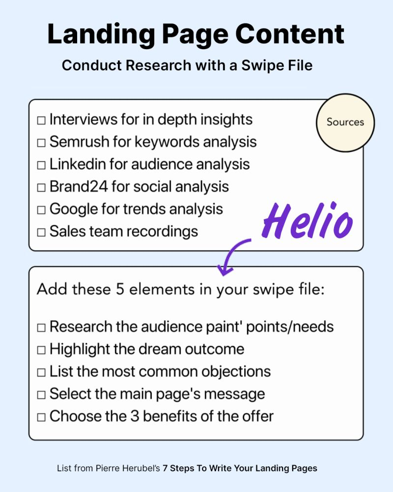
Using Helio for Landing Page Research: A Case Study
Helio is a tool that brings continuous discovery into your organization with real time research. Specific to testing your landing page swipe file, Helio helps you address the 5 elements Pierre mentioned above.
- Research audience pain points/needs
- Highlight the dream outcome
- List the most common objections
- Select the main page’s message
- Choose the 3 benefits of the offer
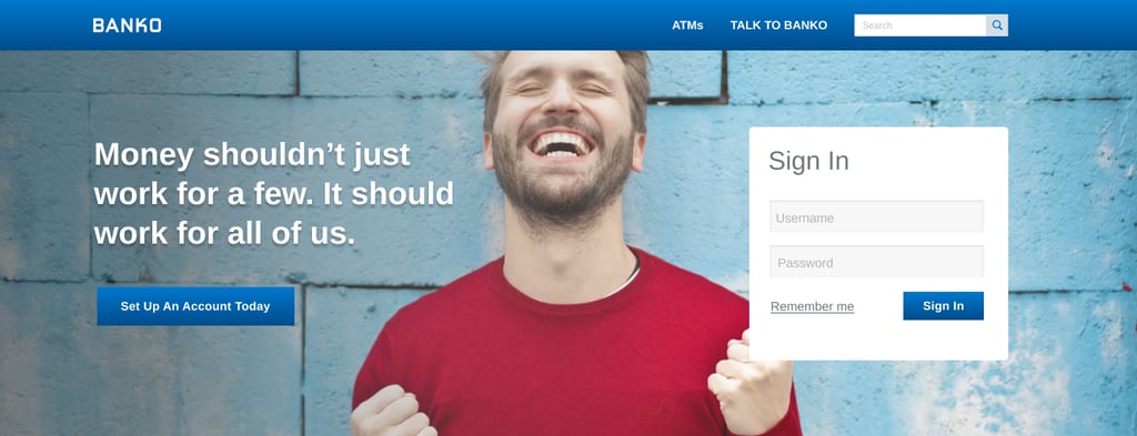
To illustrate how Helio can amplify your landing page research, we’ll use examples from an online banking platform called Banko, who used Helio to optimize their landing pages to convert more users into paying customers.
1. Audience Pain Points/Needs
We sent a survey to 100 banking consumers in California to better understand the pain points and needs of Banko’s target customers. First, we asked respondents a series of binary yes/no questions, “Have you ever been late paying a bill?” and “Have you ever overdrawn your account?”
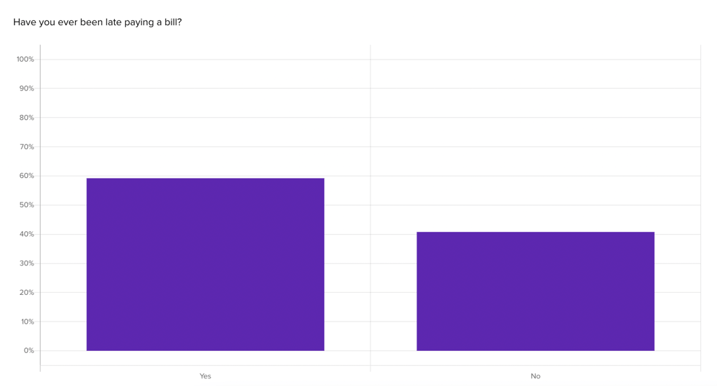
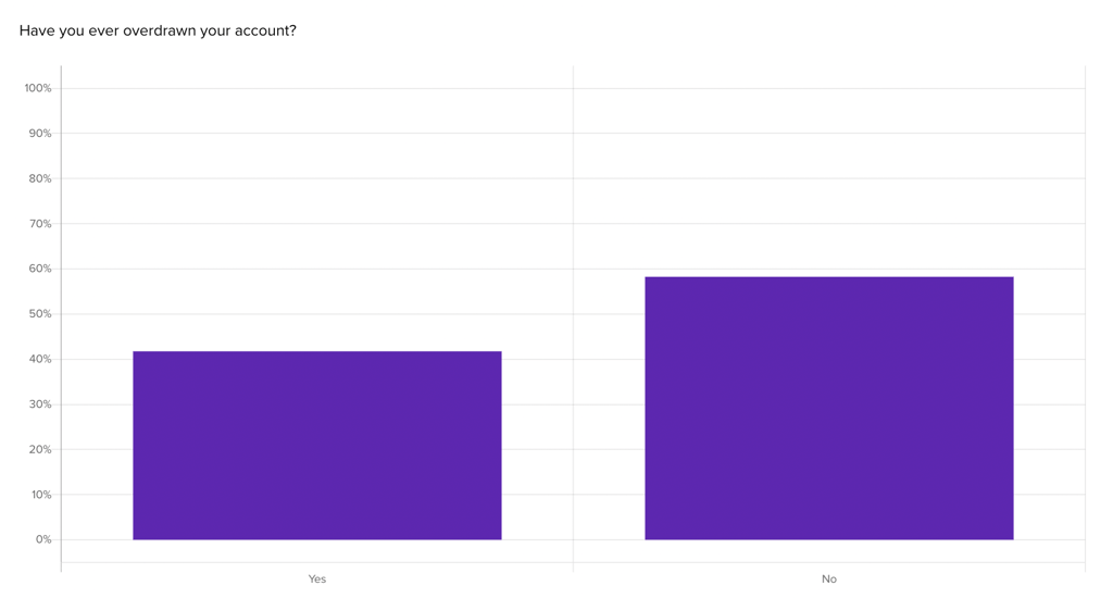
These findings suggest late bill payments may be a slightly more common pain point for their audience (59%) than overdrawn accounts (42%). View the Helio report.
2. Dream Outcome
Test different value propositions to see which aligns with your audience’s aspirations. Monitor how they interact with these propositions to find the most effective one.
Next, we asked our sample of 100 large banking consumers in California a closed-ended question, “Imagine you’re applying for an account with a new bank online. What type of products would you choose to apply for during sign-up?” Respondents were able to select multiple categories:
- Savings Account
- Checking Account
- Car Loan
- Home Loan
- ManeyMarket Account
- High Interest CD
- Other/Not Listed
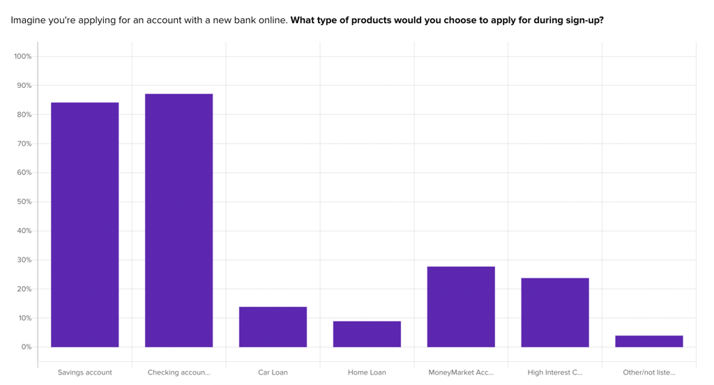
We found checking, savings, money market, and high-interest CD were the most common products. This helped validate the team’s assumptions, but also led to an unexpected finding: the significant interest in MoneyMarket Accounts (28%) and High Interest CDs (25%) compared to more conventional loans. View the Helio report.
3. Common Objections
Next we used a post-interaction survey with our audience of 100 large banking consumers in California to explore common objections and hesitations. This information is helpful to position your landing page to overcome these barriers.
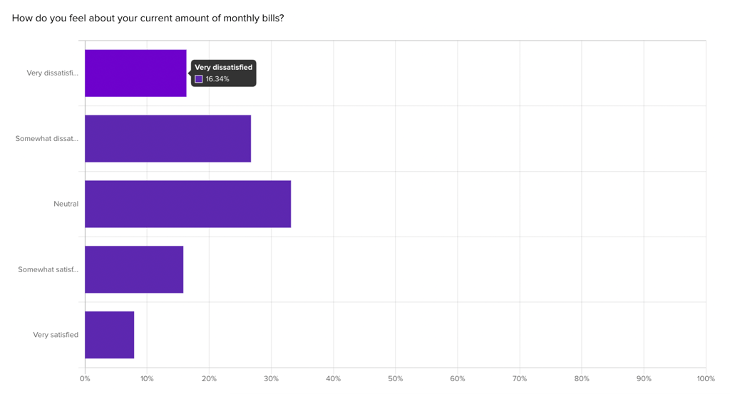
We asked a Likert scale question, “How do you feel about your current amount of monthly bills?” and found over 40% were currently dissatisfied with the current state of their monthly bills, indicating a strong opportunity area for a large part of Banko’s market. View the Helio report.
4. Main Page’s Message
With so many different tones they can bring to the world of finance, Banko needed to quickly test messaging ideas with an audience. While this example focuses on desktop landing page variations, we recommend also testing responsive landing pages for better mobile UX.
We tested 3 variations of a hero message at the top of their landing page to gauge comprehension and emotional reaction. We first gave respondents a scenario, “Imagine you’ve come to an online banking website and you are looking at the homepage.” Then we presented each variation, and asked an open-ended text question, “Briefly describe what the message on this page means to you.”
Then, we asked a closed-ended single-option question, “How well do you understand what the message on this page is saying?” We presented respondents with four response categories:
- Did not understand
- Understood a little
- Understood most of it
- Understood very well
Next, we asked a closed-ended “select all that apply” question, “What impressions does the message on this page give you?” We presented four positive and four negative responses:
- Engaging
- Inviting
- Hopeful
- Innovative
- Confusing
- Doubtful
- Ordinary
- Uninteresting
Then, we compiled the results of each test variation into a framework to compare test results across each messaging variation (pictured below).
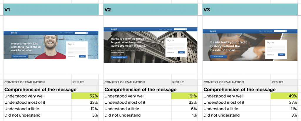
Going the direct route by presenting a fact in V2, rather than the idealistic phrasing of V1 and V3, clearly improved comprehension for their Bank Members audience. View the results comparison framework.
5. Benefits of the Offer
Banko needed to also identify the benefits their audience values most. To do this, we asked our audience of 100 large banking consumers in California to rank a series of factors from most- to least-important when it came to their online banking experience:
- Simple bill payment
- Customer service
- Spending & budgeting stats
- Credit use management
- Access to loans
Collecting this ranking feedback helped Banko tailor their landing page content and messages to match the ideas that lead to more engagement rather than wasting previous real estate on less important factors, like credit use management and access to loans. View the Helio report.
Test your Landing Page Swipe File with Helio
By incorporating these research strategies into your landing page development process, you’ll be able to create a page that not only looks great but also resonates with your audience and encourages conversions.
Your landing page is often the first impression potential customers have of your brand. By using a landing page swipe file and conducting thorough research, you can craft a page that not only captures attention but also converts visitors into customers! To learn more about how Helio can help you improve your landing pages, talk to an expert.
Landing Page Swipe File FAQ
A landing page swipe file is a collection of resources for inspiration and guidance in creating effective landing pages.
Concentrate on making the hero section eye-catching and effectively communicating the main message.
Yes, Helio can conduct surveys and observe user interactions to help identify and address your audience’s key issues.
Use your swipe file to analyze successful elements from other landing pages and apply these insights to optimize your content and design for higher conversions.