
Crafting a responsive landing page is no longer just an option—it’s necessary for building pages. With the rise of mobile browsing, especially for B2B solutions, many companies have adopted a mobile-first approach to design. However, this strategy comes with its own set of challenges, especially when it comes to usability on desktop screens.
Why is this important? Because your landing page is often the first impression customers have of your business. It can make or break a user’s decision to engage with your content, purchase your products, or subscribe to your services.
Let’s dive into some expert insights and provide actionable tips to improve your responsive landing pages.
Understanding the Pitfalls of a Mobile-First Approach
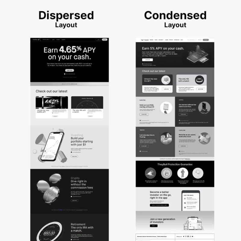
The concept of a mobile-first design was introduced to prioritize the growing number of mobile users. Yet, as web usability expert Jakob Nielsen points out, this approach can lead to what’s called “content dispersion” on larger screens. This means content that is well-organized on mobile may spread out too thinly on desktop, resulting in:
- Longer page lengths
- Increased interaction costs
- Higher cognitive load
- Difficulties in understanding content
- User frustration
These issues arise from designs that favor large images and fonts, coupled with expansive negative space, which might work well on mobile but translate to a less-than-ideal experience on desktop. This can be a problem in B2B industries, where website traffic tends to lean toward desktop over mobile.
Crafting a Balanced Responsive Design
Responsive design should ensure your website looks and functions great across all devices. To achieve this, consider these strategies:
- Prioritize Content Hierarchy- Structure your content with the most important information first. This keeps the user’s attention focused on what’s essential, regardless of device size.
- Embrace Content Density- For larger screens, don’t shy away from greater content density. Text-based alternatives can provide more information without the need for excessive scrolling.
- Optimize Images and Fonts- While large images and fonts may look impressive on mobile, they can overwhelm desktop users. Scale these elements appropriately for larger screens to maintain balance.
- Simplify Navigation- A complex mobile menu can become unwieldy on a desktop. Streamline your navigation to reduce cognitive load and make it easier for users to find what they need.
- Test Across Devices- Conduct usability tests on various devices to ensure a seamless user experience. This helps identify any device-specific issues that could cause frustration.
- Create a Landing Page Swipe File- A landing page swipe file can help you collect new ideas to test on future iterations.
Implementing the Changes
How do you put these insights into action? Here are practical steps to take:
- Assess your current design: Review your landing page on different devices. Look for any instances of content dispersion and note areas for improvement.
- Rethink your layout: Adjust your design to ensure content scales properly across devices. This may involve reorganizing elements and considering alternative layouts for desktop.
- Adjust images and typography: Resize images and fonts to be appropriate for desktop screens. Ensure that these changes do not compromise the mobile experience.
- Simplify user paths: Minimize the steps users need to take to convert. Clear calls-to-action and a straightforward path to conversion are crucial.
- Gather feedback: Use concept testing and user feedback to refine your approach. What works for one audience may not work for another, so be prepared to adapt.
- Monitor performance: Keep an eye on analytics to see how changes impact user behavior. Look for improvements in bounce rates, time on page, and conversion rates.
Testing and Optimizing Your Responsive Landing Page Design
To ensure that your responsive landing page truly resonates with users across all devices, it’s essential to conduct thorough testing and optimization.
To show how to test the responsiveness of your landing page, we ran a test on the landing page of an Architecture Engineering & Construction (AEC) customer relationship management platform, Unanet.
By including remote user testing along with your team’s manual assessment of the design, you can bring new value and insight into your evaluations. Here’s how you can approach this crucial phase:
Testing Your Current Design
- Use Device Emulation Tools: Many browsers, like Google Chrome, offer device emulation in their developer tools. This allows you to see how your landing page looks on different devices without needing the actual hardware.
- Leverage Online Testing Platforms: Services like BrowserStack provide access to real devices and browsers, enabling you to test your landing page in real-world scenarios.
- Manual Testing: If possible, manually test your landing page on as many different devices as you can. This includes various smartphones, tablets, and desktops to understand the user experience better.
Gather Real User Feedback: Use tools that allow users to give feedback on their experience. This could be through heatmaps, session recordings, or surveys.
Helio gives you the ability to select from over 1,000 ready-made audiences, segmented by their profession, behaviors, and preferences. You can tap into a group of participants specifically catered to your business, like we did when we tested Unanet’s desktop and mobile landing pages with an audience of professionals in the Architecture, Engineering, and Construction (AEC) fields.
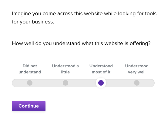
To ensure the responsiveness of the landing pages, we focused on comprehension, usability, and emotional reaction questions to gauge visitors’ interactions with the page.
Rethinking Your Layout
- Responsive Design Checkers: Utilize online tools that help you visualize your website at various breakpoints to ensure the layout adjusts as expected.
- CSS Flexbox and Grid: Test your layout using CSS Flexbox and Grid properties to see if elements rearrange and resize fluidly.
- Prototype Testing: Use wireframing and prototyping tools like Sketch or Adobe XD with responsive design capabilities to test new layout concepts quickly.
- A/B Testing: Run A/B tests to compare different layouts and see which performs better in terms of user engagement and conversion.
Many companies are intent on building fully fleshed out prototypes before putting an idea to the test. Unanet focused on wireframing each of the key pages across their marketing site, and put those mock-ups to the test, such as this hi-fi visual of their landing page.
First click test reactions were gather to understand whether key actions could be taken on this landing page prototype:
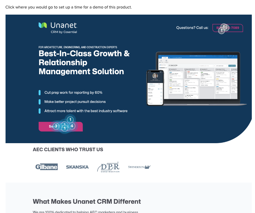
This usability testing revealed my success rate for key actions across the desktop and mobile versions of the page, such as booking a demo and contacting the team.
Helio can help you avoid the pitfalls of a typical “A/B test”, in which you move forward with 2 pre-determined solutions, hoping one outperforms the other in a live setting.
Instead, Unanet’s parallel testing of their desktop and mobile landing pages allows for quick side-by-side comparisons of the page’s performance.
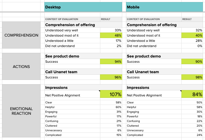
Once the comprehension, usability, and emotional reaction data had been collected in each test, the data was loaded into a comparison framework for a birds-eye view of visitors’ impressions. The results show that the desktop version of Unanet’s landing page had a slightly higher Net Positive Alignment compared to its mobile counterpart.
Adjusting Images and Typography
Visual Inspection: Manually inspect how images and text look on various devices. Ensure readability and visual appeal are maintained across the board.
The comparison of the Unanet’s emotional reaction data shown above indicates a significant drop in positive reactions in the mobile experience, specifically focused around the page feeling confusing, complicated, and cluttered.
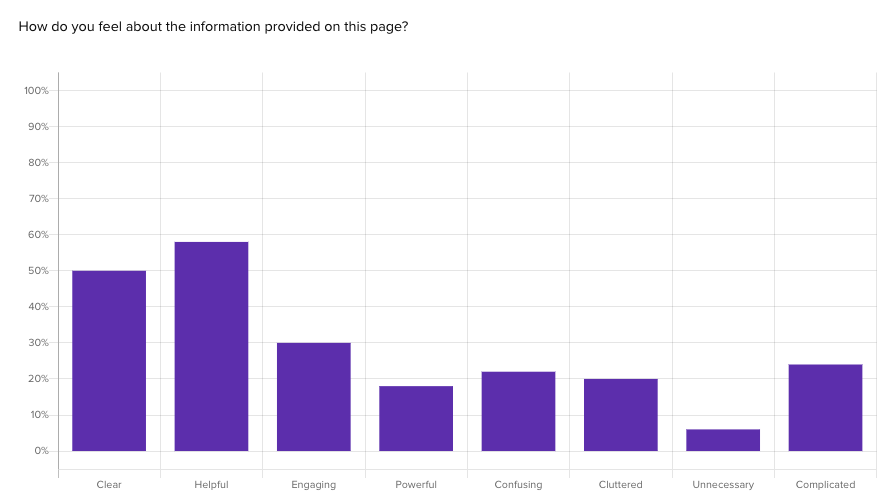
Though impressions of helpfulness and engagement remained the same, the significant negative impressions is a result of the dense information being used on the desktop version being fully incorporated into the mobile design.
It needs to state clearly what this company does … is it software/app, human services etc? … it doesn’t state this clearly in one or two words … after that, everything looks fine.

— AEC Professional (US), Helio Participant
Visitors also expressed a need for more clear action points in the mobile design, despite their usability success:
It’s obvious what they are offering, but too spread out. Not technically complicated, but having to scroll down to find a phone number or action button is not ideal.
— AEC Professional (US), Helio Participant
- A focus on more succinct information on the mobile version, as well as prioritizing some key actions for easy access, should greatly help the responsiveness of Unanet’s landing page.
View the Helio Example - Performance Testing: Use tools like Google PageSpeed Insights to check how your image sizes affect loading times on different devices.
- Scalability Testing: Examine how your typography and images scale on different resolutions. This can be done through CSS media queries and testing on actual devices.
- Accessibility Testing: Ensure that your adjustments do not impact the accessibility of your website. Use tools like the WAVE Web Accessibility Evaluation Tool to check for compliance with accessibility standards.
By systematically testing and optimizing each of these aspects, you can create a responsive landing page that looks good and provides a cohesive and user-friendly experience on any device. Remember that testing is an ongoing process. As new devices and browsers are released, you must revisit your testing strategy to ensure your landing page remains optimized for every user.
Balance Between Mobile and Desktop Landing Page Patterns
In conclusion, while a mobile-first design has its merits, it’s essential to balance it with desktop usability. By taking a step back and considering how content is presented across all devices, you can create responsive landing pages that attract users and provide them with a satisfying experience that keeps them coming back.
Remember, the goal is to make your landing pages responsive, intuitive, informative, and engaging regardless of where they’re viewed. With the right strategy and execution, your landing pages will be a robust foundation for your digital presence.
Responsive Landing Page FAQ
A responsive landing page is crucial because it’s often the first point of contact between your business and potential customers. It must make a positive impression and function well on any device to engage users effectively.
While mobile-first design prioritizes mobile users, it can lead to content dispersion on desktops, where content may appear too spread out, causing longer page lengths, increased interaction costs, higher cognitive load, difficulties in understanding the content, and user frustration.
To create a balanced, responsive design, prioritize content hierarchy, embrace content density for larger screens, optimize images and fonts for desktop viewing, simplify navigation, and test your design across various devices.
Begin by assessing your current design on different devices, adjust the layout to scale content properly, resize images and fonts as needed, simplify the user journey, gather feedback to refine your approach, and monitor performance metrics for improvements.
Use device emulation tools in web browsers, leverage online testing platforms like BrowserStack, conduct manual testing on multiple devices, and gather real user feedback through surveys or feedback tools.
Responsive design checkers, CSS Flexbox and Grid properties for dynamic layouts, prototyping tools like Sketch or Adobe XD, and A/B testing to compare and decide on the best layout.
Perform visual inspections across devices, use performance testing tools like Google PageSpeed Insights to ensure fast loading times, and test scalability with CSS media queries. Also, verify accessibility with tools like the WAVE Web Accessibility Evaluation Tool.
No, testing is an ongoing process. As new devices and browsers are released, You must revisit your responsive landing page to ensure it remains optimized for every user.
A single design can work across mobile and desktop if properly optimized. However, it’s crucial to tailor the design to address the unique needs and constraints of each device type for the best user experience.