Designing a homepage is like drawing a treasure map, each element guiding users on an exciting adventure. It’s the first thing visitors see, and it sets the tone for their entire experience with your brand. But, how do you ensure that your homepage content strategy hits the mark? The answer lies in smart testing and sharp messaging. Let’s dive into a method that’s effective and efficient in shaping the homepage of your website into a conversion magnet.
Understanding the Homepage Content Strategy
Your homepage is your digital storefront. It’s where your brand makes a first impression, and it’s crucial to get it right. A homepage content strategy is not just about aesthetics; it’s about communication. It’s about answering visitors’ fundamental questions when they land on your site:
- Who is it for? (Target Customer)
- Why should I care? (Benefits)
- How does it work? (Capabilities)
- What problem does it solve? (Problem)
- What do you offer? (Product Category)
Addressing these questions creates a clear and compelling message that resonates with your audience.
Essential Parts of a Website Homepage: The Power of a Minimum Viable Homepage
You don’t have to wait until your homepage is fully designed to start refining your message. In fact, you can — and should — test your ideas from the get-go. Taking a cue from Robert Kaminski’s minimum viable webpage template, let’s explore a lean approach to crafting your homepage content.
The Fletch team breaks down the homepage into three elements:
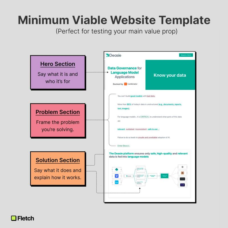
- Hero Section: The Headline Act- This is your opening statement. It’s where you grab attention and clarify what your website is all about. It’s not just what you say; it’s how you say it. Be bold, be clear, and speak directly to your audience.
- Problem Section: Setting the Stage- Here’s where you show empathy and understanding. Clearly frame the problem that your product or service solves. This is your chance to connect with the visitor by addressing their pain points directly.
- Solution Section: Showcasing Your Offering- After setting up the problem, present your solution. What does your product or service do, and how does it work? This section should transition smoothly from the problem and start to paint a picture of how you alleviate the visitor’s pain points.
Testing Your Homepage Messaging
Testing your homepage content is not just a one-off task; it’s an iterative process. Tools like Helio can help you test your messaging in the categories mentioned above. Using open-ended questions, rankings, multiple-choice questions, and visual layouts, you can gather insights quickly and refine your messaging based on actual user feedback.
Embracing Visual Simplicity
A cluttered homepage can overwhelm visitors and dilute your message. By stripping down to the essentials, you create a clearer pathway for users to follow. The layout provided in Robert Kaminski’s template is a testament to the power of simplicity. In fact, you can test parts of a website homepage individually for even more clarity.
Iteration: The Path to Perfection
Continuous testing allows for rapid iteration. By testing elements individually, you can gather specific insights and make data-driven decisions to enhance each section of your homepage.
Maximizing Visitor Actions for Conversion and Time on Page
Optimizing and testing your homepage content strategy is critical for engaging visitors and converting leads, especially for a B2B company. Here are three essential metrics to focus on:
1. Conversion Rate
The conversion rate is a fundamental metric for evaluating the effectiveness of your homepage content strategy. It measures the percentage of visitors who take a desired action, such as filling out a contact form, signing up for a newsletter, downloading a whitepaper, or starting a free trial. To optimize this metric, test different elements such as:
- Call-to-Action (CTA) placement, wording, and design.
- The clarity and persuasiveness of your value proposition.
- The visibility and accessibility of contact forms.
2. Bounce Rate
Bounce rate is the percentage of visitors who navigate away from your site after viewing only the homepage. A high bounce rate can indicate that the homepage content is not resonating with visitors or does not meet their expectations. To lower the bounce rate:
- Ensure that the messaging on your homepage aligns with the ads or links that bring users to your site.
- Improve page load times, as slow-loading pages often have higher bounce rates.
- Use engaging content and intuitive navigation to encourage visitors to explore deeper into your site.
3. Time on Page
This metric indicates the average amount of time visitors spend on your homepage. It can be a strong indicator of how engaging and relevant your content is. If visitors spend time reading your content, it’s a sign that they find it valuable. To improve time on page:
- Create compelling and relevant content that speaks to your target audience’s needs and interests.
- Include multimedia elements like videos or interactive tools to engage visitors.
- Make sure the homepage layout is visually appealing and content is easy to digest (use bullet points, subheadings, and short paragraphs).
By continuously monitoring and optimizing these metrics, you can gain insights into visitor behavior and refine your homepage content to serve your audience better and meet your business objectives. Conduct A/B testing to see what content changes improve performance in these metrics.
A Real-World Example of Homepage Testing
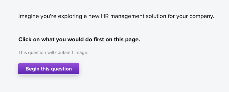
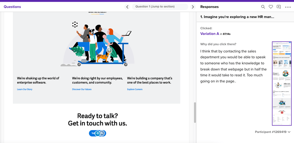
Workday is a leading provider of enterprise cloud applications for finance and human resources, helping customers adapt and thrive in a changing world. Their homepage gets more than 2 million unique visitors each month. To illustrate how Helio can be used to test homepage design, we asked an audience of human resource professionals to evaluate Workday’s homepage.
Conversion Rate Testing
Respondents were given a prompt:
Imagine you’re exploring a new HR management solution for your company. Click on what you would do first on this page.
We found 44% of visitors gravitated towards Workday’s primary blue CTA button below the fold on the homepage, which reads “View Quick Demo.” The light blue circles indicate where respondents clicked.
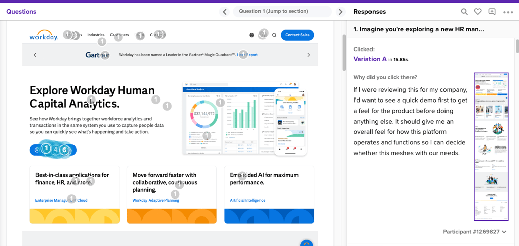
We then followed up that click test with an open-ended question, “Why did you click there?” One user offered a valuable perspective:
“If I were reviewing this for my company, I’d want to see a quick demo first to get a feel for the product before doing anything else. It should give me an overall feel for how this platform operates and functions so I can decide whether this meshes with our needs.”
—HR Professional, Helio Participant #1269827
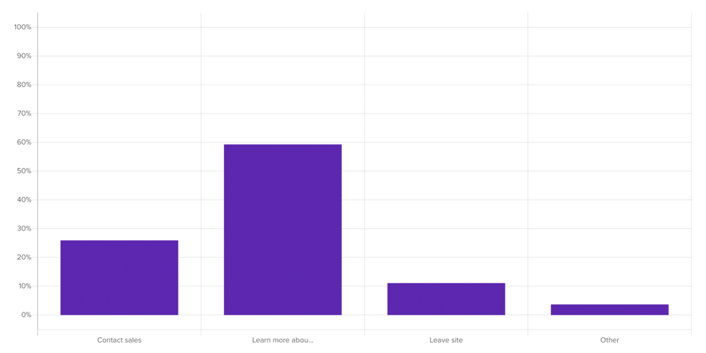
We also found that only 3% of visitors interacted with the contact CTAs at the bottom of the homepage. This insight could be applied to messaging hierarchy and placement.
The combination of the behavioral (click test) and qualitative follow-up provides a baseline for comparing the current homepage to new iterations.
Time on Page Testing
When asked to interact with Workday’s homepage, visitors spent an average of 3 minutes and 30 seconds exploring the site and explaining their decisions.
When visitors interacted with specific elements like the demos, their time of page increased significantly by 34 seconds, despite some usability concerns:
“Tried to have a look at the demo because I am interested in the analytics. It opened another page where I am to fill a short form. So I did not watch the demo.”
—HR Professional, Helio Participant #1269969
Users interacted with other demos on the Workday site beyond the homepage, but their primary CTA on the homepage deterred many who did not want to commit their info before learning more.
Bounce Rate Testing
When asked what their next likely actions would be from the homepage, 11% indicated they would immediately leave the site with little to no interaction.
Visitor explanations:
- “I attempted to look around the website but was prompted for personal info every step of the way. I prefer to look at things on my time at my own pace.”
- “It did not really convince me to contact sales.”
- “I had the information and the customer and industry opinions and experience needed to push my ideas all the way.”
Despite general willingness to learn more, Workday can improve their homepage experience to reduce bounce and increase interactions with primary CTAs.
Continuously Evolve Your Homepage Content Strategy
Your homepage content strategy shouldn’t be set in stone. It should evolve as you learn more about what connects with your audience. By adopting a minimum viable approach and engaging in continuous testing, you can craft a homepage that not only answers all the right questions but also compels your visitors to take action.
Remember, the goal of your homepage is not just to inform but to engage and convert. Keep your messaging clear, concise, and focused on the value you offer to your customers. And most importantly, never stop testing and improving.
A strategic, well-tested homepage can be your biggest asset in the digital realm. By following these guidelines and embracing the power of iteration, you’ll be well on your way to crafting a homepage that stands out in the vast sea of online content. Remember, the secret to a successful homepage content strategy is not just in the design, but in the continuous commitment to understanding and addressing your audience’s needs.
Homepage Content Strategy FAQs
Essential content includes a clear brand message, navigation menu, featured products/services, key value propositions, a call to action (CTA), and possibly recent or popular content.
A balanced mix of visuals and concise, impactful text is ideal. Visuals attract attention, while text conveys essential information. Overloading with text or having too many visuals can visitors.
Key performance indicators (KPIs) such as bounce rate, time spent on page, click-through rates on CTAs, conversion rates, and user feedback are valuable metrics to assess the success of a homepage strategy.
Personalizing content based on user behavior, demographics, or location can enhance user experience. Implementing elements like dynamic content or tailored recommendations can improve engagement.
While there’s no fixed rule, updating content periodically keeps the homepage fresh and relevant. This might include changes in promotions, featured products, or updates to reflect current trends or seasonality.