Hey there, digital trailblazers! Let’s talk about your online presence — whether you’re a seasoned marketer, a small business owner, or just dipping your toes into the digital waters, knowing the difference between landing pages vs a website probably isn’t a big deal. But here’s the million-dollar question: how do you test the purpose of your landing page and website?
First things first, let’s define our terms. A landing page is like that laser-focused salesperson who knows exactly what to say to get you to buy that one product. It’s a standalone page with one goal in mind: conversion, whether that’s signing up for a newsletter or grabbing that limited-time offer. On the flip side, a website is like a bustling marketplace. It’s a collection of pages, each serving a unique purpose, providing a wealth of information about your business or project.
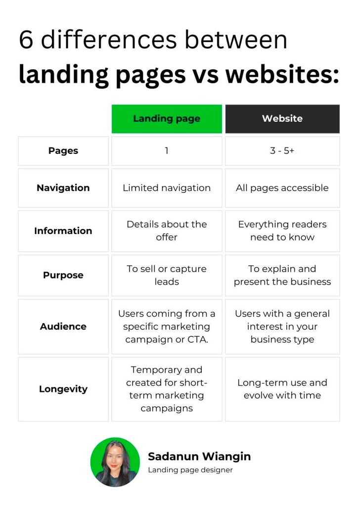
What is a landing page vs website? Sadanun Wiangin put together a simple but effective way to visualize the differences. Let’s dive into each, and discuss how to test their effectiveness.
Ensuring Your Landing Page Hits the Mark with Helio
How do we ensure your landing page effectively turns visitors into conversions? It boils down to detailed user flow and interaction testing. The goal is to create an experience so compelling that from the moment visitors arrive, they are drawn into your message and feel an irresistible urge to engage with your CTA.
Testing should zero in on the user’s pathway towards the call-to-action (CTA). This involves assessing how the landing page captures attention, communicates its message, and nudges the user towards a conversion, such as signing up or purchasing.
Now, let’s get practical. To test your landing page or website, you’ll need some tools. Think of these as your digital toolkit. Set up your tests, run them, and then sit back and watch how users interact with your page. There are heaps of tools out there – pick one that fit your needs and budget. We’re biased towards Helio. 🙂
Testing Approach → Use usability testing questions to evaluate subjects’ interaction with the CTA, use variation testing to evaluate different designs or content arrangements, and implement click maps to observe where users click and how far they scroll.
Engagement and Interaction: The Core of Landing Page Testing
To fine-tune this process, employ usability testing to gauge how users interact with your page. Do they find the navigation intuitive? Is the CTA prominently placed and compelling? Is the messaging clear and persuasive? These are the questions you’ll answer.
Testing Comprehension, Sentiment, and Behaviors of HelloFresh
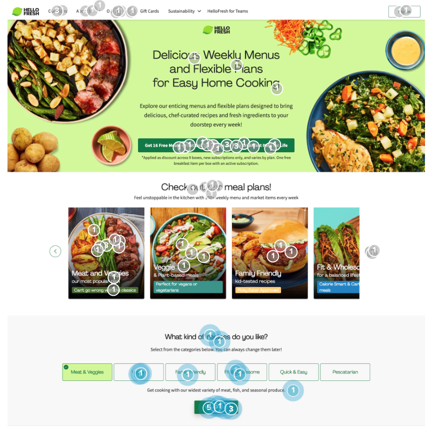
HelloFresh is on a mission to change the way people eat, forever! Through their distribution network, HelloFresh delivers hundreds of millions of meals every year.
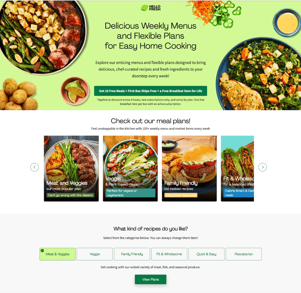
In order to accomplish this mission, they need to convert as many web users as they can on their landing pages. To illustrate how Helio can be used to test a landing page, we ran a test on one of HelloFresh’s landing pages with an audience of 100 home cooks in the US to determine visitors’ comprehension, sentiment, and behaviors on the site. View the Landing Page Optimization Framework Data Comparison. Here is the landing page we tested:
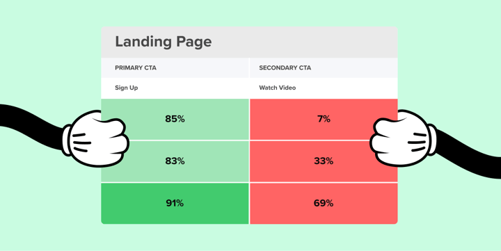
Comprehension:
HelloFresh provides an offer for 16 free meals as their primary CTA on the page, though only 2% of visitors mentioned that offer on first look. The explanation for that free meal offer also caused problems, with 33% of participants saying they felt little to no comprehension of the deal:
“It seems like it’s not very clear, or worded deliberately to be misleading.”
Helio Participant, Home Cook
Sentiment:
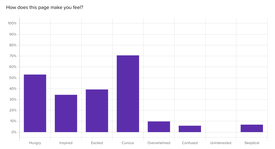
HelloFresh pushes a lot of imagery and brand personality into their landing page, so of course they want to elicit the right emotions from their audience. Using a multiple choice question, we asked our audience of home cooks how this page made them feel. We found curiosity, hunger and excitement were the most common emotions evoked by this landing page. Only 10% of participants felt overwhelmed.
Behavior
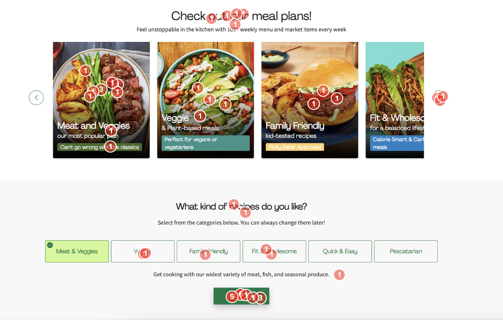
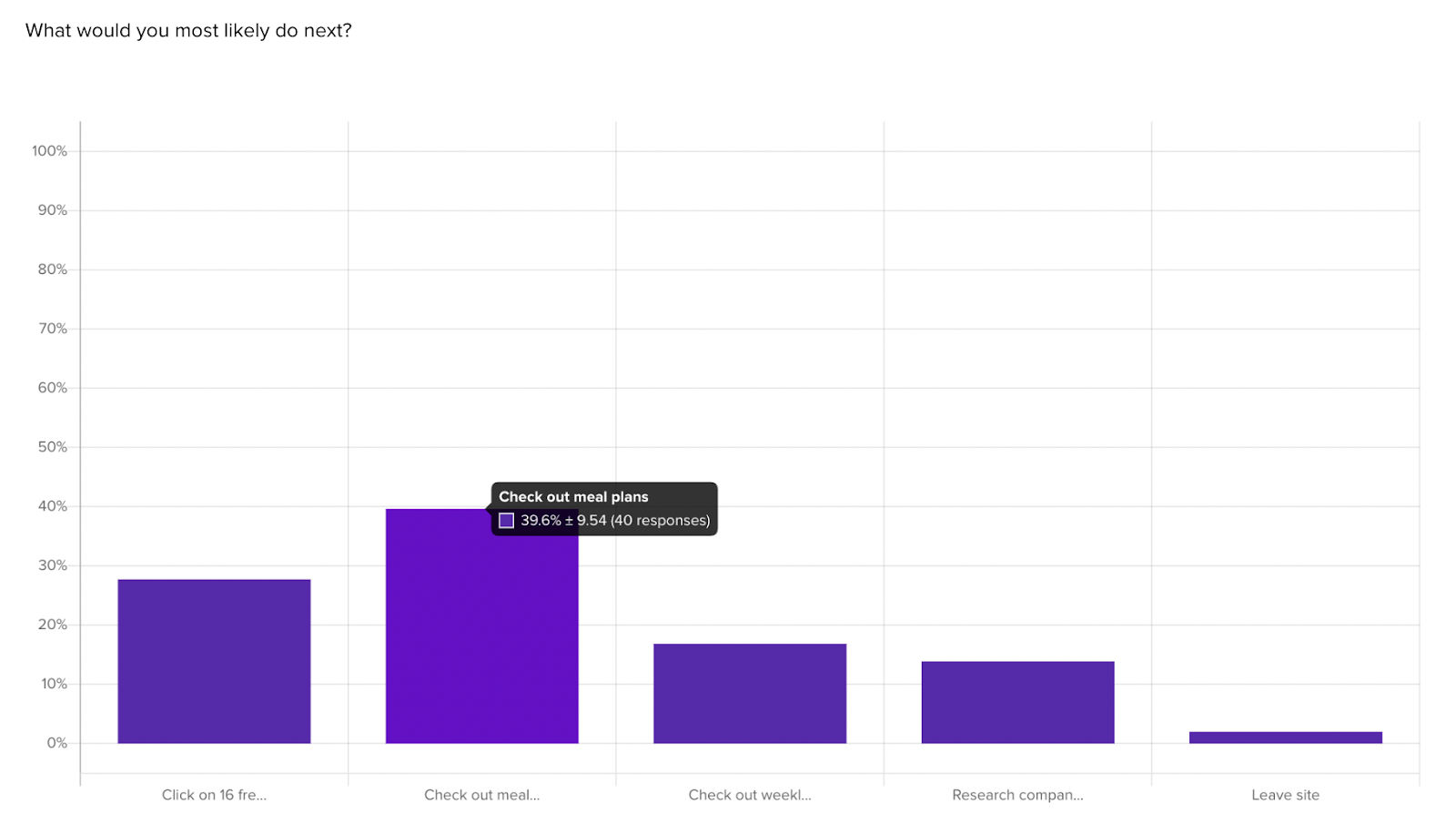
A click test showed how users would interact with the landing page on their first interaction. The largest share of visitors (27%) engaged with the meal plan carousel on first look. Though HelloFresh’s “free meal” offer gets a fair amount of attention (23%), the interactive elements like the meal plan carousel and recipe selector (24%) steal the limelight from their primary CTA:
HelloFresh’s landing page tested well in terms of visitor impressions, though they have some work to do in terms of building user comprehension and trust with their primary offer of free meals.
Using this landing page test template, test comprehension, sentiment, and behaviors across iterations of your landing pages to learn how to best engage your audience.
Design and Content: The Variables of Success
Furthermore, engage in variation testing. This involves experimenting with different versions of your landing page to see which elements—be it the headline, graphics, or the color scheme—resonate most with your audience. It’s a powerful way to discover which combinations best achieve your conversion goals.
Tracking Engagement: The Click Map Diagnostic Tool
And let’s not overlook the insights click maps provide. These tools visually represent where users click, how they scroll, and how they move through your landing page. Think of click maps as diagnostic imaging that reveals user behavior patterns, showing you what draws attention and what might be causing friction.
Landing Page Testing Checklist
When it comes to optimizing a landing page, there are numerous elements you can test to improve its performance. Here’s a comprehensive list of items you can consider for testing:
- Headline: Assess the impact of different headlines on user engagement and conversion rates.
- Subheadline: Test various subheadlines for clarity and their ability to complement the main headline.
- Call-to-Action (CTA): Experiment with different CTA button colors, sizes, wording, and placement.
- Images and Videos: Determine which images or videos resonate more with your audience and lead to higher conversion.
- Page Layout: Modify the layout to test how the arrangement of elements affects user flow and conversion.
- Navigation Links: Test the inclusion or removal of navigation links to see if they distract from or contribute to the conversion goal.
- Content: Experiment with different lengths and styles of copy to see what best communicates your message.
- Forms: Test the form length, fields, and types to balance ease of use and information gathering.
- Social Proof: Include testimonials, reviews, or logos of past clients to test how social proof affects trust and credibility.
- Trust Signals: Try adding certifications, guarantees, or security badges to see if they increase user trust.
- Color Scheme: Assess how color schemes impact user emotions and actions.
- Offer: Test different offers or promotions to see which is more compelling to your audience.
- Urgency and Scarcity: Implement countdown timers or limited offers to test for increased conversion through urgency.
- Loading Speed: Analyze how changes in page loading times affect bounce rates and conversions.
- Interactive Elements: Test interactive elements like chatbots or quizzes to engage users and encourage them to convert.
- Typography: Experiment with different fonts and sizes for readability and aesthetic appeal.
- Responsive Design: Ensure the page is optimized for different devices and test variations across mobile, tablet, and desktop. Read more in this article about responsive landing pages.
- Exit-Intent Popups: Test popups that appear when a user is about to leave the page to see if they can recover potential abandonments.
- Animations: Add subtle animations to see if they improve engagement without distracting from the main message.
- Upsells and Cross-Sells: Test the placement and timing of upsell or cross-sell offers to maximize the value of conversions.
Each of these elements can be tested, meaning you compare the performance of one variation against another to determine which one yields better results. It’s essential to change and test one element at a time to accurately measure the effect of each change on your landing page’s performance.
By meticulously testing and refining your landing page based on real user data, you can enhance its effectiveness and ensure that it serves its purpose as a focused, conversion-centric component of your marketing strategy.
Analyzing Your Website: The Journey Matters
Testing a website requires a methodical approach. Define clear objectives: What do you want to learn or improve? Once your goals are set, select the appropriate questions for the job. For user journey analysis, heatmaps and session recordings can provide visual insights into how users interact with your site.
Helio’s tools facilitate remote sessions with users for card sorting, allowing you to gather data quickly and efficiently. And for task analysis, setting up specific user tasks and scenarios with usability questions to help you measure how users complete these tasks.
Let’s dive into an example, but first, let’s review a quick step-by-step on how to set up and conduct these website tests:
- Identify the Goals: What are the critical elements you want to test? Conversion, information findability, navigation ease?
- Choose Your Questions: Pick from various analytics tools, usability testing platforms, and session recording software.
- Recruit Participants: Find users that match your target audience for testing, or use Helio’s available audiences.
- Conduct the Test: Run the tests to cover the various aspects of user interaction you’re interested based on
- Collect Data: Gather the results from your reports page
- Analyze: Look at the data to identify trends, pain points, and opportunities for improvement.
User Journey and Navigation Testing
Testing a website is a more complex undertaking compared to a single landing page. It’s about examining a user’s journey through your site—the path from entry to exit, with all the twists and turns in between. The key here is to ensure users can intuitively navigate your site, find the information they seek, and complete their intended tasks without hiccups.
To get started, map out the typical paths you expect users to take. This might be the flow from the homepage to a product page and then to a contact form or checkout. Use analytics to track actual user paths and identify where they diverge from the expected journey. Look for patterns—where do users get stuck? Where do they drop off? This data is gold for understanding how to streamline the navigation and make the user’s journey as smooth as possible.
Card Sorting: Architecting Your Information
Another critical aspect of website testing is information architecture optimization, and that’s where card sorting comes in. This technique involves participants organizing topics into categories that make sense to them, which helps you understand their thought processes and preferences.
By engaging real users in card sorting sessions, you can gain insights into how to structure your content and menus in a way that feels natural to your audience.
Task Analysis: Ensuring Efficiency
Task analysis is yet another powerful tool in your website testing arsenal. It’s about making sure users can accomplish their goals efficiently on your site. This involves identifying key tasks that users need to complete and testing how effectively and quickly they can complete them.
For example, if purchasing a product is a primary task, how many steps does it take for a user to go from product discovery to final checkout? Streamlining these processes can significantly enhance the user experience and conversion rates.
Interpreting Test Results: Making Data-Driven Decisions
The final, and perhaps most crucial step, is analyzing the data collected from your tests. This analysis should guide you toward making informed decisions to enhance your website. Look beyond the numbers; qualitative insights are often hidden in user comments, feedback, and behaviors observed during testing sessions.
When reviewing test results, consider the following:
- User Behavior: Are there common patterns in how users navigate your site?
- HelloFresh Example: The majority of visitors engaged with the meal plan carousel (27%) or recipe selection guide (24%) while exploring the landing page.

- HelloFresh Example: The majority of visitors engaged with the meal plan carousel (27%) or recipe selection guide (24%) while exploring the landing page.
- Conversion Points: Where are users taking the desired action, and where are they dropping off?
- HelloFresh Example: Once visitors are done with the landing page, their most common action is to explore meal plans rather than engaging with the primary CTA offering free meals.

- HelloFresh Example: Once visitors are done with the landing page, their most common action is to explore meal plans rather than engaging with the primary CTA offering free meals.
- Task Completion: How efficiently can users complete essential tasks?
- HelloFresh Example: The primary CTA on the landing page offering free meals was the 3rd most clicked on feature (23%), behind the meal plan carousel and recipe selector.

- HelloFresh Example: The primary CTA on the landing page offering free meals was the 3rd most clicked on feature (23%), behind the meal plan carousel and recipe selector.
- Feedback: What are users saying about their experience?
- HelloFresh Example: The landing page did a great job of engaging visitors and making them feel hungry and eager to learn more, though the clarity of their special offerings can use some work.
“I’m curious on the meal selection, can they really meet my dietary restrictions. I haven’t eaten yet so all this food is looking delicious.”
- HelloFresh Example: The landing page did a great job of engaging visitors and making them feel hungry and eager to learn more, though the clarity of their special offerings can use some work.
Use this information to create a list of action items. Prioritize these based on their potential impact on user experience and business outcomes. Remember, the goal is to make data-backed improvements that will streamline the user journey, making your website not only a place to visit but a place where visitors accomplish what they came for with ease.
Landing Page and Website Testing Common Mistakes
When it comes to landing page and website testing, a few common mistakes can undermine your efforts:
- Testing Too Many Elements at Once: This can make it difficult to pinpoint which change influenced the results. Stick to one change at a time for clarity.
- Ignoring Mobile Users: With the increasing prevalence of mobile browsing, failing to test on mobile devices can leave a significant gap in your data.
- Neglecting Analytics: Not using analytics to track user behavior means missing out on valuable insights that could inform your testing strategy.
- Overlooking User Feedback: Real user feedback is invaluable. Disregarding it means missing opportunities to improve the user experience.
- Inconsistent Testing: Sporadically testing or changing testing methods can result in inconsistent data, making it hard to draw reliable conclusions.
- Not Defining Clear Objectives: Without clear objectives, you won’t know what you’re testing for, making it hard to interpret results.
- Failing to Follow Up: Not implementing changes based on test results is a lost opportunity for improvement.
- Lack of Patience: Not allowing enough time for tests to run can result in premature conclusions.
By avoiding common mistakes and adhering to best practices, you can ensure that your testing is as effective as possible, leading to better performance, higher conversion rates, and an improved user experience.
Landing Page vs Website Test Wrap Up
Testing a landing page versus a website involves distinct strategies due to their differing roles and objectives.
- Landing Page Testing is focused on conversion optimization. It’s about ensuring that every element on the page leads the visitor toward taking a specific action, whether that’s making a purchase, signing up for a newsletter, or downloading a resource. The tests are typically more controlled and concentrated, focusing on the call-to-action (CTA), message clarity, and the page’s overall persuasive power. A/B testing, click-through rates, and conversion tracking are commonly used metrics.
- Website Testing, on the other hand, is about the overall user experience and journey through the entire site. It’s broader, considering how users navigate from page to page, the ease with which they find information, and how effectively they can complete tasks. This form of testing will often use tools like card sorting to optimize site architecture, task analysis for understanding efficiency, and heat maps for a broader view of how users interact with multiple pages.
In essence, while landing page tests are conversion-centric, website tests are experience-centric. Both require a thoughtful approach, but the key difference lies in the scope and the end goal of what you’re trying to achieve with each. Implementing the right testing strategy for each can help in crafting a more effective online presence, leading to a deeper understanding of your audience and ultimately, better performance metrics for your business.
There you have it! Testing your landing page’s and website’s purpose doesn’t have to be a chore. It’s your path to understanding your visitors and giving them what they want. Use these strategies, test smartly, and watch as your online presence flourishes.
FAQs: Testing Landing Pages vs Websites
A landing page is a single, focused page designed to convert visitors into leads or customers, typically through a specific call-to-action (CTA). A website is a collection of interconnected pages that provide a broader view of a business or project, aiming to inform and engage visitors.
Effective landing page testing zeroes in on the user’s interaction with the CTA. This involves usability testing to evaluate the CTA’s effectiveness, variation testing to find the best design or content arrangement, and click map analysis to observe user engagement and behavior.
Key elements to test on a landing page include the headline, subheadline, CTA button design, images and videos, page layout, content length and style, forms, social proof elements, trust signals, color scheme, special offers, loading speed, responsiveness to different devices, and any exit-intent popups or animations.
Website testing is broader and focuses on the user’s overall journey and experience across multiple pages. It aims to optimize navigation, information findability, and task efficiency, often employing methods like card sorting for information architecture and task analysis to evaluate user task completion.
Common mistakes include testing too many elements simultaneously, ignoring mobile users, neglecting analytics, overlooking user feedback, inconsistent testing, not setting clear objectives, failing to implement changes based on test results, and not allowing enough time for tests to run.
Best practices involve setting clear testing objectives, changing and testing one element at a time, embracing A/B testing, considering user experience, using the right testing tools, analyzing both qualitative and quantitative data, and iterating based on the data collected.
Earlier in this blog post, we mentioned a real-world example testing one of HelloFresh’s landing pages.