
Data-informed product design is where creativity meets the rigor of data- transforming how we approach and understand design. In this detailed guide, we’ll explore the nuts and bolts of crafting designs informed by data, ensuring your product isn’t just visually appealing and functionally remarkable.
Data-informed design is more than a trend; it’s a shift in the expectations of how design needs to be shaped. It’s about leveraging user experience data, product design analytics, and customer insights to shape your design decisions. This approach ensures your products resonate with your users and meet real needs.
Everyone wants to do it, but no one really knows how to do it well. The biggest problem is that most product designers don’t know where to start when it comes to working with data, including: how to know what data is important, how to tell if something is off and how to action it.

Head of Product Design, Manual
Why Embrace Data Informed Design?
Design leader Filippos Protogeridis created an excellent primer for designers and product teams looking to create lift in their work. His guide is a great overview of incorporating data into your design work.
Data-informed design stands out for its ability to turn abstract numbers into actionable insights. Tapping into UX data analysis and market trend analysis allows designers to make decisions based on real, quantifiable user interactions and feedback.
What’s the difference between data informed design and data driven design?
Data informed design and data driven design are two approaches that utilize data in the decision-making process, but they differ in how much they allow data to dictate the design choices.
Data informed design uses data as a significant input among others in the design process. While data informs decisions, it does not completely dictate them. Designers also rely on intuition, experience, user feedback, and other qualitative factors to make decisions. It’s more about using data to support creative and user-focused decisions rather than letting data have the final say.
In a data driven design approach, decisions are based primarily on data analytics and metrics. It prioritizes quantitative data over qualitative judgments, meaning the numbers have a larger influence on the end result. The design decisions are made by objectively analyzing user behavior data, conversion rates, and other measurable factors.
In essence, data informed design respects the balance between creative intuition and empirical evidence, while data driven design leans heavily towards letting the data lead the way.
In this article we’re going to explore data informed design.
The Process: From Data to Design Using Helio
Embarking on a data-informed design process is a journey of discovery and innovation. Let’s break it down:
1. Setting Clear Objectives
The Importance of Clear Goals: Defining clear objectives at the onset is crucial. It’s like setting a destination for your design journey. Ask yourself: What specific problems are you solving? Are you aiming to enhance user engagement, streamline the user interface, or improve the overall user experience? Your objectives should be SMART: Specific, Measurable, Achievable, Relevant, and Time-bound.
Aligning Goals with Business Objectives: Ensure your design goals align with broader business objectives. This alignment guarantees that your design efforts contribute directly to the product’s overall success.
When designing a digital product like a banking app, starting with clear, well-defined objectives is vital. These goals will guide your entire design process, from data collection to final product tweaks. Let’s use a consumer digital banking app, as highlighted by Filippos, as an example to understand how to align design objectives with business and product metrics.
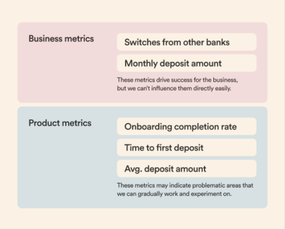
Business Metrics vs. Product Metrics
Business metrics, such as ‘Switches from other banks’ and ‘Monthly deposit amount,’ drive the company’s success. They reflect the broader business impact of your design choices but aren’t always directly influenced by design alone. For instance, a spike in users switching to your digital banking app from other banks might result from your marketing efforts or broader market trends.
On the other hand, product metrics like ‘Onboarding completion rate,’ ‘Time to first deposit,’ and ‘Average deposit amount’ are more tightly coupled with the user experience and can be directly impacted by design decisions. These metrics can reveal problematic areas where design interventions can make a significant difference. For instance:
- Onboarding Completion Rate: A high abandonment rate during onboarding could indicate a complex or unengaging process. Your design objective could be to streamline the onboarding experience, making it as intuitive and frictionless as possible.
- Time to First Deposit: If there’s a long delay before a new user makes their first deposit, it could suggest that users don’t feel confident or motivated to do so. In response, you might set a design objective to build trust through design elements such as clear information architecture, reassurances of security, and testimonials.
- Average Deposit Amount: This metric can inform design objectives around encouraging higher deposit amounts. For instance, if data shows that users typically deposit minimal amounts, you might explore design strategies to incentivize larger deposits, such as progressive disclosure of benefits or a tiered rewards system.
Helio can help you determine how your product metrics impact your business’s empirical metrics. With a combination of quant and qual feedback, Helio helps you produce signals that speak to successes or failures in user experience:
Components like onboarding completion rate, time to first deposit, and average deposit amount can all be predicted through audience discovery, and how your design impacts those decisions can also be measured.
Aligning Design Objectives with Metrics
Setting clear objectives involves choosing which metrics to influence through design and understanding how design changes can impact them. A good starting point is to:
- Identify Key Metrics: Choose metrics most indicative of the user experience quality and the business’s health. These should be your primary focus.
- Understand User Behavior: Dive into why these metrics are at their current levels. Use qualitative data to determine the root of user behaviors influencing these numbers.
- Set Actionable Goals: Based on your understanding, set specific design goals. For example, if the onboarding completion rate is low, your objective might be redesigning the onboarding flow to simplify steps and clarify the value proposition.
- Create a Hypothesis: For each design objective, hypothesize how a design change will affect the metric. For instance, “By simplifying the onboarding process, we hypothesize that the onboarding completion rate will increase by X%.”
- Measure and Iterate: Implement the design changes and measure their impact. Use A/B testing to validate your hypotheses, and be ready to iterate based on the results.
By aligning your design objectives with clear metrics, you create a focused path forward that’s both measurable and aligned with the product’s overall success. In the context of a digital banking app, this means making design decisions that look good, enhance the user’s experience, and encourage the financial behaviors that drive business success.
2. Data Collection: The Backbone of Your Design
Identifying Relevant Data Sources: Data collection is more than just gathering numbers; it’s about finding the right data. This involves identifying which metrics are most relevant to your objectives. For instance, if your goal is to improve user engagement, focus on metrics like session duration, bounce rate, or interaction rates on key features.
Qualitative vs Quantitative Data: Both qualitative (user interviews, feedback) and quantitative (user behavior analytics, heat maps) data play a vital role. While quantitative data offers hard numbers, qualitative data provides context and deeper insights into user behavior and preferences.
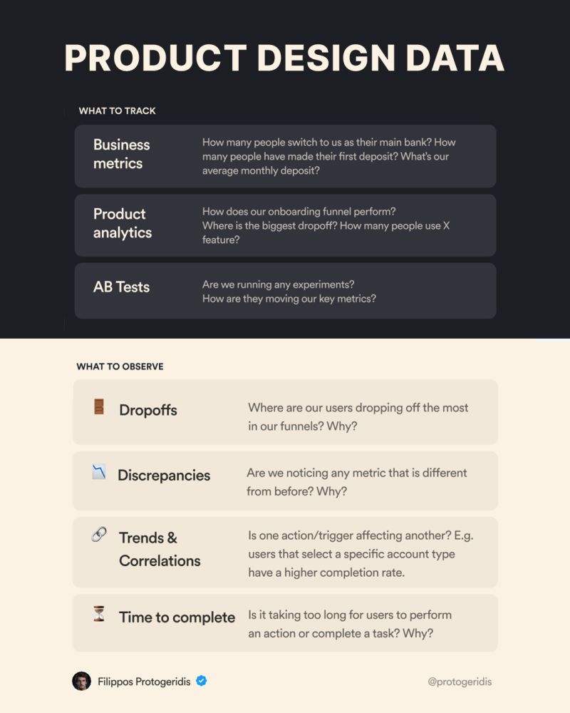
Data is the cornerstone of informed product design, especially for a digital banking app where user trust and experience are paramount. Let’s break down what business metrics, product analytics, and AB tests entail and how they contribute to a well-rounded design strategy.
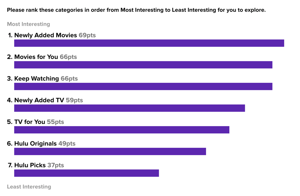
Helio provides audience feedback in the form of both quantitative and qualitative feedback. Quant questions are great for understand percentages and discrepancies in how participants react to a given set of options, such as ranking tests:
Qualitative feedback is layered throughout Helio data, both in the form of direct open response questions, and follow-ups for your quantitative tests:
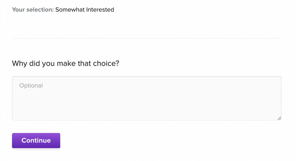
This allows you to learn the ‘why’ for each decision made by participants throughout your tests, from click interactions to rank orders and card sorts.
Business Metrics
Understanding the Financial Ecosystem: Business metrics such as the number of people switching to the bank as their main account, first deposit rates, and average monthly deposits provide a bird’s-eye view of the financial health of the product. Tracking these metrics offers insights into the macro impact of your design decisions on user behavior and the bank’s growth.
Setting Benchmarks: By establishing benchmarks for these metrics, you can set targets for your design initiatives. For instance, if the goal is to increase the number of people who make their first deposit, your design changes should aim to reduce friction and build trust during the initial user journey.
Product Analytics
Onboarding Funnel Performance: How smoothly are users navigating through the onboarding process? Where is the biggest drop-off? This data is critical in pinpointing where users face challenges and what might be causing friction.
Feature Usage: Understanding how and how often users engage with specific features, such as an in-app budgeting tool, can guide you in refining these features or introducing new ones.
Creating a Data-Rich Environment: The example dashboard visualizes these product metrics, allowing for real-time tracking and analysis. By having such data at your fingertips, you can make swift, informed decisions that align closely with user needs and behaviors.
Multivariate Tests
Experimentation as a Design Tool: AB tests are vital for evaluating the effectiveness of different design approaches. Are the experiments you’re running affecting the key metrics in the way you anticipated?
Data-Driven Iterations: By continuously running AB tests and analyzing the outcomes, you can iterate on your design with confidence, knowing that actual user data validate each change.
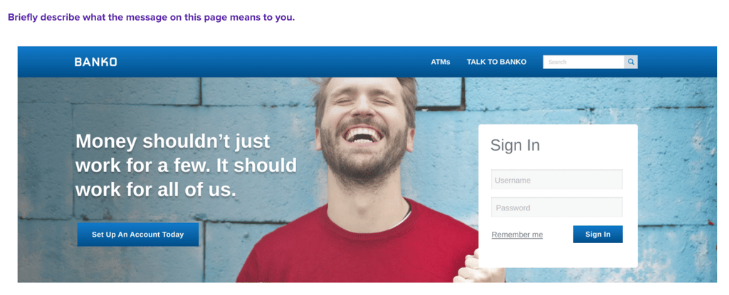
With Helio, multivariate tests can be run before development time and dollars are spent launching two iterations of something live. Consumer banking app Banko did this by putting multiple variations of their landing page hero messaging to the test using an audience of Bank Members in the US.
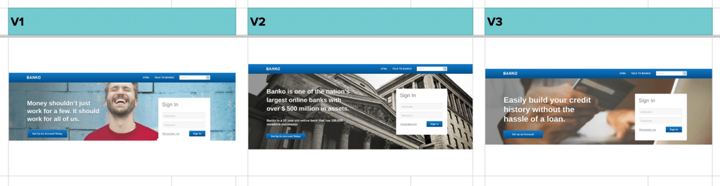
Each iteration of the hero content was put to the test with 100 participants, gauging comprehension and emotional reaction to the different headlines:
With the 3 separate tests run, the results were loaded into a data comparison framework for easy evaluation across the variations:
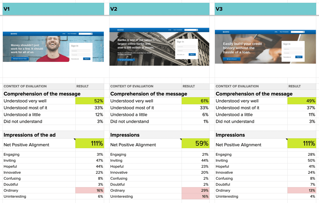
Banko learned that the use of a data point (‘$500 million in assets’) was confusing in V2, as users had no context of whether that number is impressive and helpful, or not. V1 and V3 produced very similar reactions from participants, providing multiple options for Banko to move forward with.
By using multivariate testing, companies like Banko can curb the need to spend development dollars pushing two versions live, and instead gather crucial feedback from an audience before launch.
Leveraging Dashboard Insights
Incorporating dashboard tools like Mixpanel, Google Analytics, Amplitude, or Tableau, as shown in the image, offers a comprehensive view of all these metrics. The dashboard example illustrates key performance indicators (KPIs) such as download rates, account creation, and first deposit times.
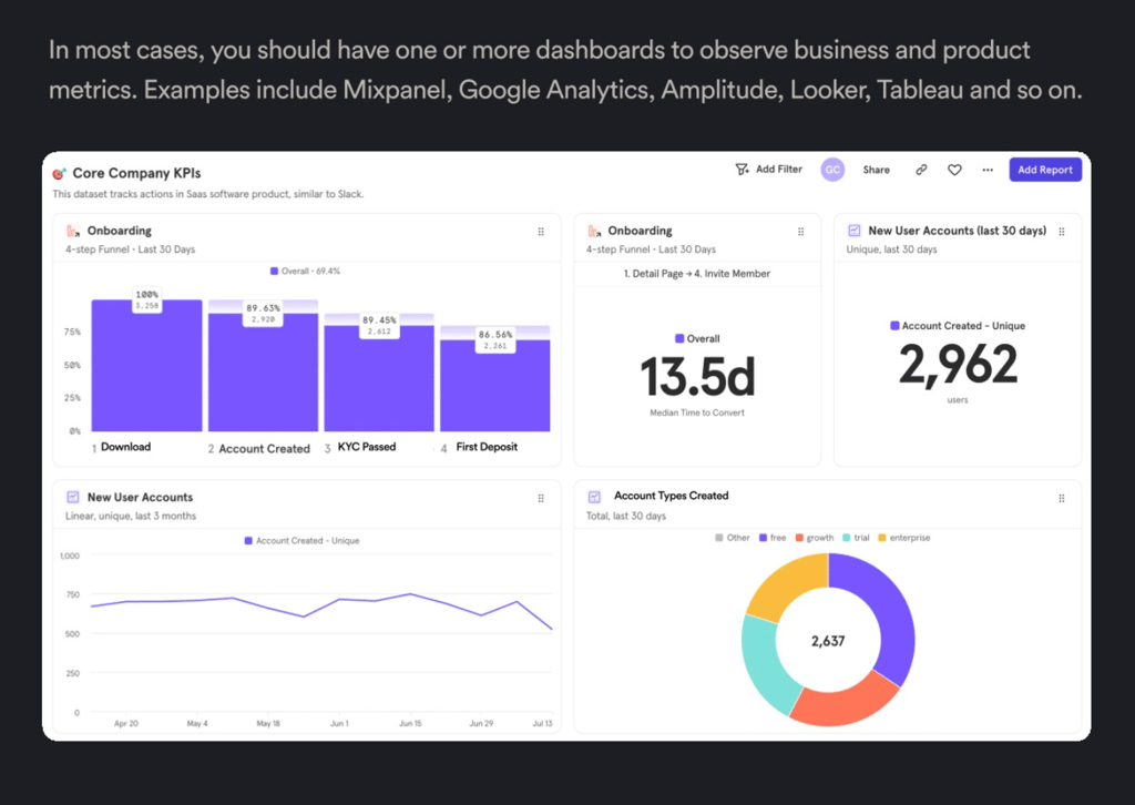
Real-Time Decision Making: With such a dashboard, you can monitor the immediate effects of design changes on your KPIs and adjust your strategy accordingly.
Holistic View: By displaying a combination of download trends, account creation stats, funnel drop-off points, and deposit patterns, the dashboard allows for a holistic analysis of the product’s performance.
By focusing on these three tracking areas, you ensure that every design decision is backed by robust data, from high-level business outcomes to the granular details of user interactions. The dashboards serve as your control center, giving you the insights needed to create a seamless, intuitive, and engaging digital banking experience.
3. Dive into Data Analysis
Interpreting Data for Insights: Data analysis involves transforming raw data into meaningful insights. This step is crucial for understanding the ‘why’ behind user behaviors. Utilize tools like user segmentation to understand different user groups or cohort analysis to see how behavior changes over time.
In data-informed product design, particularly for digital banking apps, diving deep into data analysis is not just about collecting numbers—it’s about uncovering the story behind them.
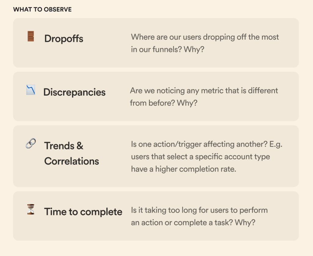
Look for trends and patterns that inform your design decisions. For example, if data shows that users frequently abandon a process at a certain stage, it could indicate a usability issue that needs addressing. Let’s expand on these points.
Observing Dropoffs
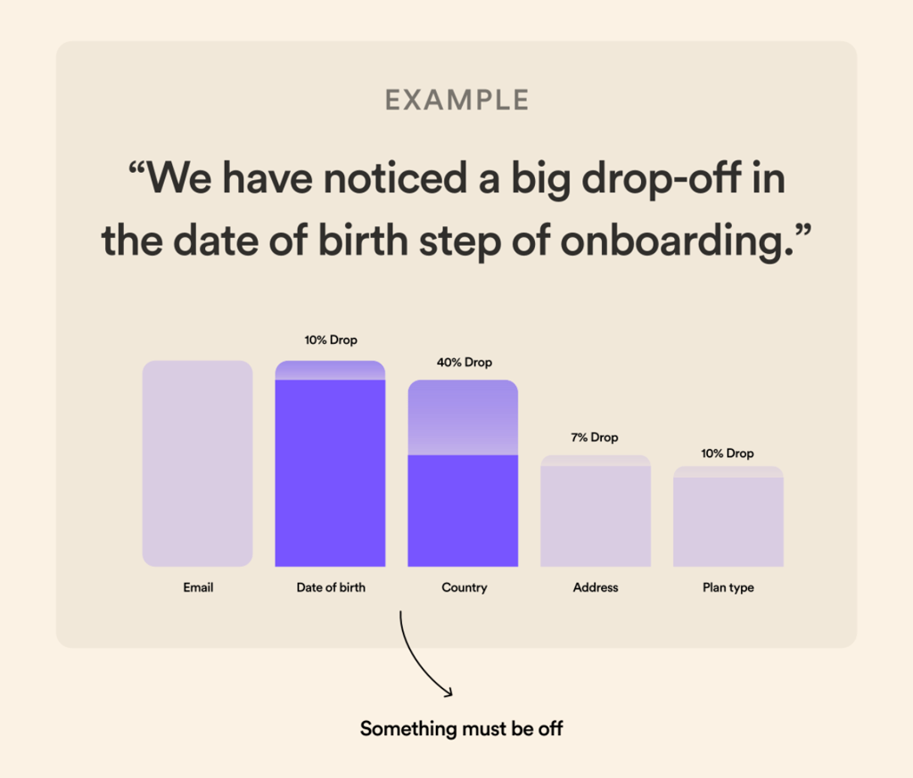
- Deciphering the Funnel: The onboarding funnel is where users first experience your app. Significant drop-offs at certain steps, like the example in the date of birth input, can be a red flag. It’s essential to ask why users are leaving. Is it due to a lack of readiness to commit, confidence in the product, or because of the process is not as intuitive as it should be?
- Tailoring the Design to User Needs: Once we identify the reasons behind drop-offs, we can tailor the design to mitigate these issues. For instance, if users are dropping off at the date of birth step, we need to ensure they understand why this information is necessary, perhaps by providing contextual information or streamlining the step to make it less intrusive.
Analyzing Discrepancies
- Detecting Changes: When metrics suddenly change, it’s crucial to understand the underlying causes. Discrepancies might signal a bug, an external market factor, or a new feature that’s not performing as expected.
- Responsive Design Adjustments: By being alert to these discrepancies and investigating them promptly, we can make responsive adjustments. For example, if a new update has led to a drop in user engagement, we can quickly iterate on the design based on user feedback and data insights.
Understanding Trends & Correlations
- Uncovering Hidden Patterns: Trends and correlations can often reveal insights that aren’t immediately obvious. For example, the data might show that users who choose a premium account are more likely to complete the onboarding process.
- Strategic Design Decisions: Recognizing these patterns can inform strategic design decisions, such as highlighting premium account benefits early in the user journey to increase onboarding completion rates.
Time to Complete Actions
- Evaluating User Effort: The time users take to complete actions is a critical measure of user experience. Long completion times could indicate that a task is too complex or that the reward for completing it isn’t clear or compelling enough.
- Optimizing User Flow: By analyzing these times, we can pinpoint where users struggle and simplify those steps or provide additional incentives to complete the process.
Example: Onboarding Drop-off
In the banking example below significant drop-off at the date of birth step during onboarding. This insight is invaluable. It tells us something about this step isn’t sitting right with users. By addressing this specific issue—whether it’s through redesigning the input method, clarifying the need for the information, or adjusting the step’s placement in the process—we can enhance the user experience and improve completion rates.
One of Banko’s key onboarding opportunities allows new users to take a questionnaire that sets them up for tracking their financial health and getting financial advice from the Banko team.
Banko put 100 participants from their audience through the onboarding flow, tracking the levels of success for completing each question:
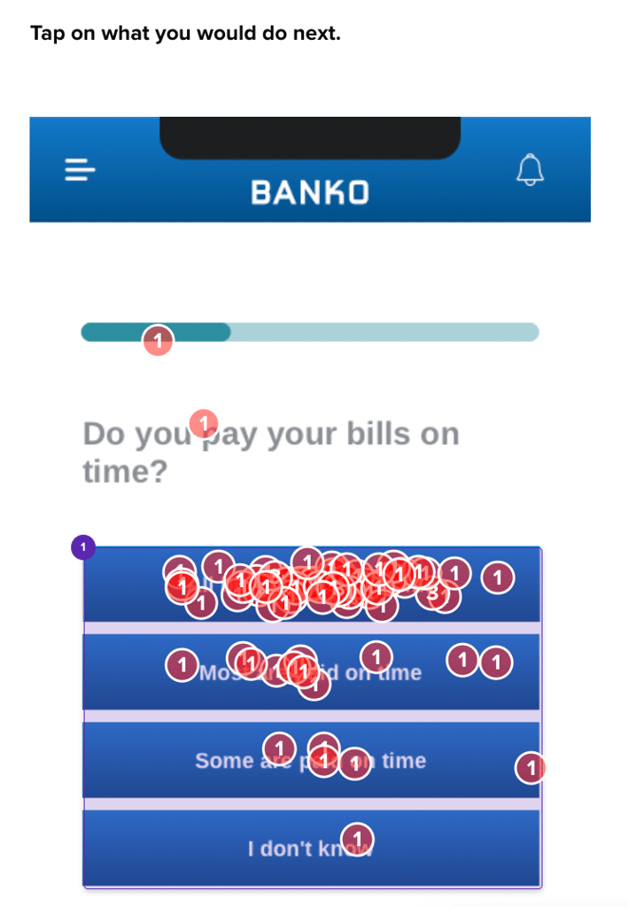
For users who decided to skip certain parts of the questionnaire, Banko temporarily took them out of the flow to understand more about why they didn’t want to engage with those questions.
This testing revealed the usability success of their onboarding feature, and the reasoning behind user’s potential hesitation:
“not sure if I feel comfortable filling that out after just signing up”
– Bank Member (US)
The design team can adjust the onboarding flow with this knowledge. Perhaps they move the bills question to a later point or better communicate the need for this information, emphasizing security and privacy to build trust.
By understanding drop-offs, discrepancies, trends, and completion times, we can create a user-centric design that looks good and functions seamlessly, encouraging user retention and satisfaction.
4. Informed Design Decisions: Understanding Your Users
Use the insights gained from data analysis to inform your design decisions. This could mean simplifying navigation, adding more engaging content, or reworking an entire feature based on user feedback.
Gathering and analyzing data is just one side of the coin; understanding the human element behind the data is where true insights are found. Their are two tiers of user engagement methods—low effort and high effort—each critical to deepening our understanding of user interactions with digital banking apps.
Low Effort: Quick Insights
- Helio Surveys: These are a quick way to get user feedback. We can gather immediate insights into user behavior and expectations by asking pointed questions within the app.
- User Recordings: Observing how users interact with the app through recordings can highlight where they experience confusion or delight, providing real-time feedback on design efficacy.
These methods are classified as low effort because they can be integrated seamlessly into the user experience without requiring significant time investment from the user or the research team.
High Effort: In-Depth Understanding
- User Interviews: Conducting interviews allows for a deeper dialogue with users, giving us the context behind their actions and their choices within the app.
- Diary Studies: Asking users to keep a diary of their interactions over time can provide longitudinal data on how they use the app daily, revealing patterns that may not be immediately apparent.
These high-effort techniques require more planning and resources but yield a richer, more nuanced understanding of user needs and experiences.
The insights from both low-effort and high-effort methods inform a cycle of continuous improvement. Design changes based on user feedback are implemented, tested, and refined.
Understanding your users through these engagement methods provides a clear direction for data-informed design decisions. The insights gained from quick surveys and in-depth studies can be transformative, leading to a product that truly resonates with users and effectively meets their needs.
5. Test, Learn, Iterate: Taking action with Ideation and Experimentation
The Role of Testing: Once changes are implemented, testing becomes vital. Use A/B testing to compare different design versions and gather more data on user preferences and behavior.
Iterative Design: Remember, design is an iterative process. Each test provides new data and insights, which should be used to refine further and improve the design. This cycle of testing, learning, and iterating helps continuously enhance the product to meet user needs better.
Ideation Methods
After understanding the data and the user, it’s time to take action. The ideation process and the experimental approach are necessary for effective data informed product design, particularly for digital banking apps.
- Journey Mapping: Understanding the user’s journey is essential. By mapping out the key questions, motivations, and frustrations users have at each step, designers can create more empathetic and user-focused designs.
- Brainstorming: Gathering the team to brainstorm on a whiteboard allows for the free flow of ideas. It’s important to explore as many possibilities as possible without judgment, to foster creativity and innovation.
- Sketching: Techniques like Crazy 8’s, which involve quickly sketching eight different ideas in a short period, can lead to innovative and radical solutions that might otherwise be overlooked in a more constrained thinking process.
Experimentation
- Launching Experiments: With a hypothesis in hand, like moving the date of birth step to a later point in the onboarding process to increase user confidence, it’s time to test it. AB tests and other experiments help determine the impact of design changes on key metrics.
- Reality of Testing: It’s vital to acknowledge that not all experiments will yield positive results. In reality, most won’t work as expected, but each failed experiment is a learning opportunity.
- Learning from Success and Failure: The key is to learn from both successful and failed experiments. Often, it is the accumulation of these learnings that leads to a breakthrough in the design that can significantly enhance user experience and product performance.
Example in Action
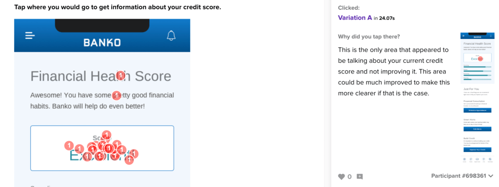
Banko used Helio’s first click testing to track the success of their experimentations and iterations using the Interaction Matrix method:
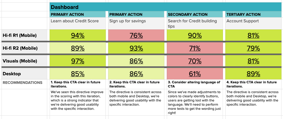
Each colored box in the framework above represents the percentage of successful participants when attempting key actions across the product experience.
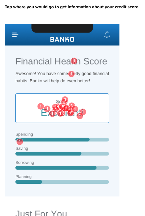
For instance, Banko’s primary action on the dashboard to learn about your credit score, tested well across each variation with over 85% of user success:
While other actions were less clear and required a few rounds of iteration to get right on the page:

The decisions made by user research are much more clear when they can be tracked with quantifiable metrics across multiple versions of the team’s iterations.
View the Banko Interaction Matrix
Taking action in data informed product design means embracing a cycle of ideation, experimentation, and learning. It requires creativity, a willingness to test assumptions, and the resilience to learn from failures. By doing so, designers and product teams can continuously refine their products to serve their users better and achieve business objectives.
Crafting Data Informed Product Design
Navigating the world of data can be daunting. The key challenge is to avoid getting swamped by data overload. Focus on data that directly impacts your design objectives.
With responses gathered from your target audience, Helio data provides signals that speak to how your ideal customer profile will react to certain concepts and designs. The combination of quantitative and qualitative feedback removes the guessing game by revealing both how your users will react, and why they make those decisions.
Data informed product design is an iterative process that balances the quantitative aspects of data analytics with the qualitative insights gained from user engagement. By aligning on metrics, accurately tracking them, identifying problem areas, validating issues, ideating solutions, and learning from experiments, teams can create products that truly meet user needs and drive business success.
- Align on Key Metrics: Begin by setting clear objectives for both business and product. Understand the difference between business metrics (like monthly deposits) and product metrics (like onboarding completion rate) and how they relate to user experience and overall business goals.
- Track Metrics Accurately: Implement systems to accurately track these metrics. Use tools like dashboards to monitor business metrics, product analytics, and AB test results in real-time.
- Identify Problem Areas: Analyze the data to identify drop-offs and discrepancies. For example, a significant drop-off at the date of birth input step may indicate a problem area needing attention.
- Validate with Qual/Quant Methods: Use qualitative and quantitative methods to validate your findings. Low-effort methods like in-app surveys or user recordings can provide quick insights, while high-effort methods like user interviews or diary studies offer deeper understanding.
- Ideate as a Group: Engage in group ideation methods like journey mapping, brainstorming, and sketching to develop innovative solutions to the problems identified.
- Launch, Experiment, and Learn: With your hypotheses set, launch experiments such as AB tests to see the impact on your key metrics. Remember, not all experiments will work, but each offers valuable learning opportunities.
Data Informed Design
Data-informed product design marries the art of design with data science. It’s about making decisions that are not just visually pleasing but are underpinned by solid, actionable data. You can create designs that truly resonate with your audience by incorporating customer experience metrics, analytical design processes, and continuous learning from user data!
Data Informed Product Design FAQs
Data informed product design integrates user experience data and analytics into the design process to create products that resonate with users’ needs and behaviors.
Aligning on key metrics ensures that design decisions are focused and can be measured against specific goals, leading to a more successful product.
Use analytical tools like Mixpanel or Google Analytics to monitor real-time data, and ensure your tracking setup reflects the user journey accurately.
Identify the issue, gather qualitative and quantitative data to understand it better, and then brainstorm with your team to find potential solutions.
Qualitative methods like user interviews provide context and insights into user behavior, while quantitative methods offer measurable data to support design decisions.
Ideation generates creative solutions to problems identified through data analysis, utilizing methods like brainstorming and sketching to innovate.
Experimentation, such as A/B testing, allows you to test hypotheses about design changes and see their actual impact on user behavior and product performance.
Analyze the results to understand why it failed, learn from the experience, and use those learnings to inform future design iterations.
Continuous discovery and iteration is key in data informed product design; constantly test and refine based on user feedback and data analysis.
While not a guarantee, data informed design significantly increases the likelihood of success by ensuring that design decisions are user-focused and objective.