Case Study
IU Online Brand Imagery Lift
Established the strongest brand imagery for Indiana University Online using multivariate testing.

Low satisfaction with current approach
Hunch that current visuals don’t connect with their remote student audience.
At-home imagery produces low sentiment
We tried connecting with students through at-home visuals compared to more physical location imagery.
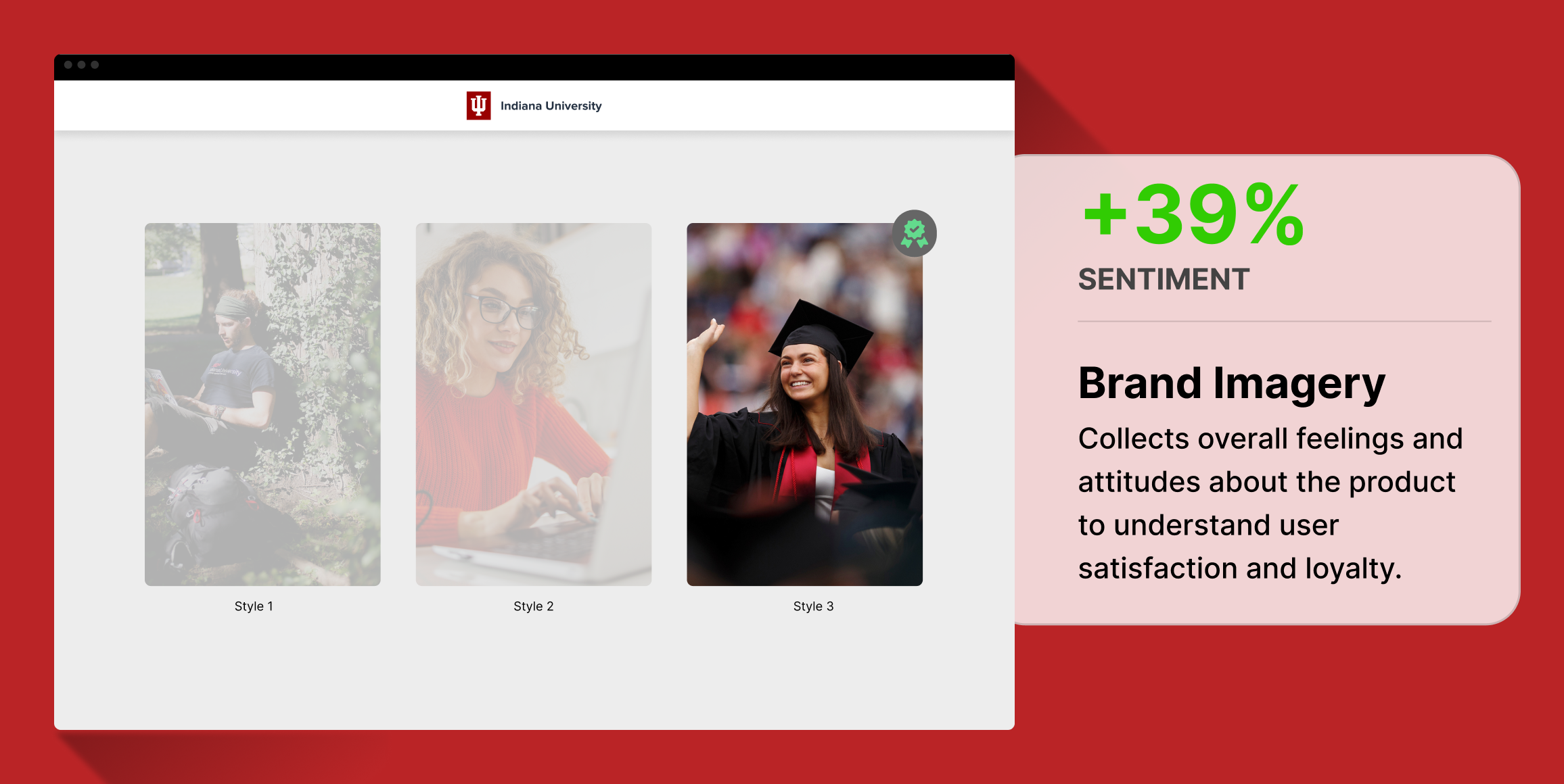
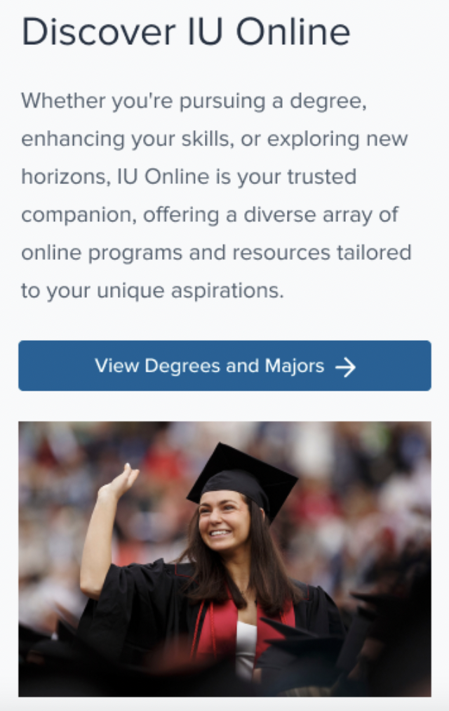
Traditional graduation imagery performs best
The imagery displaying higher education was produced the highest combined sentiment and satisfaction.
Business Challenge
Indiana University’s online team saw an opportunity to update their brand imagery to align with their audience of remote, at-home students. IU Online’s current imagery was carried over from pre-Covid days, and the imagery too heavily emphasized the physical IU campus.
Timeline
The research was conducted over a one-week period, allowing for rapid data collection and analysis to quickly implement findings into Indiana University Online’s marketing strategies.
Research Goals
The IU Online team aimed to more closely align their site imagery to the lifestyles and preferences of their remote student base.
Methodology
We used Helio multivariate tests to measure the sentiment and satisfaction with the brand imagery concepts for Indiana University’s site. A separate group of 100 participants responded to each brand imagery variation.
Participant Panel
Participants included current and prospective students from across the United States, representing a mix of those actively looking for online educational opportunities and casual browsers interested in online education.
Test Setup
Within each survey, participants were asked to rank their satisfaction with the imagery used on the page.
And then provided a list of 8 brand impressions, 4 positive and 4 negative, to indicate how they feel about the page.
Findings
Issues with current brand visuals
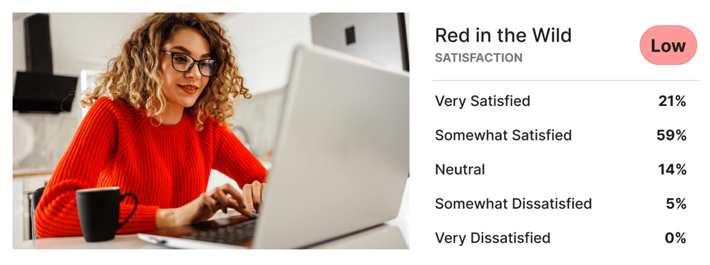
- Attempting IU’s previously used ‘Red in the Wild’ theme produced the lowest customer satisfaction
- We found that V2 produced by far the most positive impressions and levels of satisfaction, while avoiding the boringness and skepticism of the other themes.
Low value of relevance
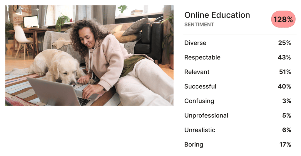
- Low sentiment despite relevant at-home imagery
- Trying an ‘Online Learning’ theme to connect with remote students produced the least positive impressions.
- The Online Education theme produced by far the lowest amount of positive impressions from participants, suffering from a lack of showing success and respectability
No one is in classes or doing anything exciting, they are just sitting at home doing homework
Undergraduate Student (US)
Driving impressions of success
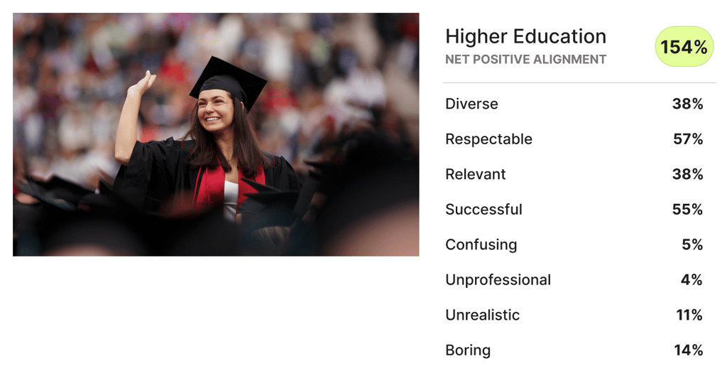
- Traditional graduation imagery produces highest sentiment
- A ‘Higher Education’ visual theme elicited up to 49% more positive impressions than the other variations.
- The Higher Education theme was able to impress upon visitors the sense of accomplishment that the team determined to be the most valuable brand impression
All images are pertaining to university life and graduation and feeling like one has successfully achieved their goal
Graduate Student (US)
Conclusion
The study confirmed that the choice of imagery on Indiana University Online’s platforms plays a crucial role in shaping brand perception and user engagement. Images that accurately and dynamically represent university life were most effective in enhancing brand appeal among prospective students.
Impact
Through the work done on Indiana University’s website redesign, and the testing employed to inform the design changes along the way, we validated our updates through analytical data within one month of launching the new site.
Indiana University’s online team confirmed that they had seen:
- Applications for the past 4 weeks up over 30% compared to previous year
- Apply page views increased by 38.9%
- Site engagement increased by 80.1%
Recommendations
- Implement Dynamic Imagery: Prioritize the use of vibrant, real-life images of campus and student activities to enhance engagement and positive brand association.
- Regularly Update Images: Keep the imagery fresh and reflective of current student life and academic offerings to maintain relevance and appeal.
- Customize Imagery to Audience Segments: Tailor imagery on specific sections of the website according to the interests of different user demographics for more personalized engagement.
Reflections
This study highlights the significant impact of visual elements on user interaction and perception in digital platforms. For educational institutions like Indiana University Online, aligning imagery with user expectations and institutional values is key to effective brand communication and engagement. Continuous testing and adaptation based on user feedback are essential to maintain an appealing and relevant online presence.