Case Study
Monday.com Landing Page Optimization
User testing insights reveal opportunities for enhanced conversion on Monday.com.

Hero CTA performs well
The ‘Get Started’ CTA on Monday.com’s landing page achieved a notable first-click rate from participants (39%).
High negative impressions
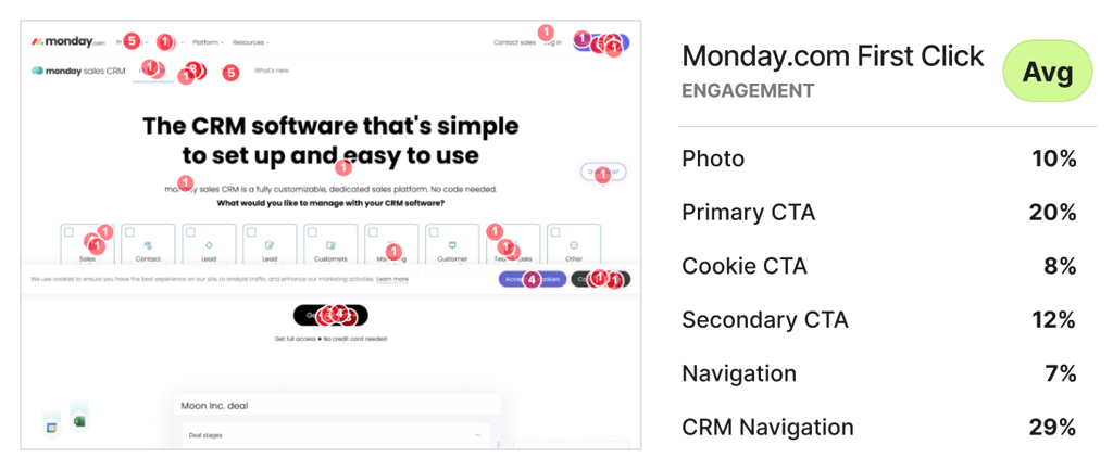
Feelings of being overwhelmed (34%) and confused (25%) were too prevalent on the page.
Complicated overlapping elements
Participants mentioned a misuse of whitespace among complex product images that confuse rather than educate.
Business Challenge
The Monday.com CRM landing page underwent an evaluation to more effectively attract and convert its main audience, which includes sales professionals and marketers. This effort was driven by the observed gap between what users say they prefer and their actual behavior on the page.
Timeline
The testing was completed in 24 hours. After running the test overnight, the findings were synthesized the following day.
Research Goals
The study aimed to analyze user interactions with the landing page to identify areas of strength and opportunities for increased conversion efficiency.
Methodology
Monday.com’s landing page was tested using remote user surveys via Helio, incorporating quantitative and qualitative feedback from consumers. The same survey was applied to four competitor landing pages to benchmark Monday.com’s performance against competitors.
Participant Panel
We used a Helio ready-made audience of Marketers and Sales Professionals in the United States was utilized to collect 100 responses for each of the five competitor landing pages.
Test Setup
The survey combined NPS scoring, satisfaction scales, and open-ended questions to gather quantitative and qualitative feedback on the effectiveness of the landing page.
The setup for the Monday.com landing page study included several key areas of focus:
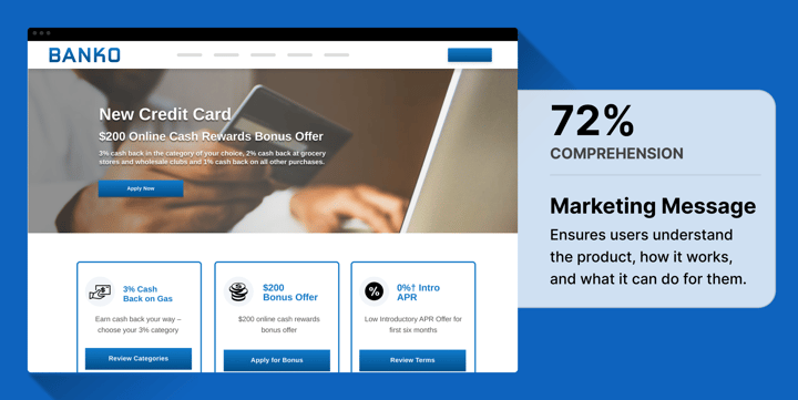
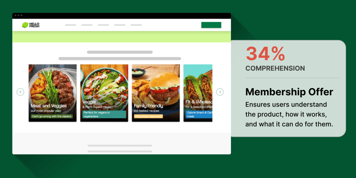
- Comprehension: Participants were asked to explain the purpose of the page. This helped assess whether the page’s messaging and design clearly communicated its purpose. Common keywords like “CRM,” “software,” and “sales” indicated that the page was primarily seen as promoting CRM software for sales teams.
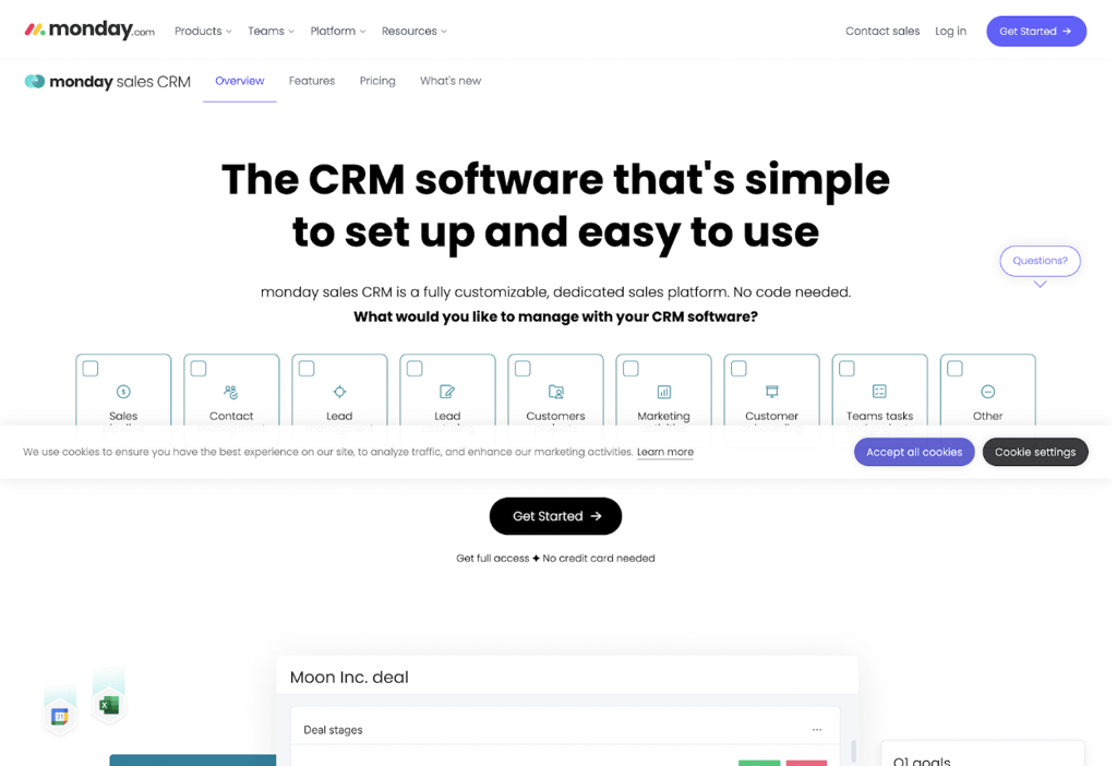
- First Interaction: Participants were instructed to click on the element they would naturally choose first when using online tools. This identified the main areas of interest or initial engagement points on the page. A follow-up question explored their reasons for these choices, with frequent mentions of “software,” “CRM,” and “free.”
- Information Seeking: Participants clicked on the sections they would visit to determine if the tool could be useful for their company. This highlighted which parts of the page were seen as most informative. A follow-up question explored their reasoning, with “product,” “company,” and “software” being common terms.
- Emotional Reaction: Participants were asked to share their overall impression of the page, selecting from multiple options and explaining their choices. This provided insight into how the page’s content and design were perceived.
- Likelihood to Engage: An NPS question measured how likely participants were to use Monday.com for their business, on a scale from 0 to 10. The median score was 8, and follow-up questions helped understand the reasoning behind their ratings, with keywords like “software,” “free,” and “business” frequently mentioned
The overall test was designed to assess how well the page attracted users’ attention, the clarity and usefulness of the information provided, the general impression of the page, and the likelihood of the product being adopted. The use of common keywords and follow-up questions offered deeper insights into user motivations and potential barriers to conversion.
Findings
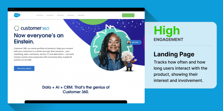
High engagement on hero CTA
- The ‘Get Started’ CTA on Monday.com’s landing page achieved a notable first-click rate from participants (39%).
- This percentage of participants immediately interacting with the primary CTA on their site is comparable to other competitor homepages, which also received around 30-40% engagement on those actions.
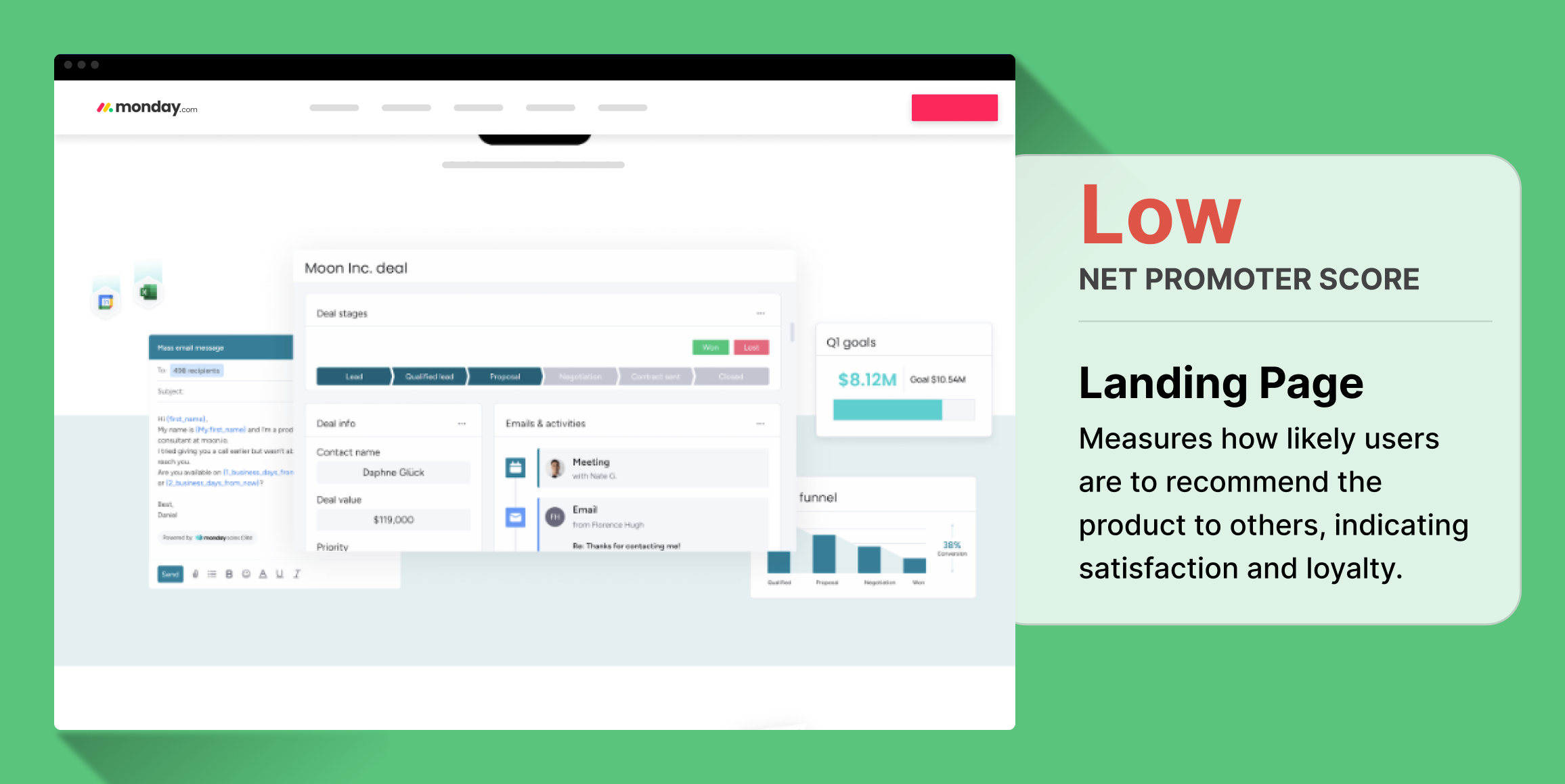
Too much negative sentiment
- Feelings of being overwhelmed (34%) and confused (25%) were too prevalent on the page.
- Despite providing the helpfulness that other competitors produced as well, these negative impressions hurt Monday.com’s net positive alignment, the sum of the positive impressions produced by the experience minus the sum of the negative.
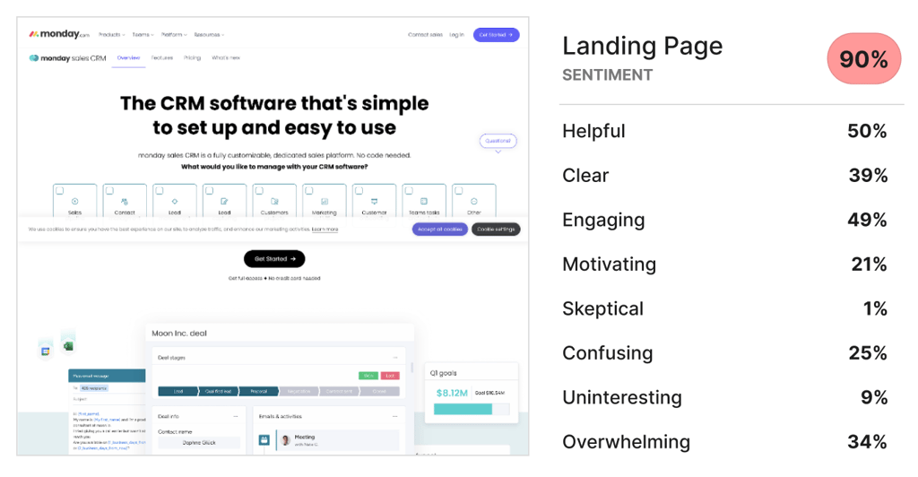
Below average Net Promoter Score
- Participants mentioned a misuse of whitespace among complex product images that confuse rather than educate.
- These types of graphics, combined with an abundance of white space in between, didn’t provide users with a clear flow of educational information:
- Monday.com’s design flaws led to their homepage faring the worst in terms of emotional reception:
Conclusion
Monday.com’s landing page research study revealed significant improvements that they can make to their site, in terms of visitor sentiment and net promoter score.
Recommendations
- Break up white space: many participants sharing negative impressions indicated an overwhelming amount of white space on the page.
- Bring clarity to images: reduce overlapping elements and focus on the features in each image that you’re trying to convey in each content module.
Reflections
The contrast between the low emotional reception and the high CTA engagement prompts a closer look into the user experience design of Monday.com’s landing page to ensure that positive user sentiment is effectively captured and converted into desired actions.