Grid System
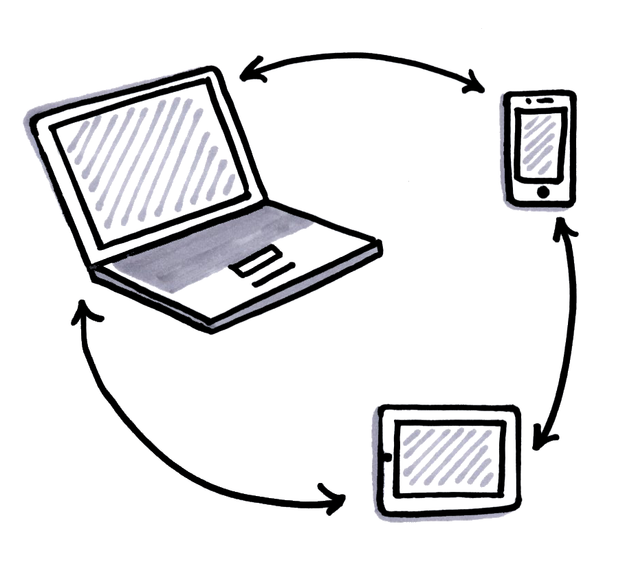
With so many different devices on the market and a multitude of platforms, it's time to rethink the grid system.
If you’re a designer, chances are you’ve come across some sort of CSS grid framework before. In fact, layout grids are really nothing new. Print publishing has long taken advantage of the visual cohesion that grids afford, and pretty much every magazine or newspaper you’ve ever seen uses grids.
The grid system uses CSS codes to position HTML elements. And for a long time, that’s all there was to know about grid systems. But the rise of mobile internet devices changed that, ushering in a new way of thinking about grid systems.
Benefits of Using A Grid
The rigidity of the grid put off some beginner designers, who view it as a constraint. But at ZURB, we think constraints are just a different way of approaching a problem. Whether you’re using a grid for rapid prototyping or detailed designing, there are a variety of benefits to grid systems that far outweigh any negatives.
- Uniformity. A grid ensures consistency between webpages, which reduces CSS coding errors and ensures reliable HTML placement. Furthermore, many grids have built-in browser compatibility, which makes user testing a much more manageable task.
- Reduced Coding. It’s easier to produce sleek and professional looking pages with grid systems. No coding from scratch. Also, if you decide in the future to reposition elements or make sweeping design changes, the grid makes iterating interfaces faster and easier.
- Nesting. Incorporating sub-grids within your existing grid (a process called nesting) is relatively simple and opens the door for complex and visually stimulating layouts. Grids also more or less eliminate the need for nested HTML tables, which are significantly trickier.
- Structural Control. In addition to helping visually organize elements, a grid system also offers a great deal of visual and structural control over your page. It makes it easier to create magazine-style layouts or online creative portfolios, which would be a nightmare to code from scratch and hard to visualize. Elements like text callouts are also easier to produce and place.
The Modern Grid
For a long while, these features were all that people expected out of their grids. But as the way people accessed the Internet began to change, the traditional grid system was no longer enough because it did not optimize across different devices.
The traditional 960 grid was neither responsive nor easily modifiable, because it was limited by its pixel dimensions. As a result, websites built using this traditional framework could not be optimized for screen sizes that were larger or smaller than 960 pixels.
And with the number of users accessing the Internet from mobile devices – especially in emerging markets – it became especially important for designers to design for smaller screens. And the 960 grid, along with others like it, did not support this. As such, there were two new major requirements that were added to the grid system that fundamentally changed how they functioned. The way we fundamentally approached web design had to change. We could get stuck in one screen size or device; we had to design for four corners. Thus, the modern grid system was born.
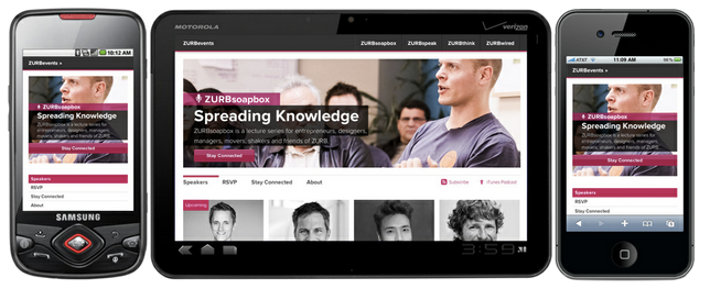
- Responsive. With all the different devices that are available on the market and the wide variety of platforms that they operate on, it is impossible to anticipate how a potential client will view your website. A responsive grid system is flexible and based on percentages rather than pixels. Most importantly, it can be configured to scale up or down, depending on the screen size it is being viewed on.
- Modifiable. Design is a rapidly evolving and dynamic field. And whatever grid it is that you’re using, it’s got to be modifiable. You should be able to adjust things like gutter size with relative ease and thus have more time to allocate to more important things, like the actual design process.
So What Does This Mean?
These two additional requirements — responsiveness and modifiability — are really important because they eliminate quite a few grid systems. Any pixel-based grid is gone, because it’s too rigid and not easily modifiable. Percentages are better. And any grid system that doesn’t use media queries means the grid isn’t responsive. Device targeting is the name of the game here, folks.
So where do we go from here? Responsiveness and modifiability make for tough criteria to be sure, but there are some frameworks out there that can get the job done. And we’re going to talk about our favorite: Foundation.
To Understand the Future, We Have To Go Back In Time
Foundation – the original, first version of Foundation – was built for internal use for client projects. It had the ZURB style guides within a simple grid that, over time, accumulated button styles and colors out of convenience and a need for uniformity. We used this early version of Foundation to design our old website and, over time, came to realize that other people could also benefit from our little muddle of codes and style sheets.
So, we took the idea of a coded style guide and abstracted it so that our clients could use it as well. We added some other nifty features like paginations and tabbing. Most importantly, we decided to make the entire grid system responsive, because everything seemed to be moving in the direction of the multi-device, and we wanted to hit the ground running.
You can override a responsive grid. Foundation’s base styles don’t lend themselves to a final site design. Instead, the grid system will get you 90% of the way there, and the last 10% is where your individual sense of design and creativity come into play.
The final product is completely your own. When optimizing for a mobile device, Foundation lets you push columns to rearrange the order in which content is viewed, making it one of the most responsive and easily modifiable grid systems around.
Launch and Iterations
Foundation 2 was launched in October 2011 and then went through about 12 releases. Updated releases came with new features, like the mobile grid. If you want to know more about all the different features and add-ons, you can follow the evolution and various iterations over at GitHub.
Foundation 2.2 was the end of the line for Foundation 2. We decided that our goals for Foundation had exceeded the capacity of the current grid, and so we decided to completely overhaul the existing framework to create a sleeker grid system that would be the fastest way to build better-designed future-friendly sites.
Six or so iterations later…
What Makes Foundation… Foundational
Foundation builds on its previous iterations in a whole new way. First off, we re-wrote all of our documentation.
Here’s a look at some of the components of Foundation:
- The Customizer. Remember when we said that grid systems should be easily modifiable? Well, the Customizer does just that in an incredibly intuitive way. Basically, when you download Foundation, the Customizer will let you tailor the grid system to your own needs. You determine how many columns you want, what size the buttons should be, what colors to use and whatever else strikes your fancy.
- We’re getting SASSy. Foundation uses SCSS, which really helps us build the most flexible possible framework. We also incorporated this nifty open-source gem called modular-scale, which basically helps us maintain a consistent vertical rhythm down the page and creates visual harmony.
- New typography. The new typography will be based on a modular scale that utilizes ratios derived from the Golden Ratio and musical scales. It’s fascinating stuff, and it means you’ll have the prettiest typeface in all the land.
- Off-canvas layouts. Off-canvas layouts are probably most familiar from apps like Facebook, where the menu is off the left-hand side of the screen. We’ve adapted four different designs of responsive off-canvas layouts that you can easily use for your layouts. Each pattern has a very specific small-device layout, as well as a similarly specific larger device layout (tablets or desktops).
- Modern CSS properties. The modular-scale is just the tip of the iceberg. We’ve included the fastest and newest CSS properties that will let you customize elements and offer greater control over the design process.
In addition to these features, we’ve also included a host of new elements and objects that will let you prototype and iterate faster. The full documentation is available on GitHub.
And That’s a Wrap, Folks
Foundation is an advanced grid system that pushes the boundaries of what a design framework can be. But the goal isn’t to be different — it’s to set the standard for what a modern grid system should be able to do. And with the latest version of Foundation, the possibilities are limitless.
Test Your Foundation Prototypes
Helio allows you to test your prototypes as early as the concept stage. That way you can see if your designs will work for your audience before you build it out fully. This test template make it easy for you.
