Concept Testing
A design method that gets us real data, real fast.
The nuts and bolts: Concept testing is the process of evaluating consumer feelings and acceptance of a new product idea prior to its introduction to the market using surveys and qualitative methods.
Somewhere between the purely quantitative testing method of user surveys and the exceedingly qualitative results of user testing lies concept testing — a peculiar but extremely helpful form of testing you could be using right now. It’s about getting information on something before you build, before customers are asking for support and before journalists are writing up their reviews. That’s why it’s good stuff.
A little while back, here at ZURB, we decided that concept testing was poorly represented in the online services space, and we resolved to fix that. We wanted to influence how designers get data and what they do with it, and so we created Helio.
Helio is a concept testing app because we get responses remotely and in bulk (quantitative) on things like memory, intent, or success (qualitative). We also don’t need a live site, or even a prototype to get this information — sketches, mockups, most any screen representation is fair game. Let’s look at how you could start pulling this into your process.
Do Colleagues Dream of Cupcake Deliveries?
That bit about testing sketches? We mean it. If what you’re looking for is high-level feedback on perception, memory, or impression you are absolutely able to use sketches for concept testing. On your next project, try this out:
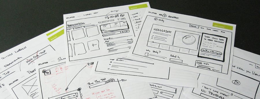
- Create a detailed sketch (read: not just boxes and lines. If that’s all you’re testing you may as well test a blank page) for a core page, ideally something positioning a product or service. For our purposes, imagine a cupcake delivery service.
- Take your sketch and go to a colleague who isn’t familiar with the project. Maybe bring them a cupcake or a beer. Not everyone wants sugary things at work.
- In exchange for said sugary/alcoholic treat, show them your sketch for 5 seconds. Count it off in your head.
- Hide your sketch, maybe under that pile of Weimaraner Owner’s Quarterly on their desk.
Ask them what they remembered, either words or phrases.
Repeat with colleagues until you run out of cupcakes or beer.
You just did a 5-second concept test. What people remember from a sketch clues you into first impressions, and how well you’re communicating the value or intent of a service. If everyone looks at your cupcake delivery service sketch and wonders where they sign up for the pr0n, something is obviously amiss. You have quantitative data (as evidenced by the cupcake and beer depletion) and qualitative results (as evidenced by their subjective memory results). Concept testing. Tell your friends.
We Can Test It For You Wholesale
If concept testing sounds interesting to you, there’s a lot of tools out there to help you get it done. We gave you one easy, low-fi example of doing a concept test, but you don’t always have to shuffle around your office with a tray of dessert and a cooler of Blue Moon.
Helio, which we mentioned, is a tool we’re partial to. With Helio you can run memory tests, mood tests, click tests, yes/no (success) tests, and a number of other types of concept tests. All designed to get you actionable data, all available (in a limited fashion) for free.
Finding Your Audience
In user testing, feedback from colleagues or the folks down at Starbucks (most of them will take a few minutes for you if you buy their no-foam, super-tall, non-fat caramel macchiato jubilee) is often sufficient, and for some projects, you’ll want to collaborate with your client to run your test against potential users.
With concept testing we need some volume, so it’s important that you get your test out to a decent sample. Online tools help here by making the test available, but you need to find people.
Helio lets you purchase results sourced from a targeted pool of testers. You can simply say how many results you want and pay a nominal fee for each participant’s response.
On the cheaper side, consider reaching out to social networks. If your company has a presence on Facebook or Twitter, ask them to help out. People love to give feedback, and they love to knock out short little tasks like this. It makes them feel like they’re part of something bigger and, in a strange way, like they have some power over you. That’s okay. We know how special you are.
Mailing lists, forums and other online audiences are useful as well, especially since they can be so focused. But be prepared for some very … strident feedback. People who frequent forums are not kidding around. In our earlier analogy, they’d be the people who bought 20 cupcakes so they could evaluate the difference in frosting weight, then incinerate one in their homemade calorimeter.
The Three Stigmata of Concept Testing
Or, what we ask, and why.
Beyond all this talk of cupcakes and tools, there’s a core issue: what do we do this for, and how do we get the results we need? Much of that comes down to what you ask.
Specificity
When you’re looking for feedback on something nebulous (like sketches, or incomplete mockups) it helps to be specific for your testers. Don’t ask “where would you go” or “what’s the first thing you saw,” as instead “where would you go to search for a product you want to buy.” This maps much more closely to the task an actual user might try to accomplish, and our data is going to better inform us of how well a concept would perform under fire.
Ambiguity
Haha, sike! You have to be careful about being too specific. In the above example, search is pretty agnostic, and so is product. What can skew your results is referring to terminology or elements that draw users unnaturally, or don’t map to what a user may be trying to do.
Back. OK, which one do you think people are going to pick? Best Buy, of course. We reference the name of the site right there in the question. This is such an obvious example you might just think, “‘derp, of course, I wouldn’t do that’ but it’s tricky sometimes.”
What if you’re testing where people would go to sign up for a service called “Premium Pizazz Cupcake Delivery” and you have a button that says “Get Pizazz!”. Your test might show that most people go to the right place … but how many people think “I need to get some cupcakes up in” and click on a button called Get Pizazz. Yeah. None. But your special terminology has misled you into thinking your call to action works, when it probably doesn’t. That leads us to another thing to remember.
Know Your Audience
Temet nosce, right? We all saw The Matrix. More than knowing yourself though, know your audience. If you’re distributing your test to 200 strangers, remember that some of them are going to 15, some are going to be 70. Some will think websites are second nature, and some will wonder why the thingamajigger can’t conflurbulate the whatsit.
When possible, consider demographics (shameless plug: Verify will actually let you filter results by demographics) and infer how different groups will perceive what you’re showing them. Men and women, for all the quality we know of, will still approach certain things in certain ways. Age, income level, location, language … everything can play a factor.
The Tester in the High Castle
Concept testing as a method is both extremely flexible and very powerful. You can adapt this to the tools you have at hand, right down a pen and paper, and scale to mocked-up concepts you show to thousands. Your results can be simple and focused, like how many people found the right call to action, or nuanced and complex, like what their perception was of your messaging.
Just remember to focus on what you ask, and how you ask it, and who you’re asking. Consider the results not as definitive but as qualitative and quantitative. This can be something you do in lieu of user testing, or before, or after, or concurrently. You can pair this with a simple survey to get truly qualitative data. In fact, we’ve done the leg work for you with our Rapid Concept Testing template. Check it out:


