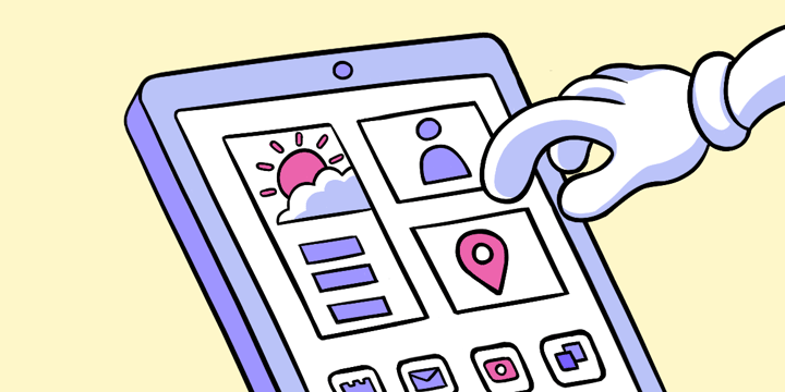
(Wire)Framing the Experience
Wireframes are simple black and white layouts that outline the specific size and placement of screen elements, site features, action areas and navigation for a product screen. They are the bare bones makeup of an interface, a schematic or blueprint if you will.
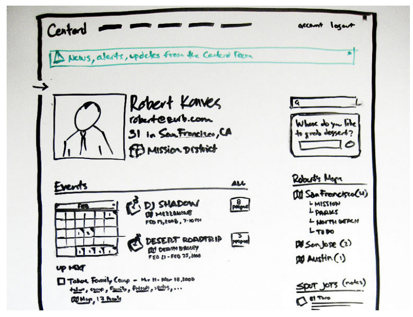
Lo-fi wireframes are done with a Sharpie and don’t include color, fonts, logos or any visual design that might take away from purely focusing on structural elements.
Much like a home blueprint, wireframes enable product teams to easily see the structural placement of plumbing, electrical and other structural elements without any interior design treatments. They expose problems with functionality in an interface screen.
This saves a lot of time and money in development. You’ll also be able to surface new opportunities.
Guide Objective
The guide objective of this section is to construct wireframes that define the information, interface and navigation design.
Goals of a Wireframe
A lo-fi sketch should surface the functionality within an interface. A strong set of sketches will help a product team visualize a workflow. The focus of a wireframe is not applying aesthetic values or beautification.
A wireframe allows you to explore three elements. Wireframes bring each of these elements together to help us visualize the overall design. A lo-fi sketch will give us a rough idea of each element:
- Information Design: used to focus on the communication of ideas and arrangement of content within an interface screen.
- Interface Design: used to define the layout and find opportunities for added success with a page.
- Navigation Design: used to define how users move from page-to-page and the connectivity between links. In a lo-fi this will be very minimal.
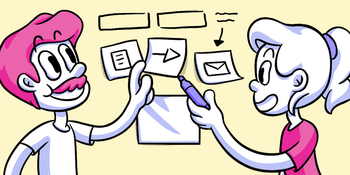
Method
Building a product is a process. Wireframes are a crucial part of the design process that can’t be skipped. However, wireframes are not all the same, and the level of fidelity required to communicate an idea may be as simple as a lo-f sketch. Each step has an important place in a larger process.
When is the right time to wireframe?
- There is no right or wrong time to wireframe, especially when you use a sketch.
- Use lo-fi sketches to visually communicate ideas and find consensus with the project team.
- When you need to understand a screen’s function.
- They are two phases of wireframing. Use lo-fis in the ideation phase to generate a variety of ideas. Use hi-fis in the prototype phase.
There are many purposes of a wireframe.
- Wireframes visually display product architecture. A large journey map can be abstract. But wireframes allow for the first real concrete visual process for a project. They turn an abstract flow into something real and tangible without distractions. This step ensures everyone on the project team visualizes the same ideas.
- Wireframes clarify product functionality. It’s not always clear when a team member says “hero image,” “map integration,” or “product filtering,” or hundreds of other types of features.
- Wireframing specific product features provides clear communication. It shows how these features will function, where they reside in the interface and how effective they might be. Visuals help the project team out. Now they can focus on clarifying expectations on how users execute features.
- Wireframes make usability a priority. This is an important point of the entire design process. Wireframes bring usability to the forefront of an interface screen. It forces a project team to look at an interface from the perspective of ease of use, workflows, naming conventions, navigation and feature layout. Wireframes can point out flaws of how a specific feature may work.
- Wireframes enable the right scale. A wireframe will highlight content gaps that will occur with scale. A search result with 10 items is very different from 1,000 items.
- Wireframes make the design process iterative. Wireframes ensure that the functionality and layout discussions can be separated from the visual and creative discussions. This gives the team more time for early feedback. Skipping wireframes prevents valuable feedback from being collected early in the process and increases development costs.
- Wireframes save time on the entire project. Wireframing saves time in a multitude of ways by making screens more calculated, content creation more focused, and functionality cleared to the development team.
How is a Lo-fi wireframe sketch different from a Hi-fi one?
- Sharpies are great for quick and easy visualizations. You can easily represent a computer layout with a sketch.
- Sketches are cheap and disposable.
- The simplicity of lo-fi wireframes comes with some downfalls. There may not be enough detail on the sites flow and how it’ll feel. The context of the presentation may be completely wrong. It’s hard to say how the product will be viewed with the countless devices and screen sizes people use.
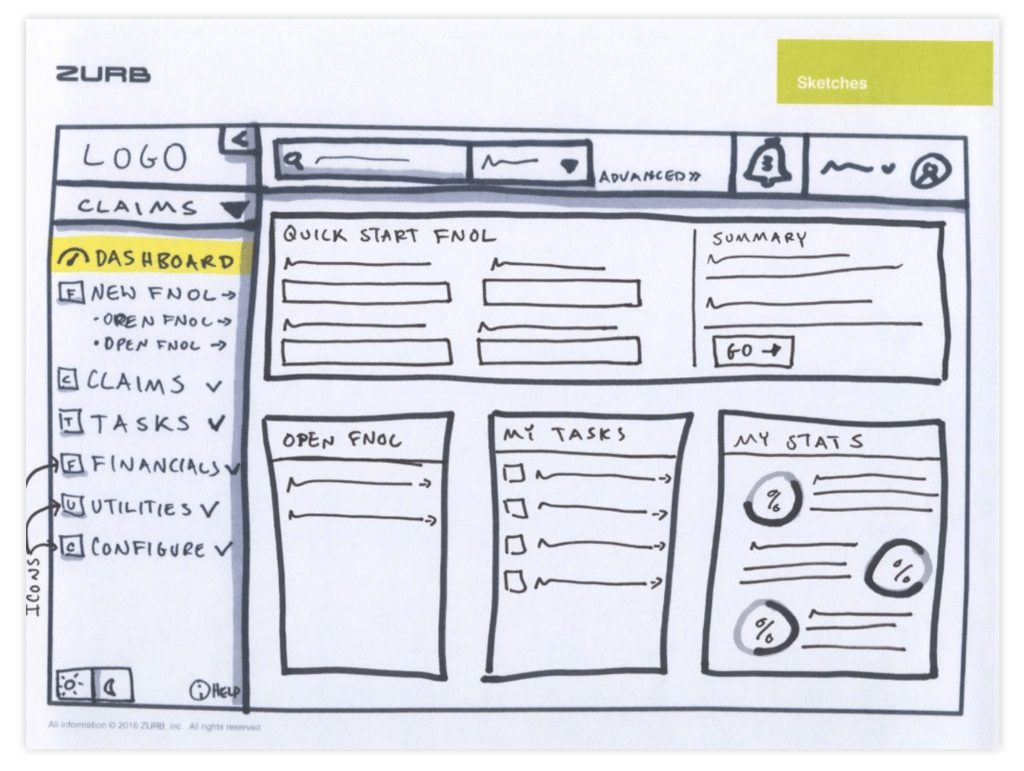
- Hi-fi wireframes incorporate as much functional detail as possible to mirror the interactions in the final product and can be used to produce a clickable prototype.
Static or coded wireframes?
- A static wireframe gives a quick glimpse at how the page will be functioning by creating an image file of a mock up page
- The drawback to a static one is that the page doesn’t have any functionality — it’s just a static image.
- Coded wireframes are the most accurate in context and the best to view the functionality of a page
- The time to create functioning coded one is much more effort.
- See how it will be in the real world across devices with a coded wireframe.
Deliverables
Which fidelity, lo-fi or hi-fi, should a product team use when wireframing? This isn’t pertaining to being an audiophile. Here, we’re taking about wireframes created for presentational purposes.
As we discussed above, you can create wireframes with primitive tools (read: pen/marker and paper/whiteboard). Or you can code up something more complex and intricate as a working prototype.
Below we explore some basic guidelines for how different types of wireframes are structured and crafted. Whether you grab your laptop or break out your Sharpie will depend on a variety of factors, including the type of project you’re working on. In any case, wireframing is a good place to start drafting up the product vision.
Remember, without the proper elements aligned with users, and an ill-functioning page, wireframes are your guide to developing the best gateway for users to reach your product.
Lo-fi
Lo-fi sketches are the quick and easy transposition of a final product. A simple sketching of the product is the most widely used wireframing method, as it can be reworked and retooled with ease, without swimming through a myriad of coding. If need be, the sketches can be tossed away simply without hours of excruciating coding and working.
Lo-fis can also be represented as quick computer-drawn layouts, where content is often pictured as shapes (commonly squares and boxes) and text will generally be visualized in Lorem Ipsum. But phony Latin isn’t the perfect substitution for actual content.
The words on the page are equally as important as the overall presentation of the material. They are not separate but equal entities — they are equal across the board. This is where directive text is more useful than Lorem Ipsum.
Hi-fi
These types of wireframes incorporate as much detail as possible to mirror the final product as possible. They can either be quick snapshots of what the page will look like, or they can be fully-functioning prototypes — Static Wireframes or Coded Wireframes, respectively.
Static
The Static Wireframe gives a quick glimpse at how the page will be functioning by creating an image file of a mock up page. The program Sketch helps with setting up this type of wireframe.
The only drawback to this wireframe is that the page doesn’t have any functionality — it’s just a static image. A “clickable” static image to fix the static purgatory that these wireframes sit in can be rectified with Figma, InVision, or Marvel.
However, there’s a downside. Coding up a wireframe bogs you down in code.
Coded
These types of wireframes are often produced with software to incorporate as much front-end web technology to showcase and test interactivity elements. These types of “coded wireframes” are becoming more and more the standard of practice thanks to prototyping tools like Foundation. Though these wireframes are the most accurate in context and the best to view the functionality of a page, the time to create these functioning wireframes is much increased, as opposed to a quick image file. Foundation, as well, allows you to create coded wireframes where you can easily move into a prototype and finished product.
Example
Test your Journey Map: This is a great time to use interactive matrix testing to test the usability of your wireframes.
To create an interactive matrix you first need to create a click test within Helio. You can use single screens
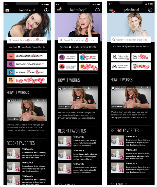
Example
From our wireframes, we create three different variations of a home screen playing with main CTA placement.
We aggregate the success rate for each item within a doc to make it easier to compare between versions. The below screenshot shows each screen tested about the same throughout the different variations. The results also show us we need to rethink how we are positioning the selfie assessment.
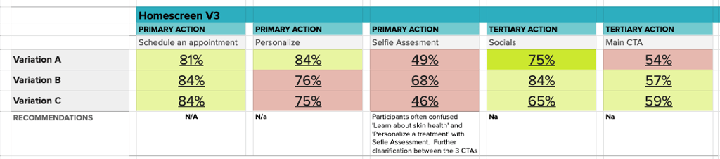
We used Helio for this click test. You can as well with this test template.
Next up: Workflows