Critiquing in Practice
Method: Critiquing | Deliverable: Audit
Let’s get the tough crap outta the way first. It’s tough to receive criticism for our work. Sometimes it’s even tougher to give it. You have to navigate your ego and their ego. But critiquing creative work is a fundamental skill in design. One that requires critical thinking while also understanding the design problem.
It’s most effective when collaborating. For the designer or creator, it’s useful for improving interface screens. In this exercise, we’ll critique an interface in a deliverable called a web audit.

Goals of an Audit
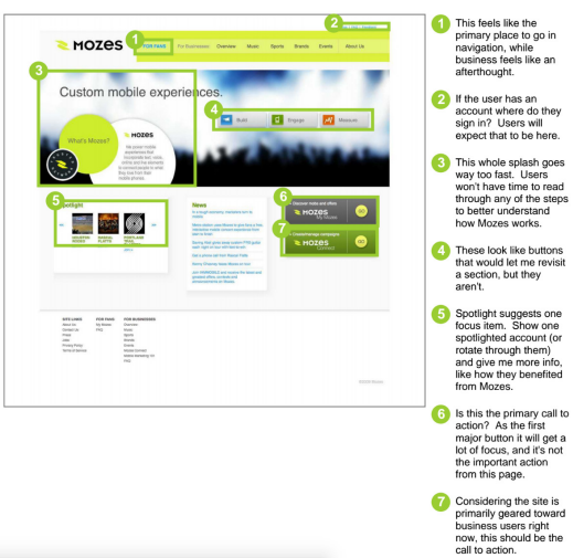
A web audit is a screen-by-screen analysis of an application or website. Marketing content, functions, interactions, visual design or business intent are all fair game to be critiqued.
The goal of an audit is to uncover opportunities in a website or application. An audit does not offer any particular solutions. However, it suggests areas for improvement.
Opportunities are problems viewed in an optimistic way. All for the purpose of improving a website, product or service.
Additional goals include:
- Improve the project communication and shape the ongoing discussions with teammates.
- Understand the intent of a design decision and compare these ideas against competitors using critical thinking.
- Get valuable feedback from other team members that might have other approaches to designing a concept.
- Get buy-in from stakeholders, teammates, and design leads to ensure that the design process runs smoothly.
- Improve the project communication and shape the ongoing discussions with teammates.
Method
Critiquing is a visual way to give contextual feedback. A critique begins by taking screenshots across all major screens in the application or website. A good web audit can be as small as a single page, for instance. Or as large as 15+ screens in an application. However, each screen should address at least 4-5 improvements.
Suggestions, feedback and ideas can be captured digitally in a feedback tool. Or through printouts with post-it notes applied directly to the top of the paper. In group sessions, posting work on a whiteboard or wall can create a shared space of understanding.
Opening up design work to feedback allows a project team to get under the hood to see what actually makes it tick. This can spark ideas to make the product even better.
Critiquing Techniques
Best done in small groups of no more than 7 people. Consider the dynamics each person on the review will bring to the table:
- A fellow designer can lend an eye towards the visual feel of a design.
- Other support disciplines — engineering, marketing, sales, etc. — can ensure that the overall objectives of a design are meeting the goals of the project.
- A stakeholder, client, or design lead might have a vested interest in the financial result of a particular product or concept.
Feedback
Feedback should center on three areas: user needs, business goals and technical feasibility.
Other considerations include:
- Branding elements
- Concept development
- Visual layout
- Architecture
A facilitator should be used in a group critique to steer the feedback to a predefined goal. A facilitator should also:
- Define the goals of a session to create constraints.
- Direct the questions to spark more ideas.
- Move the ideas forward once the critique is finished.
It’s easy to have a knee-jerk reaction to criticism. But feedback is the key to successful products. Don’t fear it. Critiques can be enjoyable and painless. Critiquing isn’t the same as insulting.
- Targeted: Feedback should answer a question. Don’t expect valuable feedback if you ask, “how does this look?”
- Actionable: There must be a next step for feedback. There is no use in getting answers to questions that have no next logical step.
- Valuable: Feedback can be both targeted and actionable, and it must be valuable. If not, then it’s a waste of time and brings no value to a project.
Interface Critiques
Critiquing an interface requires a different perspective. Changing this perspective can be accomplished in different ways:
- Use Grayscale. Bleed the color out of the design. Does focus still hold up? Or does contrast between elements?
- Find Intersections. Draw gridlines to show focal points. For instance, a good design ensures the focal points are on a spot. That’s where people can read the maximum amount of information in the minimum amount of time.
- Bump up Contrast. Are areas too overpowering? Bumping up the contrast of a design helps show what areas jump off the page when someone initially views a screen.
- Squint at it. What does a design look like at a glance, without details? Looking for solid hierarchy and weight, and that if someone glances for a few seconds they get something valuable.
- Put it in front of a Mirror. How does a page feels without readable copy? Areas you might not expect can jump out at you, and misalignments become more obvious.
- Rotate it. How does the page holds up on its side, or upside down?
- Zoom out. Does the layout hold up? The best websites still gets the story across at a small size. Elements should look balanced and people should still be able to get the gist of what they’re seeing.
Get Feedback From Different People
Use different people to collect feedback. Different people will reveal different insights to make successful interfaces. In other words, critiquing should help the designer, the critic, and everyone on a project team.
- Customers: These are the companies that are going to be using and paying for a product, so be proactive about soliciting feedback.
- End Users: Getting user feedback is just as important. Think of your end-user as your customer, and their users as your customer.
- Your Team: Share what you’re working on and ask questions. Seek feedback from multiple perspectives. Don’t always ask designers for feedback on a design. Solicit thoughts from engineers, product managers or marketers.
- Designers: A fellow designer can lend an eye towards the usability, functionality, experience and visual feel of a screen.
30 Second Critique
There are a few ways to give a thirty 30 second critique. Use these techniques to capture reactions.
- Note where your eyes go first
- Five-second memory test
- Squint your eyes
- Scan the page diagonally
- Find the intersections
The Ultimate Goal of Critiquing
The goal of a critique should be understood before hopping into a design critique. For instance, visual feedback is extremely powerful for capturing ideas.
- Critiques provide an opportunity to see gaps in a screen, workflow or product.
- Strives to achieve a goal that moves a project forward. Do not let individual egos get in the way of the goal.
- An audit is typically used as a tactical tool for making continuous improvements to an interface.
- A quarterly, strategic review that comprehensively covers the business goals can be extremely valuable.
- Make critiques a priority and stop allowing feedback to take a back seat.
Leaders should invest in their teams by giving meaningful feedback. A critique is a structured way to set expectations and provide a way to review work in a consistent and inspiring way.
- Focusing on a critique keeps your team on track Be the coach for your team.
- Repetition wins. Tell them, show them, tell them what you showed them!
- Feedback should be given continuously, from the initial sketch to a code release.
Critiquing’s General Order One, or Prime Directive like in Star Trek, is to get the team stoked to make the product better. It’s meant to drive the project forward not discourage.
Deliverables
The result of a critique is an audit. It can be as small a one sheet mock or screenshot of notes annotated on a screen. An audit is a visual way to give contextual feedback.
The audit should have a list of things to adjust:
- font size
- spacing between columns
- header images placement
- distracting elements
An audit should consider the user needs, business goals and technical feasibility.
The team will decide what feedback is best to take action on. And what is best to ignore in an audit. A properly constrained audit will ensure the feedback is relevant. For example, if someone expresses they don’t like the green logo color, and the audit is about the flow of the product, the team might choose to ignore this piece of feedback because it isn’t relevant to the problem.
| Visual design Iconography Typography Color Composition Texture Shading | Content Voice Headlines Body Media Calls to action | Interactions Behaviors & Triggers Motion System feedback Form elements Error states Accessibility Workflow Technology |
Example

Use Helio For Your Next Critique
Helio makes it easy for you to get feedback from an actual audience and your peers, even as early as the prototype stage. You can easily get started with this template:
Next Up: Opportunity Sketches


