Understanding the laws of UX can significantly enhance our work as designers and researchers, leading to more intuitive and effective designs. But how exactly can we leverage these principles in our research and testing processes? This post will dive into the core of the “laws of UX,” explore the most influential UX laws, and provide actionable insights on applying these laws to your user research and testing efforts.
What Are the Laws of UX?
The laws of UX derive from psychology and design theory, guiding how users interact with interfaces. The Debuggers Hub does a great job explaining each UX law and gives you an overview of what the principle is trying to say. These laws help designers create products that are not only functional but also intuitive and delightful to use. Understanding and applying these principles can reduce cognitive overload, minimize frustration, and avoid user decision paralysis.
Some of the most notable laws include:
- Amara’s Law: We tend to overestimate the effect of a technology in the short run and underestimate the effect in the long run.
- Fitts’s Law: The time required to move to a target area is a function of the distance to the target and the size of the target.
- Gestalt Principles: These include proximity, continuity, similarity, closure, and more, which help in understanding how users perceive grouped elements.

Why Use UX Laws in Research and Testing?
Applying UX laws in research helps create a structured approach to understanding user behavior. It ensures that proven principles back design decisions, leading to more effective and user-friendly interfaces. For example, by using Fitts’s Law, you can optimize the size and placement of buttons to enhance usability. Similarly, Gestalt principles can help organize information on a webpage to make it more digestible for users.
We can only learn so much from user research and, in fact, often, the quantitative and qualitative data we need is either seriously limited or incapable of justifying more nuanced design decisions. Arriving at effective design solutions in such instances calls for a closer look at the intersection of user psychology and design.

Detailed Look at Key UX Laws
Understanding and applying key UX laws is essential to creating effective and intuitive user experiences. These principles, derived from psychology, help designers make informed decisions that enhance usability and satisfaction. In this section, we’ll explore some of the most impactful UX laws and their significance and discuss practical methods for testing and measuring their effectiveness.
From Amara’s Law, which helps us gauge long-term user adaptation, to Tesler’s Law, which guides us in simplifying complex tasks, each principle provides valuable insights into user behavior and interaction. Let’s examine these laws and how to leverage them in your UX research and design processes.
Amara’s Law
Amara’s Law highlights the common overestimation of short-term effects and underestimation of long-term effects of technology. This can be crucial in UX research to understand how users adapt to new features over time.
- Testing Method: Conduct long-term user studies to observe how user interaction evolves.
- KPIs: User engagement over time, retention rates.
Helio Example
Helio can help you track the success (or failure) of your design iterations over time by building a baseline understanding of how your designs perform and improving each new version.
We tested a page on an ad management platform to understand the usability of key actions as we continually refined the design. Primary actions, such as sign-up or purchase buttons, should achieve over 80% success on participants’ first click. Secondary actions, like accessing contact information, should surpass 70%, and all other tertiary actions need at least 55% of participants to succeed on the first click.
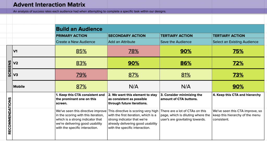
Each of these actions corresponds to a directive given to a participant in a test. The percentage of participants who click in the correct area is logged in the Interaction Matrix, pictured above. The framework’s green and red color coding provides a quick and clear view of which actions on the page show high success and which ones need improvement.
Version Variations
Over time, as new versions of the page are designed, the same interaction testing can be run to ensure that actions improve rather than decline. On Advent’s Build an Audience page, the secondary action of adding an attribute was the only failed directive until version three when the primary Create action encountered some difficulty.
Check out the Advent Interaction Matrix and learn more about how to ensure your designs’ usability across iterations with our Interaction Matrix Guide!
Fitts’s Law
Fitts’s Law is fundamental in designing user interfaces that require precise interaction. By understanding the relationship between distance, target size, and movement time, you can design more accessible interfaces.
- Testing Method: Time to target tests where users must click on buttons of different sizes placed at various distances.
- KPIs: Task completion time, accuracy.
Helio Example
We tested Indiana University’s homepage with a Current and Prospective College student audience to compare the usability and reaction to different versions of their hero CTAs.
We tested three versions with separate groups of 100 participants: one with three CTAs in a horizontal layout, one with three CTAs vertically stacked, and another with only two CTAs. The IU team wanted to know which of these versions created the most engagement and satisfaction from their audience:
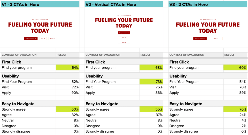
We found that the vertical layout of V2 produced the highest engagement with the primary CTA in the hero, with 68% engagement on the first click and 73% success when looking for that specific action.
“I was curious how they represent each program. I also want to know what they consider a program.”
- Prospective College Student (US)
However, the three CTA layouts produced fewer positive impressions than V3, with just two CTAs, with which participants strongly agreed they felt the easiest to engage out of the three versions.
Learn more about how to test visual variations of your designs in our case study on Indiana University’s degrees listing page!
Gestalt Principles
Gestalt principles are essential for visual perception, enabling the creation of intuitive designs by leveraging how users naturally group elements.
- Testing Method: Conduct visual grouping and pattern recognition tests.
- KPIs: Visual hierarchy effectiveness, user satisfaction.
Helio Example
A leading provider of investor relations solutions faced challenges in website navigation that potentially affected user engagement and content discovery. We used Helio’s card sorting capabilities to assess navigation expectations across 5 different versions of pages and categories on the site.
Initially, the card sort revealed that their current navigation did not align with user expectations. With the baseline issues revealed, the team began producing new navigation variations to compare against the baseline.
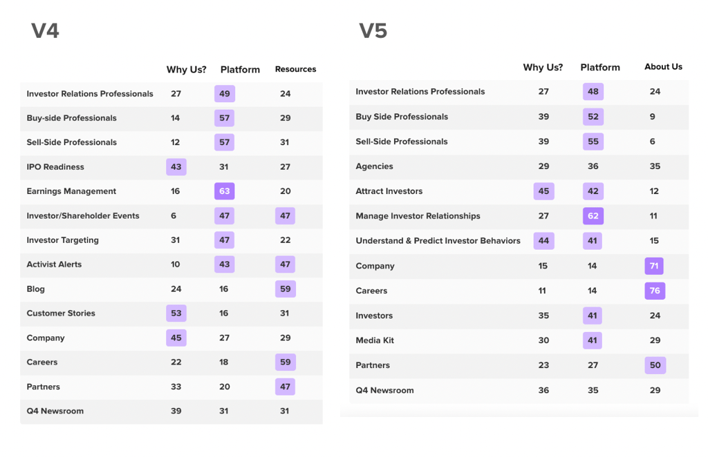
With this card sorting technique, we want to produce as much purple in the data chart as possible. Purple boxes represent a high (above 40%) percentage of participants who agree on where those pages belong in the site’s hierarchy.
Exploring these new versions of the page, we found that up to 40% more content pages were successfully sorted into their expected categories. With version 4 of the navigation, participants were much more successful at sorting pages into the Platform category and expected even more content to live there. Version 5 performed very similarly to version 4. However, we determined that V5 was the best business decision. This is because it indicated that users would be more likely to explore the Platform category for certain content rather than skip straight to Resources, as they would in V4.
Learn more about how users naturally group elements in our case study on Nav Card Sorting!
Memory Load Testing (Miller’s Law)
Miller’s Law states that the average person can hold about 7 (+/-2) items in their working memory. You can test this by evaluating how users recall information and perform tasks with varying item counts.
- Testing Method: Present users with different sets of information and measure recall accuracy.
- KPIs: Information retention, task efficiency.
Helio Example
We tested the dashboard of an online banking platform company with an audience of online banking consumers in the US. Our goal was to understand their retention level and comprehension of the design layout. We showed the banking dashboard of a user’s account for 15 seconds. Then, we asked participants to recall what type of information they saw on the page.

The goal was understanding which elements stand out most to banking consumers interacting with Banko’s homepage. We also aimed to gauge whether its unique features make the intended impression.
The data validated that Banko’s Financial Health Score was the design’s most prominent information participants recognized. This feature is one of the primary elements Banko wants to emphasize on users’ dashboards.
Check out the Banko timed survey here to see what type of insights Helio’s data reports can reveal!
Visual Attention Testing (Von Restorff Effect)
The Von Restorff Effect suggests that items that stand out are more likely to be remembered. This can be tested by highlighting certain elements and measuring user attention.
- Testing Method: A/B tests with highlighted elements versus non-highlighted ones.
- KPIs: Click-through rates, time spent on highlighted elements.
Helio Example
Measure the usability and click-through rate of your Figma prototypes through remote user testing using Helio. We tested a prototype of Advent’s ad management platform’s Audience page, which allows users to adjust their ad campaign audience targeting parameters.
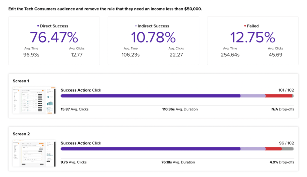
This Advent prototype data revealed that up to 13% of participants were unsuccessful at editing their target audience. Most of these failures occurred on the first step. This indicates that finding the specific audience demographic information on the page was difficult for users.
“there was a lot of information on the page. It took me a second to find the right group as they were not in an order I recognized. I then needed to find the correct line to edit with income; this did not match up with a previous line with a different income level. So it took me a few seconds to find the correct line.”
- Small Business Advertiser (US)
Check out the Helio data report of this Advent Prototype Survey!
Complexity Reduction Testing (Tesler’s Law)
Tesler’s Law emphasizes that any system has a certain amount of complexity that cannot be reduced. Simplifying tasks can improve user experience.
- Testing Method: Simplify tasks and measure user ease of use.
- KPIs: Task completion rates and user satisfaction.
Helio Example
To test the overall user experience of your designs, a Helio Gravity Score produces a single data point that sums up hundreds of reactions to their usability.
Using the ad management platform Advent as an example, we tested gravity score on each platform’s four core pages. The Audience page, discussed above in the context of Amara’s Law, performed the best. The Analytics page was the only one that produced a negative score. This indicates that the Analytics page needs significant improvements to enhance user experience.
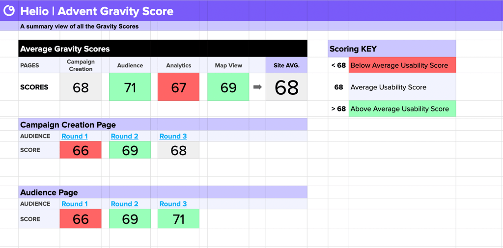
Helio’s gravity score testing is derived from SUS testing. In this method, a product user answers a series of 10 evaluative questions about their user experience. Hundreds of participants collect those 10 responses and aggregate them to produce the gravity score. Similar to SUS ratings, scores of 68 are average. Scores above or below indicate an especially positive or negative user experience.
Advent’s gravity score results underscore Tesler’s law, which states that there is always a level of complexity that must be addressed in any product. In this case, it is Advent’s Analytics page. Users see most of their ad campaign results and information on this page.
Learn more about how we produce a user experience score for designs through our Gravity Score Guide!
Integrating UX Laws into Your Research Process
To effectively integrate UX laws into your research, start by setting up a framework that identifies which principles are most relevant to your project. Choose the appropriate laws, define your KPIs, and use testing methods that align with your research goals. Track the results and iterate your designs based on the findings.
Laws of UX Testing Spreadsheet
The Helio Laws of UX Testing spreadsheet is a comprehensive tool that outlines various UX laws, their descriptions, testing methods, and key performance indicators (KPIs) to measure their effectiveness. This section will summarize the key elements and how they can be used in practical research and testing scenarios.
Practical Application
You can systematically approach UX research and testing using the Laws of UX Testing spreadsheet. Start by identifying which UX laws are most relevant to your project, setting up appropriate testing methods, and defining your KPIs. This structured approach ensures that your design decisions are grounded in proven principles, leading to better user experiences and more effective products.
Incorporating these laws into your research process helps understand user behavior, optimize design elements, and improve overall user satisfaction. By tracking the KPIs associated with each law, you can measure the impact of your design changes and make data-driven decisions that enhance the user experience.
Resources
Design Decision Resources
Explore essential principles and strategies for UX design and business growth with insights from experts like Andrej Blazhevski and Jesse Showalter. Learn about key UX laws, effective usability testing, and building consensus in design decisions. Discover leveraging KPIs to drive business success.
-
The 4 Most Important Laws of UX Design (video)
, by
Jesse Showalter
-
13 Laws of UX
, by
Hitesh Jashnani
-
How to Leverage KPIs to Grow Your Business
, by
Tullio Siragusa
-
Laws of UX
, by
Andrej Blazhevski
-
Mastering Usability Testing in UX
, by
Firas Ghunaim
-
Building Consensus When Making Subjective Design Decisions
, by
Brianna Koch
Tools and Resources for UX Testing
Utilize tools like Helio, Logrocket, and Hotjar to implement and track the effectiveness of UX laws in your projects. These tools offer various features to test user interactions, gather feedback, and analyze data, helping you make informed design decisions.
Incorporating the laws of UX into your research and testing processes can lead to more effective and user-friendly designs. Understanding and applying these principles can enhance user satisfaction, improve task efficiency, and create products users love. Start integrating these laws today and share your experiences to contribute to the growing field of UX research.
Applying the Laws to Design
Understanding and applying the laws of UX can significantly enhance the quality of user experiences. These laws, grounded in behavioral and cognitive psychology, offer deep insights into user behavior that are incredibly useful for designers. Resources like the Laws of UX make this knowledge accessible and practical, helping designers understand how users think and create designs that cater to their behavior.
Humans naturally strive to simplify interactions and experiences. After simplifying a process or interaction, we often refine it to make it more pleasant and effective. This journey begins with making sense of every interaction. Psychologists have studied this habit for centuries, formulating laws of human psychology that have become foundational principles for design.
Testing with the laws of UX involves evaluating user interactions through structured methods. For example, Miller’s Law can be used to test memory load, or Fitts’s Law can be used to measure the ease of navigating to a target area. By tracking key performance indicators (KPIs) associated with each law, you can measure the impact of your design changes and make data-driven decisions that enhance the user experience. This approach ensures that your design decisions are backed by proven principles, leading to better user experiences and more effective products.
To make the most of these principles, it’s essential to integrate them into your research and testing processes. By understanding and applying psychological principles, you can make user considerations a key part of your design process. This leads to more precise, nuanced, and well-founded design decisions. You don’t need to be a behavioral scientist, but using these resources can help you understand how to test and refine your designs effectively.
FAQ on the Laws of UX
The laws of UX are principles derived from psychology and design theory that guide how users interact with interfaces. These laws help designers create products that are functional, intuitive, and delightful, reducing cognitive overload and user frustration. Understanding and applying these principles can significantly enhance the quality of user experiences.
Amara’s Law highlights that people tend to overestimate short-term effects and underestimate long-term effects of technology. In UX research, this principle is crucial for understanding how users adapt to new features over time. Conducting long-term user studies can help observe how user interaction evolves, with key performance indicators (KPIs) such as user engagement over time and retention rates.
Fitts’s Law states that the time required to move to a target area is a function of the distance to the target and the size of the target. This law is fundamental for designing user interfaces that require precise interactions. By understanding this relationship, designers can create more accessible interfaces, often tested through time-to-target experiments, with KPIs like task completion time and accuracy.
Gestalt principles, such as proximity, continuity, and similarity, are essential for visual perception and can be used to create intuitive designs. These principles help designers understand how users naturally group elements, leading to more effective visual hierarchy and user satisfaction. Conducting visual grouping and pattern recognition tests can measure the effectiveness of these designs.
Miller’s Law states that the average person can hold about 7 (±2) items in their working memory. This principle can be tested by evaluating how users recall information and perform tasks with varying item counts. KPIs for such tests include information retention and task efficiency, crucial for designing interfaces that don’t overwhelm users.
The Von Restorff Effect suggests that items that stand out are more likely to be remembered. This effect can be leveraged in UX design by highlighting specific elements to capture user attention. Testing methods include A/B tests with highlighted versus non-highlighted elements, and KPIs like click-through rates and time spent on key elements.
Tesler’s Law, also known as the Law of Conservation of Complexity, states that for any system, there is a certain amount of complexity that cannot be reduced. Simplifying tasks based on this principle can improve user experience by making systems easier to use. Testing methods involve simplifying tasks and measuring user ease of use, with KPIs such as task completion rates and user satisfaction.


