
Hot Take!
Welcome to the new take flow. We've visually polished everything, making test taking easier and improving your data reporting in a big way.
![]() . Product Update Published
. Product Update Published
Welcome to the new take flow. We’ve visually polished everything, making test taking easier and improving your data reporting in a big way.
Here’s what we did:

- Visuals from the future. Who wants to take tests in a clunky outdated interface? Nobody. Questions are now easier to navigate and make sense, achieving maximum context retention. Animations, shadowed edges, even color vibrancy has been improved to keep your testers engaged.

- Button proximity to actionable items is now closer. People have expectations about buttons and their locations. Now, everytime users click an option on the screen, buttons are waiting directly under it. Right where it should be.

- Zooms that make sense. We made it easier for testers see the content they’re reviewing by integrating a zooming feature on the same answer window. Not only is this a fun and easily viewable interaction, testers can always take another look before they answer.
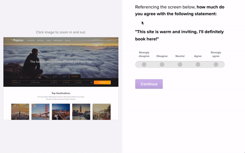
- More accurate follow ups. Sometimes testers can forget their response before answering the follow up question. We’ve now included all responses (even click and preference) right next to the tester’s follow up question.

In Conclusion:
- Beautiful interface keeps users engaged and invested.
- Buttons are closer to answers, making interaction faster and more confident.
- Images and answers on the same page, enabling zooming for deep inspection and more context.
- Improved context on likert, NPS and Multiple Choice questions by showing testers what they’ve chosen, enabling improved follow-up responses.
That’s it! We’ve burned every ounce of midnight oil we had bringing Helio past the times and into the future. We love what we do, and can’t wait to see how you use Helio to take your designs into the future!