Case Study
Indiana University Prototype Testing
Validating homepage animations on Indiana University’s new website

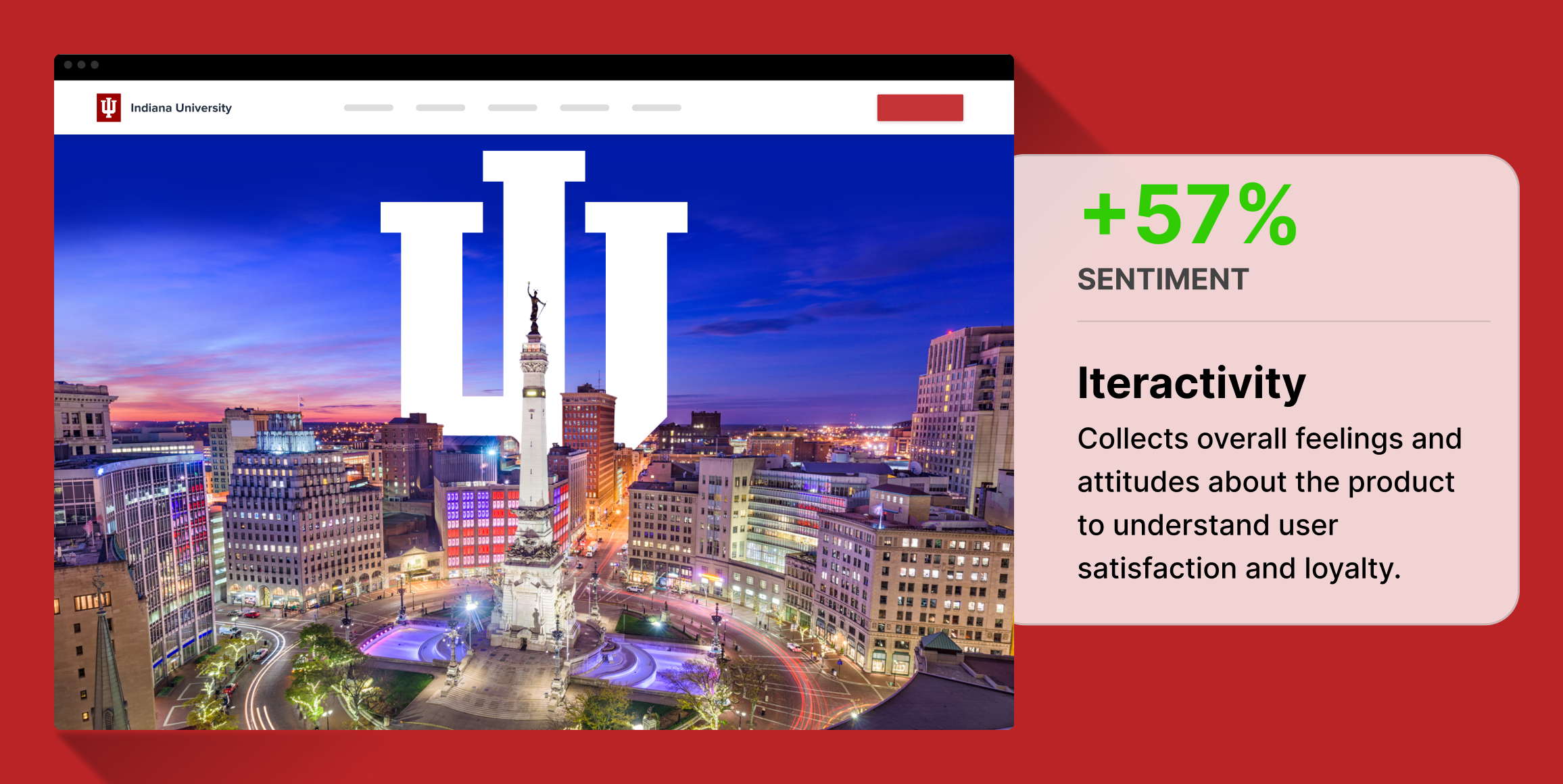
Indianapolis skyline animation
New homepage tested with and without an animation of the city skyline using Figma prototypes.
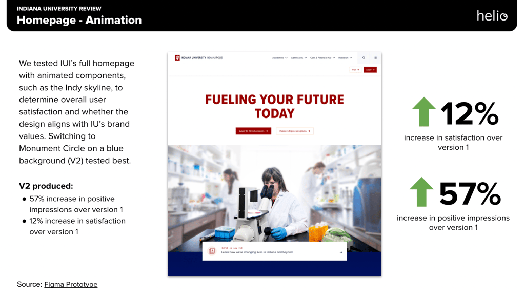
Increased homepage satisfaction by 12%
Skyline animation improved satisfaction compared to version 1.
Overall 57% increase in positive brand impressions
Brand impressions such as Impact, Discovery, and Innovation all increased compared to version 1.
Business Challenge
Indiana University sought to enhance the user experience on its homepage by determining which visual elements most positively influenced user impressions and satisfaction. The primary challenge was to choose an effective homepage design that would not only resonate with its diverse user base but also reinforce the university’s brand identity.
To create this effective homepage, the Indiana University team provided a hunch that including an animation of their city’s skyline on the page would better align with their desired brand impressions.
Timeline
This study was conducted over the course of one week, in which the Indiana team presented their hunches for testing on Tuesday, and we completed the testing and synthesis of the research by the following Tuesday.
Research Goals
The main goals of this research were:
1. To assess how different homepage designs affect user satisfaction and overall impression.
2. To determine whether animations and different background styles (solid vs. skyline imagery) would enhance the appeal of the homepage.
Methodology
The project utilized a quantitative approach to user testing, employing multivariate testing methods to evaluate different design versions of the homepage. The versions tested included a simple design with no skyline, Skyline Version 1 (V1), and Skyline Version 2 (V2).
Each version of the homepage was placed into a Figma prototype in order to exhibit the animated aspects of the homepage, so that participants experience the animations in an interactive environment. After interacting with the Figma prototype, participants were asked a series of evaluative questions to compare satisfaction and brand impressions across the three versions.
Research Panel
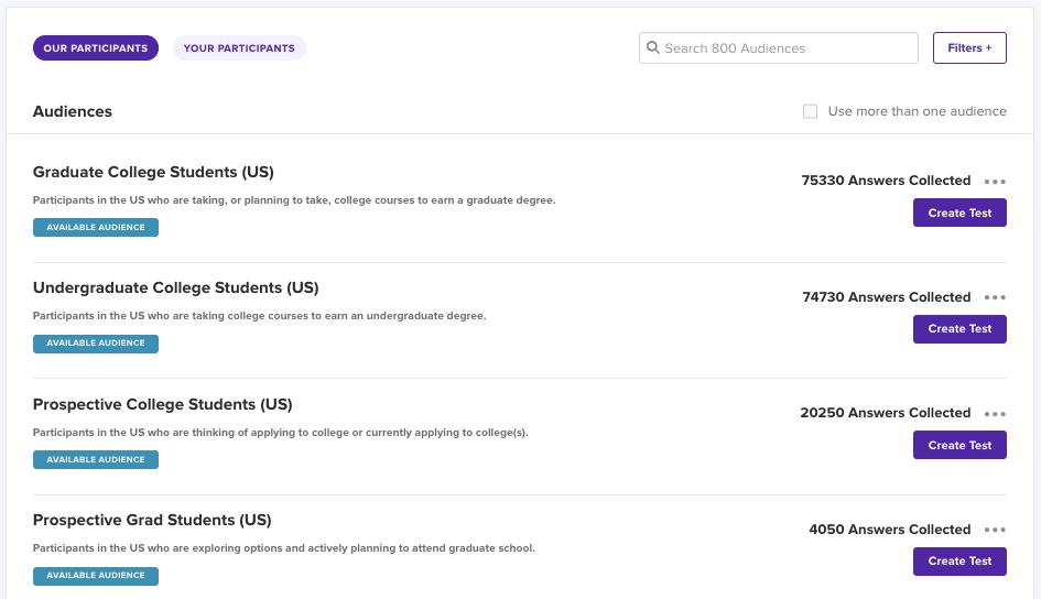
We used a Helio audience of Undergraduate, Graduate, and Prospective College Students in the US.
Test Setup
Three homepage variations were presented to users:
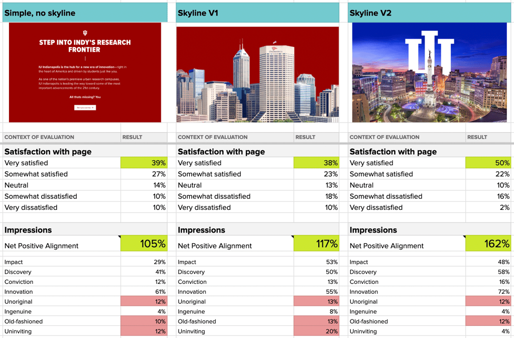
- Simple, no skyline: Basic design without any background imagery.
- Skyline V1: Features the city skyline during the day as a background.
- Skyline V2: Incorporates a vibrant evening city skyline with prominent university branding.
Participants were randomly assigned to review one of the three versions and provided feedback on their satisfaction and overall impression of the page.
Analysis and synthesis
Increased homepage satisfaction by 12%
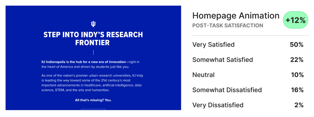
Skyline animation improved satisfaction compared to version 1. Skyline V2 produced 50% of participants who felt very satisfied with the look of the homepage, while V1 and the no skyline version fell at about 38%.
Overall 57% increase in positive brand impressions
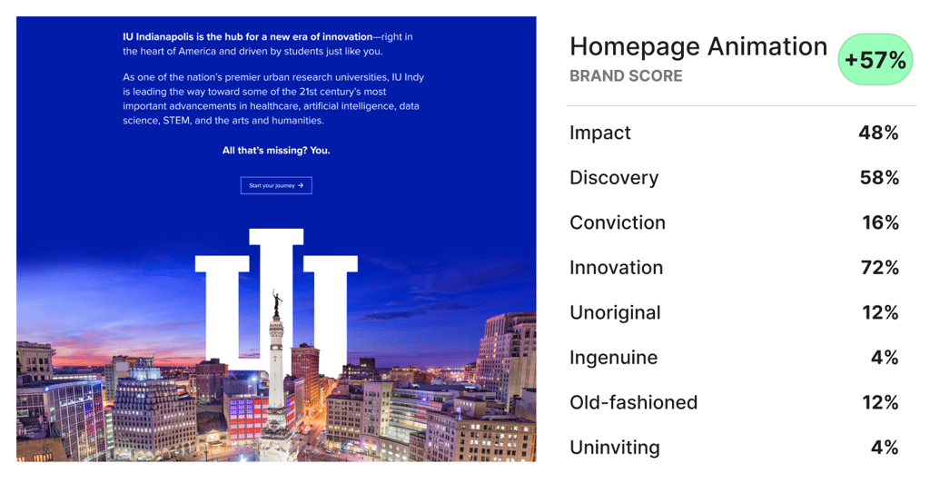
Brand impressions such as Impact, Discovery, and Innovation all increased compared to version 1. The net positive alignment of skyline version 2 (total positive impressions minus total negative impressions) was much greater than the other versions.
Combined with the fact that satisfaction was also higher, the IU team was confidently able to move forward with their plans for an animated skyline on the homepage.
Outputs/Deliverables
Each round of testing done with the Indiana University team produces several deliverables:
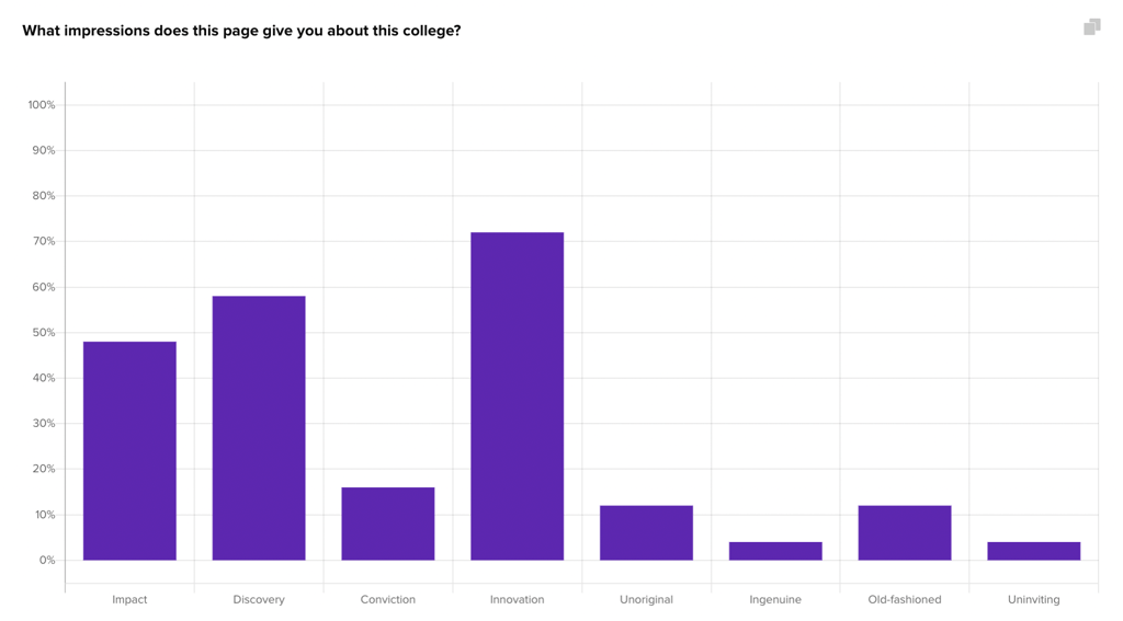
- The initial participants responses are recorded in Helio’s data report:
- We place this Helio data into comparison frameworks in order to see patterns across design versions:
- The findings from the data comparison are summed up in an executive deck:
Impact
The findings significantly impacted decision-making regarding the university’s website design:
- The evidence strongly supported the adoption of Skyline V2, which combined a visually appealing background with effective branding.
- This design was predicted to enhance user engagement and satisfaction, potentially increasing visit duration and return visits.
Next Steps and Recommendations
Following the study, the following steps were recommended:
1. Implement Skyline V2 as the default homepage layout.
2. Continue monitoring user engagement metrics to assess the long-term impact of this change.
3. Explore further variations of the skyline theme to determine if seasonal or event-specific versions could further enhance user engagement.
Reflections
This project underscored the value of remote user testing in obtaining actionable insights and highlighted the importance of aligning website design with user expectations and preferences. It also demonstrated the effectiveness of visual elements in enhancing user experience and satisfaction, guiding future design decisions at Indiana University.
