

Salesforce CRM Landing Page Optimization
Enhancing User Experience and Conversion on Salesforce’s CRM Landing Page


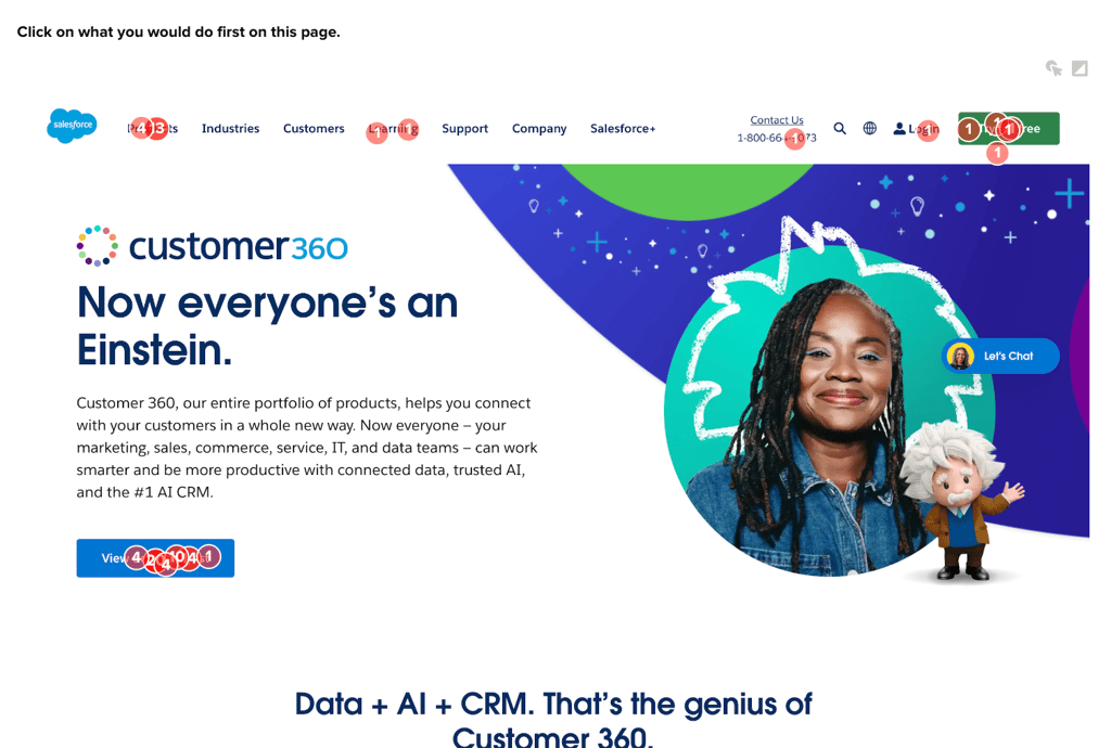
Strong performance for primary CTA
The ‘Demo’ CTA on the Salesforce landing page has a strong conversion rate, with 53% of first clicks.
High net positive alignment with brand impressions
Positive emotional reception highlights the content’s clarity and helpfulness, contributing to user satisfaction.
Low net promoter score
Despite high interest in product features, the overall experience score suggests opportunities for optimizing the user journey.
Business Challenge
Understand how well Salesforce’s CRM landing page is received by visitors in comparison with the same reactions to competitor landing pages.
Research Goals
The study aimed to analyze user interactions with the landing page to identify areas of strength and opportunities for increased conversion efficiency.
Timeline
Screenshots of Salesforce’s landing page were captured from their website. A feedback survey and usability test were developed to evaluate the engagement and effectiveness of the content. The results were analyzed within a day based on feedback from survey participants.
Methodology
Salesforce’s landing page was tested using remote user surveys through Helio, where participants reacted to the design using a variety of quantitative and qualitative methods. The Salesforce survey was then copied and used to test 4 competitor landing pages in order to understand where Salesforce excels in the market and where they can learn from their competitors.
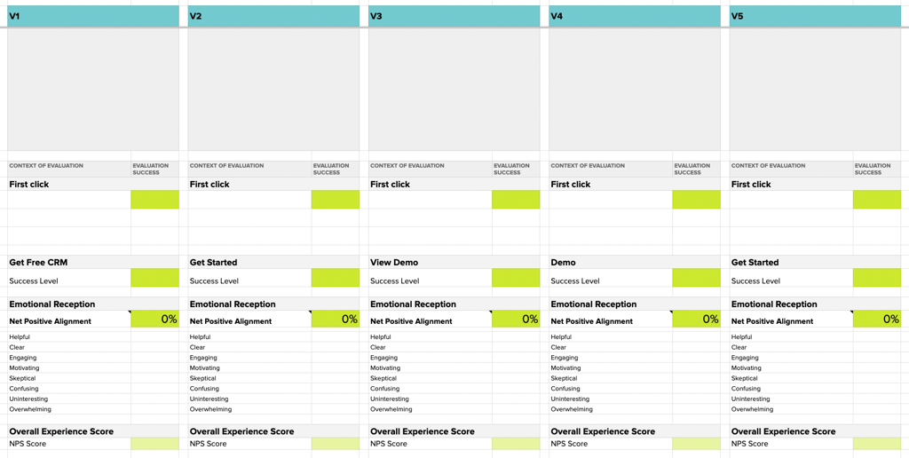
Once the responses were collected, the data was gathered into this comparison framework for surfacing quick signals across the landing page variations.
Research Panel
A ready-made audience of Marketers and Sales Professionals in the United States was utilized to collect 100 responses for each of the five competitor landing pages.
Test Setup
The study utilized an array of quantitative and qualitative metrics, such as the success level of specific CTAs and the emotional reception to the landing page’s content.
The test setup for the Monday.com landing page optimization study included a series of questions designed to understand user behavior and perceptions as they interacted with the landing page. Here’s a summary of the test setup based on the provided questions:
Comprehension: Participants were requested to explain the purpose of the page. This was done to assess whether the page’s messaging and design effectively conveyed its intentions and offerings. Frequent keywords in the responses, such as “CRM,” “software,” and “sales,” indicated that the page primarily promotes CRM software solutions for sales teams.

First Interaction: Participants were instructed to click on the element they would typically select first while navigating online tools. The goal was to pinpoint the primary areas of interest or initial points of engagement on the page. A subsequent question inquired about the rationale for their choice, with frequent terms mentioned including “software,” “CRM,” and “free.”
Information Seeking: Users were instructed to click where they would go to learn if the tool could be useful for their company. This helped to identify which parts of the page were perceived as most informative regarding product suitability. Reasons for their choices were explored in a follow-up question, with “product,” “company,” and “software” being frequent in the responses.

Emotional Reaction: This question aimed to capture the overall impression the page gave to the respondents, allowing them to select from multiple options. They were also asked to explain their choices, providing insight into the user’s perception of the page’s content and design.

Likelihood to Engage: A Net Promoter Score (NPS) question measured the likelihood that respondents would use Monday.com for their business or company, on a scale from 0 to 10. The median rating was an 8, with a follow-up question probing into the reasoning behind their rating. Keywords from the responses included “software,” “free,” and “business.”

Overall, the test was structured to gauge the initial attraction to key elements of the page, the clarity and utility of the information provided, the user’s general impression of the page, and the likelihood of the product being adopted by the user’s business. The use of common keywords and follow-up questions provided a deeper understanding of user motivations and barriers to conversion.
Analysis and Synthesis:
Strong performance for primary CTA
The ‘Demo’ CTA on the Salesforce landing page has a strong conversion rate, with 53% of first clicks.

Compared to other competitor CRM landing pages, which received around 30-40% engagement on the primary CTAs, Saleforce’s 53% is the highest percentage of first clicks on the hero CTA.
“The blue action button prompted me to click. I would like to see the demo and possibly skip over some of the more lengthy literature on the page.”
– Helio Participants, Marketing Professional (US)
High net positive alignment with brand impressions
Positive emotional reception highlights the content’s clarity and helpfulness, contributing to user satisfaction.

An emotional reaction question like this aims to maintain each negative impression below 10%, and strive to improve the positive impressions across variations.
Salesforce’s landing page excelled in the engagement it elicited from visitors, with up to 17% increase over competitors with that impression. The spike of overwhelming and confusion above 10% are concerning, though these negative impressions were shared by most competitors, so it’s nothing to cause alarm for now.
Low net promoter score
Despite high interest in product features, the overall experience score suggests opportunities for optimizing the user journey.

This numerical scale test revealed the net promoter score, a staple survey type in UX research, to be just 1. Since NPS are rated on a scale of -100 to 100, this score of 1 is as middle of the pack as one can get.
While technically any score above 0 is a positive result, a score of 1 is lackluster compared to positive results from the interaction and emotional impression testing. The Salesforce team can increase the clarity of their offering to reduce negative impressions and increase their net promoter score with their audience.
Outputs/Deliverables
We wrote a blog post to elaborate on how this testing works into the practice of landing page optimization.
We also produced a guide for testing landing page optimization just as we did with Zoho:
Next Steps and Recommendations
Break up white space: many participants sharing negative impressions indicated an overwhelming amount of white space on the page.
Bring clarity to images: reduce overlapping elements and focus on the features in each image that you’re trying to convey in each content module.
Reflections:
The contrast between the low emotional reception and the high CTA engagement prompts a closer look into the user experience design of Monday.com’s landing page to ensure that positive user sentiment is effectively captured and converted into desired actions.