Research Study
Zendesk Landing Page Optimization
Landing page test revealed engagement with primary actions on Zendesk’s website.

Hero video is a strong performer
The hero video on Zendesk’s landing page is a strong performer, capturing significant first clicks (19%).
Hero CTA maintains popularity
The ‘View Demo’ CTA demonstrates a solid conversion potential, suggesting that users are interested in seeing Zendesk’s offerings in action.
High positive reactions among competitors
High net positive emotional alignment indicates the content is resonating well with users.
Business Challenge
This independent research aimed to evaluate Zendesk’s CRM landing page to capture and convert visitors. The findings were compared with competitor landing pages to identify opportunities for optimization.
Timeline
The testing was completed in 24 hours. After running the test overnight, the findings were synthesized the following day.
Research Goals
The main goal of the study was to assess the clarity and appeal of the CRM offer presented on the landing page, and compare its performance to that of competitor landing pages.
Methodology
Zendesk’s landing page was tested using remote user surveys via Helio, incorporating quantitative and qualitative feedback from consumers. The same survey was applied to four competitor landing pages to benchmark Zendesk’s performance against competitors.
Research Panel
We used a Helio ready-made audience of Marketers and Sales Professionals in the United States was utilized to collect 100 responses for each of the five competitor landing pages.
Test Setup
The survey combined NPS scoring, satisfaction scales, and open-ended questions to gather quantitative and qualitative feedback on the effectiveness of the landing page.
The setup for the Zendesk landing page study included several key areas of focus:
- Comprehension: Participants were asked to explain the purpose of the page. This helped assess whether the page’s messaging and design clearly communicated its purpose. Common keywords like “CRM,” “software,” and “sales” indicated that the page was primarily seen as promoting CRM software for sales teams.
- First Interaction: Participants were instructed to click on the element they would naturally choose first when using online tools. This identified the main areas of interest or initial engagement points on the page. A follow-up question explored their reasons for these choices, with frequent mentions of “software,” “CRM,” and “free.”
- Information Seeking: Participants clicked on the sections they would visit to determine if the tool could be useful for their company. This highlighted which parts of the page were seen as most informative. A follow-up question explored their reasoning, with “product,” “company,” and “software” being common terms.
- Emotional Reaction: Participants were asked to share their overall impression of the page, selecting from multiple options and explaining their choices. This provided insight into how the page’s content and design were perceived.
- Likelihood to Engage: An NPS question measured how likely participants were to use Zendesk for their business, on a scale from 0 to 10. The median score was 8, and follow-up questions helped understand the reasoning behind their ratings, with keywords like “software,” “free,” and “business” frequently mentioned.
The test was designed to assess how well the page attracted users’ attention, the clarity and usefulness of the information provided, the general impression of the page, and the likelihood of the product being adopted. The use of common keywords and follow-up questions offered deeper insights into user motivations and potential barriers to conversion.
Findings
Hero video engagement success
- The hero video on Zendesk’s landing page is a strong performer, capturing significant first clicks.
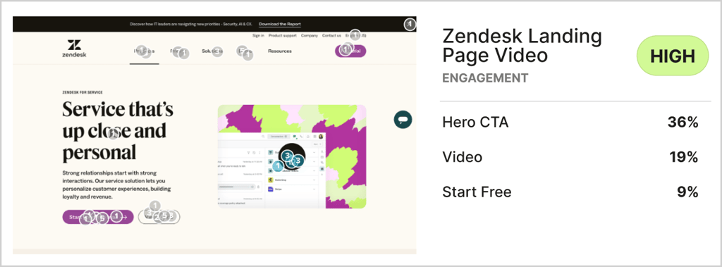
- Actions with more than 10% first click interactions on a landing page are considered high engagement areas, so the 19% of participants gravitating towards the video is a significant portion of the audience.
Hero CTA maintains popularity
- The ‘View Demo’ CTA demonstrates a solid conversion potential, suggesting that users are interested in seeing Zendesk’s offerings in action.

- With 36% of participants clicking here first on the page, the View Demo CTA in the hero is the most popular action for visitors to take. This is especially impressive considering the amount of clicks that landed on very near action items, such as the purple ‘Start free trial’ button and hero video.
High positive sentiment among competitors
- High net positive emotional alignment indicates the content is resonating well with users.
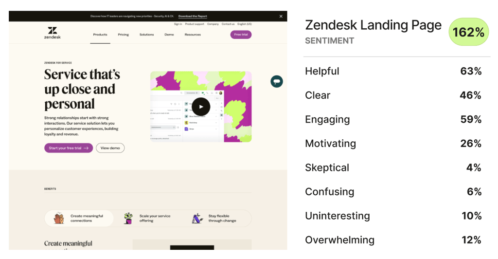
- Zendesk’s landing page produced the most positive reactions of the 5 CRM competitor landing pages tested, barely squeezing out the win over Hubspot. A gap of 10% or greater in net positive alignment is a signal of different emotional reactions, so Zendesk is practically even with Hubspot, but significantly better received than Zoho.
Conclusion
Zendesk was the most middle-of-the-pack competitor among CRM platforms, producing solid positive impressions and net promoter scores. The average performance of their landing page is a strong indication that Zendesk can improve upon their user experience.
Recommendations
- Leverage hero video: We recommend that Zendesk continue to leverage the appeal of their hero video and explore ways to streamline the journey from emotional engagement to conversion actions, particularly around the ‘View Demo’ CTA.
- Leverage demo: View demo is the most popular CTA on Zendesk’s landing page, so this flow needs to lead visitors towards a clear path for conversion.
Reflections
Since there is a CTA to ‘view demo’ and view a video in close proximity on the page, it would be interesting to see if participants conflate those two ideas, or have very different expectations of the demo versus the video.