Research Study
Usability Improvement for a Banking Dashboard
Increased usability for a mobile banking platform through iterative testing.

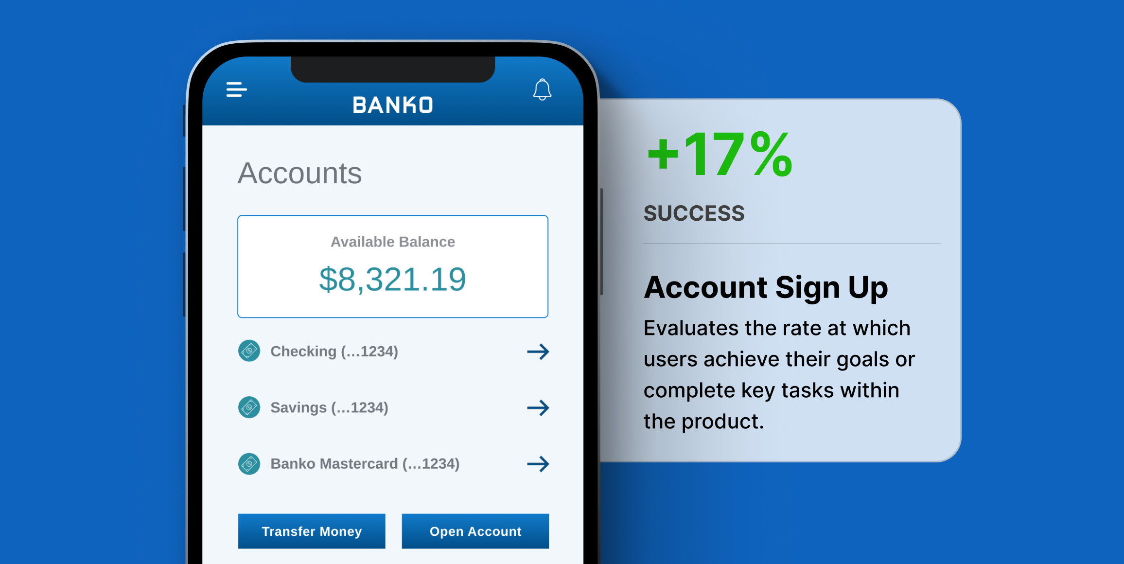
Improvement in primary sign-up action
Primary actions like signing up for savings saw up to 17% improvement in usability.
Usability of secondary CTAs increased
Secondary actions like finding credit building tips improved by up to 10%.
Final dashboard design validated
Final design produced average to above average success rates across dashboard actions.
Business Challenge
This independent research aimed to optimize the usability of an online banking platform to enhance customer satisfaction and increase user engagement. With multiple iterations of a banking dashboard, the goal was to improve upon user success rates and validate the usability of each key action in a final design.
Timeline
The testing was completed in 24 hours. After running the test overnight, the findings were synthesized the following day.
Research Goals
The main goal of the study was to identify gaps in usability of each version of the design, and track improvement in that usability over time.
Methodology
We used Helio click tests to track the success rate of completing actions in the Banko designs. Each version of the design was tested with the same click directives to track the usability of the page throughout the iterative design process.
Participant Panel
We ran the survey with 200 participants from a Helio ready-made audience of Bank Members in the United States.
Test Setup
Click test questions were used to present directives to participants and gauge where they would click on the page to complete that action.
The success of each click directive was measured alongside other calls-to-action on the page to determine the overall usability of each iteration of the design.
Findings
Improvement in primary sign-up action
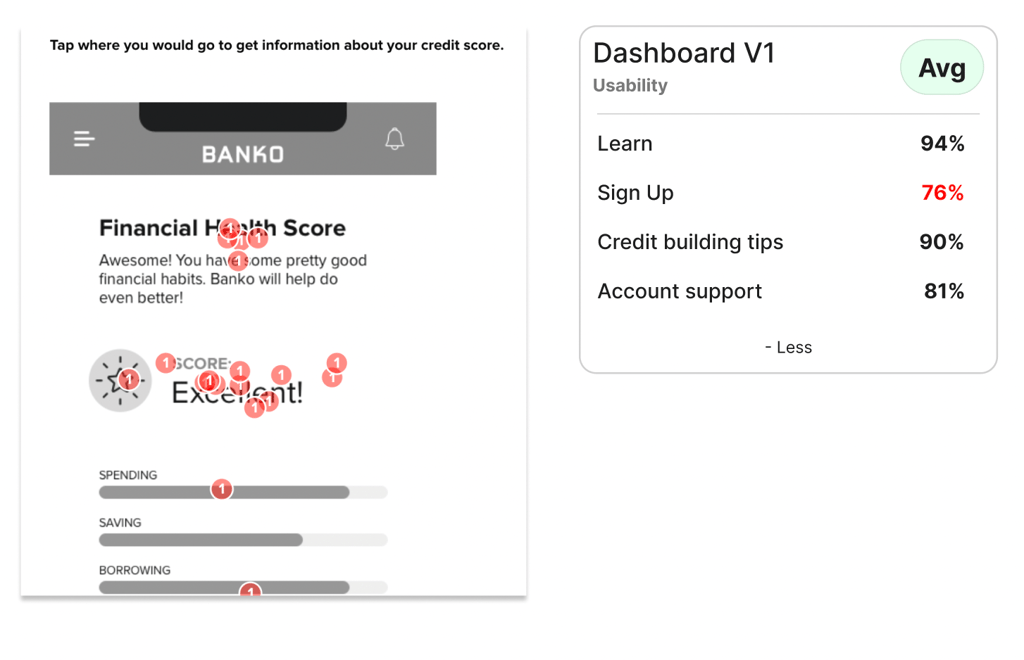
- Success rate of sign-up CTA improved over two rounds of iteration
- In the first round of hi-fi testing, we saw the sign up action produce less than 80% success rate, indicating a usability issue with this CTA.
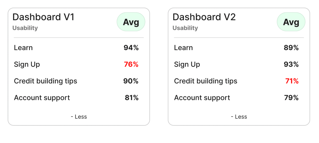
After the second round of hi-fi iterations, primary actions like signing up for savings saw up to 17% improvement in usability.
Usability of secondary CTAs improved
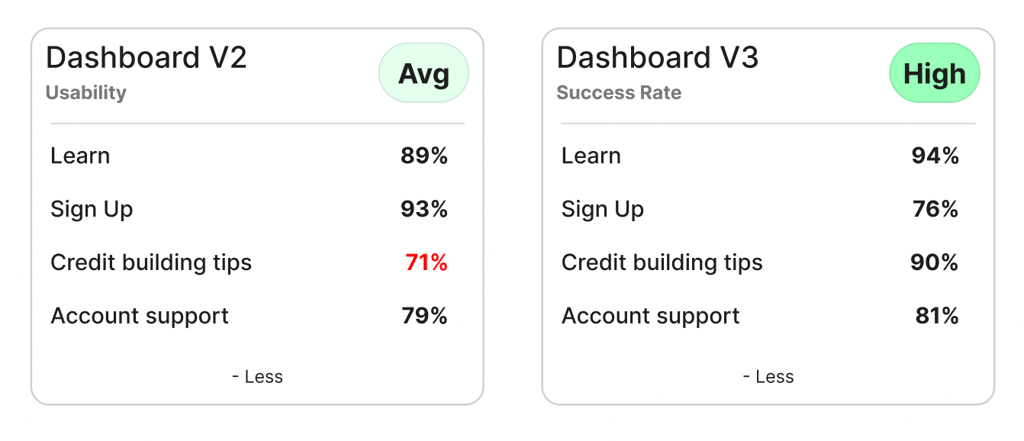
- Success rate for secondary dashboard CTAs improved
- Secondary actions like finding credit building tips improved by up to 10% from the second to third round of testing.
Dashboard usability confirmed

- The final design produced average to above average success rates across dashboard actions leading to a High usability rating for the dashboard as a whole.
Conclusions
The dashboard usability study provided insights into the success rate of interaction with different CTAs on Banko’s banking dashboard, and the improvement of the designs across three iterations.
Recommendations
Following the analysis, recommendations were made to:
- Implement Dashboard: Design V3 as the primary interface, given its high overall usability.
- Monitor usability: Continue to monitor user interaction post-launch to catch any usability issues early.
- Iterate on designs: Consider regular updates and testing cycles to ensure the dashboard evolves with user needs and technological advancements.
Reflections
This case study illustrates the critical importance of iterative testing in the development of user interfaces. By engaging directly with end-users and refining the product based on empirical data, Banko can significantly enhance user satisfaction and operational efficiency. The project not only improved the immediate usability of the platform but also set a standard for ongoing user-centered design practices at Banko.
