Standing out requires not just creativity but strategic intelligence. That’s where UX design competitive analysis comes into play— the meticulous process of dissecting your competitors’ strategies to build a superior user experience.
Let’s unpack how to conduct a thorough competitive analysis to elevate your product’s UX to the next level. We’ll jump into UX competitive analysis examples using data we collected from Helio
Competitive Analysis UX Research
There’s an old saying, “know thy enemy, know thyself.” But that’s just a paraphrase from a much longer Sun Tzu quote:
“If you know the enemy and know yourself, you need not fear the result of a hundred battles. If you know yourself but not the enemy, for every victory gained you will also suffer a defeat. If you know neither the enemy nor yourself, you will succumb in every battle.”
Sun Tzu, The Art of War
Okay, you might not do actual battle with your competitors. But it doesn’t hurt to know them as well as you know yourself. That’s where competitor analysis ux research can help.
Introduction to UX Competitive Analysis
Embarking on a UX design competitive analysis is like discovering the secrets behind your rivals’ success. This strategic expedition goes beyond mere observation; it’s an in-depth study of various facets of your competitors’ offerings, from user interface design to customer service approaches.
Not only does it arm your team with invaluable insights, but it also informs strategic decisions that can propel your product to the forefront of the market. It’s about learning, adapting, and innovating in a way informed by the landscape around you.
But you’ll want to make sure you’re studying:
- The right competitors. Studying Pepsi or Coke won’t make much sense if you’re not in the soda game. Make sure it’s someone in your market or doing something similar.
- The right parts. It doesn’t make much sense to study parts of a competitor if it’s irrelevant to what you’re doing.
You also have to know where to look and who to ask. Preferably with your own audience or target audience of potential customers. Helio makes it easy to access a target audience or simply use your own.

Don’t Do the Same Old User Tests
Use a ux design competitor analysis when you want to do something completely different from your usual user testing or surveys.
With a competitor analysis, you’ll be able to:
- Understand what sets you apart from your competition
- Ferret out opportunities that they missed
- Find markets and audiences that your competitors aren’t catering too
- Discover the niche you can own in your market
User feedback is indeed the linchpin of UX design enhancement. By actively analyzing customer surveys in Helio, product reviews, and discussion forums, UX designers can capture the voice of the customer. This direct line to user sentiment is invaluable—what delights users can become the cornerstone of your product’s experience, while their frustrations offer a roadmap to meaningful improvements.
To distill actionable insights, triangulate qualitative feedback with quantitative data. Look for patterns in what users frequently mention; these are the pulse points of your UX. If users rave about a competitor’s seamless checkout process, that’s a cue to scrutinize and refine your own. Conversely, if they lament about complex navigation, you have an opportunity to simplify and streamline.
UX Research: Understanding User Context
Engage with users where they are. Whether through social media, direct interviews, or usability testing, each interaction is a gold mine of information. Helio makes this extremely easy to use for one of our audiences. Understand their experiences in their own words, empathize with their journey, and then iterate your design to align closely with their needs and desires.
Leveraging user feedback isn’t just about fixing what’s broken; it’s about uncovering what makes a UX truly captivating. It’s a strategic endeavor that, when done well, transforms ordinary users into loyal advocates of your product.
UX Competitive Analysis Example
It can be daunting to know where to start. But don’t worry, we got you.
Our Helio advocates take these steps in their competitor analysis:
- Gauge their top navigation or call-to-action. Does it make sense? Is it understandable what action(s) an audience needs to take?
- Gauge the reaction from an actual audience. How do users react to a page? It’s colors, it’s messaging, etc. An impression test is great for this.
- Gauge their satisfaction with your competitors. Figure out how people are either satisfied or dissatisfied with a competitor and their offerings.
UX Research Analysis of Five Companies
To illustrate how Helio can be used to test landing pages, we analyzed five prominent CRM providers—HubSpot, Zoho, Zendesk, Salesforce, and Monday.com.
Five independent tests focused on user motivation, ability, and clarity of prompts. Distinct patterns emerged that shed light on the strengths and weaknesses of each platform. Below is an image of the framework used to evaluate the results from each test.
View the framework yourself here.
UX Research Competitive Analysis Results
HubSpot
Harnessing the Power of Free CRM- HubSpot shines with its clear emphasis on its free CRM, striking a chord with users for its helpfulness and clarity. This focus is HubSpot’s superpower, yielding the highest perceived value and a positive Net Promoter Score (NPS)—a rarity in this competitive analysis. By doubling down on this strategy, HubSpot can further boost user motivation and solidify its market standing.
Monday.com
The Art of White Space- Monday.com’s landing page stands out with its clean design, but it walks a fine line. While aesthetically pleasing, the generous use of white space could leave users hunting for crucial information. The opportunity here is clear: by refining the design to balance white space with accessible content, Monday.com can enhance user clarity and overall experience.
Salesforce
Mastering the Art of the Demo- Salesforce leads the pack in conversions, thanks to its strategically placed demo CTA. It’s a masterclass in building user confidence before purchase commitments. Yet, there’s room to grow. By harmonizing its focus on customer connections with a more explicit CRM message, Salesforce can reduce user confusion and further cement its leadership position.
Zoho
Streamlining the Starting Line- Zoho’s clear CRM messaging is overshadowed by the daunting “Get Started” form, causing hesitation at the starting blocks. The fix? Simplify the entry process. A smoother onboarding experience with fewer form fields can boost Zoho’s conversion rates and enhance the user’s entry journey.
Zendesk
Engaging Content Meets Design Challenges- Zendesk’s landing page is a mixed bag. While the hero video and trial/demo CTAs capture attention, some users find the overall look unengaging, resulting in a negative NPS. By revamping the design to match the content’s engagement level, Zendesk can convert those initial positive reactions into lasting user satisfaction.
Each competitor showcases unique strengths and areas ripe for enhancement. This analysis underscores the crucial role of user feedback and the need for ongoing refinement to meet evolving industry benchmarks.
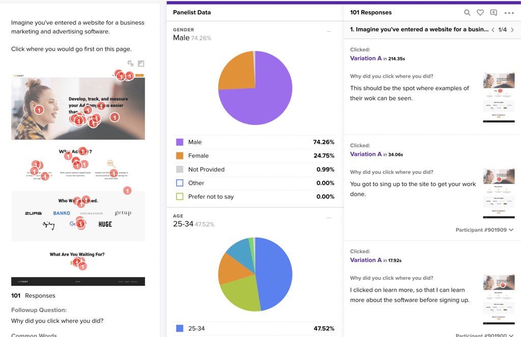
Here’s another example of a competitor analysis we did on a landing page conversion and the data we collected:

Our Helio testing shows you need a unique selling proposition to stand out.
Finding Your Unique Selling Proposition
Finding your Unique Selling Proposition (USP) through UX research is about delving into what makes your product or service uniquely valuable to users. It’s a systematic quest to determine the functional attributes that set your offering apart and the emotional resonance and experiential qualities that make your product indispensable. This search involves rigorous user research, encompassing interviews, surveys, and usability tests to understand the user’s pain points, desires, and behaviors.
Through this research, you discern whether it’s the frictionless ease of use, the disruptive innovations, or the dependable performance that users will not just like but love and rely on. The USP rooted in UX promises an experience that users will find nowhere else. It’s about creating moments of delight, solutions that feel tailored, and interactions that are so intuitive that they go unnoticed.
In essence, your USP, informed by UX research, is the magnetic north that guides every product decision, ensuring each design element speaks to that unique value proposition. It’s the strategic alignment of your product’s capabilities with the user’s deepest needs, crafting a user experience that is functional and meaningful. It turns users into champions of your brand, advocating not just a product but a pivotal experience that becomes a seamless part of their lives.
UX Competitor Analysis Template
But we have something that’ll get you started sooner. Our UX competitor analysis template gets you started on all the things we just talked about. Simply plug-and-play!
Continuous Learning with UX Research: The Never-Ending Journey
UX design is an ever-evolving discipline; competitive analysis is a journey, not a destination. As technology advances and user preferences shift, staying current is not just about being in vogue—it’s a strategic imperative.
Adaptation: The Roadmap to a User-Centric UX
Your UX strategies must be fluid, pivoting as user feedback and market trends dictate. It’s about keeping your finger on the pulse of the digital world and ensuring that your user experience remains top-tier.
Embarking on a UX design competitive analysis is akin to setting sail on a vast ocean of opportunity. You chart a course to a more distinctive and engaging user experience with each insight gleaned from your competitors. This strategic voyage is your chance to turn casual users into loyal advocates, navigating the currents of innovation and learning.
Design a UX journey that meets and celebrates the user at every turn!
Comprehensive UX Competitor Analysis FAQ
It’s a strategic approach to study competitors’ UX to enhance your product’s design and usability. It identifies areas for improvement and innovation in your product’s UX design.
Begin by identifying key competitors and gathering data on their UX strategies. Tools like Helio provide insights into user preferences and behaviors.
User feedback highlights what users value and dislike, guiding UX enhancements.UX competitive analysis improves customer satisfaction by aligning your UX more closely with user needs and expectations.
It’s crucial to understand how users interact with and feel about a product.
It can inform product development and marketing strategies for a better market positioning. You should you conduct UX competitive analysis regularly, to keep up with market changes and user expectations.
It’s the unique benefit your product offers, reflected in the UX.


