User Experience Research Methods shape and reshape every digital touchpoint, from web applications to complex marketing sites. Companies are no longer content with merely producing functional products; they want them to be tailor-made for their users, addressing their needs and aspirations.
If you’ve found yourself mulling over which user experience research methods would best suit your venture or pondering why such a vast variety of methods are available, you are among many. It’s a common question, and the good news is that experts like Christian Rohrer have taken the initiative to demystify the subject for us.
Journey into the World of User Experience Research Methods
Before exploring the various User experience research methods, it’s essential to understand what User Experience Research is.
Simply put, it is a systematic approach to understanding users’ needs, behaviors, and preferences by gathering and analyzing data. This process involves observing and interacting with users to gain insights that inform the development of products or services.
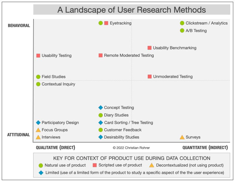
Now, let’s take a closer look. It’s a vast and varied landscape out there when it comes to UX research methods.These methods can be classified into three main categories based on the data collection techniques: qualitative, quantitative, and hybrid. Each of these approaches has advantages and limitations in delivering insights.
A Framework to Decode UX Research Methods
All too often, design teams find a comfort zone in a handful of tried and tested User experience research methods. While these might be effective, sticking solely to them may mean missing out on a spectrum of insights that other methods could provide. Understanding that each project has unique nuances and dynamics is crucial, necessitating a diverse research approach.
Christian Rohrer, in his brilliant summary, presents a three-dimensional framework to help navigate the maze:
- Attitudinal vs. Behavioral: This dimension addresses the dichotomy between what users say and what they do. While attitudinal data sheds light on users’ stated preferences and opinions, behavioral data delves into their actions.
- Qualitative vs. Quantitative: The age-old debate between depth and breadth. Qualitative methods offer a profound understanding, giving a microscopic view of user behaviors, emotions, and motivations. On the other hand, quantitative methods aggregate data from a larger audience, showcasing trends, patterns, and generalizable insights.
- Context of Use: This is about the environment and circumstances surrounding the use of a product. It distinguishes between research methods that observe users in their organic, real-world settings versus those that use predetermined.
Changing UX Research with Helio
Helio isn’t merely a survey tool; it’s a revolution in UX research. It stands out by melding the benefits of quantitative data gathering with the depth of qualitative feedback. This fusion means that while you get the large-scale data points you’d expect from surveys, you also gain a deeper understanding through usability tools that capture nuances often missed by conventional methods.
Here’s a snapshot of the various user experience research methods that seamlessly dovetail with Helio:
Usability Testing
By roping in users to execute specific tasks on the product, this method identifiesroadblocks and hiccups they might encounter.
The purpose of usability testing is to have participants use your product and reveal where they have success or difficulty. We want to understand the percentage of participants who can complete an action on the page and their response time.
To put the e-commerce clothing platform Getup to the test, we asked participants to interact with different page designs by completing a series of directives across primary, secondary, and tertiary actions. For instance, participants were asked to find features like shopping for a suggested look on the homepage of the app:
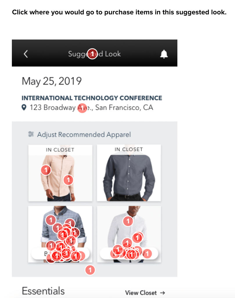
Helio’s data report allows you to outline a cluster of clicks on the page to measure the percentage of participants who successfully interacted with the feature:
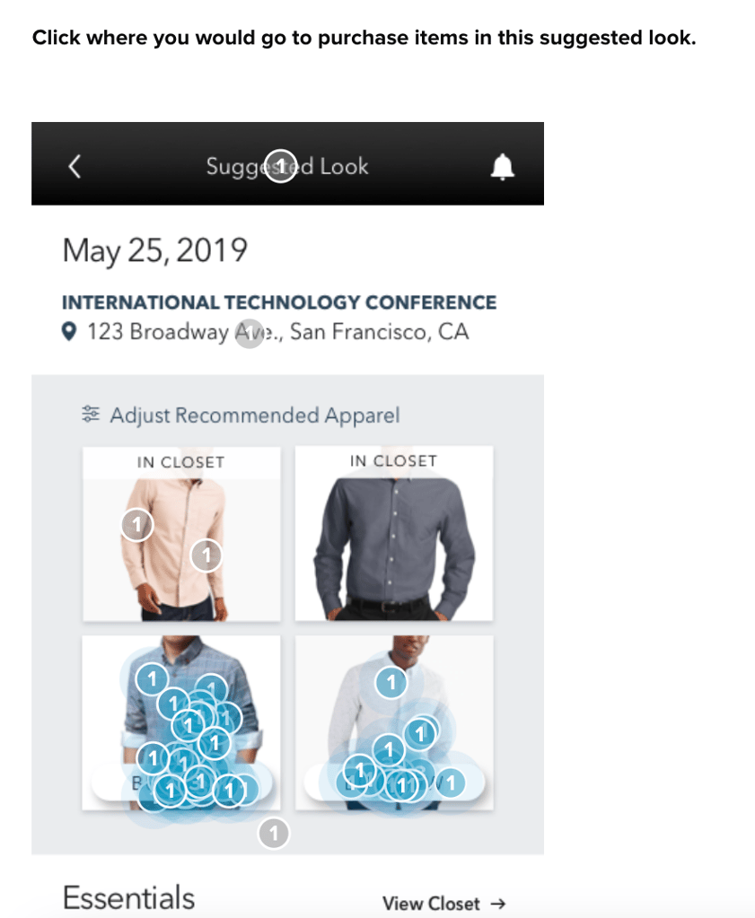
Through this testing and data analysis, Getup was able to see that their shop suggested look feature on the homepage was receiving up to 78% of successful interactions from visitors on first click. The relative success of that action against other features, and against future iterations of itself, the Getup team used an Interaction Matrix framework for usability benchmarking.
View the Helio Example
Usability Benchmarking
A method that quantifies usability, setting a product’s UX against established benchmarks or its competitors.
The image below shows a practical example of testing for various homepage actions on eCommerce site Getup. The Interaction Matrix framework shows that Getup’s homepage baseline was first tested. Then, revealing usability issues with many primary and secondary actions, such as Shopping for a Suggested Look.
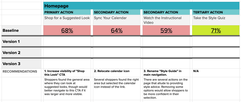
Primary actions are the most important CTAs on the page and are expected to produce at least 80% success from users. Secondary actions, which hold importance but aren’t the main purpose of a page, should reach at least 70% success. Tertiary actions are expected to be found by 55% of users on the first click.
Once your baseline is tested, use the data to make design decisions to drive your new variations forward.
Here’s what the Getup data tells us:
- Primary Action: ‘Shop for a Suggested Look’ needs improved visibility, especially as the most desired action on the page from a business perspective.
- Secondary Action: ‘Sync Your Calendar’ could benefit from more clearer placement of the CTA itself, and style advice can be more clearly provided from the homepage.
- Tertiary Action: ‘Take the Style Quiz’ consistently performed well, with the least variation among the versions.
Translating Data into Design Decisions
To translate these insights into actionable design strategies, Getup planned the following:
- Highlight Key Features: If ‘Shop this Look’ drives engagement, make it stand out. Use bold colors or position it prominently.
- Simplify Navigation: If syncing calendars is essential, streamline the process. Use icons over text links for intuitive navigation.
- Guide the User Journey: Rename sections like ‘Style Guide’ to more directly reflect the action you want users to take, like ‘Get Your Personalized Style Advice’.
With these plans in mind, the Getup team continued to test new variations of their homepage actions, seeing immediate success in secondary actions like syncing calendars and watching instructional videos.
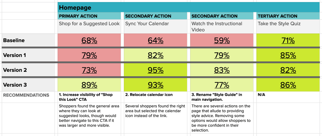
The primary action of Shopping a Suggested Look was the last nut to crack, which finally leapt into the expected success range with Version 3 of the homepage.Getup’s Interaction Matrix shows constant iteration and improvement over time, validating their team’s decisions with user data.
View the Getup Interaction Matrix
Clickstream
A tool that offers a visual journey of a user’s navigation through a site, shedding light on behavior patterns.
To test full front-to-back flows, we need to test user error rate through the flow rather than success on individual clicks.
To do so, online banking company Banko tested their app’s onboarding process with a Helio audience of Bank Members in the US. One of Banko’s key onboarding opportunities allows new users to take a questionnaire that sets them up for tracking their financial health and getting financial advice from the Banko team.
Banko put 100 participants from their audience through the onboarding flow, tracking the levels of success for completing each question:
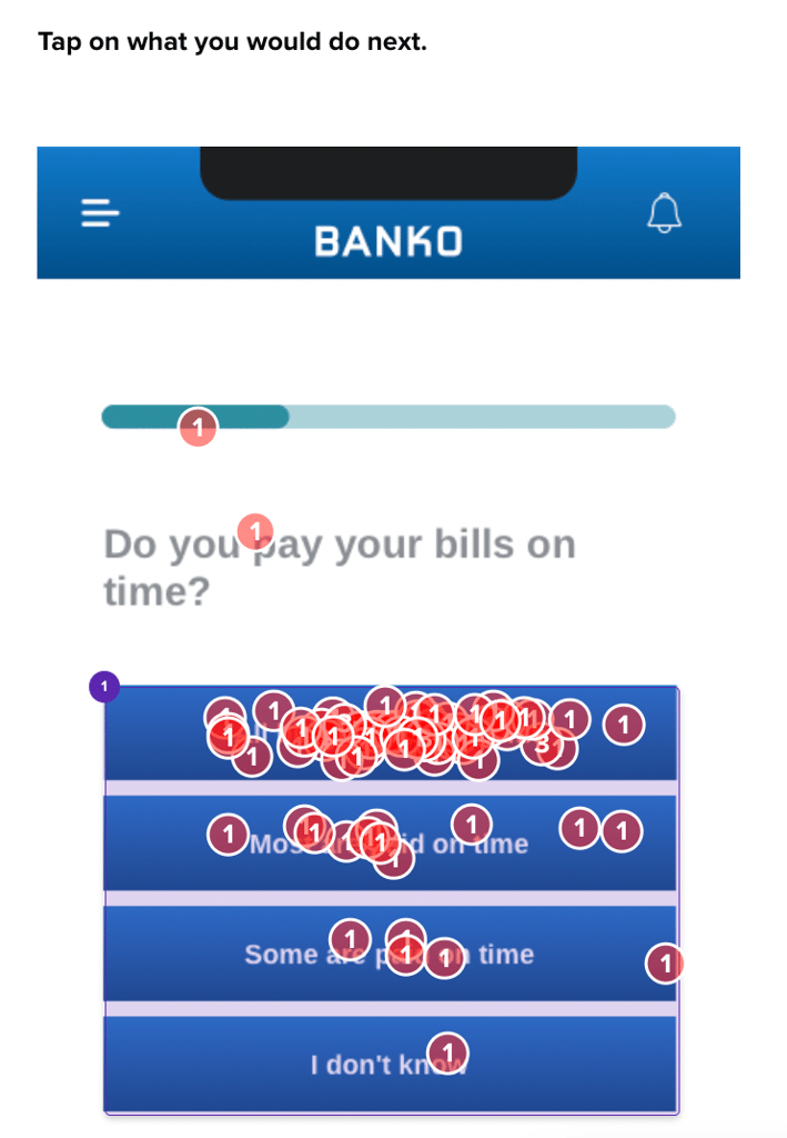
For users who decided to skip certain parts of the questionnaire, Banko temporarily took them out of the flow to understand more about why they didn’t want to engage with those questions.
This testing revealed the usability success of their onboarding feature, and the reasoning behind user’s potential hesitation:
“Not sure if I feel comfortable filling that out after just signing up”
– Bank Member (US)
Multivariate Testing
A comparative analysis technique, it juxtaposes two versions of a web page or app to discern which resonates better with users. Compare different versions of headlines, product descriptions, and CTAs without needing to launch multiple designs live like a traditional A/B test.
To use multivariate testing for your website, you just need the ability to quickly tweak a couple screenshots. Let’s look at a case study using Figma, a popular UI design tool. By testing the standard homepage headline against one crafted using the “Now You Can…” homepage headline framework, we gained insights into how such a simple change can impact comprehension and emotional reaction.
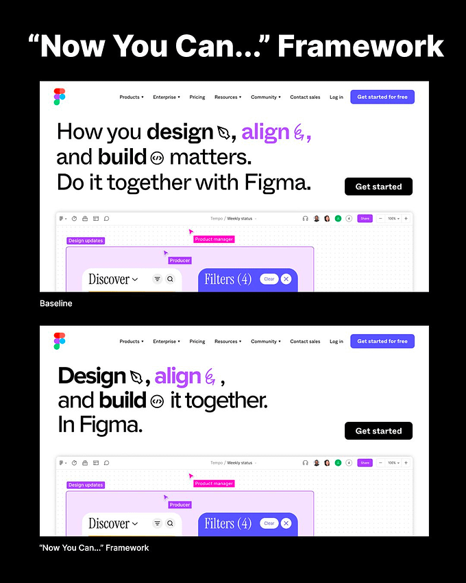
Using Helio, we split an audience of designers and marketers and presented each group a variation of Figma’s homepage in a test setup. The original headline was “How you design, align, and build matters. Do it together with Figma.” The alternative, crafted with the “Now You Can…” framework, read “Design, align, and build it together. In Figma.”
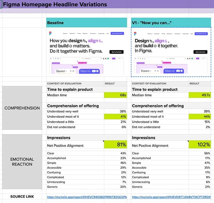
Here were the observations from that test:
- Comprehension Speed: The “Now You Can…” version allowed users to understand the offering 20 seconds faster than the baseline. This reduction in time suggests that the message was clearer and easier to grasp.
- Clarity and Simplicity: Users found the “Now You Can…” version much clearer, avoiding the confusion and complexity perceived in the baseline.
- Generic Feel: Despite the improvements, both headline variations were criticized for feeling somewhat generic, indicating room for further refinement to stand out in the market.
See the side-by-side comparison between the baseline and the new copy in the image below:
Here’s a link to the Figma Homepage Headline data comparison sheet, including links to the Helio tests for each homepage headline.
Concept Testing
A pre-launch evaluation tool, it’s designed to gauge user reactions to new concepts or prototypes.
SkinSavvy tested their mobile app from multiple angles using prototypes. As new features on the platform were completed, such as book a consultation on the map page, the flow was placed into a prototype for testing in Helio:
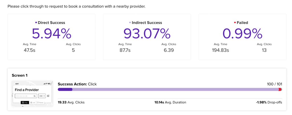
As participants attempt to complete the flow, Helio tracks the direct success (participants who only clicked once on the correct action), indirect success (those who clicked around and eventually found the right action), and failure.
Direct success can be low since SkinSavvy’s consumer app provides multiple places to engage. Hence, the expectation is that they click around and explore a bit before landing on their ultimate goal. The fact that 99% of participants found that the ultimate goal is a great sign for the usability of the Set Up a Consultation flow.
This test type also allowed SkinSavvy to gather qualitative feedback about each flow after participants had completed it:
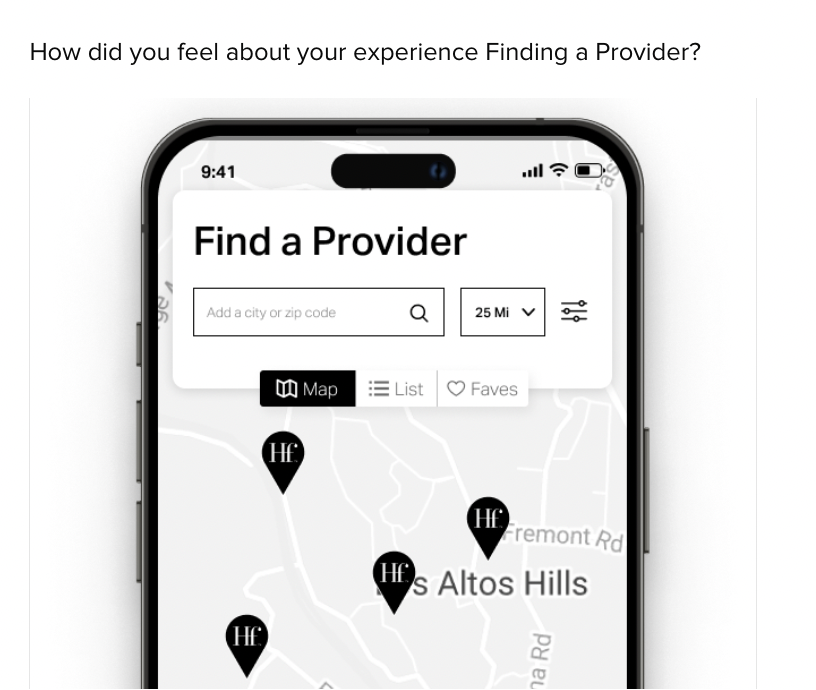
Some participants mentioned a need for more pertinent info to be connected with the provider locations they see on the map:
“I think when choosing what service you want, a short sentence like “refresh your skin” or “clear your pores” could give a good idea as to what each service entails even if someone doesn’t know too much about skincare or treatments.”
– Helio Participants, Beauty Product Consumer (US)
With their prototypes revealing potential user comprehension and usability pitfalls, SkinSavvy could iterate on their designs and maintain their high usability marks while providing more information about their audience’s needs.
With confidence in their designs, they could move on to their pilot program and test the full experience of their new app with live users.
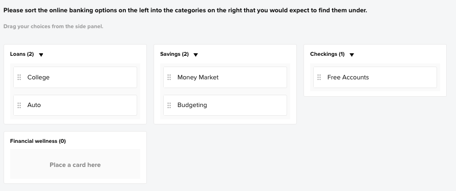
Card Sorting & Tree Testing
These methods focus on optimizing information architecture, examining how users categorize information and navigate a site’s structure.
To understand users’ mental mindset, they are asked to sort existing content pages into categories that represent main navigation drop downs on Banko’s banking platform:
Once the responses are collected, the data is provided in a table view that outlined where each card was most likely to be sorted:
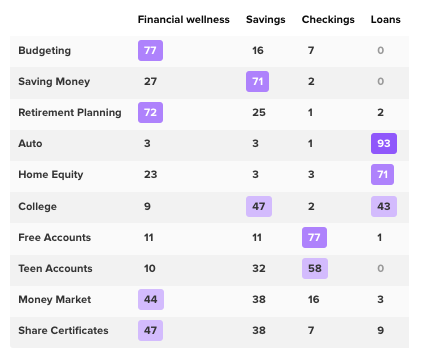
The purple in the table represents consensus from the audience, where the majority of participants sorted that card. For Budgeting, 77% of users sorted that page under Financial Wellness. Money Market was a less clear option, with almost an equal percentage of participants sorting that page into Financial wellness and Savings.
The most polarizing of the cards sorted was the College content, which was sorted into both Savings and Loans by over 40% of participants. This is a great indication that participants need more context for the College content for participants to successfully understand where to find that information on their site.
View the Helio Example
Customer Feedback & Surveys
They are the user’s voice, collecting their opinions and feedback to influence and shape product development.
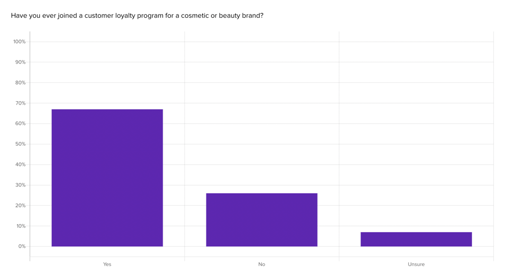
Beauty brand SkinSavvy used Helio in their mission to set up a customer loyalty program and encourage user engagement through their mobile app. To start this journey, they needed to learn what type of experiences already stand out in customers’ minds when it comes to loyalty programs, so they used Helio to send a proof of concept questionnaire to an audience of Beauty Product Consumers in the US.
SkinSavvy learned how their audience had engaged with loyalty programs so far, with most of them (68%) having joined one in the past:
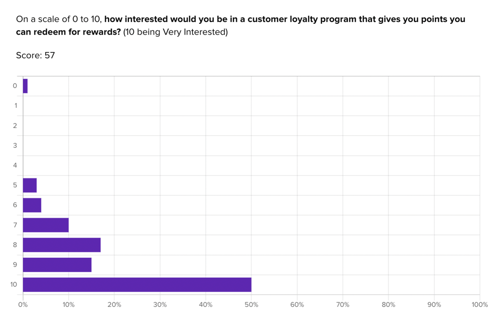
They were also able to gauge early interest in their own concept for a loyalty program:
“I usually do sign up if they offer a perk quickly enough or with low entry cost (like free shipping, $5 off or an extra freebie). If they have really high thresholds (like spend $500 for little perks), I won’t sign up.”
– Helio Participant, Beauty Product Consumer (US)
Helio helped SkinSavvy understand that interest for a loyalty program is high, with most participants (50%) saying their interest level is a 10/10. However, participants admit that they don’t always sign up for these programs with new brands, so providing enticing perks and few barriers to entry will be key to building engagement with their new loyalty program.
View the Helio Example
With Helio in your arsenal, design teams can ensure their UX research is comprehensive, rounded, and, most importantly, actionable. Integrating hard metrics with soft insights means teams can make decisions that genuinely echo with their users.
Context of Use in Helio
In many testing cases, Helio can be used in these different contexts.
- Natural product use studies aim to understand behavior in reality, through data mining and ethnographic field studies.
- Scripted product use is done to focus insights on specific areas of the user experience.
- Limited methods allow users to interact with design elements to present solutions for their needs.
- Card sorting and tree testing focus on information architecture’s arrangement and navigation ease.
Studies not using the product examine brand issues and aesthetic attributes associated with designs. Helio can be used for product studies and evaluating marketing activities.
Phases of Product Development: The Time Dimension
The product development phase and its objectives are crucial when choosing research methodologies. At the beginning of the product development process, you’re mainly focused on the strategic question of which direction to take. This is where generative methods come into play. They help generate ideas and provide answers about which way to go.
Once a direction is selected, the design phase kicks in. Here, formative methods come into play. They inform you how you can improve the design. Finally, when a product has developed enough to measure its effectiveness, you can assess it against earlier versions or competitors. This is where summative methods come into the picture.
Take a look at the following table, which gives a breakdown of where many methods map to these stages in time:
- Strategize Stage:
- Research Goal: Find new directions and opportunities.
- Generative Research Methods: Techniques include field studies, diary studies, interviews, surveys, participatory design, and concept testing.
- Design Stage:
- Research Goal: Improve the design’s usability.
- Formative Research Methods: Examples include card sorting, tree testing, usability testing (moderated and unmoderated remote testing).
- Launch & Assess Stage:
- Research Goal: Measure the product’s performance against itself or its competitors.
- Summative Research Methods: Tools used are usability benchmarking, unmoderated UX testing, A/B testing, clickstream analytics, and surveys.
Art or Science?
When it comes to user-experience research methods, they may have scientific roots but their goals are not solely scientific. They need to be customized to meet stakeholder requirements. Hence, the descriptions of these methods here should be viewed as general guidelines rather than strict classifications.
Ultimately, the effectiveness of your work will be measured by its impact on enhancing the user experience of the website or product at hand. These classifications aim to assist you in making the optimal decision at the appropriate moment.
Launching into the World of UX Research with Helio
The vast spectrum of user experience research methods might seem overwhelming. However, once you embark on this journey with clarity about the strengths and offerings of each method, you’re well on your way to harnessing insights that can steer your product to success. Platforms like Helio streamline and enrich the research journey, blending the tried-and-tested survey techniques with sophisticated usability tools.
Christian Rohrer’s exhaustive article is the compass you need to delve deeper and immerse yourself in the ocean of UX research. It’s an indispensable resource for anyone venturing into, or looking to strengthen their foothold in, the world of UX research.
Resources
The product development phase and its objectives are crucial when choosing research methodologies. At the beginning of the product development process, you’re mainly focused on the strategic question of which direction to take. This is where generative methods come into play. They help generate ideas and provide answers about which way to go.
- Customized to meet stakeholder requirements – Christian Rohrer’s exhaustive article is the compass you need to delve deeper and immerse yourself in the ocean of UX research. It’s an indispensable resource for anyone venturing into, or looking to strengthen their foothold in, the world of UX research.
- Many methods map to these stages – Studies not using the product examine brand issues and aesthetic attributes associated with designs. Helio can be used for product studies and evaluating marketing activities.
- Gauge early interest in their own concept for a loyalty program by John Doe – They are the user’s voice, collecting their opinions and feedback to influence and shape product development.