The speed and efficiency of decision-making can make or break a project. Inspired by Matt Cooper-Wright’s insights from IDEO, we’re diving deep into how you can make design decisions swiftly without compromising quality. This post will explore strategies to expedite the design process, ensuring that decisions are both user-centered and stakeholder-approved.
Understanding Design Decisions
Before diving into acceleration, let’s understand what encompasses a ‘design decision.’ These decisions can range from high-level strategic choices about design direction to specific decisions about user interface elements. They require balancing aesthetics, functionality, user needs, and business goals.
The Spectrum of Design Decisions
Design decisions can be categorized into several layers, each contributing to the final product:
- Strategic Decisions: These are high-level choices that define the direction of a project. They answer questions like, “What problem are we solving?” and “Who are our target users?” Strategic decisions set the course for the project and are often influenced by market research, business objectives, and the company’s overall goals.
- Conceptual Decisions: At this stage, designers decide on the general approach for solving the problem. This includes choosing between different design philosophies, such as minimalism or skeuomorphism, or deciding whether the solution should be a mobile app, a web platform, or a physical product. Conceptual decisions shape the creative vision of the project.
- Structural Decisions: These decisions involve the architecture of the user experience. Designers determine the layout and structure of information, how users navigate the system, and how the content is organized. Structural decisions are crucial for ensuring the product is intuitive and user-friendly.
Additionally,
- Aesthetic Decisions: These are the decisions that most people think of when they hear “design.” They involve selecting colors, typography, shapes, and other elements that give the product its look and feel. Aesthetic decisions are vital for making the product appealing and engaging to users.
- Functional Decisions: These decisions focus on the product’s usability and include user interaction mechanisms. Designers choose what happens when a user clicks a button, how windows appear, or how notifications are displayed. Functional decisions ensure the product is usable and practical.
- Technical Decisions: Often made in collaboration with developers, these decisions involve choosing the right technologies and frameworks to build the product. They need to align with the aesthetic and functional decisions to ensure that the design can be effectively implemented with the chosen technology.
- User Interface (UI) Specific Decisions: These are detailed decisions directly affecting how users interact with the product. They include the placement of buttons, the flow from one screen to another, and the micro-interactions that occur during use. UI decisions are critical for ensuring the product is easy to use.
Balancing Key Factors in Design Decisions
Successful design decisions require a delicate balance of several factors:
- Aesthetics: A product’s visual appeal can significantly influence its success. Good design captures attention and makes the product stand out in a crowded market.
- Functionality: A product must not only look good but also work well. It should deliver the functionality that users need in an intuitive and accessible way.
- User Needs: Understanding what users want and need from the product is crucial. This involves user research, usability testing, and ongoing feedback to ensure the product meets and exceeds user expectations.
- Business Goals: Every design decision should align with the broader business objectives. Whether driving sales, increasing engagement, or improving customer satisfaction, each decision should contribute to the business’s overall success.
By comprehensively understanding these aspects, designers can make informed decisions that enhance a product’s usability and appeal and ensure it aligns with business strategies and user expectations. This holistic approach to design decision-making speeds up the design process and enhances the final product’s quality and success.
The Power of Choice Making
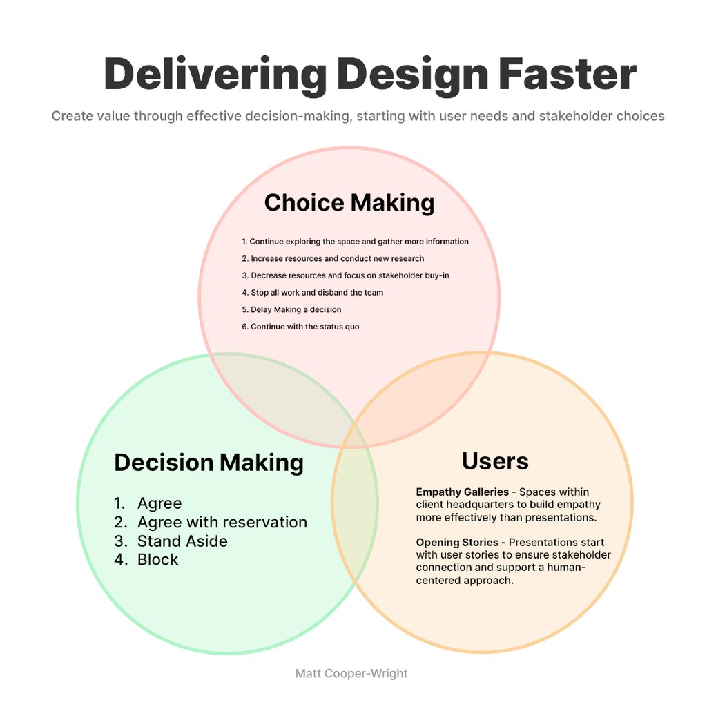
In his insightful post, Matt Cooper-Wright emphasizes moving away from the traditional binary decision-making models towards embracing a spectrum of choices. This approach can dramatically speed up the design process by fostering quicker consensus and encouraging innovative thinking. Below, we explore how different choice-making options highlighted in Cooper-Wright’s model can be applied to design decisions.
Expand Options: Generating a Spectrum of Choices
Rather than cornering decision-making into a simple yes/no dichotomy, expanding the range of options available can catalyze creativity and lead to more nuanced solutions. Here’s how you can implement this:
- Continue Exploring the Space: Sometimes, the best decision is to keep your options open a little longer. Allowing the design team to continue exploring different possibilities can unearth innovative solutions that a rushed decision might miss.
- Increase Resources and Conduct New Research: If initial solutions aren’t satisfying, allocating more resources for deeper research might be beneficial. This could involve more thorough market analysis, user testing, or prototype development, providing new insights that lead to better decisions.
- Decrease Resources and Focus on Stakeholder Buy-in: Alternatively, limiting resources might force the team to think more creatively about solutions, using constraints as a driver of innovation. Simultaneously, focusing on securing stakeholder buy-in with this refined approach streamlines decision-making, keeping decisions within a more focused scope.
- Stop All Work and Disband the Team: While it sounds drastic, there are scenarios where halting progress to reassess or redirect efforts can save resources and time in the long run, especially if the project is veering off track.
- Delay Making a Decision: Sometimes, you need more time to make an informed decision. Delaying decisions until you have vital information or resources can prevent costly mistakes. Delaying a decision until vital information or resources are available can prevent costly mistakes.
- Continue with the Status Quo: In some cases, the best choice might be to stick with the existing design or strategy, especially if it’s still effectively meeting user needs and business goals.
Resource Flexibility: Dynamically Adjusting Inputs
Flexibility in allocating resources throughout the design process can lead to more efficient and effective outcomes. During the brainstorming and ideation phases, infusing the project with additional resources, such as bringing in external experts or giving teams more time, can lead to a broader range of ideas and solutions.
Conversely, focusing resources on fine-tuning and refining the leading options as solutions take shape ensures concentrated and efficient efforts.
Stakeholder Engagement: Enhancing Alignment and Buy-in
Engaging stakeholders throughout the process ensures their support and alignment with broader organizational goals, significantly speeding up implementation. Here’s how to improve this engagement:
- Early Involvement: Involve stakeholders from the start to ensure their needs and expectations are understood and integrated into the design process from the beginning.
- Ongoing Communication: Maintain regular updates and check-ins with stakeholders. This keeps them informed and allows for early detection and mitigation of potential misalignments or objections.
- Feedback Loops: Establish mechanisms for quick stakeholder feedback on prototypes and decision proposals. This can help catch issues early and refine solutions before making final decisions.
By embracing a spectrum of choices and integrating these strategic approaches into the design process, teams can make faster, more informed decisions aligning with user needs and business objectives. This streamlines the process and enhances the creativity and effectiveness of design outcomes.
Once the concept is defined, it’s time to create prototypes and test them rigorously. Prototyping allows product managers to gather feedback from users and iterate on the design. This iterative approach ensures that the final product design meets user expectations and delivers the desired functionality.

Leveraging User-Centric Techniques
Incorporating user feedback throughout the design process is crucial for ensuring design decisions align with end users’ needs and expectations. Matt’s approach provides insightful strategies such as ‘Empathy Galleries’ and ‘Opening Stories’. These techniques foster a strong user focus, making designs more intuitive and impactful by deeply connecting with the users’ experiences and expectations.
In design reviews, stakeholders and decision makers often need the help of the design team in order to surface what the team needs an answer on. Lead the horse to water, and they will drink.

Integrating Tools and Technologies
Tools like Helio can help collect user feedback swiftly, enabling real-time insights into user preferences and behaviors. These tools can help streamline the decision-making process by providing data-driven insights that are easy to interpret and act on.
Helio helps your product design team quickly gather feedback and insights from a specific audience, enabling faster design decisions.
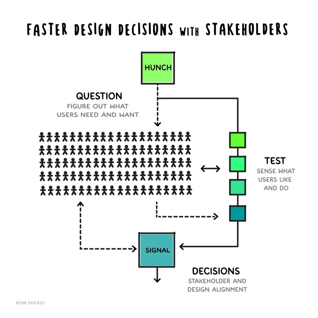
Over the past 25 years, we’ve continued to improve our process to make weekly design cycles smoother. We involve stakeholders in reviewing decisions with user data and feedback, which helps us make decisions faster and better align our teams. We call these Jumps.
Choices
We started by identifying hunches that shape our design process every week. Then, we explore these ideas further or transform them into specific questions for our target audience. We also involve our clients in this cycle of discovery and research by holding weekly review sessions to go over the design work together.
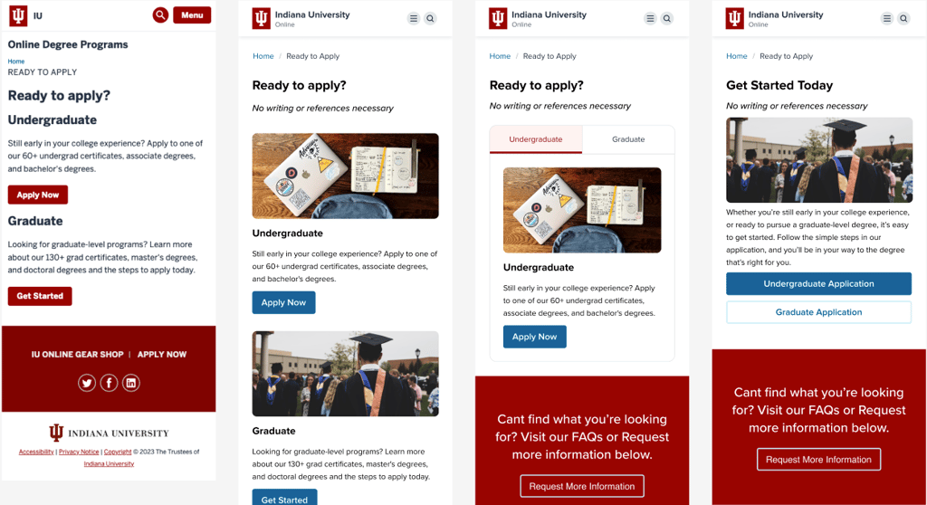
One of our clients, Indiana University, needed to increase application conversions on their site. A key area that they identified for improvement was the Application page itself. In its current state, the Apply page had very little content and two primary CTAs battling for attention on the page:

With vast improvements needed, the team began by throwing out Hunches regarding what they think would work well on the page. Concepts such as adding imagery to the page, using a tabbed structure to separate primary actions, and including a numbered list of steps:
Users
This approach blends generating new ideas with gathering feedback from our audience. When we conduct extensive concept testing, we view it as a thrilling chance to learn, confirm our ideas, and explore new questions that help refine our designs.
To determine whether the choices we had provided across these page variations were effective, we sent each version of the Apply page to 100 participants in an audience of Current and Prospective College Students (US).
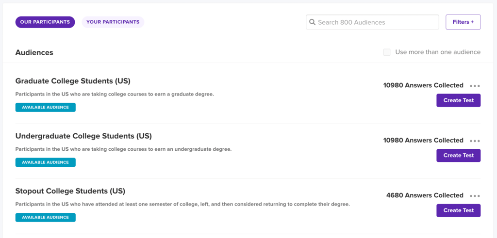
For each version of the page, we asked participants to interact with the design through a series of clicks and then respond to some evaluative questions. These evaluative questions included overall satisfaction with the look of the page, expected time to complete the application based on the info provided, and expected ease of use of the application process:
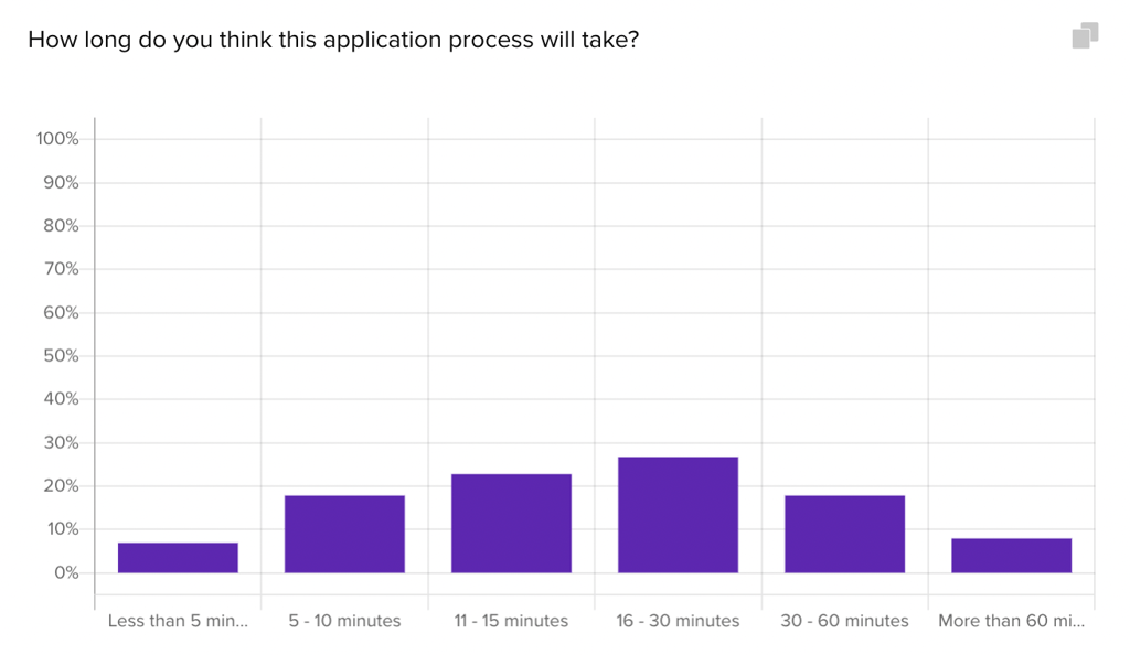
We sent the tests to collect responses overnight and returned the next day to evaluate the data and provide findings to the IU team.
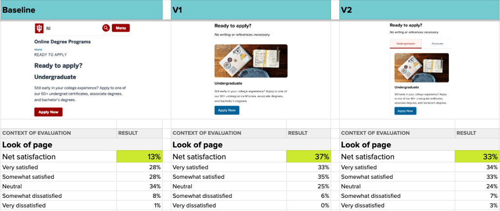
We immediately saw that the visual improvements made to the page, like adding imagery and different brand colors, greatly improved overall satisfaction by up to 24%. However, it was clear based on written reactions to the page that there was still something missing:
What do you expect to see when you click Get Started?
“A page explaining the next steps to take to pursue the degree. Explaining the process.”
- Undergraduate Student (US)
Student quotes like this indicated that we needed more information on the Apply page so that participants feel they are ready to start the application process without additional information.
With the findings from this first round of testing in mind, the team provided more Choices to test with Users, such as numbered steps to apply and student testimonials:
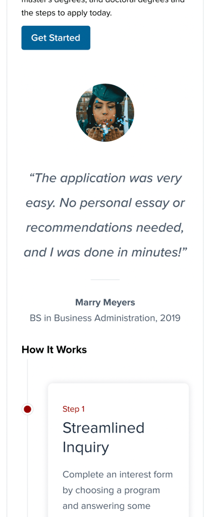
After gathering new ideas from the IU team and implementing them into new design versions, these ideas were ready for testing again.
This method is similar to how Matt describes work sessions. The key to effective decision-making lies in clearly understanding the full scope of each choice—its benefits, risks, technological impacts, and expected outcomes. This comprehensive approach ensures our decisions are well-informed, confident, and continually improving. Plus, it’s pretty enjoyable.
Decisions
By including stakeholders and a specific audience early on, we can make faster decisions. It’s usually clear if we’ve overlooked an opportunity, but the beauty of our iterative process is that we can simply retest or ask our users again next week. Helio enables us to do this efficiently.
In the case of our testing on Indiana University’s Apply page, our first round of testing accomplished visual improvement on the page. However, we found that the information provided was still lacking. By incorporating new elements into the page based on the team’s hunches, we were able to test updated versions and quickly determine which design would resonate best with users:
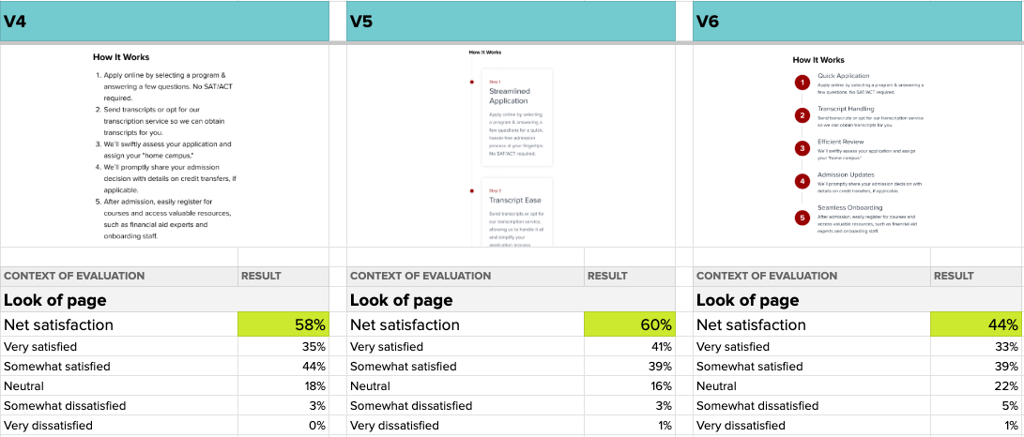
Each of these new versions clearly increased satisfaction with the page’s look, leading the team to understand that the new Choices they’ve offered to visitors can work.
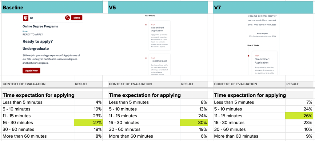
An even more telling signal: the time expectation for completing the application dropped from up to 30 minutes to just 15 minutes in the newest version that included the student testimonial.
Despite taking three rounds of testing, all the iteration and learning were completed in just one week. The Indiana University team left confident that their new Apply page design would engage and convert users at a higher rate.
By using these user-centric techniques, design teams can ensure every decision is based on a thorough understanding of the user’s needs and experiences.
Resources
Design Decision Resources
We’re all about delivering design faster, so I dove into the topic to surface more ideas from our peers. Authors like Zeke Franco, Lia Garvin, and Jake Bereton explore how designers can make more successful decisions by using structured frameworks and incorporating user feedback.
-
Choice Architecture: Introduction to Designing for Decision Making
, by
Zeke Franco
-
Key Design Decisions for Product Management: A Comprehensive Guide
, by
Jake Brereton
-
Importance of Data in Making Design Decisions: Data-Driven Design
, by
Daniel Oluyemi
-
Decisions Decisions: How to Facilitate Decision Making in Design Reviews
, by
Lia Garvin
-
Crafting Product-Specific Design Principles to Support Better Decision Making
, by
Maria Rosala
-
The Decision-Making Process Designers Should Use Daily
, by
Rafiq Elmansy
Structured Decision Making: Enhancing Speed and Efficiency
Adopting a structured decision-making model is crucial for streamlining the design process and ensuring decisions are made efficiently and effectively. This model relies on clear protocols to define decisions and determine who is responsible for each part. Let’s explore the critical components of this approach in more detail.
Consensus Techniques: Building Agreement
Consensus techniques are pivotal for inclusive and effective decision-making. They help ensure that all team members feel included in the process and that their opinions are valued. A group called Seeds for Change has a structured approach to decision-making. We don’t specifically use this as a tool, but it maps how we think about decision-making in client engagements.
Here’s how these techniques work:
- Agree: Team members fully support a decision, indicating a unanimous agreement.
- Agree with Reservations: Members may have minor concerns but don’t consider them significant enough to oppose the decision. This allows for forward movement while acknowledging areas that might need attention in the future.
- Stand Aside: Some members might choose not to participate in the decision due to a conflict of interest or lack of sufficient insight into the issue. This option prevents blockages in the decision-making process while respecting individual positions.
- Block: A member or a group can veto a decision if they have substantial concerns that a proposed action could lead to negative outcomes. This is crucial in preventing the group from making potentially harmful decisions.
These consensus techniques consider all viewpoints, leading to more robust and well-rounded decisions.
Setting Clear Decision Criteria for Clarity and Transparency
For decisions to be effective and swift, each decision point should have clear criteria aligned with predefined goals and user data. This transparency helps make informed decisions and align the team towards common objectives. Here’s how you can ensure clarity and transparency in decision-making:
Before any decision-making session, establish clear criteria that the decisions must meet. These could be based on user research, business goals, budget constraints, or technological feasibilities.
Keep a detailed record of all decisions and their rationale. This helps maintain transparency and provides a reference for future decision-making processes. Regularly communicate the progress of decision-making to all stakeholders. This involves sharing updates about decisions, the reasoning behind them, and any changes to the plan. Open communication fosters trust and ensures everyone is on the same page.
Regular Review and Feedback Through Iteration
To further enhance the decision-making process, it’s important to incorporate regular reviews and feedback mechanisms:
- Scheduled Reviews: Set regular intervals (e.g., weekly or bi-weekly) to review decisions and their outcomes. This helps assess the impact of decisions and determine if any adjustments are necessary.
- Feedback Mechanisms: Implement mechanisms for collecting feedback from all stakeholders, including team members, users, and clients. This feedback should be analyzed and used to refine future decisions.
- Iterative Improvement: Encourage a culture of continuous improvement where decisions are regularly evaluated and refined based on new information and feedback. This iterative approach improves the quality of decisions over time and keeps the team adaptive and responsive to change.
Structured decision-making is a powerful strategy that can significantly reduce delays and improve the quality of outcomes in design projects. By establishing clear protocols, fostering consensus, ensuring transparency, and incorporating regular feedback, teams can make quicker, more informed decisions that lead to successful designs.
Making faster design decisions
Making faster design decisions doesn’t mean rushing through the design process; it means being smarter about the methods and tools employed. Design teams can achieve faster outcomes without sacrificing quality by expanding choice-making frameworks, effectively engaging stakeholders, and using structured decision-making models.
Design Decisions FAQ
Design decisions encompass all the choices made during the design process, from strategic direction to specific user interface elements. They impact the project by determining its direction, aesthetics, functionality, and overall user experience. Effective design decisions ensure that the product meets user needs and business objectives, making it functional and appealing.
Expanding options involves exploring broader solutions rather than settling on a yes/no decision. This approach can speed up the design process by preventing decision paralysis and encouraging creative thinking, allowing teams to discover more nuanced and innovative solutions quickly.
User feedback is crucial in ensuring that design decisions align with the actual needs and preferences of the end-users. Integrating this feedback throughout the design process helps refine the product to better suit users, which can increase its usability and market success.
Consensus techniques involve multiple decision-making options that allow team members to express agreement, reservations, or objections. This inclusive approach ensures that all perspectives are considered, leading to more robust and accepted decisions that support collaborative and effective design development.
Regular review and feedback are essential for iterative improvement. By consistently evaluating decisions and their impacts, teams can adjust their strategies in real time, ensuring the design remains aligned with user needs and business goals. This continuous loop of feedback and refinement enhances the quality and effectiveness of the final product.
Engaging stakeholders throughout the design process ensures that decisions are aligned with broader organizational goals and stakeholder expectations. This alignment helps speed up decision-making and implementation, as decisions supported by all stakeholders are less likely to face delays and opposition.
Balancing aesthetics and functionality involves careful consideration of the product’s visual appeal and practical usability. Designers must ensure that the product is not only attractive but also intuitive and efficient to use. Strategies include user testing, iterative design cycles, and ongoing stakeholder and user feedback to refine the product’s appearance and functionality.

