Why do most New Year’s resolutions fail? Why do gym memberships often go unused? The answer lies in the complexity of changing behavior. Despite the abundance of products and services designed to nudge us towards our goals—whether it’s eating healthier, managing finances better, or staying active—many fall short in effectively addressing these challenges. This is where behavioral design comes into play.
Behavioral design is the art and science of creating products that drive lasting behavior change by understanding human psychology. It’s about more than just making things look good; it’s about making things work in a way that resonates with how people think and act. When done right, behavioral design can turn a good product into a great one by ensuring it captures attention, influences decisions, facilitates action, and sustains behavior.
Exploring the Behavioral Design Process
Aaron Otani, a seasoned expert in this field, breaks down behavioral design into four stages: Grab Attention, Influence Decisions, Facilitate Action, and Sustain Behavior. This framework provides a structured approach to understanding and applying behavioral principles in design, making it easier to create products that meet user needs and encourage long-term engagement.
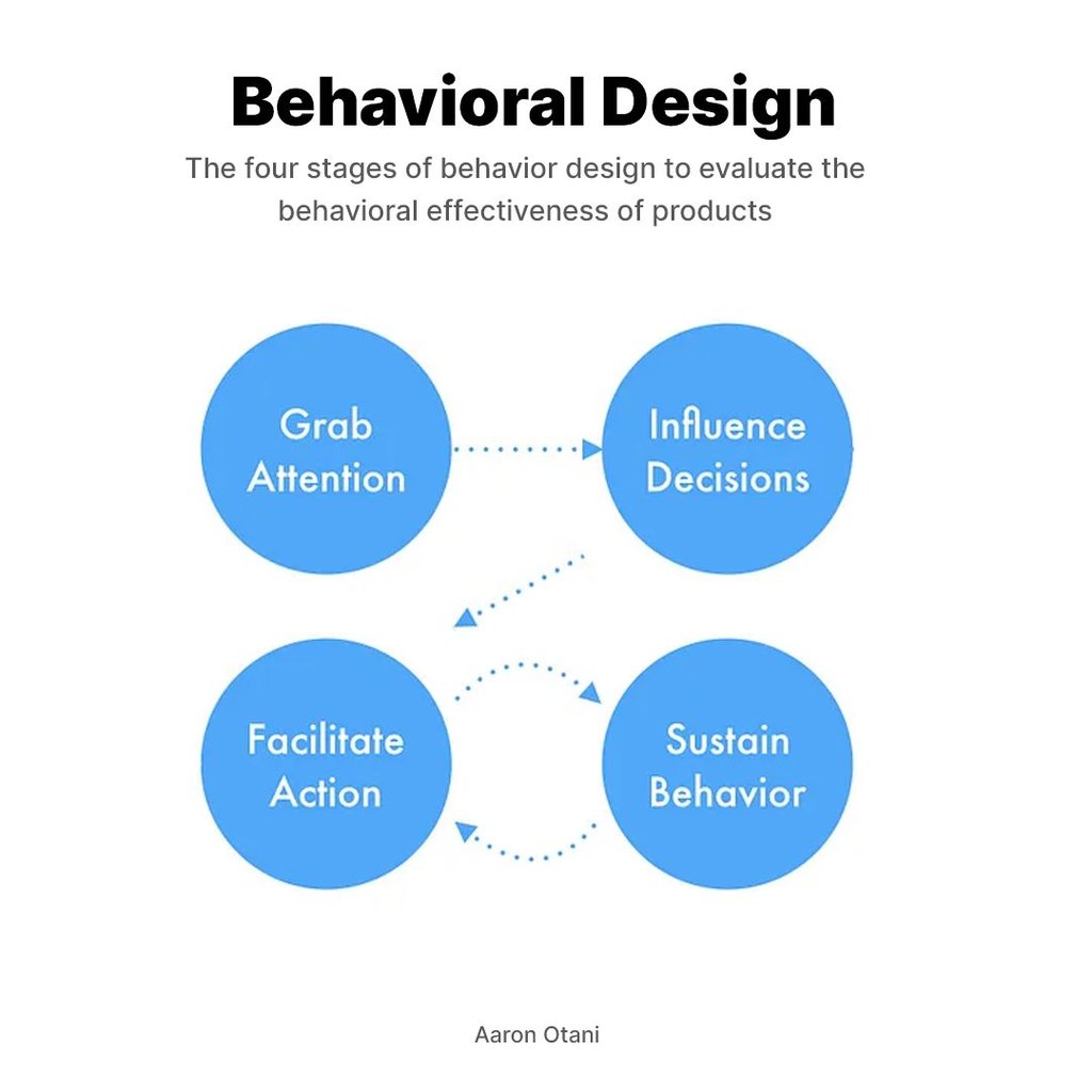
In this post, we’ll dive deep into each stage of the behavioral design process, exploring practical techniques and real-world examples. We’ll also highlight how tools like Helio can help you implement these strategies effectively. Whether you’re a designer, product manager, or marketer, understanding behavioral design will give you the edge you need to create products that truly make a difference in users’ lives.
So, let’s explore how you can leverage behavioral design to drive meaningful change and answer the crucial question: “What is the behavior design process?”
Behavioral design is rooted in the understanding that human decisions are not always rational. It seeks to guide choices in a subtle yet effective manner. The core of behavioral design lies in its ability to understand and anticipate human behavior, and then use that understanding to design solutions that can lead to better decision-making.

What is Behavioral Design?
Behavioral design is a game-changer in the world of product development. But what exactly is it? In simple terms, behavioral design is the practice of using insights from psychology and behavioral science to create products that drive lasting behavior change. It’s not just about making things look good—it’s about making them work in a way that aligns with how people think, feel, and act.
Why is Behavioral Design Important?
Understanding behavior is crucial for creating products that resonate with users. Many products fail because they don’t account for the complexities of human behavior. By focusing on behavioral design, you can mitigate the risk of your product being ignored or forgotten. Instead, you create something that genuinely connects with users, encouraging them to engage with it repeatedly.
Core Principles of Behavioral Design
At its heart, behavioral design revolves around a few core principles:
- Human Behavior: Every decision we make is influenced by a mix of cognitive biases, emotions, and social factors. Behavioral design taps into these elements to guide user behavior in a subtle yet effective manner.
- Cognitive Biases: Our brains are wired to take shortcuts—known as cognitive biases—which affect our decisions. By understanding these biases, designers can create experiences that anticipate and leverage these mental shortcuts.
- Behavioral Triggers: These are the cues or prompts that initiate a specific behavior. Effective design identifies and utilizes these triggers to encourage desired actions.
Behavioral Design vs. Traditional Design
How does behavioral design differ from traditional design? Traditional design often focuses on aesthetics and usability, aiming to make easy and pleasant products. While this is important, it doesn’t always guarantee that users will change their behavior. Behavioral design goes a step further by considering the psychological and emotional factors that drive behavior, ensuring that products are usable, engaging, and motivating.
Stage 1 – Grab Attention
In the realm of behavioral design, the first and arguably most crucial step is to grab the user’s attention. Without capturing attention, all subsequent efforts to influence decisions and drive action fall flat. But how exactly do you make people care? This stage focuses on using inviting aesthetics, compelling storytelling, and engaging motion design to make a memorable first impression.
Tools like Helio can be invaluable in this stage. Helio provides insights into effective aesthetics and storytelling elements by allowing you to test different design components and see what grabs users’ attention. Whether it’s color schemes, imagery, or narrative elements, Helio helps you identify what works best for your audience.
The Power of Aesthetics
Visual appeal plays a huge role in grabbing attention. People are naturally drawn to things that look good. Clean, modern designs with an appealing color scheme can make users pause and take notice. But it’s not just about looking good—your design needs to convey a clear and immediate value to the user.
- Color and Contrast: Use vibrant colors and high contrast to make important elements stand out.
- Typography: Choose fonts that are easy to read and convey the right tone.
- Imagery: Use high-quality images and illustrations that resonate with your audience.
Compelling Storytelling
Humans are wired for stories. A compelling narrative can hook users emotionally, making them more likely to engage with your product. Storytelling in design involves creating a journey that users can relate to and feel invested in.
- Narrative Arc: Craft a story with a beginning, middle, and end that guides users through your product.
- Characters and Scenarios: Use relatable characters and scenarios to illustrate how your product can solve problems or improve lives.
- Emotional Connection: Evoke emotions like curiosity, excitement, or urgency to make your story more engaging.
Engaging Motion Design
Motion design adds an interactive layer to your product, making it more dynamic and engaging. Subtle animations and transitions can guide users’ attention to key elements and create a more immersive experience.
- Micro-Interactions: Small animations, like button clicks or hover effects, can make interactions more satisfying.
- Transitions: Smooth transitions between screens or states help maintain user engagement and make navigation intuitive.
- Feedback: Use animations, such as loading indicators or confirmation messages, to provide feedback and keep users informed and engaged.
Emotional Reactions
Eliciting emotional reactions is a powerful way to grab attention. Emotions like surprise, curiosity, and urgency can make your design more memorable and engaging. Personalizing content to match user behaviors and values can amplify these reactions.
- Surprise: Incorporate unexpected elements or easter eggs to delight users.
- Curiosity: Use teasers and cliffhangers to pique interest and encourage exploration.
- Urgency: Create a sense of urgency with limited-time offers or countdowns to motivate immediate action.
Personalization
Personalization tailors the user experience to individual preferences and behaviors, making the design more relevant and engaging. When users see content that resonates with them personally, they’re more likely to pay attention.
- User Data: Utilize user data to present personalized content, recommendations, and notifications.
- Behavior Tracking: Track user behavior to understand preferences and tailor the experience accordingly.
- Dynamic Content: Use dynamic content that changes based on user interactions and preferences.
Practical Examples
- Fitness Apps: Fitness apps often use vibrant colors, motivational stories, and engaging animations to capture users’ attention and encourage them to start a workout.
- Financial Apps: Financial apps might use clean, modern designs with personalized tips and alerts to grab attention and make users feel in control of their finances.
- E-commerce Sites: E-commerce sites often use high-quality images, compelling product descriptions, and interactive elements to attract and retain shoppers.
Helio Example
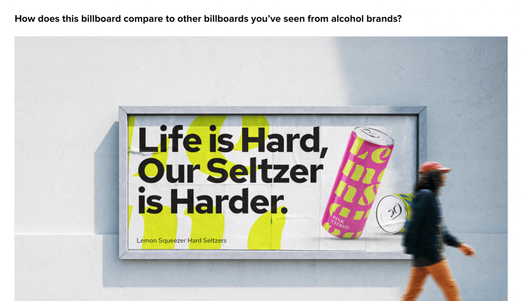
We tested billboard designs for a theoretical new drink brand called Lemon Squeezers to see how well their brand would do due attract attention in a heavily saturated market.
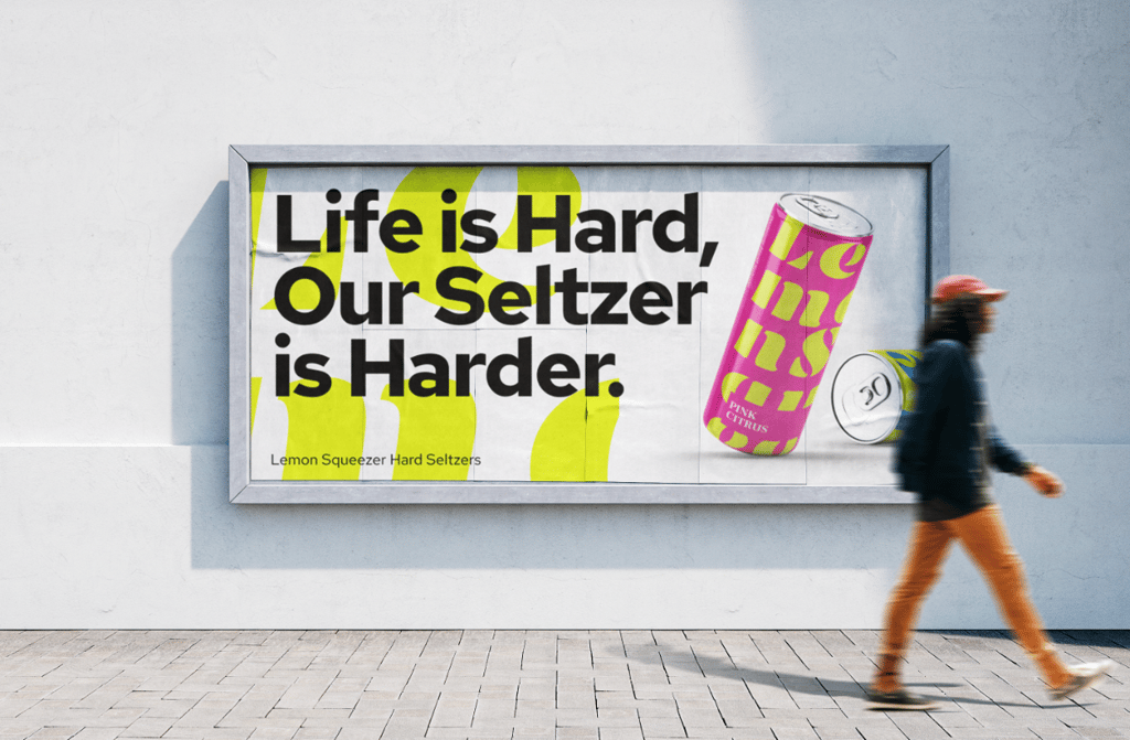
We reached out to an audience of Alcohol Consumers in the US through Helio’s remote user survey tool, and asked how the new brand’s billboard stacks up against existing brands:
A Likert scale was used to collect initial reactions from the audience, with follow-up qualitative questions used to understand why participants feel how they do about the new drink brand:
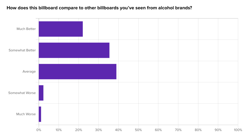
Qualitative feedback noted the billboard’s colorful design and catchy tagline, but also mentioned that it resembles many typical advertisements in the market, featuring prominent product imagery and branding:
“It’s colorful with a great “tag line” but it looks like all the rest of them.”
“picture of the can, logo in big letters, pretty normal.”
– Alcohol Consumers (US)
Overall, the findings suggest that while the Lemon Squeezers billboard is competently executed and generally well-received, it struggles to distinctly stand out in a competitive advertising landscape. This could prompt the brand to explore more innovative or unique advertising strategies to differentiate itself in the market.
Grabbing attention is the critical first step in the behavioral design process. By focusing on inviting aesthetics, compelling storytelling, engaging motion design, emotional reactions, and personalization, you can create a product that attracts users and sets the stage for deeper engagement. Use tools like Helio to test and refine your approach, ensuring your design captures attention effectively and consistently.
Resources
Behavioral Journey Map Resources
Behaviors drive everything we do. We’re leaning toward the idea that behavioral design is the way of the future when building products. Check out the links we’ve sourced that explore this idea and explore the future of marketing methods and ideas.
-
Understanding Behavioral Design: Influencing Choices for Better Outcomes
, by
Eduardo Feo
-
Why Behavioral Design is our future
, by
Julie O’Brien
-
Motivation to Design: Extrinsic and Intrinsic Motivation & 8 Motivators for Creation
, by
César Bejarano
-
Harnessing the power of Behavioral Economics in product design
, by
Ramy Doss
-
The importance of behavioral science in designing products
, by
Hamidreza Nabiei
Stage 2 – Influence Decisions
Once you’ve grabbed the user’s attention, the next step in the behavioral design process is to influence their decisions. This stage guides users to make choices that align with their needs and goals. The key is to present clear, straightforward content that eliminates confusion and motivates action. Let’s break down how to influence decisions through behavioral design effectively.
Helio can help you test different content presentations and recommendations to determine the most convincing ones. By evaluating the impact of various behavioral techniques on decision-making, Helio provides data-driven insights that can refine your approach. Whether testing social proof elements or experimenting with different CTAs, Helio’s user testing capabilities ensure your strategies are effective.
Clarity is Key
When users understand what they need to do and why they should do it, they’re more likely to take action. Avoid jargon and keep your messaging simple and direct.
- Simplified Content: Use plain language and clear instructions to make your message accessible to everyone.
- Visual Hierarchy: Organize information to naturally guide the user’s eye to the most important elements.
- Consistency: Maintain consistent design elements to avoid confusion and help users navigate your product more easily.
Presenting Recommendations
Once you have users’ attention, guide them by offering recommendations. Whether it’s a product suggestion, an action step, or a feature highlight, recommendations can significantly influence decisions.
- Personalized Suggestions: Use data to provide user preferences and behaviors recommendations.
- Highlighted Benefits: Clearly state the benefits of following your recommendations, emphasizing both extrinsic (e.g., saving money) and intrinsic (e.g., gaining comfort) rewards.
- Call-to-Action (CTA): Place strong, clear CTAs that tell users exactly what to do next, using actionable language like “Buy Now” or “Learn More.”
Leveraging Behavioral Science Techniques
Behavioral science offers various techniques for nudge users to make decisions that benefit them and align with your product goals.
- Social Proof: People are more likely to follow the actions of others. Showcase testimonials, user reviews, or usage statistics to build trust and encourage similar behavior.
- Scarcity: Highlight limited-time offers or limited availability to create a sense of urgency. By emphasizing the risk of missing out, scarcity can prompt quicker decision-making.
- Anchoring: Present an initial information (the anchor) that sets a reference point for subsequent decisions. For example, showing a higher-priced item can make lower-priced options seem like better deals.
Reframing Messages
How you frame your message can significantly impact decision-making. Reframing involves presenting information to highlight the positive aspects or desired outcomes.
- Positive Framing: Focus on a decision’s benefits and positive outcomes rather than the negatives. For instance, saying “You’ll save $20” is often more compelling than “You’ll avoid a $20 fee.”
- Goal-Oriented Framing: Align messages with users’ goals and values. If a user values health, frame your message around how your product helps them achieve a healthier lifestyle.
- Contextual Framing: Consider the context in which users make decisions. Tailor your messages to fit the situational factors that might influence their choices.
Practical Examples
- E-commerce Websites: E-commerce platforms often use personalized product recommendations based on browsing history and past purchases, along with limited-time discounts to encourage quick decisions.
- Subscription Services: Services like Netflix or Spotify highlight popular content and user reviews to guide new users in choosing what to watch or listen to next.
- Fitness Apps: Fitness apps provide personalized workout plans and highlight the benefits of consistency and progress to motivate users to follow through.
Helio Example
Since we have some customers of the brand on our team, we decided to put HelloFresh’s membership offer page to the test in a comprehension gap case study.
This study aimed to understand how HelloFresh’s landing page impacts visitors’ decisions, and whether there is a comprehension issue with how they’re presenting their offer to consumers.
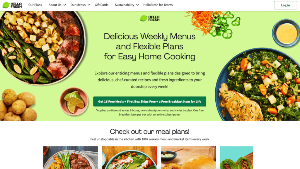
We provided a variety of questions for participants to give their reactions to the page, such as click testing, brand impression testing, and comprehension gauges:
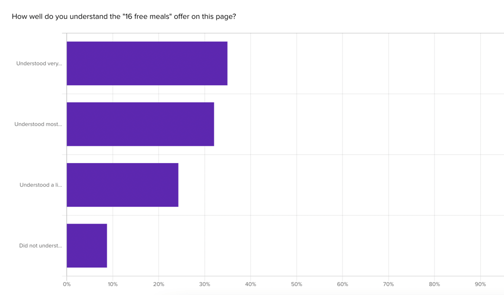
33% of Home Cooks say they felt little to no comprehension of the member deal. HelloFresh provides an offer for 16 free meals as their primary CTA on the page, though only 2% of visitors mentioned that offer on first look. The explanation for that free meal offer also caused problems, with 33% of participants saying they felt little to no comprehension of the deal:
“It seems like it’s not very clear, or worded deliberately to be misleading”
– Home Cook (US)
First click testing on the membership offer page also revealed what elements participants gravitate towards:
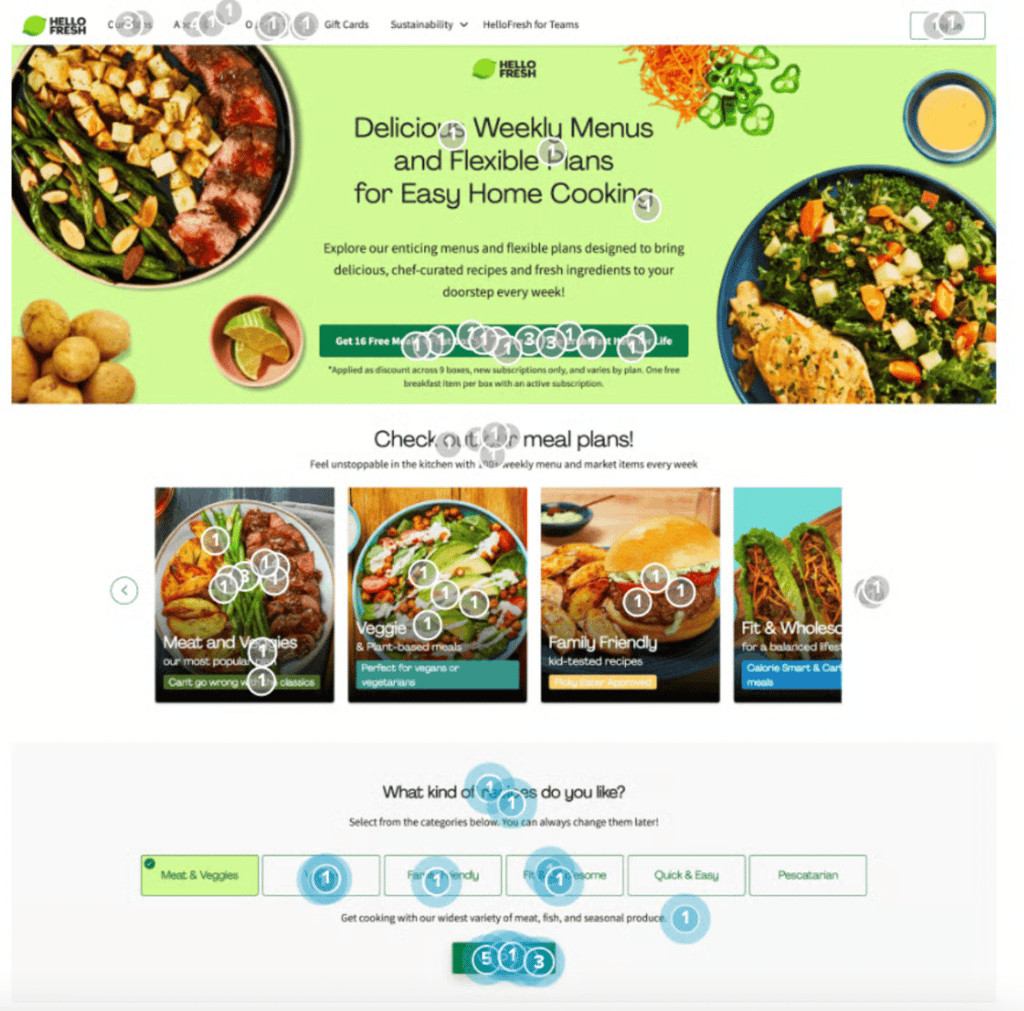
The largest share of visitors (27%) engaged with the meal plan carousel on first look. Though HelloFresh’s “free meal” offer gets a fair amount of attention (23%), the interactive elements like the meal plan carousel and recipe selector (24%) steal the limelight from their primary CTA.
View the HelloFresh Case Study
Influencing decisions is a critical stage in the behavioral design process. By presenting clear content, offering tailored recommendations, leveraging behavioral science techniques, and framing messages effectively, you can guide users toward making beneficial choices. Use tools like Helio to test and optimize your strategies, ensuring your design grabs attention and influences meaningful actions.
Stage 3 – Facilitate Action
After grabbing attention and influencing decisions, the next step in the behavioral design process is to facilitate action. This stage focuses on making it easy for users to follow through with their decisions. The goal is to reduce friction, simplify tasks, and provide guidance to ensure users can act on their intentions effortlessly.
Helio can help identify common barriers to action through user testing and feedback. By understanding where users struggle or drop off, you can optimize the timing and methods for triggering actions. Helio’s data-driven insights can help refine your design to ensure it facilitates action effectively.
Simplifying Actions
The easier it is for users to take action, the more likely they are to do so. Simplifying actions involves removing unnecessary steps and making the process as straightforward as possible.
- Streamlined Processes: Eliminate redundant steps and streamline the user journey. For instance, a one-click purchase option simplifies the buying process.
- Clear Instructions: Provide clear, concise instructions that guide users through each step. Visual cues and short, direct text can make a big difference.
- Auto-Fill Options: Use auto-fill features to reduce the effort required from users, such as pre-filling forms with known information.
Reducing Cognitive Load
Cognitive load refers to the amount of mental effort required to complete a task. Reducing cognitive load helps users process information more easily and make decisions without feeling overwhelmed.
- Minimalist Design: Keep the design clean and uncluttered. Focus on essential elements and remove distractions.
- Chunking Information: Break down complex information into smaller, manageable chunks. This makes it easier for users to understand and act on the information.
- Consistent Navigation: Use a consistent layout and navigation structure throughout your product to help users feel more confident and less mentally taxed.
Providing Guidance
Guidance helps users navigate through tasks with ease. Providing clear directions and support can boost user confidence and increase the likelihood of action.
- Walkthroughs and Tutorials: Use guided walkthroughs and tutorials to help users understand how to use your product and complete key tasks.
- Tooltips and Hints: Provide contextual tooltips and hints that offer additional information or clarify next steps without overwhelming the user.
- Default Settings: Set smart defaults that align with common user preferences, reducing the need for users to make decisions at every step.
Timing and Triggers
The timing of prompts and actions can significantly impact user behavior. Optimizing when and how actions are triggered ensures that users are prompted at the right moment.
- Action Triggers: Use timely triggers to prompt users to take action. For example, sending a reminder email just before a subscription renews can prompt users to update their preferences.
- Optimal Timing: Identify the best times to prompt users based on their behavior patterns. For instance, an app might send activity reminders during peak usage times.
- Behavioral Nudges: Incorporate nudges that gently push users towards desired actions without being intrusive. These can include notifications, alerts, or in-app messages.
Practical Examples
- E-commerce Checkout: Online retailers often simplify the checkout process with features like guest checkout, one-click purchasing, and clear progress indicators.
- Productivity Apps: Apps like Trello or Asana use checklists, drag-and-drop functionality, and visual task boards to reduce cognitive load and guide users through task management.
- Health Apps: Health and fitness apps provide step-by-step workout plans, progress trackers, and timely reminders to facilitate user engagement and action.
Helio Example
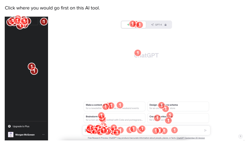
To understand how users are taking action with your product, and how that stacks up to competitors, we put two competitor conversational UIs to the test: Google’s Bard AI and ChatGPT. We gave directions to one hundred people in the US who are home cooks to interact with the platforms in order to find a recipe for an upcoming themed party.
The testing was conducted through the HEART framework, a method of research that gathers data on the audience’s happiness, engagement, adoption, retention, and task success with the product.
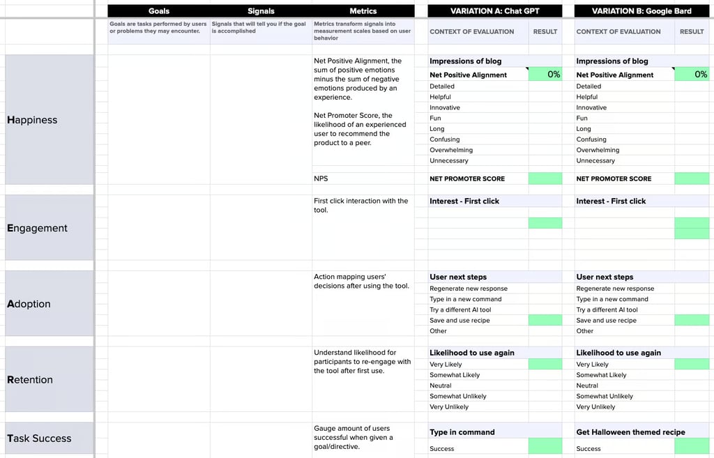
After establishing the goals for each metric in the HEART framework, we set up surveys to measure each of these metrics across the two AI platforms. The test consisted of multiple questions, such as brand impression questions, likelihood Likert scales, and first-click tests:
With 100 participant reactions to each test, we began loading the data into the HEART framework to compare the responses across the two competitor platforms:

The full data comparison framework revealed the direct comparison of emotional reactions, user interactions, and comprehension of the page:
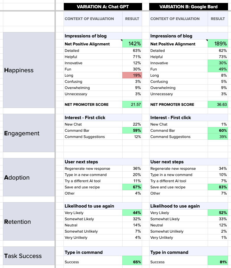
The head-to-head comparison of these two competitor AI platforms revealed that Google’s Bard produces a more helpful and engaging experience when it comes to providing recipe’s to at-home users. Bard AI was especially successful at producing positive impressions, such as innovation and fun, while allowing a greater number of participants to interact with their prompt suggestions rather than finding their own way in the platform.
View the HEART Framework Guide
Facilitating action is a crucial stage in the behavioral design process. By simplifying actions, reducing cognitive load, providing clear guidance, and optimizing timing and triggers, you can ensure users can easily follow through with their decisions. Use tools like Helio to test and refine your approach, making it as easy as possible for users to act on their intentions.
Stage 4 – Sustain Behavior
The final stage in the behavioral design process is to sustain behavior. Once users have taken action, the challenge is to keep them engaged and motivated over the long term. This stage focuses on reinforcing positive behavior, building habits, and maintaining user interest through continuous engagement and personalized interactions.
Helio can help by testing different methods of providing positive feedback and measuring their impact on long-term engagement. By evaluating the effectiveness of personalized interactions and intrinsic motivators, Helio provides valuable insights that can help sustain user behavior. Whether it’s testing new features or gathering user feedback, Helio ensures your strategies are effective and user-centric.
Celebrating Progress
One of the most effective ways to sustain behavior is by celebrating users’ progress. Positive reinforcement can encourage users to continue engaging with your product.
- Feedback and Rewards: Provide immediate feedback and rewards for completed actions. This can include badges, points, or other forms of recognition.
- Progress Tracking: Use visual progress trackers to show users how far they’ve come. This can be especially motivating in fitness apps, learning platforms, and productivity tools.
- Milestones: Celebrate significant milestones with special rewards or messages. This not only acknowledges user achievements but also motivates them to reach the next milestone.
Continuous Engagement
Maintaining user engagement requires ongoing effort. Continuous engagement strategies keep your product top-of-mind and encourage regular use.
- Personalized Interactions: Tailor interactions to individual users based on their behavior and preferences. Personalized emails, notifications, and content recommendations can keep users engaged.
- Regular Updates: Keep your product fresh and exciting by regularly adding new features, content, or updates. This gives users a reason to keep coming back.
- Community Building: Foster a sense of community among your users. Features like forums, social sharing, and user groups can create a supportive environment that encourages ongoing engagement.
Emphasizing Intrinsic Motivations
While extrinsic rewards are effective, intrinsic motivations—those driven by internal satisfaction—are crucial for long-term engagement.
- Purpose and Meaning: Highlight how using your product aligns with users’ values and goals. For example, a productivity app might emphasize how it helps users achieve work-life balance.
- Social Connection: Leverage social features that connect users with others. This can include social sharing, leaderboards, or collaborative tools.
- Mastery and Skill Development: Show users how they are improving and gaining new skills. This can be particularly motivating in educational platforms or hobby-related apps.
Providing Continuous Support
Ongoing support ensures that users feel confident and capable of continuing to use your product effectively.
- Customer Support: Offer accessible customer support channels, such as live chat, FAQs, and community forums.
- Educational Content: Provide tutorials, guides, and tips to help users make the most of your product.
- Feedback Mechanisms: Implement ways for users to give feedback and suggestions. This not only improves your product but also makes users feel valued and heard.
Practical Examples
- Fitness Apps: Fitness apps often use progress tracking, badges, and community challenges to keep users motivated and engaged over time.
- Subscription Services: Services like Netflix and Spotify continuously update their content libraries and offer personalized recommendations to keep users returning.
- Learning Platforms: Educational apps like Duolingo use streaks, milestones, and community features to encourage regular practice and learning.
Helio Example
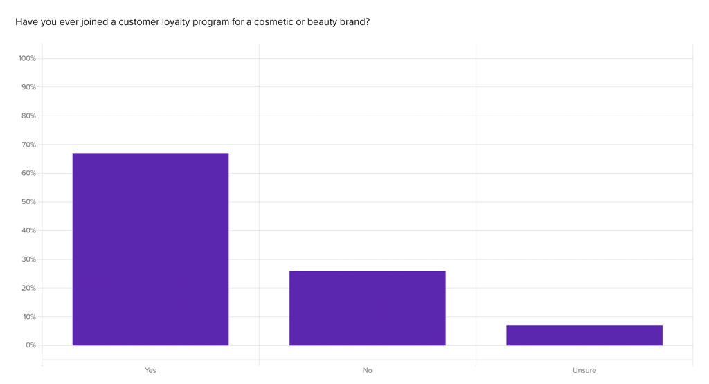
Beauty brand SkinSavvy employed Helio to establish a customer loyalty program and boost user engagement through their mobile app. To begin, they wanted to understand the types of experiences that already stand out in customers’ minds regarding loyalty programs. Thus, they used Helio to distribute a proof of concept questionnaire to an audience of Beauty Product Consumers in the US.
SkinSavvy discovered how their audience had engaged with loyalty programs so far, finding that a majority (68%) had participated in one previously:
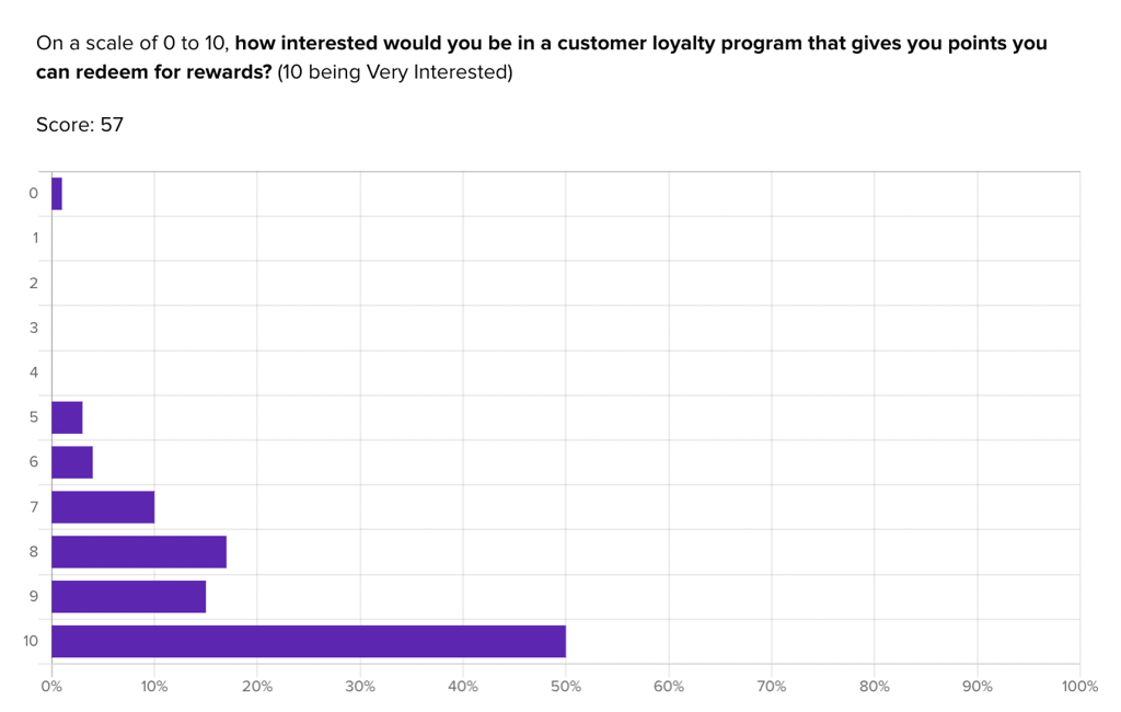
They were also able to gauge early interest in their own concept for a loyalty program:
“I usually do sign up if they offer a perk quickly enough or with low entry cost (like free shipping, $5 off or an extra freebie). If they have really high thresholds (like spend $500 for little perks), I won’t sign up.”
– Helio Participant, Beauty Product Consumer (US)
Helio enabled SkinSavvy to discover that interest in a loyalty program is high, with many participants (50%) rating their interest level at 10/10. However, participants also admitted that they don’t always sign up for these programs with new brands. Therefore, offering enticing perks and minimizing barriers to entry will be crucial for building engagement with their new loyalty program.
View the Helio Example
Sustaining behavior is the final but critical stage in the behavioral design process. By celebrating progress, maintaining continuous engagement, emphasizing intrinsic motivations, and providing continuous support, you can ensure long-term user engagement and satisfaction. Tools like Helio can help you test and refine your approach, making sure your design not only initiates action but also sustains it over time.
Challenges and Future of Behavioral Design
Behavioral design has the potential to revolutionize how we create and interact with products, but it comes with its own set of challenges. Understanding and addressing these challenges can pave the way for more effective and innovative solutions in the future.
Common Challenges in Behavioral Design
- Resistance to Change: One of the biggest hurdles in behavioral design is overcoming users’ inherent resistance to change. People are creatures of habit, and even minor changes can be met with reluctance.
- Ethical Considerations: While influencing behavior, designers must ensure they do so ethically. Manipulating users into actions that aren’t in their best interest can lead to a loss of trust and credibility.
- Complexity of Human Behavior: Human behavior is influenced by a myriad of factors, including psychological, social, and environmental. Capturing all these variables in design is a complex task that requires deep understanding and research.
- Balancing Extrinsic and Intrinsic Motivations: While extrinsic rewards like discounts or badges can drive initial engagement, sustaining long-term behavior change relies heavily on intrinsic motivations, which can be harder to identify and nurture.
Future Trends in Behavioral Design
- Integration of AI and Machine Learning: Artificial intelligence and machine learning can enhance behavioral design by providing deeper insights into user behavior and preferences, allowing for more personalized and effective interventions.
- Greater Focus on Mental Health: As awareness of mental health issues grows, future behavioral design will likely incorporate more elements that promote mental well-being, reducing stress and enhancing user satisfaction.
- Ethical Design Practices: There will be an increased emphasis on ethical design practices, ensuring that behavioral interventions are beneficial and transparent, and respect user autonomy.
- Holistic User Experiences: Future designs will aim to create more holistic user experiences that consider the entire user journey, integrating multiple touchpoints and channels seamlessly.
Behavioral Design and User Research Process
Behavioral design is a powerful approach that can drive significant behavior change by understanding and leveraging human psychology. By following the four-stage framework of grabbing attention, influencing decisions, facilitating action, and sustaining behavior, designers can create products that not only meet user needs but also foster long-term engagement.
Tools like Helio play a crucial role in navigating the challenges and leveraging the opportunities in behavioral design. By providing robust user testing capabilities and data-driven insights, Helio helps designers understand what works and what doesn’t, ensuring that their designs are both effective and ethical.
While challenges exist, the future of behavioral design is promising, with advancements in AI, a greater focus on ethical practices, and the integration of holistic user experiences. Tools like Helio provide invaluable support in this journey, offering insights and testing capabilities that help refine and perfect behavioral design strategies.
Understanding the behavioral design process is crucial for anyone looking to create impactful and engaging products. By embracing the principles and techniques of behavioral design, you can create solutions that resonate deeply with users and drive lasting change.
Behavioral Design FAQ
Behavioral design is the practice of using insights from psychology and behavioral science to create products that drive lasting behavior change. It focuses on understanding how people think, feel, and act to design solutions that resonate with users and encourage engagement. This approach goes beyond aesthetics and usability to ensure products effectively capture attention, influence decisions, facilitate action, and sustain behavior.
Behavioral design is crucial in product development because it addresses the complexities of human behavior that traditional design often overlooks. By understanding and leveraging cognitive biases, emotional triggers, and social factors, designers can create products that genuinely connect with users. This connection not only enhances user satisfaction but also drives long-term engagement and loyalty, reducing the risk of products being ignored or forgotten.
Behavioral design differs from traditional design by focusing on the psychological and emotional factors that drive user behavior. While traditional design emphasizes aesthetics and usability, behavioral design goes a step further to ensure products are engaging and motivating. This approach uses techniques from behavioral science to guide user decisions and actions, making products more effective in achieving their intended goals.
The core principles of behavioral design include understanding human behavior, leveraging cognitive biases, and utilizing behavioral triggers. These principles help designers create experiences that subtly guide user behavior. By tapping into the natural ways people process information and make decisions, behavioral design ensures products are intuitive and compelling, enhancing their overall effectiveness and user satisfaction.
To implement behavioral design in your product, start by understanding your users’ needs, preferences, and behaviors. Use this information to design elements that capture attention, such as inviting aesthetics and compelling storytelling. Simplify decision-making processes by presenting clear, straightforward content and providing personalized recommendations. Facilitate action by reducing cognitive load and offering guidance, and sustain behavior by celebrating progress and maintaining continuous engagement.
Common challenges in behavioral design include overcoming users’ resistance to change, addressing ethical considerations, and understanding the complexity of human behavior. Designers must balance extrinsic and intrinsic motivations to sustain long-term behavior change and ensure their interventions are ethical and beneficial. Additionally, capturing the myriad factors influencing behavior requires deep research and a nuanced approach.
Tools like Helio can assist with behavioral design by providing robust user testing capabilities and data-driven insights. Helio helps designers understand what elements capture attention, influence decisions, and sustain behavior. By testing different design components and strategies, Helio ensures your approach is effective and user-centric. This helps refine and optimize your product to better meet user needs and drive lasting engagement.
