Research Study
HelloFresh Membership Offer Effectiveness
Surveys reveal significant gaps in customer understanding of HelloFresh’s membership offers.

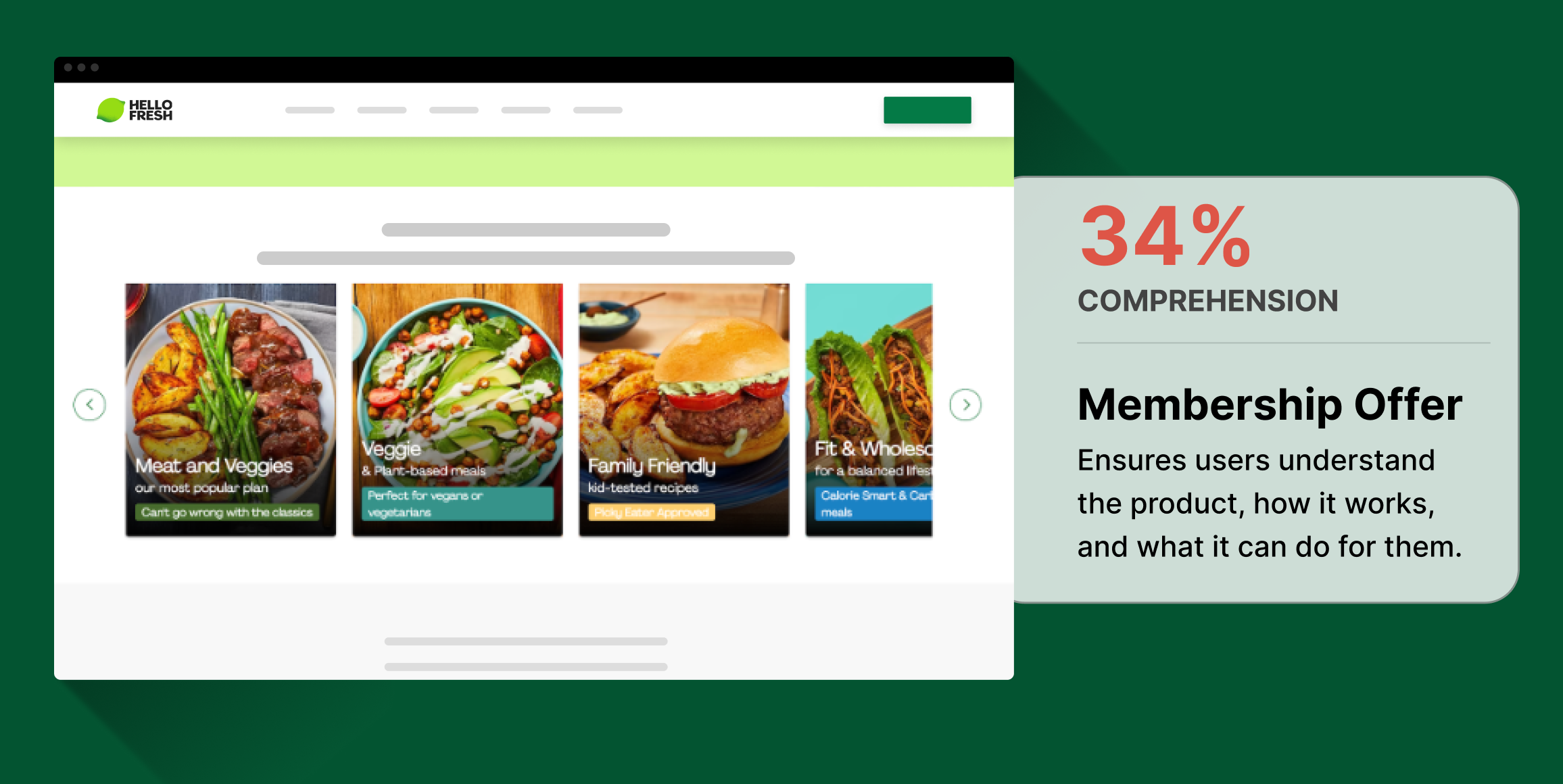
Low Comprehension of Membership Offer
33% of Home Cooks say they felt little to no comprehension of the member deal.
High Engagement with Meal Plan Carousel
The largest share of visitors (27%) engaged with the meal plan carousel on first look.
Impressions are Positive Despite Confusion
Curiosity (71%), hunger (53%), and excitement (39%) were the most common emotions evoked by the landing page.
Business Challenge
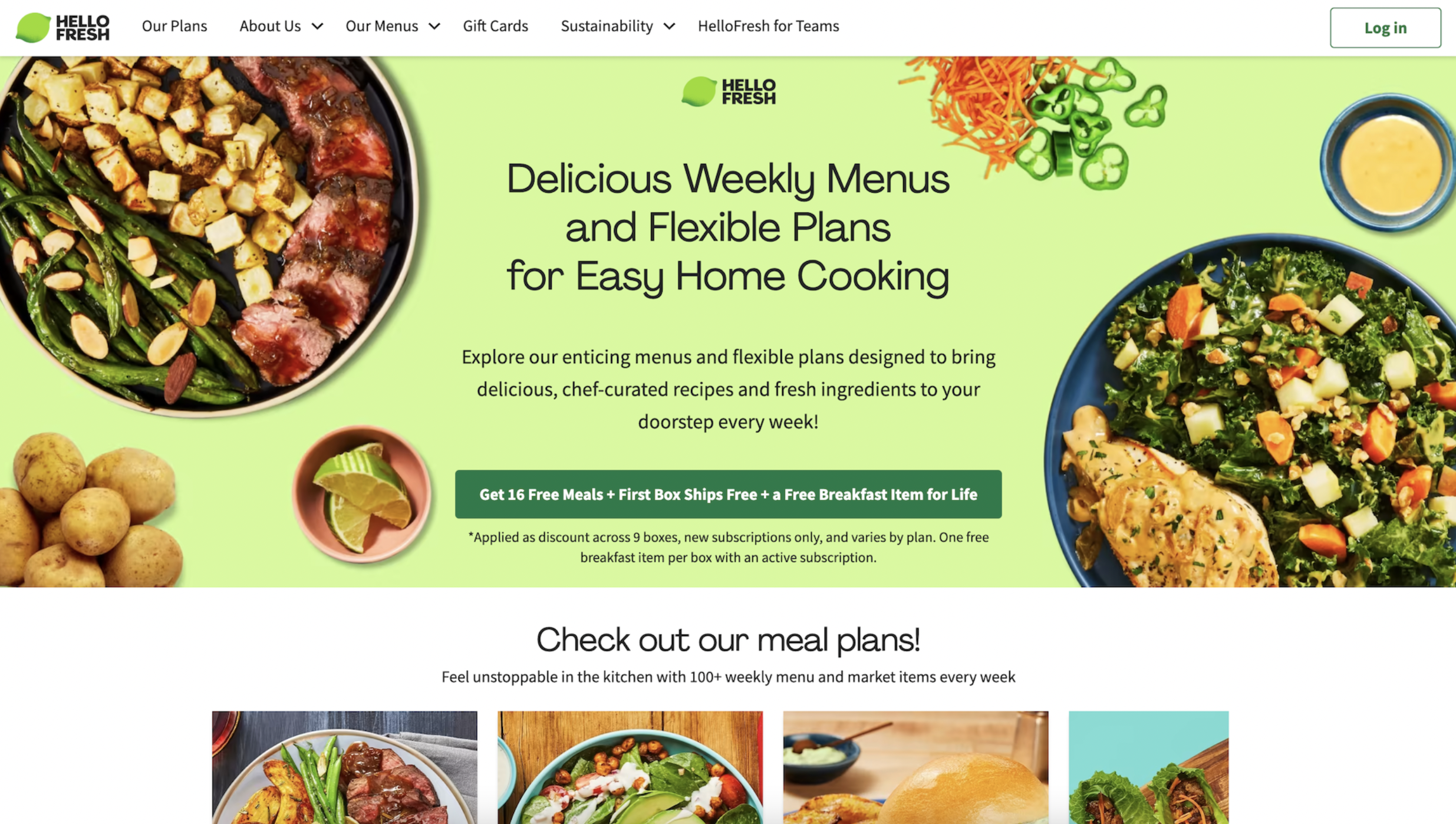
This independent research aimed to evaluate the effectiveness of HelloFresh’s landing page in converting visitors into customers. HelloFresh, a company delivering millions of meals annually, uses this page to promote a membership offer of 16 free meals, spread across the first 9 meal boxes. The testing focused on how well this offer was understood and whether it effectively encouraged sign-ups.
Timeline
The testing was completed in 24 hours, evaluating the HelloFresh membership offer page to gather insights on consumer reactions and understanding of the landing page content.
Research Goals
The primary goal was to assess how well the landing page converts visitors by analyzing their responses to the ’16 free meals’ offer. The testing also sought to test the hypothesis that the offer’s presentation might be confusing, potentially deterring engagement.
Methodology
The UX metrics we tracked as leading indicators of the design’s performance were:
- Engagement – Consumers’ likelihood to engage with key calls-to-action on the landing page, such as ‘Sign Up’ or ‘Get Started’.
- Sentiment – A measurement of the positive and negative brand impressions consumers experience from the design.
- Comprehension – Clarity of the membership offer, measured through quantitative and qualitative reactions to the page’s content.
Participant Panel
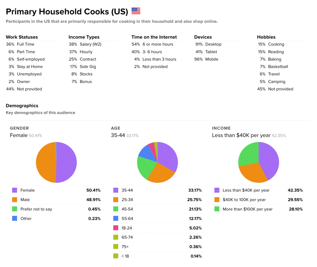
The study utilized Helio’s ready-made audience of Home Cooks in the United States, targeting 100 participants who are the primary cooks in their households or who cook at home at least three times per week.
Test Setup
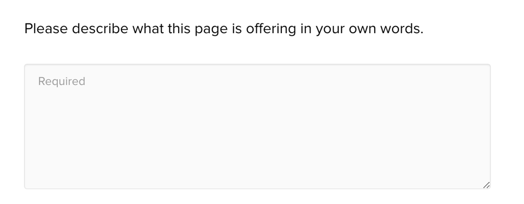
Participants were first asked to describe the offer presented on the landing page to assess their initial understanding.
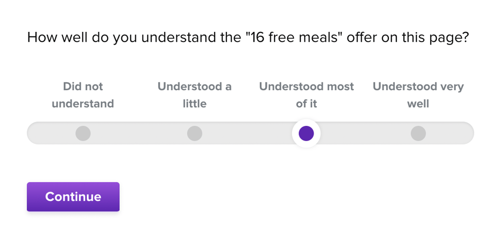
Next, more detailed questions were posed to evaluate their comprehension of the page’s content.
A click test was conducted to observe how users interacted with the landing page during their first visit.
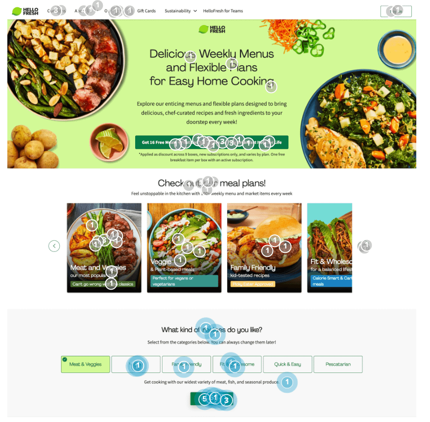
Given the emphasis on imagery and brand personality on HelloFresh’s landing page, participants were also asked how the page made them feel, using a multiple-choice format.
Findings:
Comprehension Issues:
- 33% of Home Cooks reported little to no understanding of the membership offer.
- Despite the prominence of the “16 free meals” offer, only 2% of visitors mentioned it on their first look.
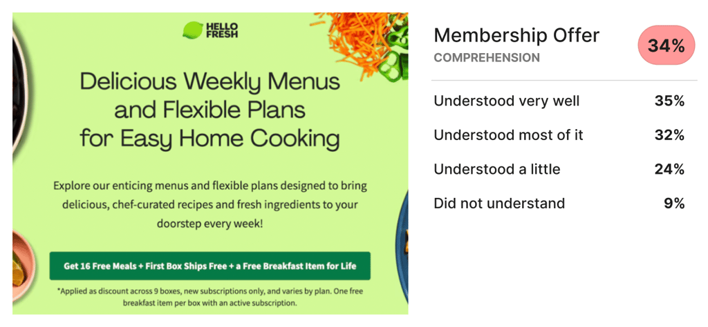
- Some participants expressed concern about the clarity of the offer, with one stating, “It seems like it’s not very clear, or worded deliberately to be misleading.”
Engagement Patterns:
- The meal plan carousel attracted the most attention, with 27% of visitors engaging with it initially.
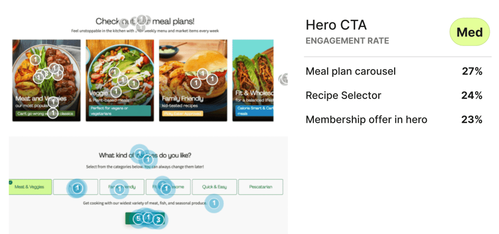
- The “free meal” offer received 23% of initial attention, but interactive elements like the recipe selector diverted focus from the primary call to action.
Emotional Responses:
- The page elicited emotions such as curiosity, hunger, and excitement in many participants.
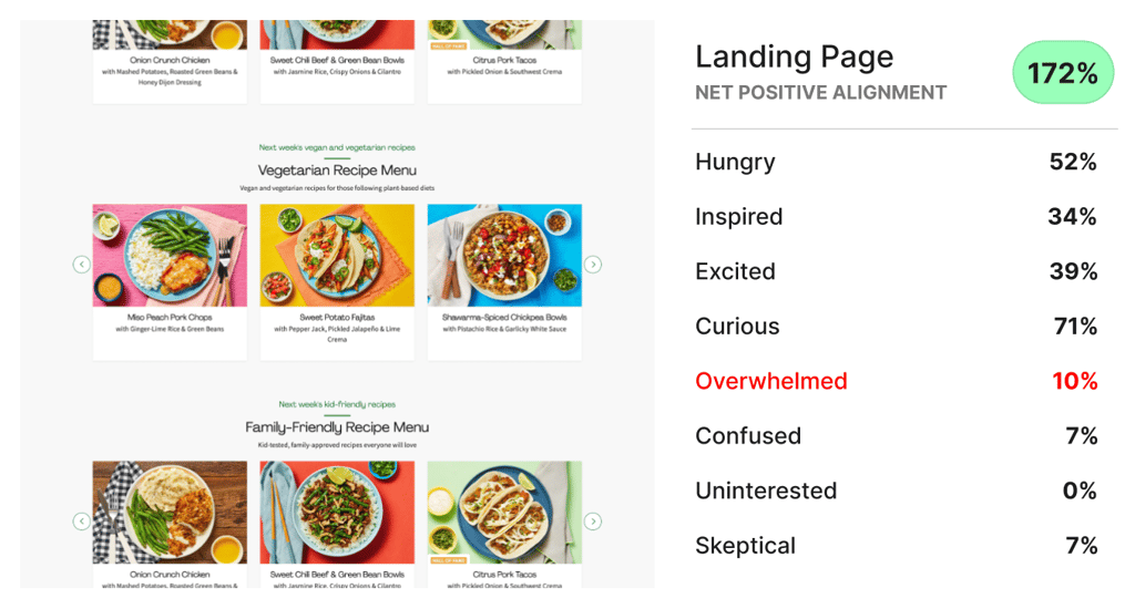
- However, around 10% of respondents felt overwhelmed, indicating that the page’s content might be too dense for some users.
Conclusion: While HelloFresh’s landing page generated generally positive impressions, there are areas for improvement. Enhancing user comprehension and trust in the primary offer could lead to higher conversion rates.
Recommendations:
- Simplify the Offer: Consider removing the complexity around the “16 free meals across 9 boxes” to make the offer easier to understand.
- Leverage Meal Plan Engagement: Given the high engagement with the meal plans, creating a clearer call to action and pathways for exploration could deepen visitor interaction.
- Streamline Content: Reducing the amount of content on the page could help alleviate the sense of overwhelm reported by 10% of visitors, potentially improving the overall user experience.
Reflections: This testing focused solely on the membership landing page. Future research could explore a follow-up flow, assessing how likely participants are to proceed with membership after engaging with HelloFresh’s meal plans.
