“Don’t make me think.” This bit of wisdom encapsulates the ideal user experience on any website, particularly on the homepage design. Your homepage is the gateway to your brand, the starting point of the user’s journey. It should be a beacon of ease and clarity, guiding visitors effortlessly toward understanding your product or service.
When someone lands on your homepage, they often look for answers or solutions. They’re not there to unravel complicated headline messages or decode jargon. They’re there to discover how you can make their life or work easier, more enjoyable, or more efficient. The best homepage headlines communicate this simplicity and directness, creating a seamless path from curiosity to action.
“Don’t make me think” Your landing page should tell how you make things easier for people.

Redona Dida, Founder, The Sofire
Your homepage should be the ultimate elevator pitch. It’s not just a display of what you offer; it’s a carefully crafted message that says, “We understand what you need, and here’s how we make it simple for you.” By making things easier for people, you’re not only showcasing your product’s benefits, you’re also displaying empathy towards your users—a powerful tool in creating a connection and converting visitors into customers.
Creating a compelling homepage design is crucial for any website, as it sets the first impression and guides visitors to the desired action.
Today, we’re delving into a powerful headline messaging framework known as “Now You Can…,” which has shown promising results in enhancing homepage messaging.
The Power of Direct Benefits in Homepage Headlines
Redona Dida recently called attention to the “Now You Can” framework. The “Now You Can” framework is an approach to crafting headlines highlighting the benefits or transformations a product or service brings to the user. This messaging approach conveys a sense of accessibility and ease, implying that something previously out of reach is now attainable.
The essence of the “Now You Can…” framework lies in its ability to communicate direct benefits. Using this strategy, you’re not just listing features of your product or service; you’re telling potential customers what they can achieve with it. This shifts the focus from the product itself to the value it provides, making it a more customer-centric approach. This approach is great for headlines, but you can also apply this when doing ad testing, too.
When crafting a homepage headline that sticks, clarity and directness are key. The “Now You Can…” framework succeeds because it taps into the fundamental principles of effective communication and marketing. Redona provides a closer look at why this approach works so well:
- Highlights Primary Benefits—A headline using this framework immediately highlights a product’s or service’s primary benefits. It’s not just about what the product is, but what it enables the user to do. For instance, a headline like “Travel Anywhere, Anytime with Our App” doesn’t just sell a travel app; it sells the dream of effortless exploration.
- Clarity and Straightforwardness—In a digital landscape cluttered with information, clarity cuts through the noise. Clear and straightforward headlines remove the guesswork for visitors, making it easier for them to understand the offering. This framework achieves just that, with no room for misinterpretation.
- Encourages Direct Action—Active verbs like “Go” and “Create” serve as a call to action, prompting the user to engage with the product. It’s about creating a sense of agency and immediacy, which is compelling in decision-making.
- Brevity and Memorability—The best headlines are short, succinct, and memorable. They are easy to read, and easy to understand, and they stick in the mind long after the first encounter. The “Now You Can…” framework ensures the headline is concise and impactful.
- Audience Targeting—A well-crafted headline speaks directly to its intended audience, resonating with their desires and needs. This framework allows for customization to target different demographics, making the message relevant and personal.
- Emotional Connection—Great headlines evoke an emotional response. They speak to feelings of freedom, accomplishment, and the joy of creation. It connects emotionally by suggesting what users can now achieve, driving deeper engagement.
- Accessibility—Finally, this framework democratizes the appeal of a product or service by making it accessible to all, regardless of technical skill or background knowledge. It levels the playing field, inviting everyone to benefit from the offering.
Incorporating the “Now You Can…” framework into your homepage design is more than a copywriting trick—it’s a strategic approach to connect with visitors, convey value, and convert interest into action. It’s a way to ensure your homepage isn’t just seen but remembered and acted upon.
Case Study: Improving Figma’s Homepage Headline
To illustrate this framework’s effectiveness, let’s look at a case study using Figma, a popular UI design tool. By testing the standard homepage headline against one crafted using the “Now You Can…” framework, we gained insights into how such a simple change can impact comprehension and emotional reaction.

Homepage Headline Testing Method
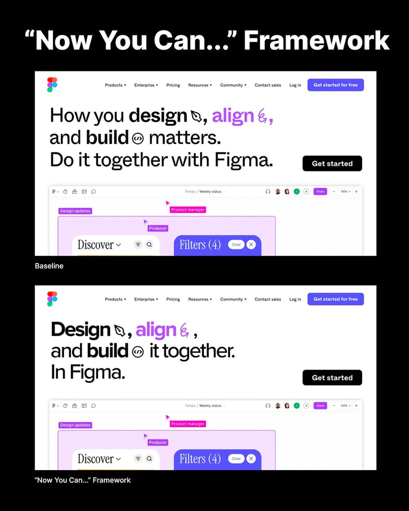
Using Helio, we split an audience of designers and marketers and presented each group a variation of Figma’s homepage in a test setup. The original headline was “How you design, align, and build matters. Do it together with Figma.” The alternative, crafted with the “Now You Can…” framework, read “Design, align, and build it together. In Figma.”
The Results
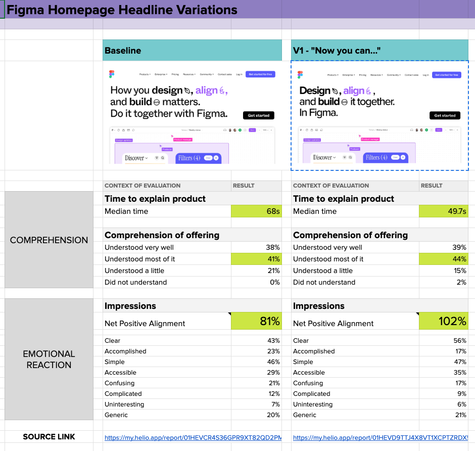
- Comprehension Speed: The “Now You Can…” version allowed users to understand the offering 20 seconds faster than the baseline. This reduction in time suggests that the message was clearer and easier to grasp.
- Clarity and Simplicity: Users found the “Now You Can…” version much clearer, avoiding the confusion and complexity perceived in the baseline.
- Generic Feel: Despite the improvements, both headline variations were criticized for feeling somewhat generic, indicating room for further refinement to stand out in the market.
See the side-by-side comparison between the baseline and the “Now you can…” framework in the image below:

Here’s a link to the Figma Homepage Headline data comparison sheet, including links to the Helio tests for each homepage headline.
Applying the “Now You Can…” Framework to Your Homepage Headline
Your homepage design is the welcoming face of your business, where first impressions are made. Make it count by highlighting how you’ll immediately improve your visitors’ lives. Use clear, simple language that resonates and sets you apart from the crowd.
Remember, it’s not just about features—it’s about the experience. Test and fine-tune your message to ensure it hits home, and aim to strike an emotional chord that sticks with your audience long after they’ve left your page.
Now, let’s translate these findings into actionable tips for your homepage design:
Tip 1: Lead with Benefits
Start your homepage message with the transformation your product or service enables. For example, instead of saying, “Our software has a robust analytics feature,” you could say, “Now you can gain deep insights into customer behavior with a click.”
Tip 2: Simplify Your Message
Avoid industry jargon and complex terms. The “Now You Can…” framework works best with simple, relatable language that speaks directly to users’ needs and aspirations.
Tip 3: Differentiate Your Offering
To combat the generic feel, pair the “Now You Can…” headline with specific, unique benefits that set you apart from competitors. For instance, “Now you can design like a pro, with real-time collaboration exclusive to our platform.”
Tip 4: Test and Refine
As shown in the Figma case study, testing different headline variations can provide valuable insights. Use A/B testing to gauge how different messages perform with your audience and refine them based on feedback, or test an XYZ hypothesis of how users will respond to a different message.
Tip 5: Focus on Emotional Connection
Your homepage should not only explain what users can do now but also evoke an emotional response. Use imagery and storytelling that resonates with your audience’s desires and pain points. If you’re unsure about your audience’s pain points, consider needfinding.
Craft a Homepage Headline that Creates Impact
The “Now You Can…” framework is a potent tool for improving homepage messaging. It’s about effectively and succinctly offering a bridge from the user’s current state to their desired state. By focusing on benefits, simplifying the message, differentiating your offering, and connecting emotionally with your audience, you can create a homepage that informs and inspires action.
Remember, the key to a successful homepage design is how well it communicates your value proposition. Continuously test and refine your messaging to ensure it resonates with your audience and drives them toward conversion. Happy designing!
FAQs
The key principle is simplicity and clarity, encapsulated in the phrase “Don’t make me think.” Your homepage should guide visitors effortlessly towards understanding your product or service, making their life or work easier, more enjoyable, or more efficient.
The homepage is the gateway to your brand and the starting point of the user’s journey. It is the ultimate elevator pitch, showcasing the product’s benefits and the brand’s empathy towards users.
The “Now You Can” framework is a headline messaging approach highlighting the benefits or transformations a product or service brings to the user. It communicates direct benefits and creates a customer-centric approach, focusing on what users can achieve.
This framework highlights primary benefits, ensures clarity and straightforwardness, encourages direct action, and achieves brevity and memorability. It also targets specific audiences, creates an emotional connection, and promotes accessibility.
A case study with Figma, a UI design tool, compared the standard homepage headline against one crafted using this framework. The test showed that the “Now You Can…” version was clearer, more straightforward, and understood 20 seconds faster than the baseline.
To apply this framework, start with a message highlighting the transformation your product or service enables. Simplify your message, differentiate your offering, test and refine based on feedback, and focus on creating an emotional connection with your audience.
Lead with benefits, simplify your message, differentiate your offering, conduct A/B testing for refinement, and focus on emotional connection through imagery and storytelling.
The goal is to create a homepage that informs and inspires action. It should communicate your value proposition effectively and resonate with your audience, driving them toward conversion.


