The pressure to deliver new features can lead organizations into what Ant Murphy, calls the “feature factory build trap” — constantly churning out new features without pausing to measure their true impact. This relentless push for output over outcome can lead to missed opportunities for improvement and a lack of understanding of feature success metrics and what truly drives user value.
Identifying and tracking the right feature success metrics is crucial to shift the focus from mere production to actual value creation. But how do you determine if a feature is truly “done”? Is it when the code is deployed, or is it something more? Let’s explore how you can ensure that each feature you release isn’t just completed but contributes positively to your business goals.
If we can all agree that the outcome is what’s important, not the output (i.e. a feature) then we shouldn’t consider any item of work as ‘done’ until it’s created the desired outcome.

Ant Murphy, Founder, Product Pathways

Beyond Deployment: When is a Feature Truly “Done”?
Let’s start by setting the record straight: a feature is not “done” simply because it’s live. True completion is about impact—has the feature made a difference in the way you intended? To know that, we must look beyond the production line and start measuring success in terms of outcomes.
But what does that look like in practice? It’s not just about looking at the numbers post-launch; it involves integrating the measurement of impact right from the conception of the feature. Ant Murphy emphasizes that we must focus on the outcomes rather than the outputs. This means redefining “done” as reaching the desired outcome, not just ticking off a task on your to-do list.
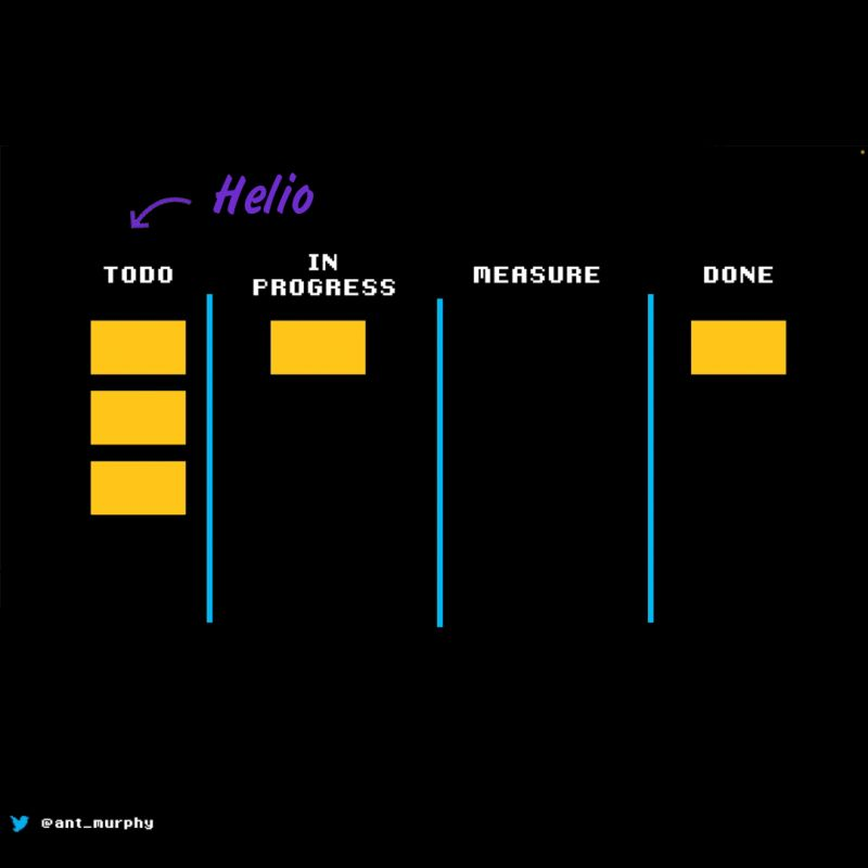
The Role of Helio in Feature Success Measurement
Helio offers an intriguing approach to this. It suggests testing for desirability, usability, and sentiment well before a feature makes it onto your to-do list. This proactive approach allows you to conduct quick concept testing, which is a risk mitigator against building features your users may not need or want.
Incorporating this kind of testing early on helps you establish baseline metrics before a single line of code is written. With Helio’s strategy, you’re not just building a feature but crafting an experience based on user data and insights.
Defining Your Feature Success Metrics
So, what feature metrics should you track to ensure a feature is “done”? We’ve paired several key metrics with a data example to illustrate how Helio can provide early signals around feature adoption.
1. User Engagement
This metric helps you understand how users are interacting with your feature. Are they using it as expected? Is it enhancing their experience? Track metrics like daily active users (DAUs), session length, and frequency of use.
A key component of engagement with new features is whether users truly understand how to use it. Advent, a digital marketing tech platform, decided to test graphic elements of a dashboard for their new Audience Targeting feature. Using Helio, Advent was able to source survey responses from 100 advertisers in the U.S. in minutes.
First, they asked a freeform response question, “Based on what you see on this page and your own experiences with marketing software, what do you think the ‘compass’ icon represents (located in the right sidebar)?”
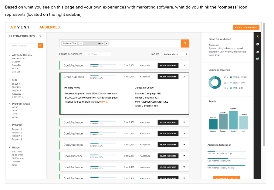
The compass icon, which guides users to the new audience page, symbolizes targeting specific locations. Feedback indicates that while the icon effectively represents geographical locations, its association with targeting individuals in those areas was unclear.
After showcasing the updated dashboard to the user, Advent analyzed participants’ open-text responses.
“The compass, in my opinion, represents the place of usage or target.”
– Helio Participant, Advertiser (US)
With this feedback, Advent recognized the need to update its feature icons. The new iteration must intuitively convey that it targets people, not just locations.
2. Conversion Rates
If your feature aims to facilitate or encourage actions like signing up or making a purchase, conversion rates offer clear insights. These metrics can gauge the feature’s effectiveness.
In the Advent example, one desired action is for users to create a new audience. We presented a screen for campaign measurement to an audience of 100 U.S. advertisers. We asked them to click on where they would go to create a new audience.
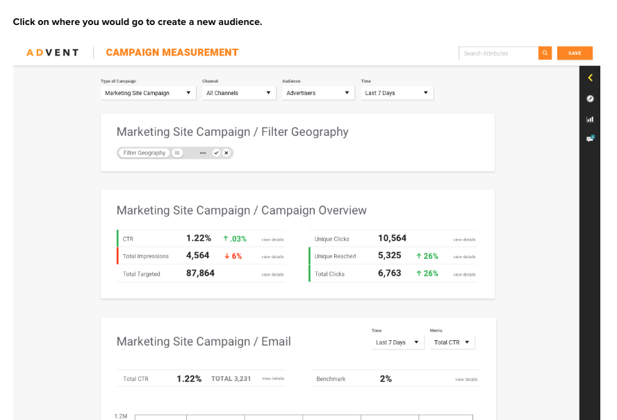
Measuring user clicks across different designs was crucial for understanding the conversion potential of Advent’s new Audience feature before its launch. This approach allowed for a pre-live assessment. The Advent team provided specific directives to measure engagement. This helped gauge the success of participants in interacting with the new feature.
The resulting click map illustrated just how scattered users’ actions are when trying to complete that task:
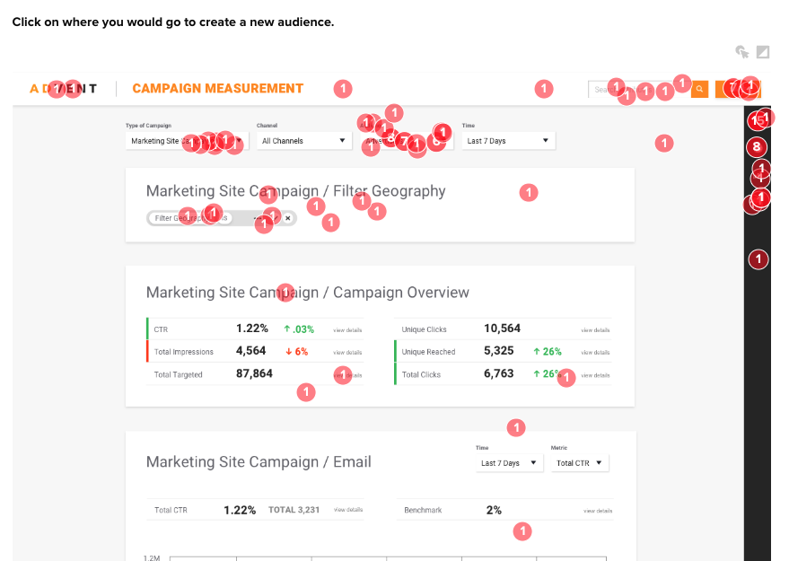
The Advent team felt they were planning ahead by including multiple success actions across the user dashboard and navigation. However, upon closer look, only 35% of participants successfully found where to access the new feature from their dashboard:
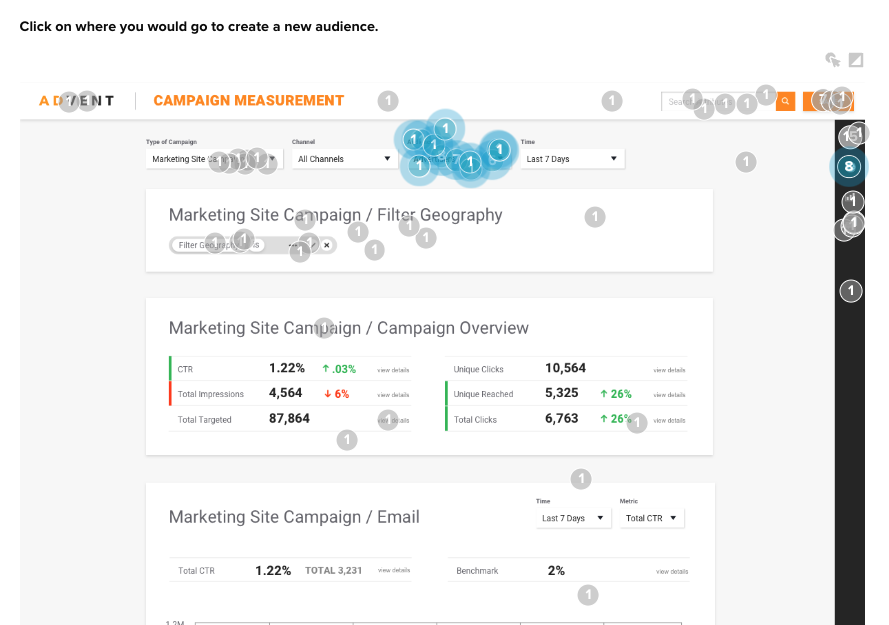
The team’s engagement testing revealed that the navigation icon isn’t intuitive and lacks a clear, top-level area to view audience information. This insight is part of their broader learning process.
Additionally, they discovered that other actions on the page, like the bright orange Save button in the top-right corner, distract from the main directive. Interestingly, this button shouldn’t even appear active at that stage. These usability tests have highlighted several pain points that Advent needs to address for users.
3. Performance Benchmarks
Speed and reliability can be critical for user adoption. Monitor load times, downtime, and error rates to ensure the feature performs well under different conditions.
Tracking time to action allowed the Advent team to paint a clear picture of what new elements are working over others.
The multiple success clicks in the conversion rate testing above were also evaluated to understand participants’ reaction time.
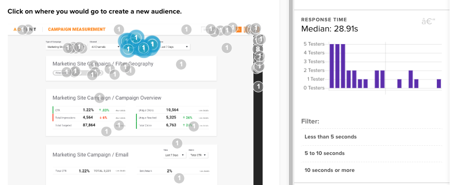
For instance, the majority of successful participants found the new audience action in a median time of almost 30 seconds. That, on its own, is a significant amount of time to complete an important new action on the platform.
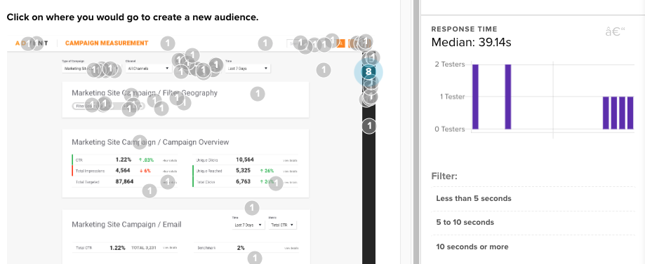
However, we see a 10+ second increase in time to action for participants who wandered long before finding the appropriate action on the page. They missed the clear audience action where most successful users clicked in 30 seconds.
Advent knows that these time-to-action numbers need to improve through iconography, CTA emphasis, or user education on their dashboard.
4. Customer Satisfaction and Sentiment
Utilize surveys, net promoter scores (NPS), and sentiment analysis to gauge how your users feel about the feature. Are they satisfied? Would they recommend it to others?
Building off the experience of the click tests participants were just asked to complete, Advent gathered emotional reactions to the platform participants had just engaged with.
The numerical scale is a common quantitative test used to generate the well-established Net Promoter Score. This score measures the net difference between the proportion of promoters (scores of 9 or 10) and detractors (scores of 6 or less).
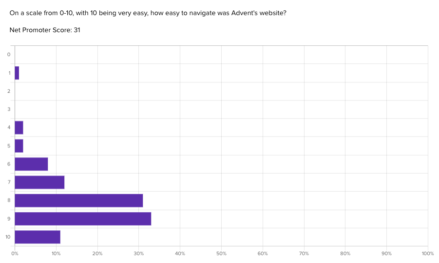
Scores range from negative to positive 100, with anything above a 0 indicating a generally positive reaction. With an NPS score of 31, Advent’s platform shows that, despite some previously mentioned comprehension and usability issues, the overall experience still meets user’s expectations, and therefore the team’s expectations. View the Helio Example.
These NPS scores can be measured over time to show improvement—or decline—based on rapid iterative testing of your designs.
5. Business Outcomes
Ultimately, your feature should contribute to meaningful customer and company outcomes. High NPS scores, daily active users, session length, and frequency of use should contribute to lifetime client value by keeping them a customer for longer.
Another way to look at it is this: improving your feature success metrics will help reduce customer churn, creating a more favorable environment for business growth.
Depending on your product and business goals, there will likely be other relevant KPIs to monitor. Let us know if you want to talk to an expert for guidance. We’re always happy to help makers and doers in business.
Conducting Impactful Concept Testing
Before you commit resources to developing a feature, use concept testing to gather user feedback and predictions on how it might perform. This step can save you from investing in features that don’t align with user needs or business objectives.
Here’s how Helio can amplify this idea. Before putting it on your to-do list, you can test desirability, usability, and sentiment. Before you commit to an idea, quick concept testing will limit the risk of building unnecessary features, and it helps you define baseline metrics BEFORE ever building a feature.
Making Data-Driven Decisions
With these metrics, you can move from guesswork to data-driven decisions. Instead of assuming a feature’s success, you have tangible proof of its impact.
In conclusion, escaping the feature factory build trap is not just about changing how we work; it’s about transforming how we measure success. By focusing on the impact and outcome of features, and rigorously testing and validating before development begins, we can create more meaningful products that deliver real value. Armed with the right metrics and a focus on user-driven outcomes, your features will not only be “done” but will drive success for both your users and your business.
Feature Success Metrics FAQs
Understanding the fundamental metrics that indicate feature adoption is crucial for evaluating the success of a product. What specific metrics, such as user engagement, active usage, or user retention, should be prioritized to measure feature adoption effectively?
Identifying the threshold or criteria that distinguish successful feature adoption from unsuccessful adoption is essential. What benchmarks or patterns in the metrics can help us determine if users are truly embracing a new feature or if improvements are needed?
It’s important to delve into user behaviors that directly impact feature adoption. Which user actions or interactions should be closely observed in the metrics to gain insights into how users are integrating the new feature into their workflows or routines?
Recognizing external factors, such as market trends, competition, or changes in user demographics, is crucial for interpreting feature success metrics accurately. How can we factor in these external variables to ensure that the metrics reflect the true impact of the introduced feature?
Continuously optimizing and enhancing feature adoption is an ongoing process. What strategies, based on the analysis of metrics, can be implemented to encourage greater user adoption? This may include UX/UI improvements, targeted marketing efforts, or user education initiatives.