Growth experiments are the adrenaline shots that keep businesses nimble, informed, and ahead of the curve. These designed tests, each a mini-crusade against stagnation, are not just about finding what works but continuous discovery and adaptation. So, let’s dive into the art and science of continuous discovery in growth experiments.
Kieran Flanagan inspired us with his essential lessons from conducting thousands of marketing and growth experiments. He emphasizes practical insights for successful experimentation strategies.
Here are his big takeaways:
- Prioritize fast execution and feedback over perfect processes.
- Choose experiments with known history and significant potential impact.
- Balance your experiment portfolio between risk and potential gain.
- Focus experiments on overarching themes for deeper insights.
- Ground experiments in customer insights, not just predictions.
When you prioritize fast execution, you adopt a sprinter’s mindset – quick off the blocks, responsive to the track, and ready to adapt your stride. That’s the essence of continuous discovery: a relentless quest for insights that can pivot your strategy from guesswork to precision. Each experiment you conduct is a question posed to the market: “Is this what you want?” And with each answer, you refine your approach, sharpening your growth tactics like a chef sharpens a knife.
Choosing Your Experiments Wisely
To maximize the effectiveness of growth experiments, it’s crucial to select tests strategically, opting for those with a proven track record and the potential to make a significant impact. The aim is not merely to engage in a flurry of activity but to choose wisely, ensuring that each test is a calculated decision rather than a haphazard attempt.
The strategy should also involve a balanced approach, not the precarious balancing act of a tightrope walker, but a carefully composed mix of prudence and boldness. Consider your collection of experiments as if it were a thoughtfully curated art exhibition, with each piece representing varying levels of risk and potential reward. Such diversity ensures that the success of some experiments can compensate for those that do not yield the desired results, thus maintaining a steady and resilient growth trajectory.
Flanagan emphasizes the importance of identifying overarching themes within these experiments. The goal is not to rack up isolated successes but to interlace a series of experiments into a rich narrative providing deep insights. Each experiment adds to this narrative, enriching the story with every focused effort. The ultimate objective is to decipher not just the actions of users but their underlying motivations—the ‘why’ behind their behaviors, which is the linchpin of effective growth strategies.
Putting It All Together: The Cycle of Success
Grounding your experiments in customer insights rather than mere predictions is like choosing a map over a random walk when exploring new territories. The customer insights act as your North Star, guiding your experiments towards true north–sustainable growth. This customer-centric approach is the bedrock upon which successful growth experiments are built.
Execution > Process: It’s easy to fall in love with the rigor and processes around growth. I’ve seen people adhere so strictly to growth processes that it slows them down and forces them to work on tiny incremental work. Shipping fast with quick feedback loops is more important that running the perfect process.

CMO at Zapier
Helio, a platform designed for rapidly collecting user feedback through surveys and interactive content, emerges as a potent ally in this quest for growth. It embodies the principles of continuous discovery, allowing you to test, learn, and adapt in a cycle that’s as fast as the digital world demands. Whether it’s selecting the right target audience, designing the experiment, creating tests or surveys, analyzing results, or refining and retesting – Helio is your co-pilot, navigating the ever-shifting skies of the market.
So, as you gear up for your next set of growth experiments, remember the wisdom Flanagan shared and the capabilities Helio offered. Embrace fast execution, choose your experiments wisely, balance risk with potential gain, focus on themes, ground your decisions in customer insights, and keep the cycle of continuous discovery spinning. That’s how you transform the guesswork of growth into the science of success.
Embracing Continuous Discovery in Growth Hacking
Moving deeper into growth experiments, let’s focus on continuous discovery and how it becomes the heartbeat of any successful growth strategy. In the language of business, it’s akin to continuous improvement, but with a sharp focus on the customer-centric aspects that directly fuel growth.
Continuous discovery isn’t just a buzzword; it’s a vital business practice for staying relevant and competitive in today’s fast-paced market. It’s about embracing a growth mindset where learning and adapting never stops. Just as scientists formulate and test hypotheses, growth hackers use continuous discovery to test their theories about user behavior and market trends.
The Learning Loop of Experimentation
Think of continuous discovery as a learning loop. You begin with assumptions, test them through experiments, gather data, and then learn from the results. This loop isn’t just a one-time journey around the track; it’s a repetitive process that keeps your growth strategies fresh and effective. Each round provides valuable insights that feed into the next set of experiments, ensuring that your strategies evolve as quickly as your customers’ preferences do.
From Data to Insights to Action
In this data-driven age, it’s not just the volume of data that matters but how you translate it into actionable insights. Growth experiments provide a rich vein of data, but the analysis turns this data into gold. This is where you put on your detective hat and look for patterns, trends, and anomalies. You’re not just collecting data; you’re on a quest to uncover the story the data tells you.
Tools of the Trade: Helio and Beyond
Tools like Helio can be your sidekick in this adventure. They provide the framework for setting up experiments, collecting feedback, and analyzing results. But remember, tools are only as good as the hands that wield them. It’s your strategic thinking, your ability to ask the right questions and your knack for interpreting the answers that will set you apart in the growth game.
Setting Up Your Growth Experiments
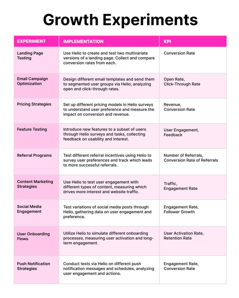
Let’s jump back into the chart, a comprehensive roadmap for navigating the multifaceted landscape of growth experiments. Each chart segment outlines a specific type of experiment and pairs it with its implementation through Helio and the key performance indicators (KPIs) that measure success. Let’s take a stroll through each section and flesh out how these tests can be the catalyst for your company’s growth. We’ll explore 9 examples.The Learning Loop of Experimentation
Think of continuous discovery as a learning loop. You begin with assumptions, test them through experiments, gather data, and then learn from the results. This loop isn’t just a one-time journey around the track; it’s a repetitive process that keeps your growth strategies fresh and effective. Each round provides valuable insights that feed into the next set of experiments, ensuring that your strategies evolve as quickly as your customers’ preferences do.
From Data to Insights to Action
In this data-driven age, it’s not just the volume of data that matters but how you translate it into actionable insights. Growth experiments provide a rich vein of data, but the analysis turns this data into gold. This is where you put on your detective hat and look for patterns, trends, and anomalies. You’re not just collecting data; you’re on a quest to uncover the story the data tells you.
Tools of the Trade: Helio and Beyond
Tools like Helio can be your sidekick in this adventure. They provide the framework for setting up experiments, collecting feedback, and analyzing results. But remember, tools are only as good as the hands that wield them. It’s your strategic thinking, your ability to ask the right questions and your knack for interpreting the answers that will set you apart in the growth game.
1. Landing Page Testing: The First Impression Counts
Starting with the digital handshake – your landing page. Using Helio, you can craft and compare two multivariate versions of a landing page. It’s like setting up a split test to see which version resonates more with visitors. By tracking conversion rates from each, you’re asking, “Which layout, copy, or call-to-action wins the day?” It measures how well your landing page turns visitors into leads or customers. Ie, the ultimate growth experiment.
Helio can be instrumental in conducting A/B tests for landing pages. Here’s how you’d go about it:
- Target Audience Selection: Identify who you want feedback from and use Helio’s distribution channels to reach them.
- Experiment Design: Set up two different versions of your landing page within Helio, each with variations in design, copy, and calls-to-action.
- Create Tests: Develop interactive content or tasks that direct traffic to each landing page version.
- Analyze and Compare: Use Helio’s analytics tools to measure conversion rates for each version.
- Iterate: Based on the data, make informed decisions to optimize the landing page design for higher conversion rates.
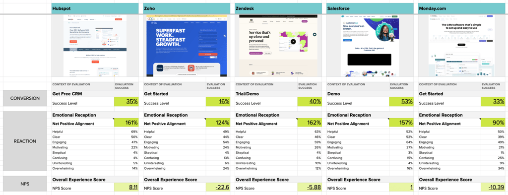
To illustrate how Helio can be used to test landing pages, we embarked on a comprehensive analysis of five prominent CRM providers—HubSpot, Zoho, Zendesk, Salesforce, and Monday.com.
Five independent tests focused on user motivation, ability, and clarity of prompts. Distinct patterns emerged that shed light on the strengths and weaknesses of each platform.
Framework Link: https://docs.google.com/spreadsheets/d/1Ekku7gfZ02T4K1dh_A3O1bNJPB4N1K4UOXoVqzx5swM/edit?usp=sharing
HubSpot
- Strengths: HubSpot’s emphasis on free CRM concepts resonated well with users, providing clarity throughout the landing page. The free CRM focus contributed to the highest level of perceived helpfulness among all competitors. HubSpot also stood out as the sole company with a positive Net Promoter Score (NPS).
- Opportunities: Building on this positive reception, HubSpot can further leverage its free CRM concept to strengthen user motivation and enhance its market positioning.
Monday.com
- Strengths: While Monday.com’s landing page incorporated white space for a clean aesthetic, it was noted that this approach might deter users seeking clear direction to important information.
- Opportunities: Refining the use of white space and addressing overlapping content sections could enhance participant clarity and improve the overall user experience on Monday.com’s landing page.
Salesforce
- Strengths: Salesforce achieved the highest conversion levels on its homepage by strategically positioning a demo as the primary call-to-action (CTA). This approach instilled confidence in users that they would gain a comprehensive understanding of the product before committing.
- Opportunities: Balancing the holistic focus on customer connections and the Customer360 product with a clear CRM message could reduce confusion and strengthen Salesforce’s market position.
Zoho
- Strengths: Zoho’s landing page, while having a clear CRM focus, faced challenges due to a high form requirement for users to “Get Started,” resulting in lower immediate conversions.
- Opportunities: Simplifying the onboarding process and potentially reducing the form requirements may improve the conversion rate and provide a smoother user journey.
Zendesk
- Strengths: Zendesk’s landing page tested well in terms of engagement on their primary trail/demo CTAs and impressions of helpfulness and engagement due to the hero video
- Opportunities: Despite positive emotional reactions, the look of the page deterred some visitors, who deemed it uninteresting and somewhat overwhelming, leading to a negative NPS.
Each competitor displayed unique strengths and opportunities for improvement, emphasizing the need for continuous refinement based on user feedback and evolving industry standards.
Landing Page Optimization Services
2. Email Campaign Optimization: Crafting the Perfect Inbox Experience
Email remains a kingpin in marketing. The key lies in designing and sending various email templates to segmented user groups. With Helio, you can leverage a growth experiment to see how each segment reacts, measuring the open and click-through rates. It’s a dance, finding the rhythm that gets users to move from reading an email to taking action on your website.
Helio helps streamline the process of email campaign optimization as follows:
- Segmentation: Use Helio to segment your audience based on demographics, behavior, or customer journey stage.
- Design Templates: Create various email templates with different messaging, layouts, and subject lines.
- Conduct Surveys: Before sending out the campaigns, you could use Helio to survey users’ preferences or past email experiences.
- Deploy and Measure: Send emails through Helio and track open and click-through rates.
- Iterate: Refine email content based on performance metrics and user feedback from follow-up surveys.
We recently ran a Helio test, on our own product, that provides insight for app builders.
We tested 3 types of email greetings for inviting team members into Helio to see which version gets the most people to activate their account right away, and which will convince them to provide their information upon sign-up.
Here’s what we found:
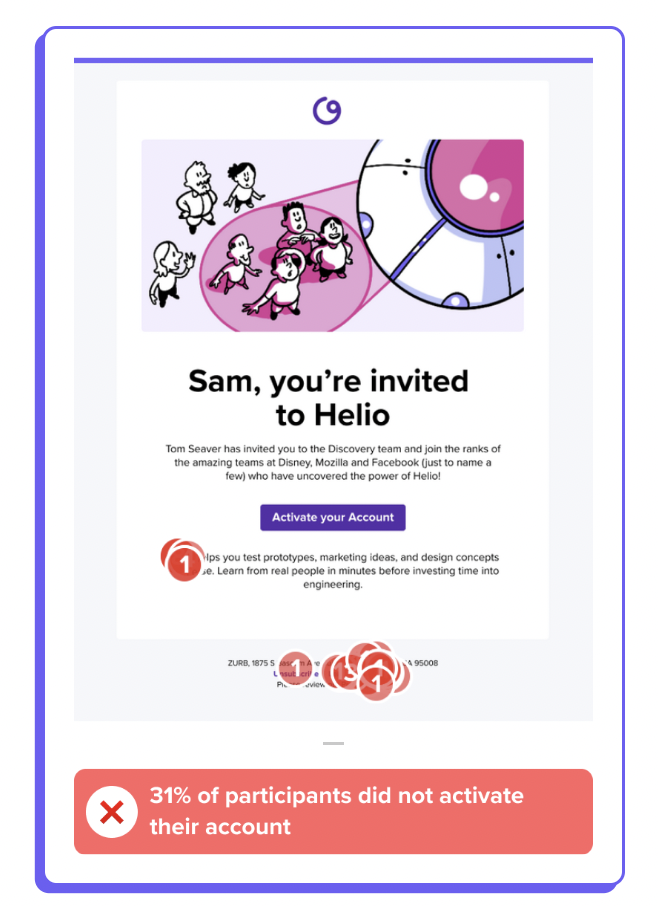
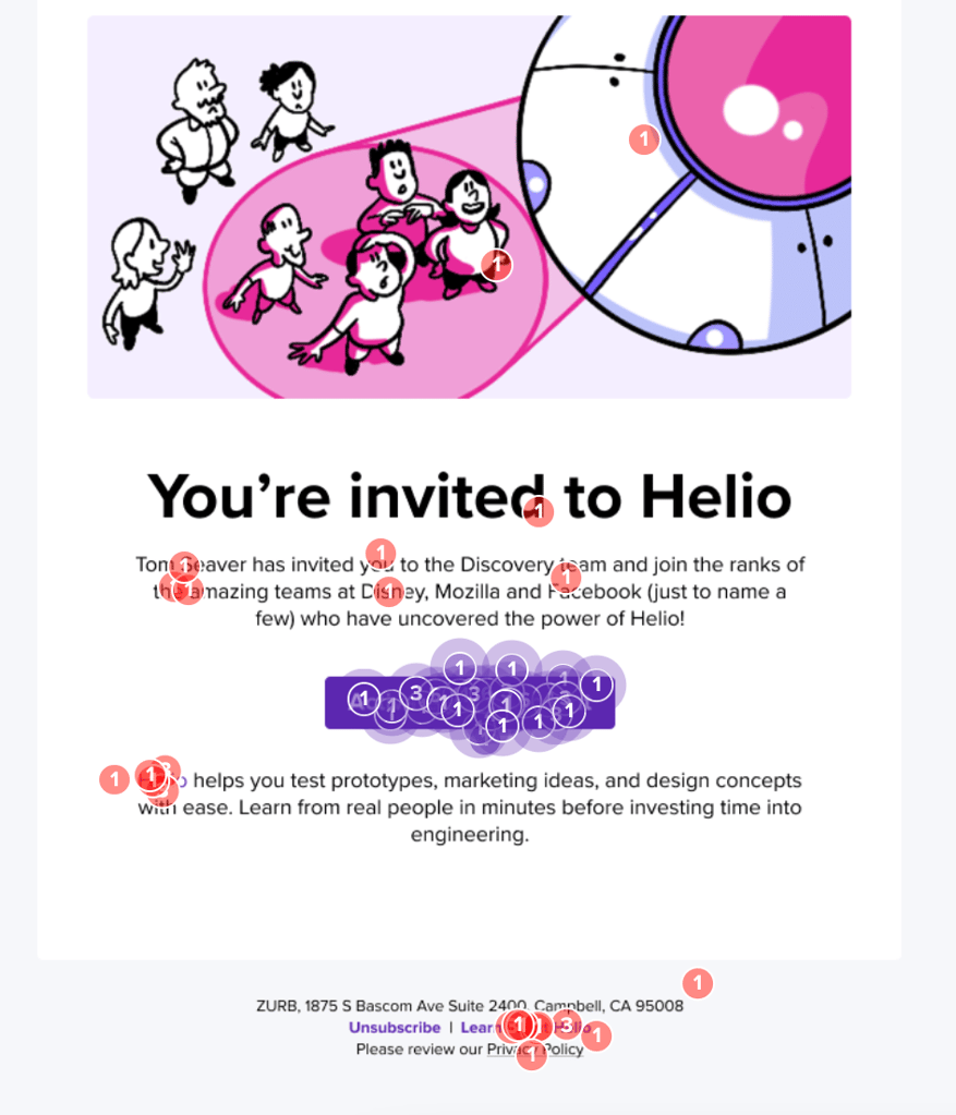
Variation B made participants more likely to activate their account. Variation B, with the sender name and account name, resulted in the most participants using their first click to activate their account. Up to 14% more participants would immediately click the primary CTA in Variation B compared to the other variations. In Variations A & C, participants were more likely to click into alternate links to learn more about Helio before activating their account. This is an example of our best testing variation producing more immediate trust with the email, and our platform.
The emails that used the sender’s full name produced the most positive reactions.
Variations B & C had significantly greater positive reactions than Variation A, mainly in the area of feeling confident. We also asked participants what they need to see in an invite email to be convinced, and many mentioned they expect to see their co-worker’s full name before confidently clicking into an account invite. These participant expectations and preference for Variations B & C show that the sender’s full name is the most crucial piece of information in the invite email.
“To make an email more trustworthy it should come from a legit website or commonly used email platform, with the senders full name.” Participants trusted Variation B the most when asked to provide their personal information.
Our best testing email, Variation B, produced the most participants who said they would provide their full name upon sign-up. Up to 14% more participants said they’re likely to provide their own full name upon sign-up compared to the other 2 variations. This shows how the right email can have a lasting impact beyond the email action and into the platform itself.
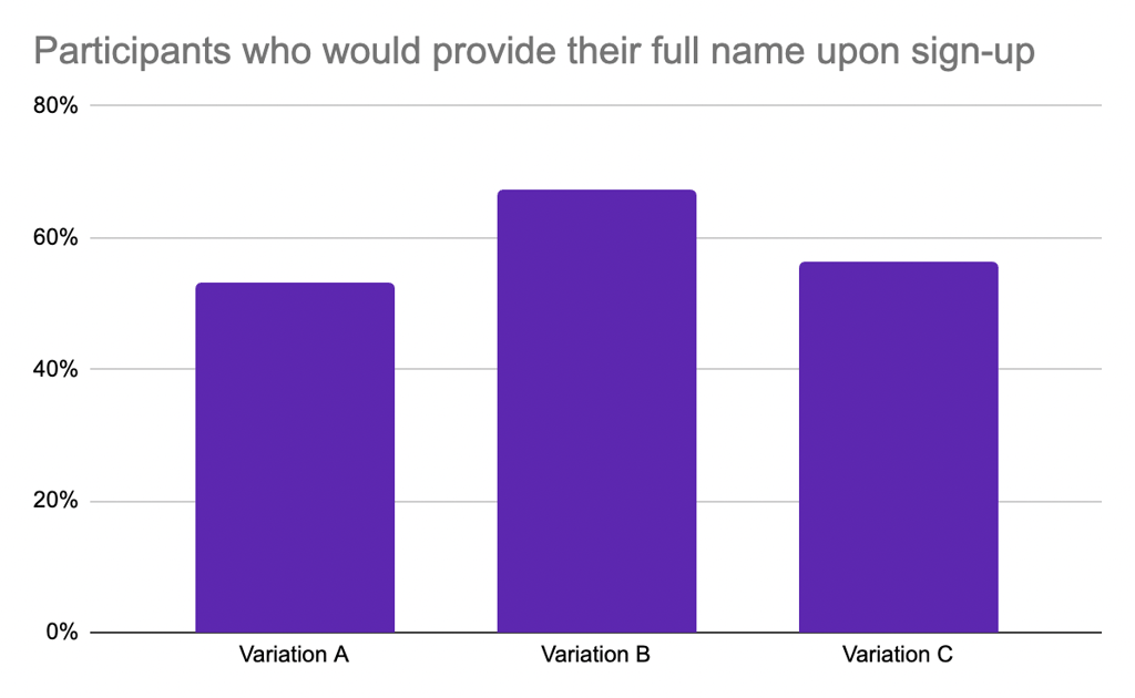
Our main takeaways from this study:
- Variation B made participants more likely to activate their account.
- Emails that used the sender’s full name produced the most positive reactions.
- Variation B, with the account name and sender name, did the best job of building trust with our platform.
With these signals, we’ve made the decision to implement Variation B as the new invite email for our Helio accounts. We hope that the proper use of the account name and the sender name in the email will encourage account invitees to sign up more quickly, and reduce the bounces on our sign-up page when we start asking for visitor’s information. Choosing the right email version should help us drive more users to our platform, especially with the release of our new Unlimited Viewers feature.
Leave the frills at home.
We don’t need to act like we’re best friends with our new users, or trick them into some secret society with code names and avatars. People just need to be convinced that the invite they receive is coming from a person they trust, and the best way to do that is by being upfront about who that person is.
3. Pricing Strategies: Finding the Sweet Spot
Pricing can be as much an art as a science. You can tap directly into the user preference psyche by setting up different pricing models in Helio surveys. This isn’t just about finding the highest price point a customer will tolerate; it’s about understanding the perceived value of your offering and how pricing affects conversion and, ultimately, revenue.
To test pricing strategies with Helio:
- Define the Variables: Establish different pricing models you want to test.
- Survey Creation: Develop surveys within Helio to gather user preferences on pricing.
- Data Collection: Distribute the surveys to your target audience segments.
- Analysis: Examine the data to understand the impact of pricing on user preference and conversion rate.
- Optimization: Adjust pricing strategies based on survey feedback and conversion data.
Fabletics is a clothing company that makes products to elevate your game, no matter how you move. Everyone gets to play. They believe movement should be fun for everyone and every body — and that fashion-forward, high-performance activewear should be accessible.
Their VIP membership program, which is more than 2.3+ million members, is a key part of their business model. Community is their biggest advocate and at the heart of everything they do. Without them, and the growth experiments they ran to get there, Fabletics wouldn’t exist.
Naturally, converting more web users into VIP members is a top digital marketing priority. To illustrate how Helio can help optimize this page for conversions, we asked an audience of 100 online shoe shoppers in the US and Canada to evaluate one of Fabletic’s webpages, shown in the screenshot below. This size sample is large enough to get quick signals on what informs buyer decisions and how to tailor your approach.

Step 1: Know What Resonates with Your Audience
Every audience is unique. First, we wanted to pinpoint the activities and content that this audience finds irresistible. We asked an open-ended question to gauge expectations before putting ideas into action. We asked our audience of online shoe shoppers what they would want from a monthly clothing brand membership, and found some very strong expectations already established:
“If i was going to sign up with a clothing brand they would have to give me a free gift of good value every month and discounts that are no less than 75% and clothing would have to also have one year guarantee.”
Step 2: Craft Real-World Scenarios
Next, we asked buyers, “how well does this membership offer match your expectations?” Since the expectations had been established for a membership program in the previous question, we put Fabletics’ membership page in front of users to see how well it stacks up.
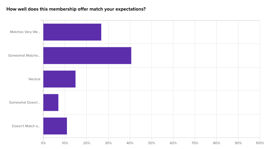
More than 65% of users said the membership matched their expectations. Fabletics must be in-tune with their community.
However, a full 18% of participants indicated that the Fabletics membership doesn’t meet their expectations, largely because of the monthly fee for being a member while also requiring minimum purchases amounts to gain certain member benefits.
Step 3: Present Choices to Your Prospects
This step is about interaction. Offer your prospects clear next steps, whether it’s a clickable call-to-action or a physical product to try.
In our Fabletics example, we asked our audience of online shoe shoppers where they would click first on the page. Click data is important for setting the stage and learning how visitors interact on first contact, like the majority of consumers (30%) who traveled to the middle of Fabletics’ page to explore FAQs and the Get Started CTA.

This large concentration of clicks so far down the page indicates that Fabletics’ may want to reprioritize the actions on their page to have these more significant CTAs near the top for easy access.
Step 4: Analyze Engagement and Collect Data
Click data can show interaction, though it may not lead you to visitors’ preferred next step. That’s why we presented our audience with a closed-ended question: “After you’re finished with this page, what would you most likely do next?” with four response options:
- Explore FAQs
- Get Started
- Take Special Offer Quiz
- Explore Products
- Leave Site
Two of Fabletics’ important CTAs on the page, Get Started and Take Quiz, were the least likely destinations for consumers who would rather explore products or learn more before committing.
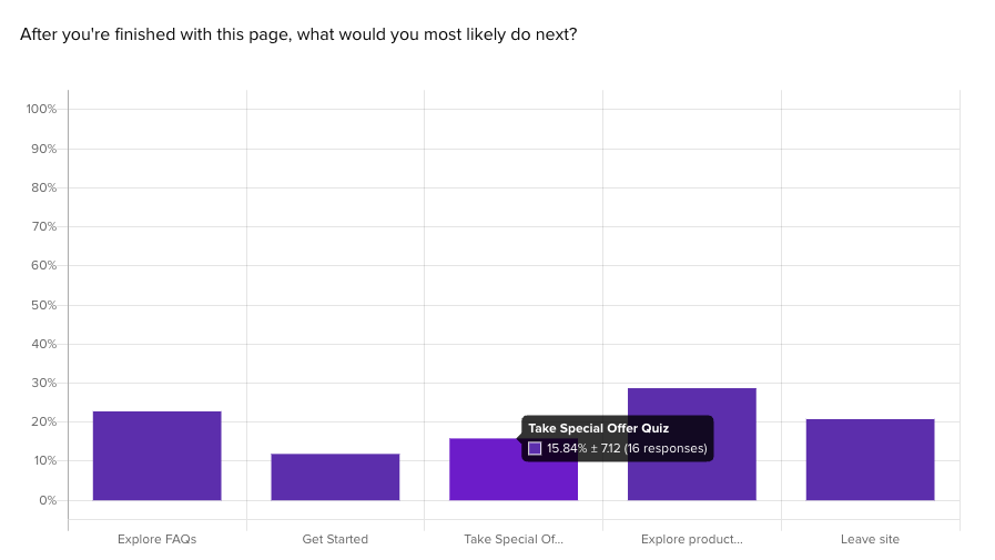
Keep an eye on this data, because there’s usually gold. This data shows how visitors decide on one direction over the other, and whether your desired actions take precedence.
Step 5: Conduct Follow-Up Probes
After the initial engagement, don’t be shy to ask for feedback. Their expectations, understanding, and satisfaction are key to their buying intent.
Despite visitors assurances that they understood Fabletics’ membership offer overall, we found that many could not clearly explain the VIP subscription in their own words:
“What’s unclear is how many credits you’re awarded in exchange for your monthly payment. You also still have to pay for shipping if the value of your order is less than $49.95 (but how will you know the value, if you paid in credits?) A bit confusing”
Step 6: Prioritize and Strategize
Use a scoring system to prioritize the signals. This helps you zero in on where to focus your efforts.
With some interaction and comprehension issues identified, we can see the full emotional effect of the Fabletics page with our final impression question, “What impressions does this membership offer page give you?” We hope to see positive impressions like simplicity and helpfulness dominate the data, with negative impressions being shared by less than 10% of the participant group.
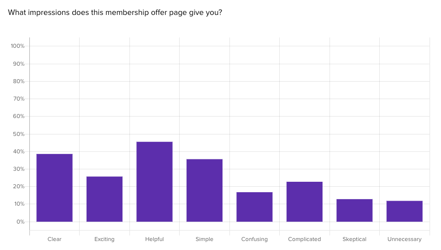
With feelings of confusion and complication reaching up to 20%, and all of our negative impressions scoring over 20%, we can see some clear emotional problems caused by the VIP Membership page.
4. Feature Testing: Tuning Into User Feedback
Every feature release is a mini premiere. Will it be a blockbuster hit or a box office flop? By introducing new features to a subset of users through Helio surveys and tasks, you’re gathering immediate feedback on usability and interest. This direct line to user engagement metrics and qualitative feedback is invaluable in fine-tuning your product roadmap.
Feature testing through Helio can be very insightful:
- Feature Selection: Choose which new feature you want to test.
- User Tasks: Create tasks or interactive content that allow users to experience the new feature.
- Feedback Collection: Use Helio to collect immediate feedback on usability and interest.
- KPI Measurement: Collect feedback and measure user engagement with the new feature.
- Refinement: Make feature adjustments based on user responses and retest until the desired level of usability and engagement is achieved.
1. User Engagement
This metric helps you understand how users are interacting with your feature. Are they using it as expected? Is it enhancing their experience? Track metrics like daily active users (DAUs), session length, and frequency of use.
A key component of engagement with new features is whether users truly understand how to use it. Advent, a digital marketing tech platform, decided to test graphic elements of a dashboard for their new Audience Targeting feature. Using Helio, Advent was able to source survey responses from 100 advertisers in the U.S. in minutes.
First, they asked a freeform response question, “Based on what you see on this page and your own experiences with marketing software, what do you think the ‘compass’ icon represents (located in the right sidebar)?”
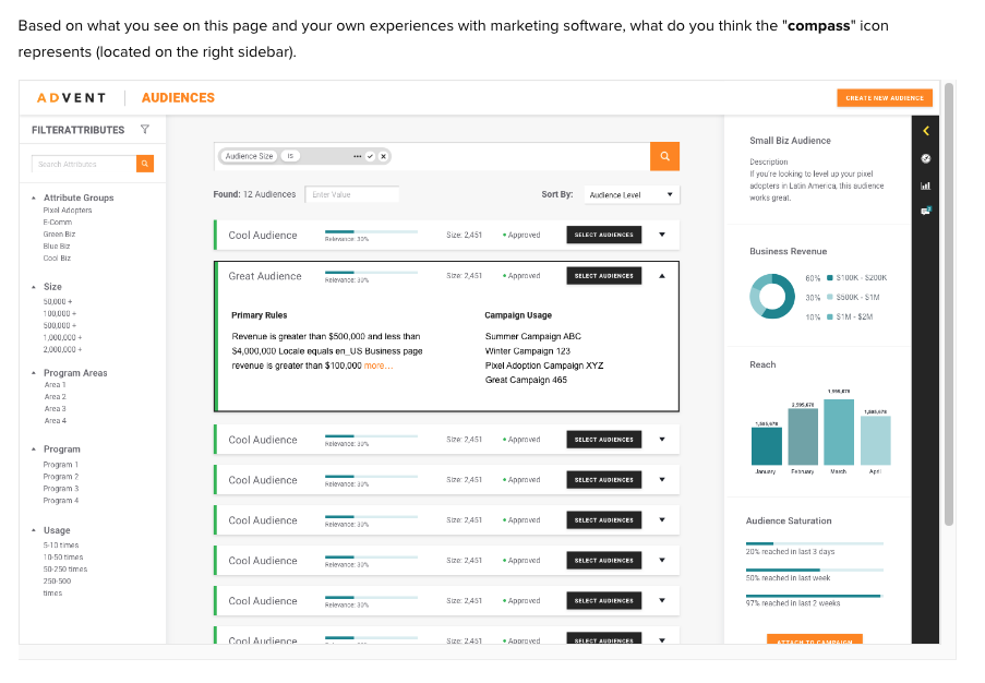
After presenting the user with their dashboard, complete with new feature updates, Advent reviewed the open-text responses from participants:
The compass icon used for navigating to the new audience page was hopefully conveying the idea of targeting people in specific locations. Based on the participants’ written feedback, the idea of geographical locations was clear based on the compass icon, though the concept of targeting people in those locations seemed to be lost:
“The compass, in my opinion, represents the place of usage or target.”
– Helio Participant, Advertiser (US)
With this feedback in hand, Advent knew that the next iteration of their new feature’s iconography needed to intuitively convey the concept of targeting people, not just locations.
2. Conversion Rates
If your feature is designed to facilitate or encourage a specific action, such as signing up or making a purchase, conversion rates can provide clear insight into its effectiveness.
In the Advent example, one desired action is for users to create a new audience. When presented with a screen for campaign measurement, we asked our audience of 100 advertisers in the U.S. to click on where they would go to create a new audience.
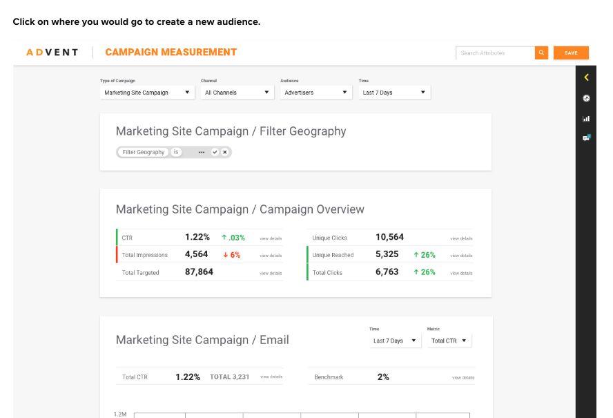
Measuring user clicks across designs was key to understanding how Advent’s new Audience feature was converting, even before it went live. By providing specific directives, the Advent team was able to gauge how successful participants were at engaging with their new feature.
The resulting click map illustrated just how scattered users actions are when trying to complete that task:
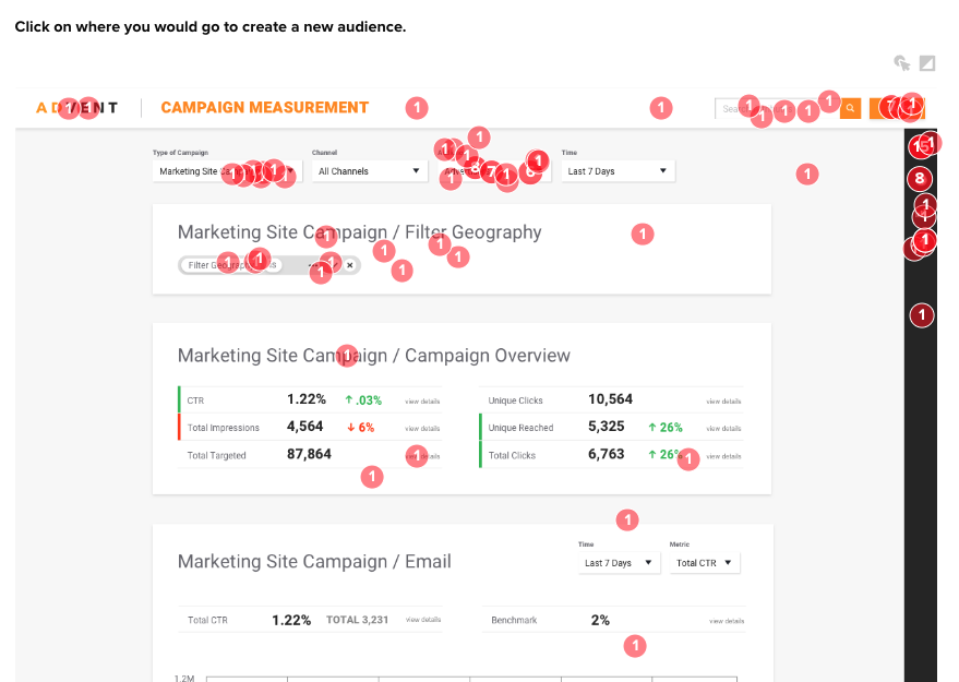
The Advent team felt they were planning ahead by including multiple success actions across the user dashboard and navigation. However, upon closer look, only 35% of participants successfully found where to access the new feature from their dashboard:
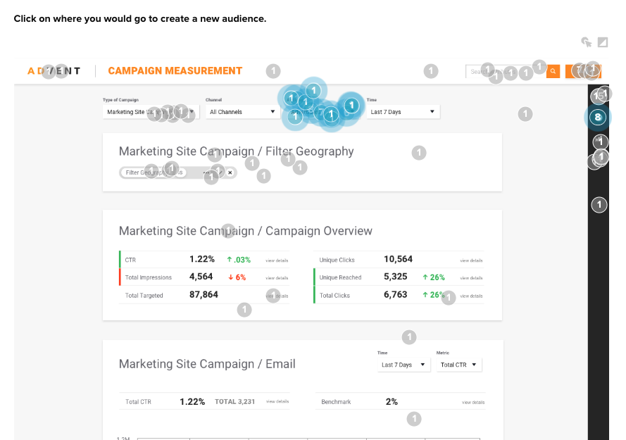
Part of this goes back to what the team learned in their engagement testing: the navigation icon isn’t intuitive and doesn’t provide a clear top level area to view audience information.
They also found that other actions on the page distract from the directive, such as the bright orange Save button in the top-right corner (which shouldn’t even appear active at the time). These usability tests show clear pain-points for Advent to solve for users.
3. Performance Benchmarks
Speed and reliability can be critical for user adoption. Monitor load times, downtime, and error rates to ensure the feature performs well under different conditions.
Tracking time to action allowed the Advent team to paint a clear picture of what new elements are working over others.
The multiple success clicks in the conversion rate testing above were also evaluated to understand the reaction time of participants.
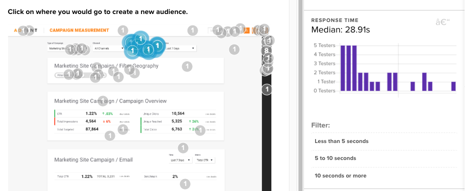
For instance, it took the majority of successful participants a median time of almost 30 seconds to find the new audience action. That on its own is a significant amount of time to complete an important new action on the platform.
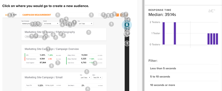
However, we see a 10+ second increase in time to action for participants who wandered for a long time before finding the appropriate action on the page. More so, they missed the more clear audience action where the majority of successful users clicked in 30 seconds.
Advent knows that these time-to-action numbers need to improve, either through iconography, CTA emphasis, or user education on their dashboard.
4. Customer Satisfaction and Sentiment
Utilize surveys, net promoter scores (NPS), and sentiment analysis to gauge how your users feel about the feature. Are they satisfied? Would they recommend it to others?
Building off the experience of the click tests participants were just asked to complete, Advent was able to gather emotional reactions to the platform participants’ had just engaged with.
The numerical scale is a common quantitative test type used to create the tried-and-tested Net Promoter Score, which measures the net difference between the proportion of promoters (9 or 10) and detractors (6 or less).
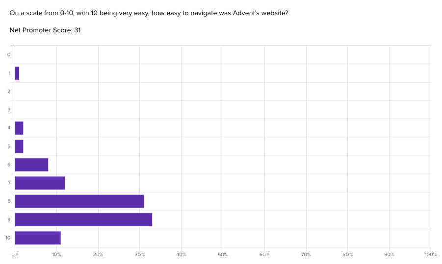
Scores range from negative to positive 100, with anything above a 0 indicating a generally positive reaction. With an NPS score of 31, Advent’s platform shows that, despite some previously mentioned comprehension and usability issues, the overall experience still meets user’s expectations, and therefore the team’s expectations.
5. Referral Programs: Leveraging the Network Effect
Referral programs are the business equivalent of “tell a friend.” Testing different referral incentives via Helio lets you see what motivates your users to become brand ambassadors. The number of referrals and the conversion rate are clear indicators of the success of these programs.
Testing referral programs with Helio involves:
- Incentive Planning: Decide on different incentives to offer for referrals.
- Survey Setup: Create surveys to assess which incentives appeal to your audience.
- Implementation: Introduce the referral program to a group of users through Helio.
- Track Referrals: Monitor the number of referrals and conversion rate of referrals generated.
- Adjustments: Refine the referral program based on user preference data and the success rate of the incentives offered.
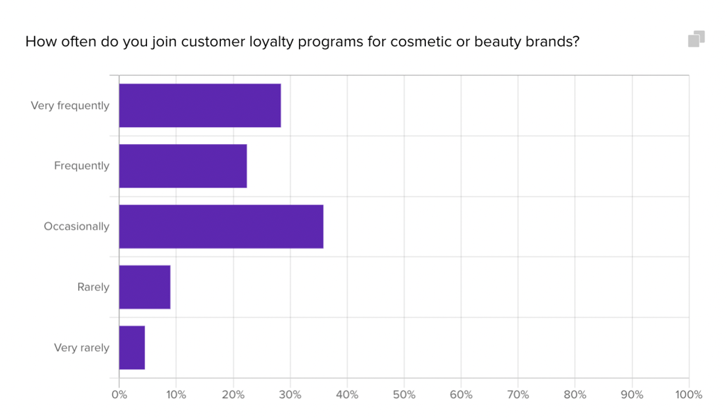
Beauty brand SkinSavvy used Helio to survey their target audience and understand their current experiences with customer loyalty programs as well as willingness to engage:
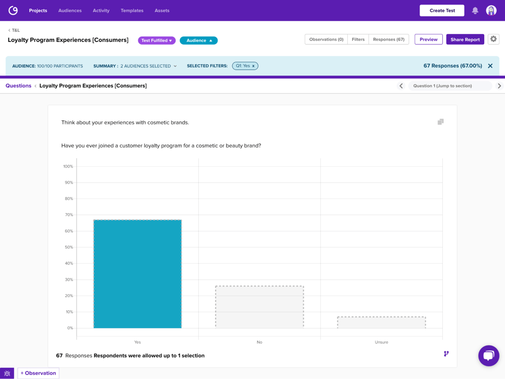
SkinSavvy found that most of their consumers (67%) have joined a loyalty program before, though the majority (36%) only take advantage of these offers occasionally.
“I usually do sign up if they offer a perk quickly enough or with low entry cost (like free shipping, $5 off or an extra freebie). If they have really high thresholds (like spend $500 for little perks), I won’t sign up.”
– Helio Participants, Beauty Product Consumer (US)
Helio helped SkinSavvy understand that interest for a loyalty program is high, with most participants (50%) saying their interest level is a 10/10. However, participants admit that they don’t always sign up for these programs with new brands, so providing enticing perks and few barriers to entry will be key to building engagement with their new loyalty program.
View the Helio Example
6. Content Marketing Strategies: Engaging Users with Quality Content
Content is king, but context is queen, and together, they rule the digital realm. Using Helio to test different types of content allows you to see what truly engages your users and drives traffic. Engagement rate here is a proxy for interest; it tells you whether your content is hitting the mark.
To implement content marketing strategies using Helio:
- Content Variation: Create different types of content you want to test, ranging from blog posts to videos to infographics.
- Audience Engagement: Set up tests or surveys within Helio that ask users to engage with the content. This could be as simple as reading a post or watching a video.
- Data Collection: Use Helio to collect data on how the content is consumed and shared. This includes metrics like time spent on page, shares, and comments.
- Traffic and Engagement Analysis: Analyze each content piece’s traffic and engagement rates to see what resonates most with your audience.
- Content Optimization: Refine your content strategy based on the insights gained, focusing on the types of content that drive the most engagement and website traffic.
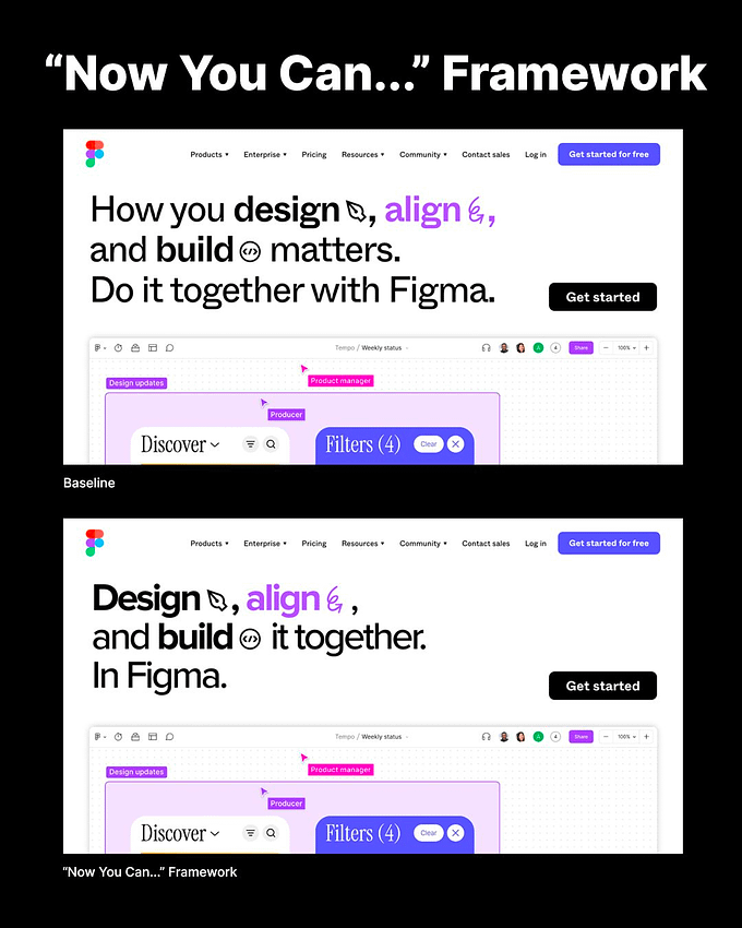
To illustrate how to conduct copy testing for your website, let’s look at a case study using Figma, a popular UI design tool. By testing the standard homepage headline against one crafted using the “Now You Can…” homepage headline framework, we gained insights into how such a simple change can impact comprehension and emotional reaction.
Using Helio
We split an audience of designers and marketers and presented each group a variation of Figma’s homepage in a test setup. The original headline was “How you design, align, and build matters. Do it together with Figma.” The alternative, crafted with the “Now You Can…” framework, read “Design, align, and build it together. In Figma.” Here were the observations from that test:
- Comprehension Speed: The “Now You Can…” version allowed users to understand the offering 20 seconds faster than the baseline. This reduction in time suggests that the message was clearer and easier to grasp.
- Clarity and Simplicity: Users found the “Now You Can…” version much clearer, avoiding the confusion and complexity perceived in the baseline.
- Generic Feel: Despite the improvements, both headline variations were criticized for feeling somewhat generic, indicating room for further refinement to stand out in the market.
See the side-by-side comparison between the baseline and the “Now you can…” framework in the image below:
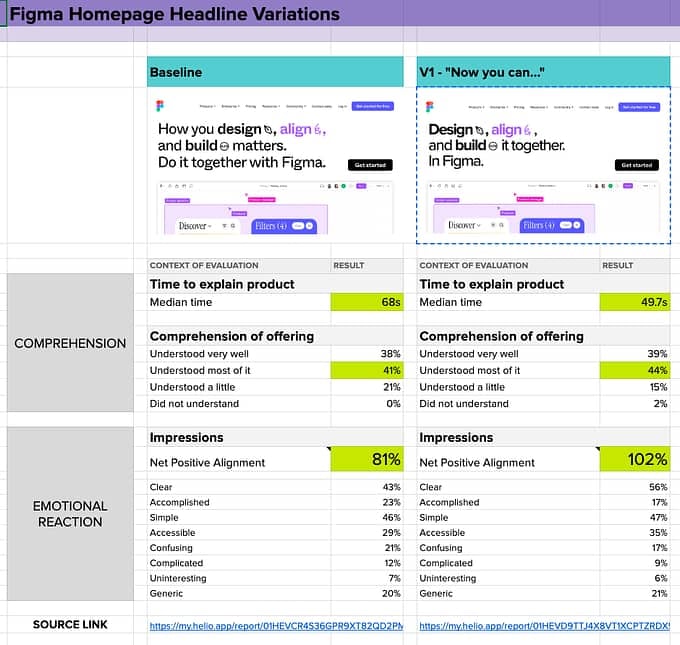
Here’s a link to the Figma Homepage Headline data comparison sheet, including links to the Helio tests for each homepage headline.
7. Social Media Engagement: The Pulse of Your Brand
Social media is the town square of the digital age. Testing variations of social media posts through Helio can yield rich data on user engagement and preferences. It’s not just about likes and shares; it’s about follower growth and creating a thriving community around your brand.
Testing social media engagement with Helio might involve:
- Post Variations: Create different versions of social media posts, varying the content, imagery, and timing.
- Engagement Measurement: Deploy these variations via Helio to track engagement metrics like likes, comments, and shares.
- Audience Preferences: Use Helio’s tools to gather data on user preferences and behaviors about social media content.
- Follower Analysis: Evaluate the growth in followers and the engagement rate to determine the most effective types of posts.
- Social Strategy Refinement: Adjust your social media strategy based on the performance metrics and user feedback for better future engagement and follower growth.
Online clothing brand Getup’s efforts to promote themselves on social media center around getting users to directly download their app from the ad. Compared to directing participants towards a landing page, it’s a bold move that may deter potential users from engaging immediately.In our test, Getup was able to capture a significant amount of immediate interest with their social media ad, with 46% of participants clicking through to download the app.

Other popular points of engagement were comments, clicking on the Getup hashtag or clicking onto Getup’s X account. Despite this risky approach, it looks like Getup may have found a reliable way to attract high value conversions from their social media ads.
8. User Onboarding Flows: The Journey from Newbie to Power User
First impressions matter, but so does the following journey. By simulating different onboarding processes via Helio, you’re looking to fine-tune the user experience from the get-go. User activation and retention rates are the KPIs that tell you whether users are finding value in your product quickly and sticking around for the long haul.
Onboarding
User onboarding is your product’s greeting; it’s your chance to make a lasting first impression. A well-executed onboarding process can transform a newcomer into a loyal user. Here’s how Helio helps in crafting that perfect welcome:
- Map the Onboarding Journey: Start by mapping out various onboarding scenarios with Helio. Each path should aim to educate new users about your product’s value and features.
- Create Interactive Guides: Use Helio to create interactive guides or tutorials that walk new users through the initial stages of using your product. The goal is to make this as engaging and helpful as possible.
- Gather Real-Time Feedback: Helio can collect real-time feedback on their experiences as users interact with the onboarding process. This insight is gold, as it reveals what’s working and what might be causing confusion.
Additionally
- Measure Activation and Retention: Helio can track how many users take key actions during onboarding (activation) and how many stick around over time (retention). These metrics tell you how well your onboarding process is engaging users.
- A/B Testing Onboarding Elements: Experiment with different onboarding elements using Helio. Test everything from the copy and graphics to the steps users should take.
- Iterate Based on Insights: Use the data from Helio to refine your onboarding flow. It’s about iterating quickly based on user feedback to continuously improve the onboarding experience.
By fine-tuning your user onboarding flows with Helio, you’re not just showing users how to use your product; you’re beginning to build a relationship with them. This stage is critical – users decide whether your product is right for them. A smooth onboarding experience sets the stage for everything that follows, from user satisfaction to the likelihood of referral. So, make it count.
For testing user onboarding flows with Helio:
- Onboarding Variants: Design different onboarding process flows to test.
- User Interaction: Use Helio to simulate these onboarding processes with users, tracking their interaction and feedback.
- Activation and Retention Metrics: Collect data on user activation and retention rates during onboarding.
- Experience Optimization: Analyze the data to determine which onboarding flow leads to better user activation and retention.
- Process Improvement: Iterate on the onboarding process based on user feedback to enhance the user experience and long-term engagement.
To test full front-to-back flows, we need to test user error rate through the flow rather than success on individual clicks.
To do so, online banking company Banko tested their app’s onboarding process with a Helio audience of Bank Members in the US. One of Banko’s key onboarding opportunities allows new users to take a questionnaire that sets them up for tracking their financial health and getting financial advice from the Banko team.Banko put 100 participants from their audience through the onboarding flow, tracking the levels of success for completing each question:
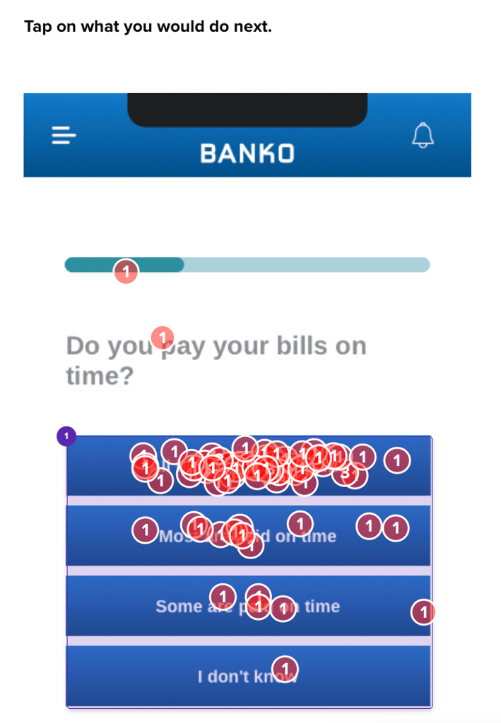
For users who decided to skip certain parts of the questionnaire, Banko temporarily took them out of the flow to understand more about why they didn’t want to engage with those questions.
“not sure if I feel comfortable filling that out after just signing up”
– Bank Member (US)
This testing revealed the usability success of their onboarding feature, and the reasoning behind user’s potential hesitations.
9. And Push Notification Strategies: The Art of the Nudge
In a world awash with information, the gentle nudge of a push notification can mean the difference between engagement and oblivion. By testing different messages and schedules via Helio, you can discern what prompts users to take action without tipping into annoyance. The engagement and conversion rates from these notifications are your guiding stars here.
To test push notification strategies using Helio:
- Notification Design: Craft various push notification messages with different tones, timings, and calls-to-action.
- User Reaction: Deploy these notifications to users through Helio and monitor how users engage with them.
- Engagement Data Collection: Gather data on user engagement and actions following each notification.
- Impact Analysis: Use Helio’s analytics to understand which notifications drive the most engagement and conversions.
- Notification Refinement: Fine-tune your push notification strategy based on the insights to optimize user engagement and conversion rates.
We recently put our own notification system to the test with the help of Helio. Our new notification settings page was in need of some usability improvements with the addition of a button to silence groups of notifications at once.
We presented different versions of the settings page to three separate groups of participants, asking them to interact with the page based on goals they would have, such as silencing Slack notifications from Helio.

After interacting with the page, participants were asked to indicate their satisfaction and emotional reactions to the experience:
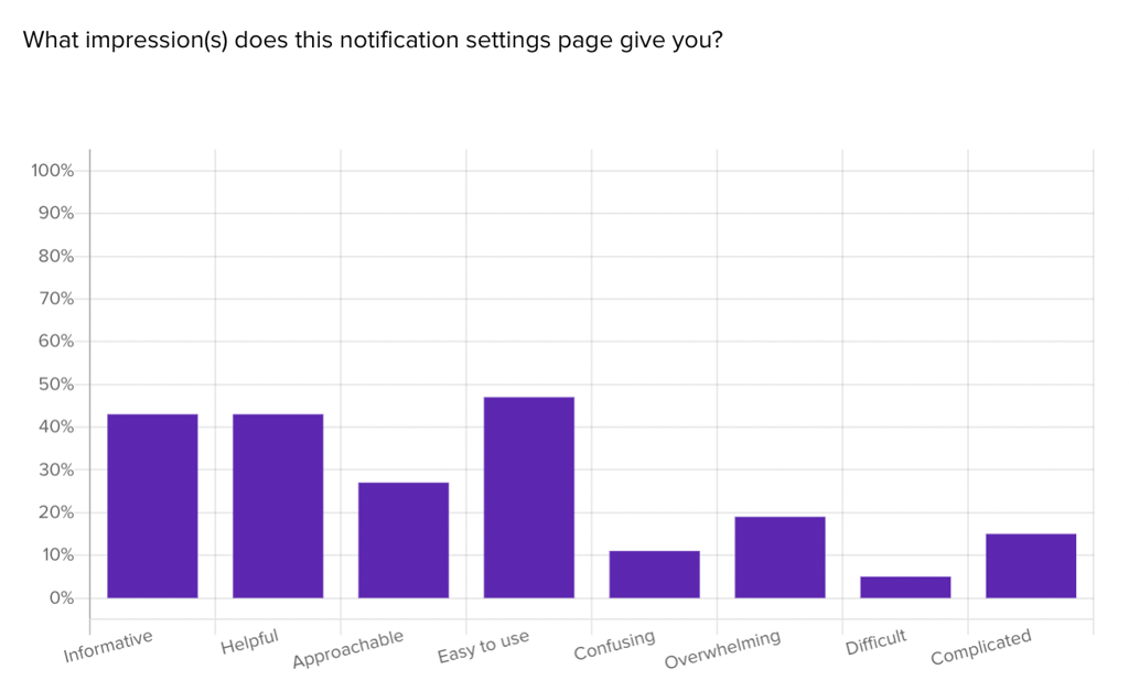
Once all the data was collected across all three versions of the page, we entered the data into a comparison framework to see a bird’s eye view of the results:
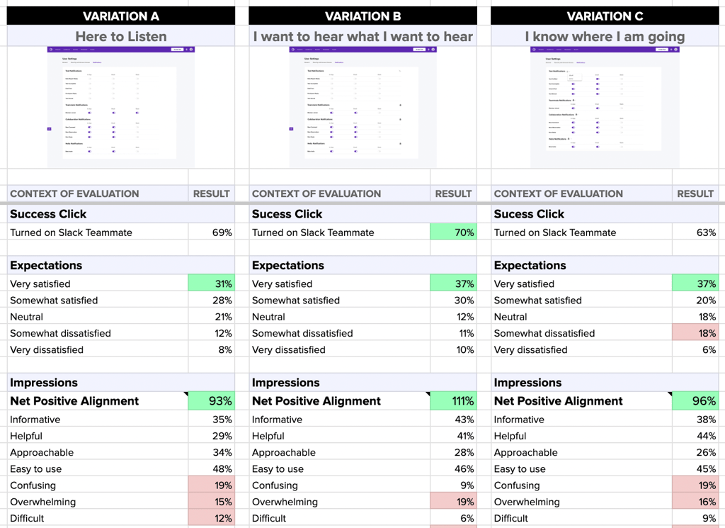
Impressions from the emotional reaction question were totaled up to a single Net Positive Alignment data point, which is the sum of the positive impressions minus the negative impressions associated with the experience.
Our data framework clearly shows us that the placement and implementation of the notifications settings in variation B produced the highest usability success, greatest satisfaction, and most positive impressions out of the three versions. Based on this data, our team was able to move forward with confidence with a user-validated version of the notifications settings page.
Each of these experiments, when conducted through Helio, allows businesses to gain rapid insights into user behavior and preferences, leading to more informed decisions that can significantly impact growth. By engaging directly with users and continuously iterating based on feedback, companies can fine-tune their strategies to meet user needs better and drive business success.
Harmonizing Your Growth Strategies
And here we are, at the culmination of our guide to growth experiments. We’ve navigated the hows and whys of using tools like Helio for landing page tests, email campaigns, feature rollouts, and more. It’s been a journey of discovery, strategy, and, most importantly, growth. Let’s encapsulate the key takeaways and forge ahead with our newfound knowledge.
- Fast Track to Feedback—The quintessence of our journey lies in the power of speed and feedback. It’s not about crafting perfect processes but about racing towards the feedback that will guide your next move. With each experiment, you’ve learned to prioritize this fast execution to validate ideas quickly and pivot as necessary.
- History as Your Compass– You’ve seen the value in choosing experiments not at random but based on a known history and their potential for significant impact. This approach has meant betting on strategies with a proven track record while still leaving room for innovation.
- Balancing Act of Risks and Rewards– Your portfolio of experiments has become a balancing act, with each test carefully weighed between its risk and potential gain. This balance ensures that while some experiments push the envelope, others provide steady results that underscore your growth.
- Themes That Tie Together– Throughout the experiments, you’ve kept a keen focus on overarching themes – the storylines that tie your tests together for deeper insights. This thematic approach has not only provided direction but has enriched the understanding of your users’ journey.
- Customer Insights as the Foundation– And perhaps most crucially, you’ve grounded each experiment in real customer insights instead of mere predictions. You’ve tapped into what your users truly want and need, using their voices to steer your product and marketing strategies.
Your Growth Symphony
In wrapping up, think of growth experiments as a blend of various strategies that drive your business forward together. Helio acts as your guide, helping you fine-tune each approach to better connect with your audience and push your business towards greater achievements.
Take what you’ve learned and integrate it into your growth strategies. Continue to experiment, learn, and grow. Growth is more than a target; it’s an ongoing process. With the insights and tools at your disposal, you’re ready to tackle this journey confidently and creatively.
FAQs on Growth Experiments
Growth experiments are strategic tests designed to explore various aspects of business operations, marketing, product features, and user engagement to identify what tactics can significantly enhance growth. These experiments, guided by data and customer feedback, enable businesses to discover effective strategies through a process of continuous learning and adaptation.
Select growth experiments based on their historical data, potential impact, and relevance to your business goals. It’s crucial to prioritize experiments that offer the most significant insights and can drive considerable growth. Balancing the risk and potential gain is essential to ensure a diversified approach that maximizes learning while mitigating potential downsides.
Fast execution allows businesses to gather feedback and iterate on their strategies quickly. This approach ensures that you can adapt and respond to user preferences and market demands in real-time, optimizing your growth strategies based on actual data rather than assumptions.
To balance your experiment portfolio, mix high-risk and high-reward experiments with those having known outcomes and lower risk. This strategy ensures a steady growth trajectory while exploring new avenues for expansion. Regularly review and adjust your portfolio based on performance and strategic fit.
Customer insights are foundational to successful growth experiments. They ensure that your strategies are grounded in real user needs and behaviors, making your experiments more likely to succeed. Use customer feedback, behavior analysis, and market research to inform your experiment designs and decisions.
Success is measured by predefined key performance indicators (KPIs) such as conversion rates, user engagement metrics, and revenue growth. Analyzing these metrics before and after an experiment can provide clear insights into its effectiveness and inform future strategies.
Tools like Helio offer platforms for designing experiments, collecting user feedback, and analyzing results. These tools facilitate rapid testing and learning, allowing businesses to adapt their strategies based on actionable insights.


